-
Posts
1,568 -
Joined
-
Last visited
-
Days Won
68
Content Type
Profiles
Gallery
Forums
Everything posted by Mary Solaas
-
@Julie Magerka I'm not a fan of Taylor Swift, but I love your layout. That background is marvelous and everything just flows together.
-
Dear Rene. I can appreciate your feelings. For the longest time I had seasonal depression from Thanksgiving through Easter - Mom died just 15 days before Christmas in 1982; my husband died just 10 days after Easter in 1988; my dad died on Thanksgiving Eve in 1989; my brother died on Thanksgiving Eve in 2014. I still loved Christmas, Thanksgiving and Easter, but that seasonal depression just kind of lurked in the background so that after the festivities with the family were over, it kind of moved in. My brother was the only one who died at home after suffering from stroke and pancreatic cancer. I was the caregiver in all but my brother's case; although he and I spent much time together, I took him on several trips during 2013 and 2014, but his youngest daughter was really his caregiver.
-
Oh, Susan. I love Christmas music anytime, any place. My young grandchild and I would listen to 2 of our favorite tapes (at that time it was tapes - I've since gotten a car with a CD player and play those same songs on CD now.) It was Jim Nabors and Nat King Cole who were our favorites. and we would put it on when we went for a drive or when we went to and from Church. Such happy times!
-
I couldn't resist. This is my favorite of the AI pictures I did of that Caboose Lake photo. Used Cass' Shaped Text script on the Bahira text, which I had duplicated and inner bevelled. I added shadows to all.
-
Daniel, I went ahead and upgraded the 2023 version received in the Humble Bundle, then added the Vision FX as a plugin to it. I have been having a ball with it as you can see from my postings in this thread. Go ahead and bite the bullet and have some fun!
-
I had to try my hand at that Adamski effect. This is a sunset beach scene from Unsplash (Alvin Mecenau), and one that I put through motion blur and radial blur several times, then put it in Vision FX through PSP 2023 Ultimate - not sure if it is exactly the Adamski effect, but this is my result (I put my silhoutte on the finished project since I had removed the original lady.
-
@Donna Sillia OK - bought the RasterToMask Script. Saved my MultiLayerMask and converted it to a mask with that script and saved the script. Called the script forward into a layout and this is what I came up with using the mask from the saved masks.
-
-
-
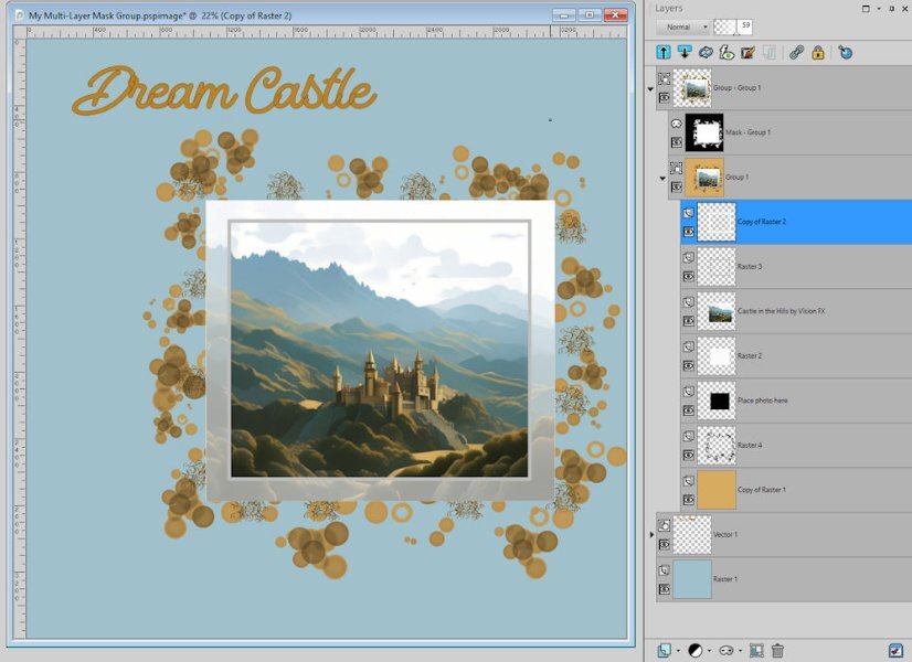
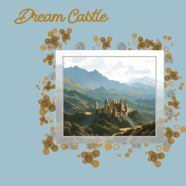
Playing around again. @Donna Sillia you inspired me to create a multi-layer mask also. This is what I came up with
-
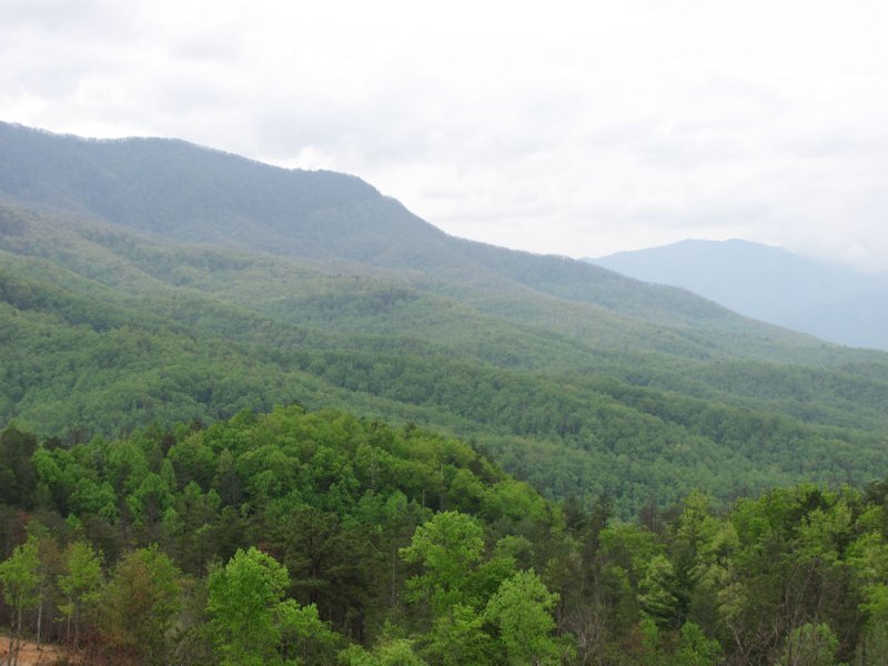
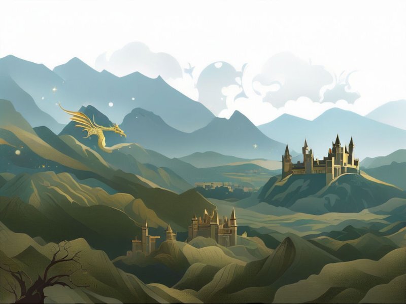
Playing with Vision FX again. Started with the picture of the Smokey Mountains and asked for a gold dragon and castles in the hills.
-
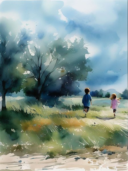
Speaking of AI, I created this one in 2023 Ultimate with Vision FX from that same Caboose Lake picture as before, only this time I asked for children playing in the meadow and as a watercolor.
-
-
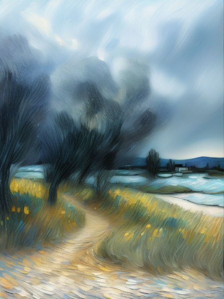
I did get that bundle and have been playing with it. Since I had used CF Spark to create pictures (AI), I wanted to try out the Vision FX. It works best in PSP 2023. In CF Spark, you can create a picture from scratch. I don't see how to do it in Vision FX. It works on a picture you provide - changing it up according to your description. I tried it out on a picture I took up at Caboose Lake in 2022 and used a copy (very important to use a copy of the picture you want worked on). This is the result (I used the description for changes that were there when I opened it up within PSP 2023.
-
-
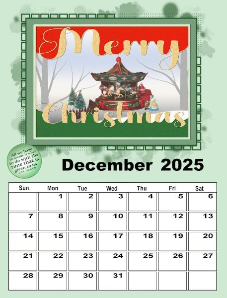
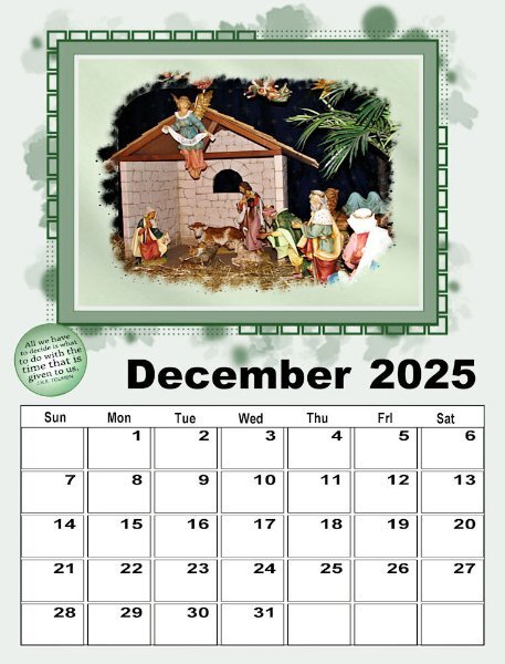
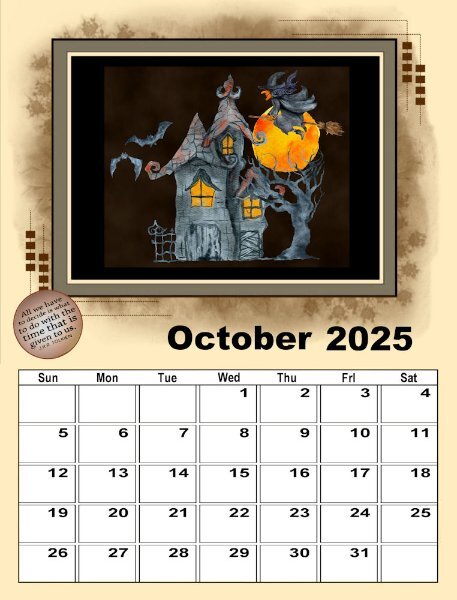
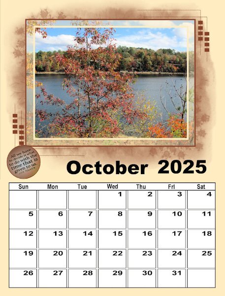
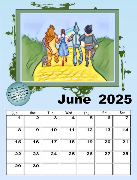
I'll post the rest of my calendar in this forum. October - both sets. The Halloween picture is from CF of course - a watercolor. The photo was taken by me in 2020 at an RV camp in Alabama.
- 160 replies
-
- 10
-

-

-
-
Well, I did do it. Now I'm in Neverland. I've got all this stuff. ??????? Oh, my!!!!!!
-
And now August. The Lighthouse is a watercolor from CF. The picture I took up at Caboose Lake RV Park in Indiana.
-
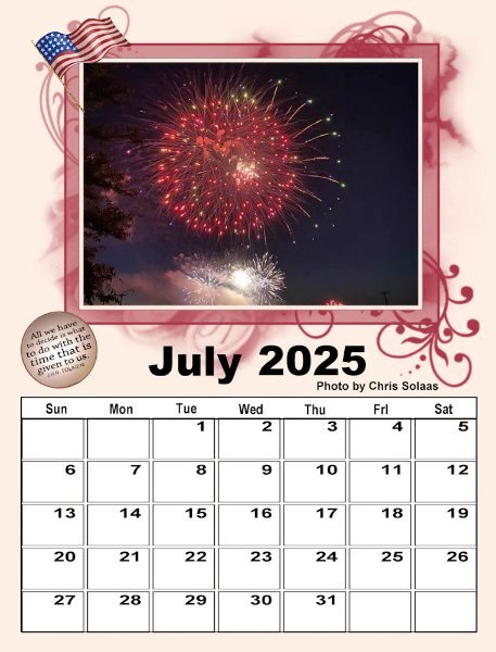
Well, with only 2 calendars, I guess I'm in good shape!?! I'm only on July, but here goes. The poster for set 1 is one I made in a lab some time ago.
-
Thanks for the information @James Durrant. The only one I was really interested in getting was the Corel Draw.
-
The mask kind of looks like it is in layers ??? with varying opacity?????
-
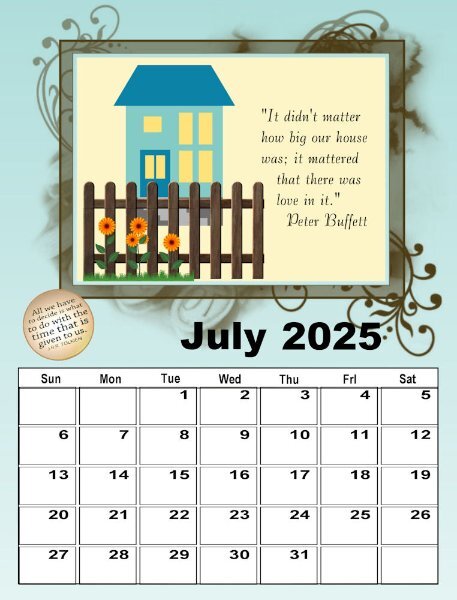
I didn't go to the lengths I did on the last one. However, this one - I developed the picture from a clip art I had from Kissclipart that I had used in my Alphabet Workshop, put it on a background that I had created to reflect grass and sky, merged it into one image and then used Instant Effects - Watercolor and used strength 50%, Color Match 30% and smooth 22%. I cropped the image to fit inside the first (light) frame.
- 430 replies
-
- 10
-

-

-
YES, YES, YES. New class! Yay!


