Mary Solaas
-
Posts
1,609 -
Joined
-
Last visited
-
Days Won
68
Content Type
Profiles
Gallery
Forums
Everything posted by Mary Solaas
-
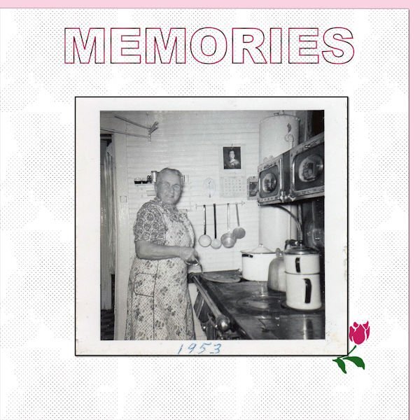
Lab 14 Mod 2. Requirements: ink dot paper - I used a pink paper behind it and used the blend mode Luminance and so the ink dots are pink; Irregular Text Stroke - the title. The font is Arial Black as was suggested. The picture is of my grandmother (mom's mother) taken in 1953 and she was in her 70's (late 70's). It is my favorite snapshot of her - in her kitchen in Upper Michigan - a wood stove which also kept the kitchen warm - and she used an old fashioned iron to iron clothes - it was not electric, but was heated on that old wood stove. I remember also the chickens she kept and would kill one (an old hen) on Saturday and cook it on Sunday - our Sunday dinner. She had 7 children and the middle son stayed home - never married - and took care of her and grandad. the rose at the corner of the picture is one isolated from a group by Creative Fabrica. I see that the ink dots paper doesn't show up so well. I will post the paper separate.

-
Happy Birthday, Carole. May your day and the coming year bring many blessings. Love to you.
-
@Jannette Nieuwboer Yeah - at first glance it looks like an upright piano.
-
Really cool!!! - a wonderful idea - well done!!
-
I like the picture you posted that YOU took.🙂
-
Glad to see you back. I'm lagging behind. Not going to try and catch up. Just one step at a time!
-
I have Windows 11 - it just decided I needed it - didn't wait for me to chose it, just went ahead and did it!
-

Balls & Bubbles problems and crazy antics in PSP
Mary Solaas replied to Mary Solaas's topic in PSP Stuff
That was what I had to do, too. Now it works for me. Every time! -
All of a sudden, several days ago, my mouse wouldn't open my logon to my computer. I tried punching several buttons, but that didn't work until I pressed Ctrl+Alt+Delete. Which was crazy - right? Also, the pointer was beginning to jump around. The mouse was old since I had bought it several laptops ago, but it is only in the past few months that it has been acting up. My problems with the Balls & Bubbles cleared up after the mouse was replaced.
-
Evidently my old mouse was the problem. Since installing the new mouse, Balls & Bubbles now works. That mouse (the old one) had even messed up my login screen.
-
Balls & Bubbles problem in 2022 and 2023. I tried Donna's solution by removing the duplicate file locations - all except the ones I had copied into my personal file location and it worked. Unfortunately, after removing everything in file preferences>file locations, I closed PSP 2022 Ultimate and when I went back into it, it loaded all those file locations I had removed. So now balls & bubbles will not work again but just locks up the program.
-
D is for Daffodils - they survived the last snowstorm and are coming back.
-
Lab 14 Mod 1. Requirements: quatrafoil 4 - background paper; Letterboard - Travels. The picture is from RougueFile, Bongo; the font for the title is Bodoni MT Black.
-
@Sue Thomas That is so beautiful. Thank you for giving us the words to the song - so beautiful - I lived for 4 years in upper Michigan (my high school years) and we definitely had much snow - I loved it - the first snowfall is so wonderful - the sound of silence! @Cassel Love your remembrance of a fun time locally. Younguns do love the challenges. Imagine - an ice wall! the kids think that is something built just for them! What's not to like???
-
I did look it up and the Help folder said to look up in file location preferences under "File". It said that temporary files are located on the C drive under your user name folder, in App Data\Local\Temp\Corel Paint Shop Pro 2022 Temp Files. The files that I had been working on last night were there (though unrecognizable names) as .tmp files. When I tried to bring them up in 2022, they wouldn't open as the file name (.tmp) was unrecognized. So much for finding closed un-saved files!
-
This is a unique D!
-
Lab 13 Mod 12. Requirements: random stripes - I made it into a plaid; pattern of 4 images - I made several and used one on a small paper behind the pic.
-
Lab 13 Mod 11 - make 6 small arrows and a page of multiple arrows. all the elements, papers and photos are mine.
-
Lab 13 Mod 10. This was a memorial statue in front of the Cary, Illinois Fire Station that caught my eye on my annual visit to my cousin. The lab module called for a newspaper paper and a line pattern: circles, straight lines and dots. The fire truck is a watercolor from Free Clip Art. The Fire Station logo is also from Free Clip Art.
-
PSP - Lab 13 Mod 9 - requirements: Chicken Wire Pattern (put it on the background layer); Chevron ribbon (on the left side). I used the chevron stripes for a plaid paper and for a stripe paper - which I used as a pattern for the small paper and for the fill on the main title. The grill cluster is from PS - Jessica Dunn (one of my favorite designers); the title of grill master is also from PS - Elif Sahin. The title font is Comic Sans MS. The main title was inner bevelled and shadowed.
-
C is for Cameras
-
@Cristina I can't believe it. I posted this to you just about 15 min. ago and it disappeared. Well, anyway. I really love this. It's a stunning way to interpret that module. Way to go, girl!
-
This is the result.
-
I did a B&W photo with color showing through early last year. Not sure what discussion in the forum prompted it, but this was my take on it. I started with a photo from Laurie (a duplicate of course), made it into a black and white photo, erased the portion of the flower (I see that there is a portion I didn't erase in the middle of the flower). In my pspimage the color photo is the bottom layer and the black and white photo is the next layer. Since the 2 were together, I then just started erasing the flower on the top layer. The completed flower image wasn't accepted so I will post it next.
-
@Cassel Thanks anyway.