Mary Solaas
-
Posts
1,568 -
Joined
-
Last visited
-
Days Won
68
Content Type
Profiles
Gallery
Forums
Everything posted by Mary Solaas
-
This is beautiful. Yes, it takes some time to do the project well. It actually took me 2 years to finish my Alphabet Soup album. So just stick with it. You have lovely ideas that come through in your layouts.
-
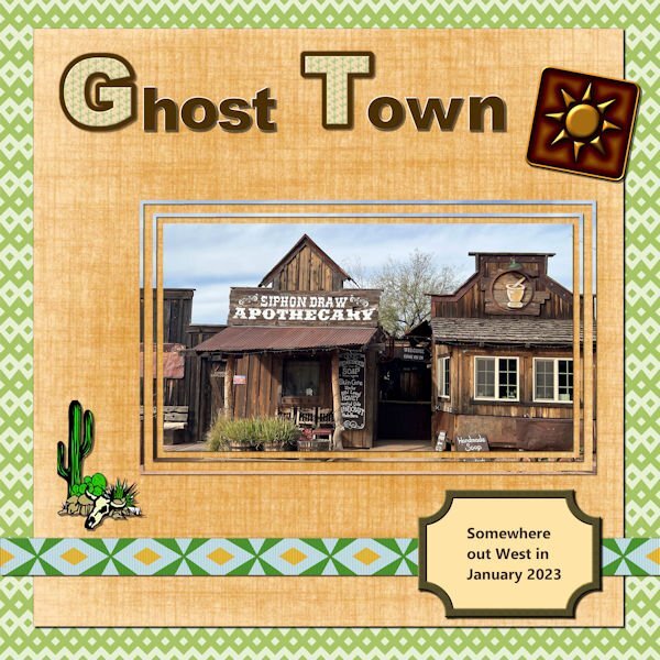
Lab 13 Mod 2. Double arrow - I made papers and ribbons; Cutout shape - I made several but did not save them as "shapes" or "brushes", just png's (several of them all with different corners cut out) - used a copy to make the label. The rest of the papers and elements are from my desert kit including the title. The picture was taken by Joe and Laurie on that western trip they took in 2023. I used that mask I made some time ago playing with several frames in different opacities.

-
I, too, have all 4 of Carole's books. The 1st 2 on Kindle. and the next 2 in paperbook. The previous 1 is marked with numerous paper clips as that is how I marked it for places to study as needed. I just got my copy of the new one and am looking forward to reading and marking it!
-
I agree. In my planning of an album, I usually plan the pages as facing each other and so the look is cohesive. Worked with my Chattanooga album which I had printed for my daughter who shared the trip with me. The trip that my son and daughter-in-law and I took in the RV out west, I did that in double pages and it was a chore in getting it printed and not losing anything in the center.
-
Since I am a Diamond member, I downloaded both the pdf and the mpr of Playing With Vectors Master Class. The very end of the mp4 mentions the upping of the Tracking # in the pen tool. This is not mentioned however in the pdf version. Anyway. Thanks for the update for me. I love what you do, Carole. I guess I'm going to also go to the Master Classes as well as the Labs. Will I ever catch up??????????
-
@Cassel I never thought to look at the tracking! Wow! What a difference. Could we have a workshop or something to give us practice on just using the pen tool??????
-
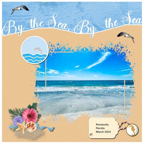
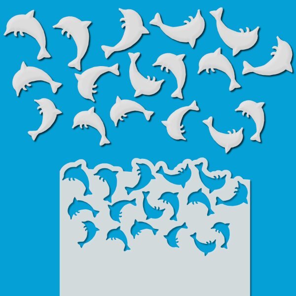
Lab 13 Mod 1. I did choose the dolphin stencil. The other elements and background paper are mine and all came from my Beach kit except the mask which was one from the mask workshop - I use that mask a lot.
-
@Michele HOW TRUE HOW TRUE HOW TRUE. Love you for displaying this bit of truth.
-
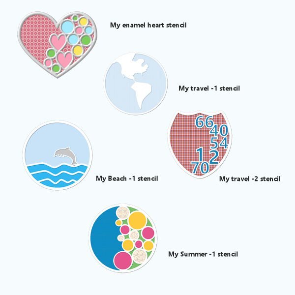
I'm playing with labs. Lab 13 Mod 1 has just one element - stencil. I haven't decided what will be the theme of my layout, but I made several stencils and 1 as an "enamel" element. Unfortunately, I made the background layer white and all of the outlines of the stencils are white!
-
@Donna Sillia Love your work with alphas!
-
@Donna Sillia What an amazing alpha - really cool.
-
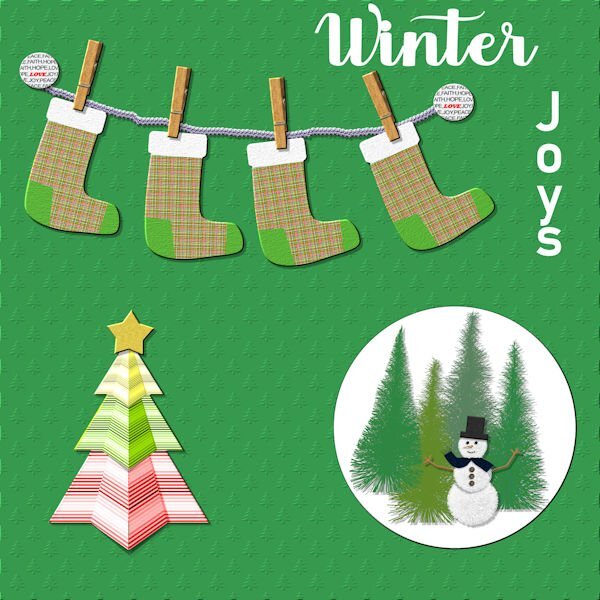
Lab 12 Mod 12. Finally finished with Lab 12. Will I ever catch up????? Title - Winter: Aryadata; Joys: Arial Black; Requirements: Christmas Stocking; folded tree; bottle brush trees. The snowman is by Rachel Martin (PS); the rope is by Cass; the clothes pins are by Brooke Gazarek (PS). I've had fun with the embossed paper and have made several of them with different elements. I've also made several different brads - some with Cass-brad factory and I believe these were from that script.
-
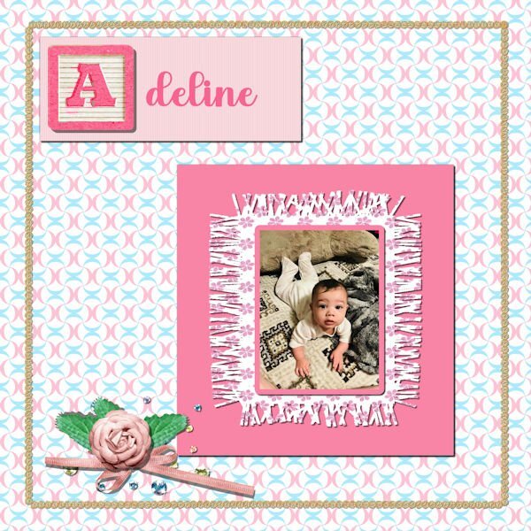
Lab 12 Mod 11. Swirl - background paper; block letters - I had an alphabet from Jessica Dunn and I used that rather than building my own - I recolored it as it was originally in green letter and frame. The bow, flower, scatter were also from Jessica Dunn. the fringe blanket was made in a previous lab; the lace frame I developed myself building on a previous lab and making it into a tube
-
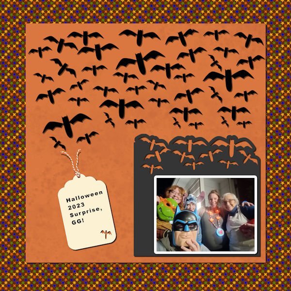
Lab 12 Mod 10 (October - must be Halloween) - requirements: multi star pattern (background paper), bat vector item to be exported as a preset shape - did both preset shape and a brush. Tried doing the bat shape using the exploded cutout tut.
-
Just playing around with a mask I made with a lace edging made in a previous lab module. The butterfly I made with Cassel's enamel script.
-
My husband loved carrot cake. He and I used to make it together for special occasions after he retired.
-
I'm so glad to see you back, Minka. Are you in Maine or Florida? Do you still winter in Florida and summer in Maine?
-
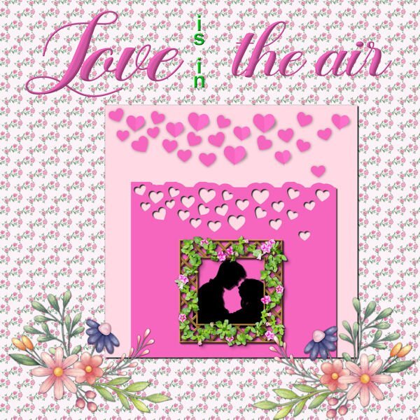
Love is in the Air. Pink title is Billgates with layer styles: Emboss; green title is Arial with 3D Effects: inner bevel; background paper I made from a tile I developed from a CF item that I worked with; the 2 flower items in the bottom corners are a watercolor from CF. The silhoutte I got from someplace several years ago and they are in a flower frame which was a Cassel freebie several years ago. The exploded hearts cutout was the requirement for Lab 12 Mod 9. I also did one of dolphins but haven't used it in a layout and I may practice this on some other cutouts later. Seashells didn't work so that is why the dolphins - i used layer styles on them - inner bevel.
-
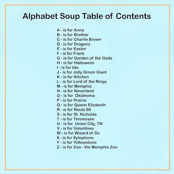
So, I have the Title and the Table of Contents
-
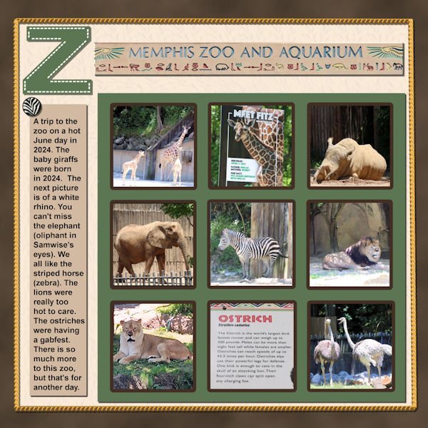
@Ann Seeber Thanks. I wasn't sure about the giraffes. It was so hot that day and I wasn't feeling well that week, but it was my daughter's and my staycation and I bullied through. But we didn't get to the aquarium or any further in the zoo. I bet I could do a whole alphabet from that zoo. But that will have to wait - too many sticks in the fire. That Aquarium alphabet that Carole gave us is so neat - I though about my pics from the Chattanooga Aquarium, but haven't gotten that far yet. And here it is the middle of July!!!!! I also have been looking at the P52 thread and gotten a few of my pics from the different weeks - both Canon camera and the phone camera. I might be able to come up with the 25 or so weeks that have passed. My - time does fly (think of Susan Ewart and her Time kit).
-
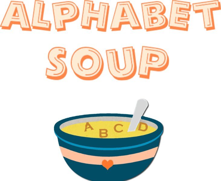
Finally - Z is for Zoo. This is almost the completion for the 2022 Alphabet Challenge. My theme was alphabet soup since it was random choice for each letter. @Ann Seeber I'd appreciate your proofreading skills on this one.
-
Spark is good, but you have to know what you want and be able to express it. Anja really has the knack to get something glorious out of it. With Spark, I got my Andy Warhol cat that I love, but I had to work at the wording to get it. Use Anja's wording with Spark and see what you come up with!
-
Sometimes I feel like I'm in a candy store! Definitely can over-indulge! Gluttony?????