Mary Solaas
-
Posts
1,500 -
Joined
-
Last visited
-
Days Won
68
Content Type
Profiles
Gallery
Forums
Everything posted by Mary Solaas
-
These need to be posted in the thread for the Quick Page Workshop. Like your unicorns
-
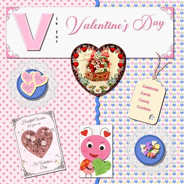
Bonnie - love your ice cream pics and layouts! Makes me drool for ICE CREAM! I decided to go with V is for Valentine's Day. (There are too many places I like to go to for vacation - mountains, sometimes the beach, family members in the north, the south, the east, the west; route 66, route I-90 (from the east coast to the west coast) - would take a whole album to do those vacations! So here we are with Valentine's Day. Cassel's heart punches on the corners of the title paper; I made the cookies and bought Cassel's script for tube icing since I wanted icing that was not just flat - used the sprinkles I made in one of the labs for the word Love on the cookies; used the picture tube for the heart candies; used the plate in the basic course, made the doily in one of the labs; made the papers; Cass-zig zag ribbon in white which I (of course) colorized; the valentines: the old victorian one was from PS - Janet Kemp; the others are scanned images of cards I have received; made the tag in one of the labs, as is the string attached to the tag. And of course, Valentine's Day is celebrated with cards, candies, cookies, cake and whatever sweet you can give your "sweet".

-
I'm now on Day 3.
- 382 replies
-
- 10
-

-

-
Ann - I recognize that font - Annie Tobin's - she was so special.
-
Carole, the only thing able to download on the original paper is the collage. Can you send us to FB header as a separate post or email?
-
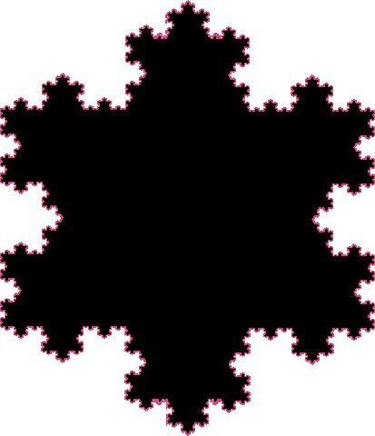
Kasany - WOW - You just WOW me every time with those fractals.
-
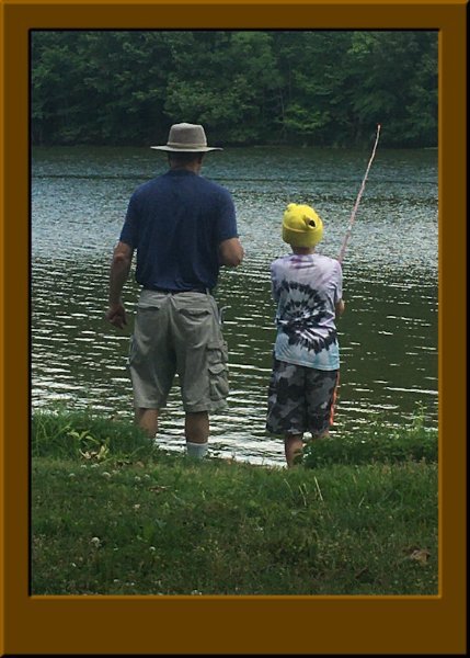
Day 2. Yes, I always like to change colors. The non-scrap is a picture that I love - old (for David is a big 14 now) but still good - David and his grandpa fishing together (David is my great grandson and the grandpa is my son).
- 382 replies
-
- 10
-
-
-
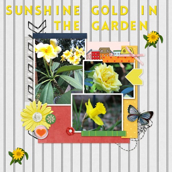
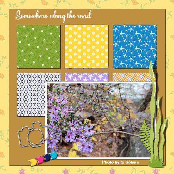
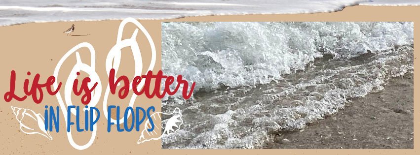
And these are my day 1. The turtles sunning themselves is a pic taken by my son, Chris, when he and his family visited the park in New Orleans. The peony in the extra is from a trip with my eldest son and his wife when we went rv-ing in 2021 in the northwest - this pic was taken at an rv park in Nebraska. The rolling waves on the beach in the FB header is a pic my son, Chris, took when he and his family visited the Gulf.
- 382 replies
-
- 15
-
-
-
How neat - filling out the space when you have a vertical picture instead of a horizontal one!
-
Good to see you too!
-
Fonts are available, but making special alphas is great.
-
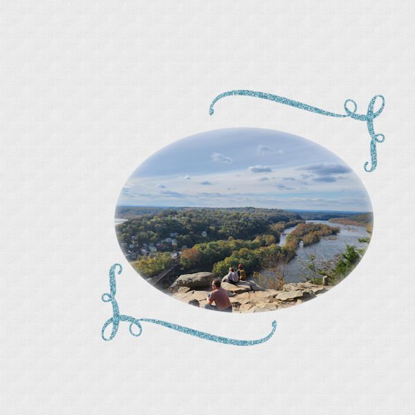
This is one I worked on several months or weeks ago. The picture was taken by my granddaughter in Harpers Ferry, WV. The glyphs are brushes I made from one of the fonts Creative Fabrica gives out.
-
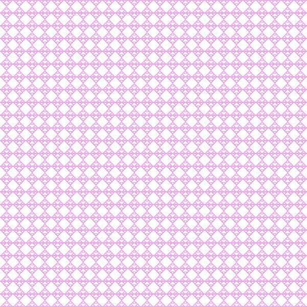
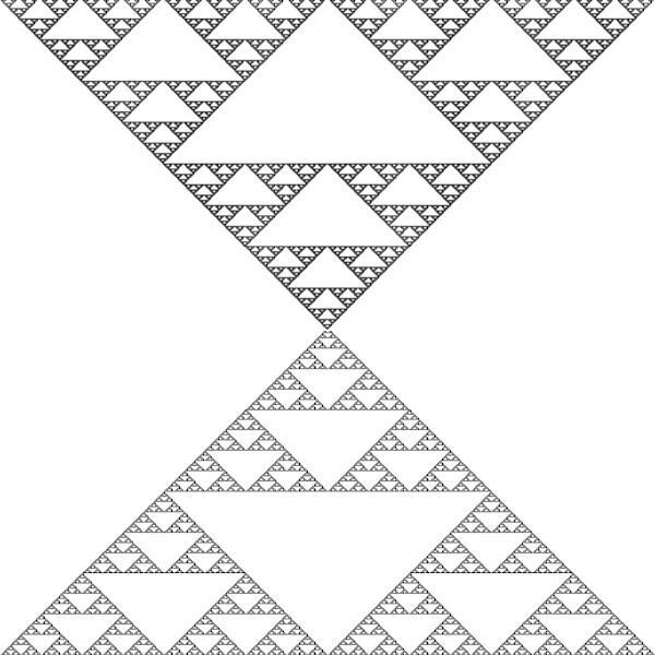
So, I made a layout using one of the fractal triangle papers, and the Koch Star mask. The picture was taken by my daughter-in-law Pam Solaas - she works in this show every year and took me to it too this year. Love it. It is known nationally and has been held for over 70 years in Germantown, TN (just outside Memphis, TN). The horseshoe I got from Creative Fabrica and made it into a paint brush and a picture tube. Also created the wood-burned element from the tutorial by Carole. The font for the title is Ballpark from Creative Fabrica some time ago.
-
Amazing what you did - especially that last little area in the child's tan chair! WOW!
-
Love what you do, Ann. Seems like I'm going to have to play with that background replacement tool - My next OCD venture???
-
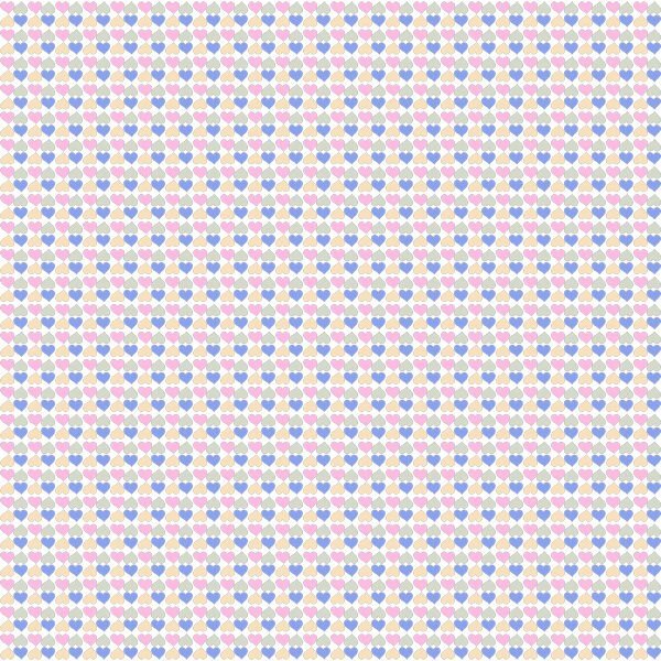
I've posted the patterns (*.png's) on the Facebook page. Seems like that accepts all forms (*.pspimage, *.png, *.jpg - and all sizes). Anyway, someone mentioned the heart paper and triangle paper so I also posted them. All are free to use. Susan - could you post the *.png overlay you made on Facebook? I would like to have it just as you used it since I won't have to extract it, etc. LOL
-
I'm in. Need to get my mind fixed on something else.
-
speaking of things we have all been doing, Susan I really liked that overlay you did of your barn door cracks. Could I get a copy?
-
Suzy and Susan. It is not easy to use and since it was free I just messed around with it. PSP is easier and especially since Carole is so good at explaining things and knows so much. You all can have the patterns I managed to make as noted above or I can post them as png's on Facebook (can I?) Only if you want to. I have to quit. I made one more pattern and 1 more paper but it is too time consuming for me to continue with it. It won't do what I would really like it to do. I have a few ideas in mind since fractals are just repetitive patterns in nature. I'll post the new pattern and the new paper here.
-
and 1 more
-
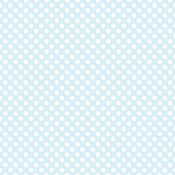
and here are some of the papers I made with the patterns.
-
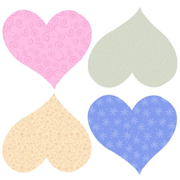
There are so many tools in PSP. But I did download that fractal explorer that Kasany was talking about. Played around with it in my OCD phase about papers and patterns. Well I made 2 patterns out of that and then thought about psp's preset shapes and the heart shape and so I'll show you what I have been doing instead of what I should be doing!!LOL!!!
-
I did download Fractal Explorer but haven't had a chance to play with it yet. I just love what you are doing with it. I did think about the repeat patterns in nature and thought about the repeats in a flower especially - the petals, the sepals. Never really thought about it until your postings. Love what you do.
-
I really love what you did with the background paper. And, looks like I'll have to order the mitered frame script.
-
I followed your instructions and this is what I came up with as a paper