Leaderboard


Popular Content
Showing content with the highest reputation on 11/22/2023 in all areas
-
Now I've really got the hang of adding multiple images. The first time I went back into edit, then added an image. This time I simply added one at time. I feel so silly, as initially I was making a real meal of it, and failed. 🙂 I will summarize how I created these, and others, as I have lost count of the tools I used. I'm in my element doing intricate stuff like this. The gold rings are vectors. The most difficult part is aligning the vector elements to the rings. (Making them one) (used the pick tool, free, and sheer) warp brush, push. I also used the warp brush push, on the rings to have then higgledy piggledy. Lock transparency to colour the berries red. I used the create a gold element technique on the holly and berries, Using the blend mode I liked the screen effect. Selected the elements, expanded and deleted the one ring. Keeping the outer frame consistent. Floral elements from CF.
 6 points
 -
These are gorgeous. When I read all the tools/steps, my head starts to hurt! But you are the master at intricacy!4 points
-
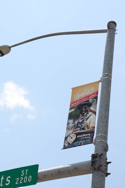
You did a professional job on the straightening the poster, using the perspective correction tool, also an equally as good job on the extraction. Did you use a mask or several masks for the extraction? I do.4 points
-
I think this is the final version. Thanks for the ideas everyone.
4 points
-
A tip, I like to keep one whole vector circle, as it makes it easy to use the magic wand to select inside, in order to copy and paste an image, or flood fill.
3 points
-
Sue, I value your input also. You are a master.2 points
-
I could be wrong, but I think if you add them one by one, they display one under the other. If you select both from the gallery, they display side by side.2 points
-
Blend modes interact with the layer(s) below. I'm sure there's plenty of info in the campus on this topic, but a quick search in the PSP Help Topics is below. After years of PSP, I still don't understand them all: the explanations are a little too technical for me. https://help.corel.com/paintshop-pro/v24/en/help/index.html#page/Corel_PaintShop_Pro/blending_layers.html2 points
-
I gave it a try. I put the background image underneath the date boxes and experimented with different blend modes and opacity. I'm very curious that with some blend modes the image completely disappeared! Why's that?
2 points
-
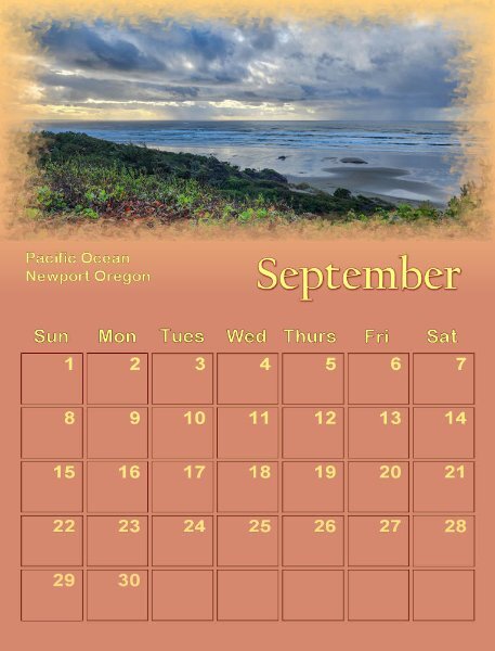
I went here for vacation this year.
2 points
-
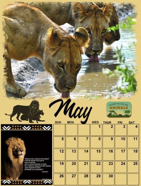
Completed the first six months. Will do more later and the rest of the week.
2 points
-
Please make sure you share again next year. This is such a fun story.1 point
-
I bet we probably passed by each other too. The boardwalk was so exciting, and my grandad took me with him everywhere.1 point
-
Thank you, Corrie! One day at a time...1 point
-
It was in a bounding box and I forgot to rasterize it. It was there on the .pspimage, just not on the .jpg. The platform initially rejected it as too large so I had gone back and increased the compression from 22 to 72. SQUEEZE time! LOL1 point
-
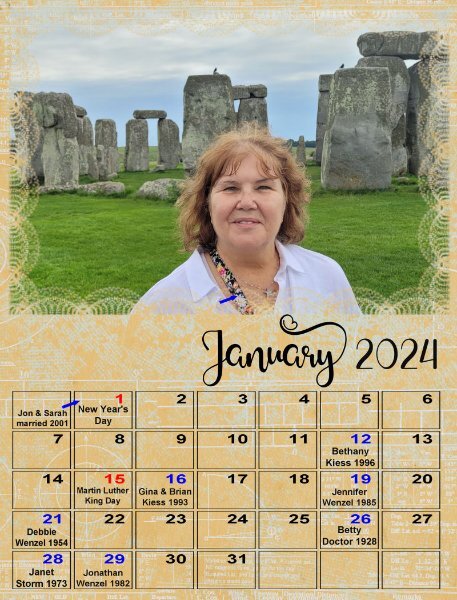
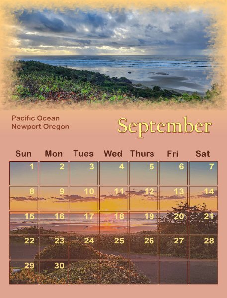
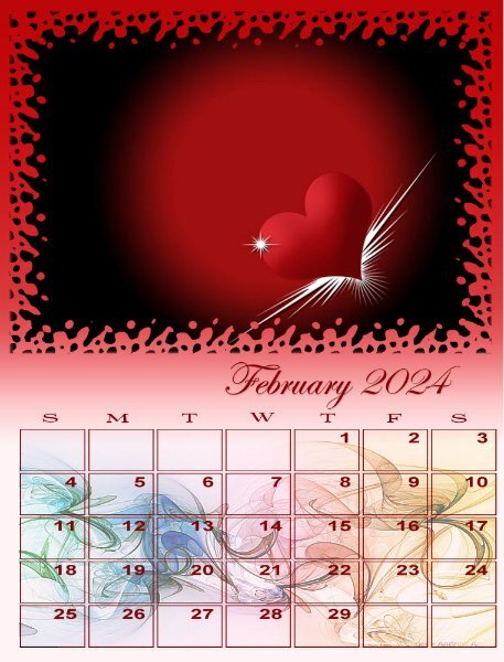
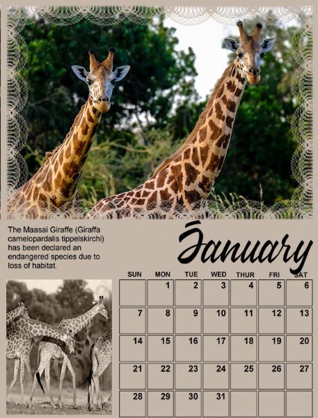
After trying various things, I decided to complete my calendar pages by making the calendar larger and adding holidays in red and personal dates in blue. Here's an example from January.
1 point
-
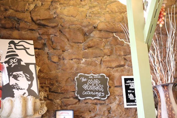
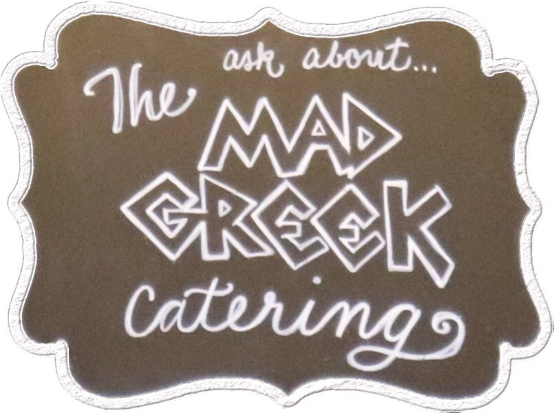
And another was to extract a plaque from the wall and make an element of it.
1 point
-
I've had a lot of fun with finishing up my Travel Tale. I've made several things I thought I would like to show. One is straightening out a poster in Lawrence, KS that I had photographed and so I'll show the photo and what I came up with for an element to add to the layout.
1 point
-
It's so much fun when the daily theme for my Fabulous Divas group has an "f" and a "d" so I can play with the text. The font I used is Bernal Sans, a duo that has a regular version and an alternate one.1 point
-
No, but if it were my choice, I would have! I was very young so I didn't make the decisions. 🙂 I have lovely memories, though. Sundays on the beach; watching my grandfather play pinochle in the park on those old stone chess tables; Tuesday night fireworks; eating delicious food on the boardwalk. Childhood was so carefree.1 point
-
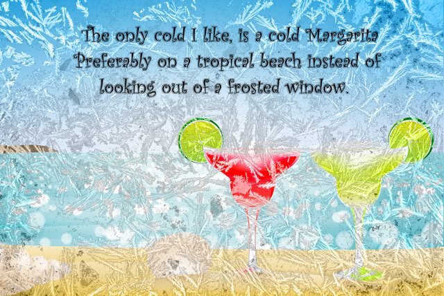
The kit I used for this one was called The Winter Solstice by Jessica Dunn.1 point
-
The background pick if from Creative Fabrica. The frosty window is from a photo I took a few years ago. I also used the luminance on the top layer.
1 point
-
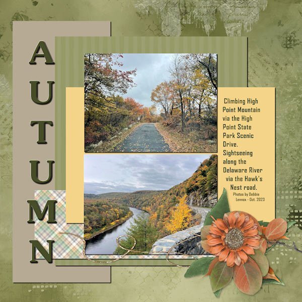
My latest entry in the Basic Scrap Course: Module 3. Photos by my daughter, Debbie, from last month when she was visiting for her High Point Regional High School Reunion. The fall colors seemed muted this year. Not as many reds, so perhaps no maple trees. The materials are: Background paper-ID_All That's Fall; Title font: Souvenir; Text font: Agency; Cluster Group: ID_All That's Fall and ps_Jessica Dunn_harvest pie string. Making the cluster a group worked well as I could add shadows within the group while also being able to move the whole cluster around intact.
1 point
-
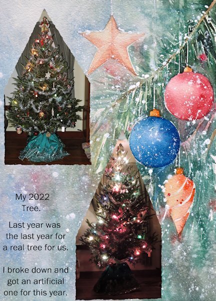
The main thing we have always done was get a real tree and decorate that. Last year was the last year for that because it was getting to hard for me to get the lights on. I am sure there will be tears in my eyes when I put up the brand new artificial one this year.
0 points


Resized.thumb.jpg.d25811db03a63358cedab1e79f527635.jpg)