Leaderboard
Popular Content
Showing content with the highest reputation on 10/30/2024 in all areas
-
9 points
-
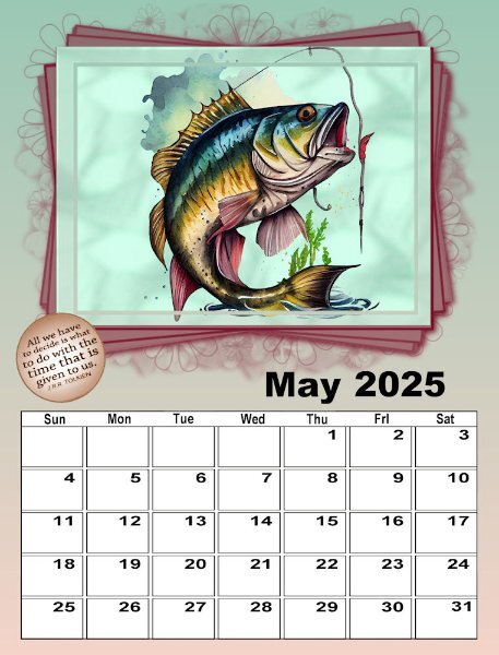
This is my May for the 1st set. I created the photo with a CF watercolor of the jumping fish, and added a background using one of my papers I made with AbstractCurves and adjusted it with HSL, and then added PSP Instant Effects - Watercolor. Then I worked with it to get the softened effect (think I used those extra tools with brushes - push, smudge, etc.8 points
-
8 points
-
8 points
-
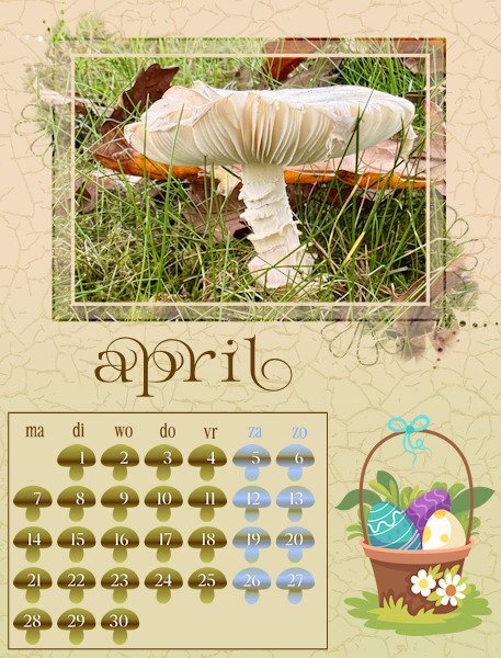
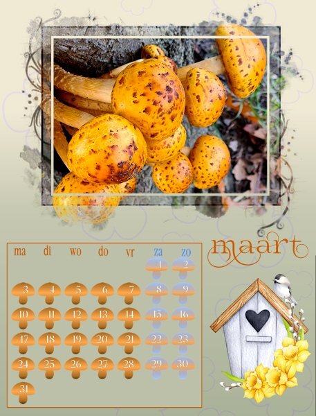
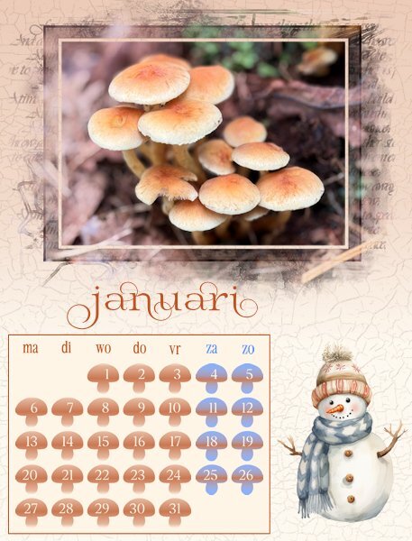
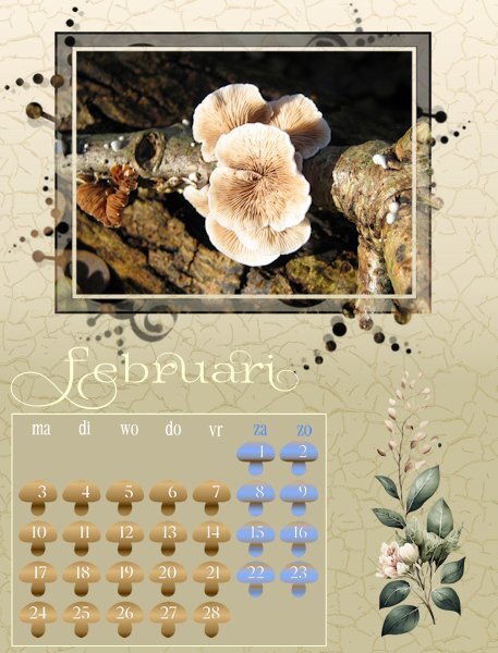
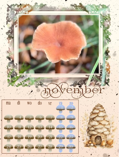
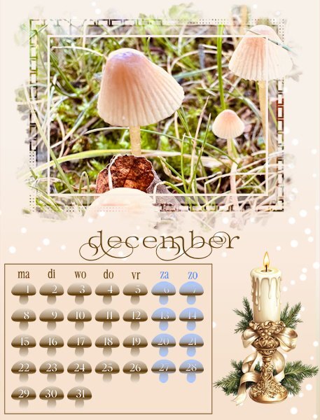
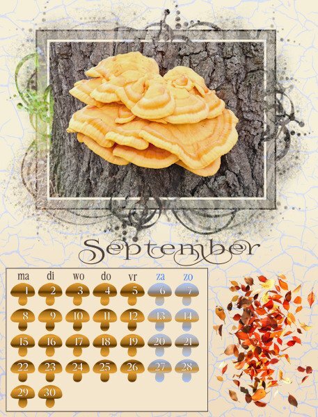
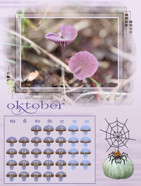
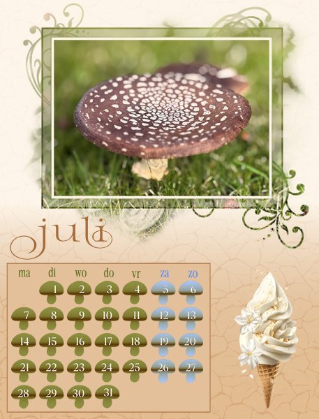
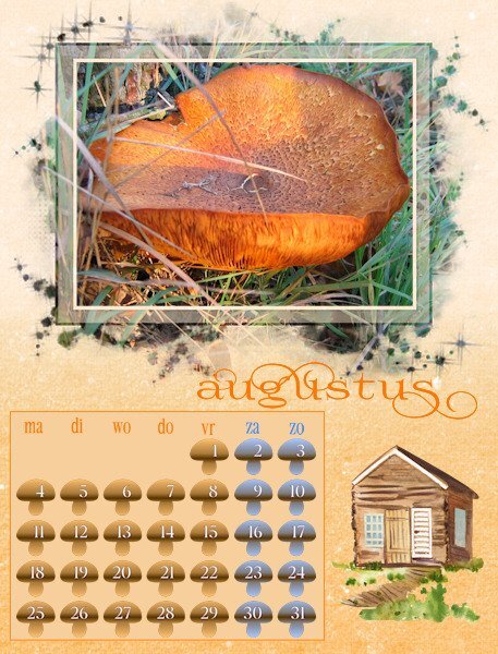
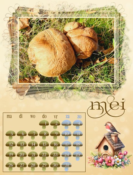
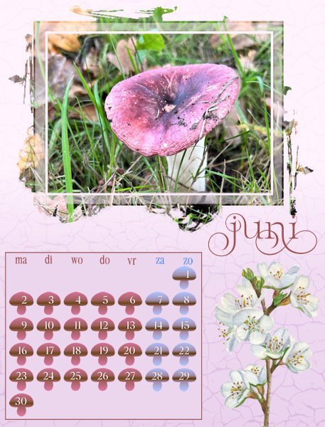
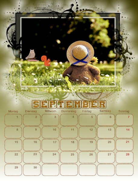
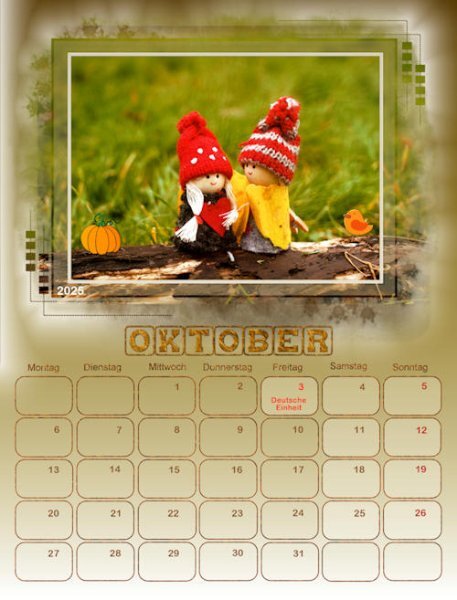
Hurrah, I'm back in business! Today I was able to go to the shop and buy a new mouse. I have all my months done and am resizing for posting. As it is almost midnight over here I will post some now and the remainder tomorrow. I didn't want the month names to overlap the masks because I know that some of the recipients of my calendar will cut the photo from the page as the month is over and use those later for making cards. This is my 5th year of making a calendar and over the years I have used different ways of doing the date boxes, like bigger with a photo underneath, smaller with all the special days with colors or small elements, completely colored etc. I also know that the recipients do not want to write on the calendar and besides that not all the special dates are in different countries on the same date and not all have a second X-mas or Easter day. Therefore I made little mushrooms with the dates, just to have something different for this year; I only colored the weekend days differently.8 points
-
@Donna Sillia I took my calendar pages to a local Staples Stationary outlet. They printed it, punched holes and added a comb to the top so it could be hung on a wall. It cost me under $20 and the results were awesome. I just used the full-size pages as jpgs. Here's the cover and back page I made last time...7 points
-
5 points
-
5 points
-
5 points
-
I think it all depends on where you get your calendar printed. Some places will offer a template and you just fit your JPG or PNG file in that template. You might want to change the resolution to 300dpi, but for some printing places, that is not even necessary, so check what is required. I have had books printed and was never asked for a CMYK version, so again, check if it is required at all.5 points
-
perfect colors in this layout Mary. I love what you did with the main frame part of the mask.5 points
-
I agree, each page with it's glory of color is like celebration. I love color so there was so much to discover in Donna's pages. it really has that "wow" factor. So many different calendars that had me going "WOW" that's fabulous.5 points
-
5 points
-
5 points
-
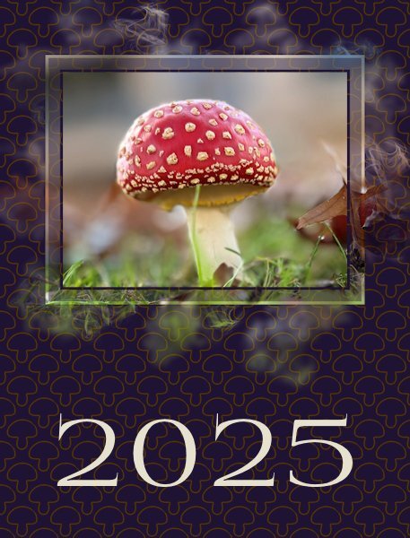
And this is the cover for my calendar. When I was trying some colors for the background I got this nice result with a blendmode. Originally I had a very light color with a darker layer with my mushroom as a pattern. For the pattern I kept the outline of the mushroom without a fill and with this dark color it looks fine, at least in my opinion. Now I only have to make an index with all the names of the mushrooms , but that is more or less a text file with some sort of frame around it. I will print that on the backside of the cover and I need the Latin names as well otherwise my recipients in another country do not know the Dutch names and I don't know the common German or English names. Besides that I have to change the names of the months to German and English. So I'm not done yet.................4 points
-
4 points
-
I will follow your advice. I have the files saved in both formats, just in case. I worked on a book for one of my friends and have contacted his printer for advice, although it will be a small order and I don't know if they will print it. I am also contacting Staples and UPS printing. I have a very good experience with UPS when a needed a card printed fast.4 points
-
All my classwork is done in 300dpi so no conversions were needed. Staples didn't ask for CMYK. I was working in .jpg and that was fine.4 points
-
Thank you so much,, Susan. I used Adobe Express and Filter Forge a lot for the backgrounds.4 points
-
I have a couple of stories; Garden Furniture; The first was last year. I have always wanted a rattan garden set. One store I was a customer of sold all sorts of goods at great prices. I saw a Rattan garden set which was originally £1500 and was on sale for £500 a great deal, so we ordered it. on day of expected delivery, we got a message from the Delivery company to say that when they received the garden set it was damaged so they sent it straight back to the store. We contacted the store hoping they had another one at that price, however, they did not have another one to replace it, and it was reduced as it was their "showroom" product. (We did not know how it was damaged?). So we asked for a refund......that's where the problems started!! They often say it will take 7 days for it to get into your account, so checked 7 days later no sign of refund, waiting another day just in case of delay....so sign of refund. I phoned them up and they checked and said I would get it in a few days, they were under the impression it was broken when it arrived to us and kept asking for us to send it back...but we had not even seen it! It was in their warehouse! Few days passed and no sign of the refund, we sent an email to them asking about the refund and no response! Hubby phoned them up and he explained the situation, they said they will look into it and get back to us.......but they did not get back to us, they kept saying we would get it in a few days... This went on for 7 weeks with emails and phone calls!! On the Friday I decided to contact the bank and get a chargeback, they agreed to do the chargeback......Monday morning the store got back to me and sent me the refund straight away!! So I cancelled the chargeback. Surprising what it takes to get your money back!! Mums Hearing Aids The other issue is still ongoing. Mum needed new hearing aids, she was using hospital hearing aids, and we decided to get better hearing aids. The Audiologist arrived and tested her hearing to find that she was profoundly deaf in both ears. We knew she was deaf, but had not known to what degree she was deaf in both ears. So we ordered a new pair to arrive 28 days later. An appointment for a Friday 27th September, was made, but my niece was not happy as she sees mum on Fridays.....I tried to reason with her but she was being unreasonable and difficult! So I postponed the appointment to the following week 3rd October. On that day, I was at mums early for the appointment at 9am, we waited for him to arrive and no sign, by 12 noon I decided to ring and find out why he was not there. They apologised and said they would get back to us as they will contact him to find out what happened. We were told he was unwell and they made a new appointment. They made a new appointment for the 8th October, but that was cancelled and was told that he was still unwell for the foreseeable, so they will assign another audiologist out to mum, however, the first man had mums new hearing aids and they would try and get them back. They had cancelled that appointment as they were still waiting to get the hearing aids back from the first man. Another appointment was made on 17th October and was cancelled on the 18th!! I emailed them regarding all the cancellations and that I was not happy with all the cancellations, I understand that he was off sick and wondered why we had so many cancellations and mum is disappointed that she had not got her new hearing aids. She apologised and said they were unable to contact the him to get the hearing aids back and that they have now ordered a new pair to be made for mum, to her prescription, so if they did not get the original ones back at least this will sort the problem, and when they arrive we will assign a new audiologist. They made another appt for around the 8th November, providing they have the original hearing aids or the new hearing aids by then. Will update with any future developments Carole: When I tried to submit this information it disappeared! And rather than write it all again, I went to my emails and was about to copy the information from there, i spent time editing, making it ready to copy and paste in here......at that point I found it had restored my previously typed conversation! This time I quickly copied everything here, before submitting again, in case it disappears again!4 points
-
Thank you, Corrie. I am so glad that I chose my grandson's photos to use in these challenge. I am planning on have it printed for him and his girlfriend for a Christmas present.4 points
-
I don't know why. but it seems like if I think something is going to take no time at all, it seems to take forever and I have all kinds of challenges that pop up. My hubby and I were just talking about that. He had something he was going to be doing and it wouldn't take any time at all he said. And I reminded him that when you say that, you know what happens, it goes south and takes 4x as long. in 2020, My hubby got new glasses, they were supposed to have the coating that makes them go dark in the sun. They came, but they didn't have the coating. so they had to be sent back. The new ones came, they had the coating but they used the wrong prescription. then the next two times we went, they broke the lens when they tried to cut them. In the end, it had to be sent to the lab to be cut and not cut at the store and it was about 4-5 months later. We got to keep the first pair of glasses as well, because they messed up so much. It's a 45 min drive each way so it was a chunk of our day gone.3 points
-
When I went to the dealer to get a backup key, like yours, mine cost $250 USD AND it took them 1 1/2 hours to make. crazy3 points
-
Donna I love all those Thailand pages, each month is so vibrant, and those colors suit you perfect!3 points
-
Finally, the December calendar I once again used Adobe Express for the background with a few adjustments. The photo is from David, and I thought it looked festive even though Christmas is not celebrated in Thailand. The bottom picture is also from David and is actually a Gay Pride festival. I merged the mask and added color to the opaque areas and then applied a bevel. The nutcracker was made by me from an Adobe Illustrator tutorial for my Build a kit 2. I wish I could make backgrounds as beautiful as AE.3 points
-
As I explained to Carole, I was helping a friend with his book using Canva, and he introduced me to Jane, the woman who owns the local business that does all his printing. I have contacted her, and we are discussing printing and formats. I will let everyone know how that turns out. I would rather support a local business, if possible.2 points
-
I still don't get where we change the calendar templates to 300 dpi. I only know when we open a new image it asks us there, which is set to 300 dpi on mine. Can you show that to me on the next Q&A. Sorry, I'm not being the sharpest knife in the drawer on this.2 points
-
I just had a lesson learned about pngs. I am doing the wedding suite and i took the files to Staples just for test prints...well, it considered pngs a photo and would not size at 100% or at actual size (same as 100%), wouldnt even give that option. I lost 1/8 of an inch off the size of the cards in the suite. Doesn't sound like much but it really is, in the design of the card. So I had to convert to PDF (I had to ask Corel how to do that, I'm still such a newbie - and they were great and gave me directions. who knew it was so easy - not me). The calendars are like photos so I'm curious to see how they turn out for you Donna. I really want to print stuff and know that there won't be cut off parts, like I get when getting prints at a photo lab.2 points
-
I've never done a calendar but I've used Shutterfly for books and I believe they have calendars as well. Then I use Persnickety Prints for my 12x12 prints and they also have calendars available in various sizes. Both Shutterfly and Persnickety Prints print from jpg files (never tried png) and I can't complain about the quality. Both are great in my opinion. One thing about Shutterfly, if you get on their email list, they send out coupon codes all the time for various things, some as high as 50% off. Like others I create everything I do in 300dpi.2 points
-
Thank you so much! After a lot of experimenting this is what I found out. I made a simple dark brown mushroom (used a clipart mushroom turned it into a black silhouette, colored that dark brown) and then used the cass-Custom Calendar script. I put the results on the pages and that didn't looked good, but I had used the background or foreground gradient for the background layer of the page. Then I selected the inside of the mushrooms with the magic wand and simply colored them with that same gradient set to 7, 9 0r 11 repeats. After that you can merge both the mushroom layers if you want or keep them linked. For the weekend colors I selected both rows and put them on a separate layer (delete the on the date layer) and used a blue color with the same number of repeats for the gradient. Hopefully you understand my explanation.2 points
-
2 points
-
Today I am converting all my pages to 300dpi and then copying them into Photoshop to convert them to cmyk. Since Photoshop won't save them as png, I am opening the psd file in Paintshop and saving it as a png. After I am finished, I will be contacting a printer.2 points
-
2 points
-
2 points
-
2 points
-
Here's my cover page. My calendar has friend and family birthdays. This is my wife and sister. But I had a challenge: The picture cut off right above their heads. So, I cut a thin strip above them, pasted above them flipped vertically, pasted the original above that, etc. You can see the repeating images above them in the mask. I don't think the result is too strange... The font for this page is Gigi.2 points
-
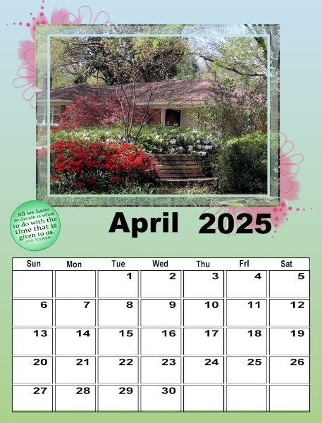
I'm obviously not going to finish this workshop anytime soon, but Carole, this is my first time and it is wonderful. You suggested that we look ay the QP Workshop tuts for ways to deal with the template. I guess that's what I've actually been doing as I had done that workshop several times. This is my April #2. The picture is one I took on a walk in our neighborhood the end of March 2020 - just before 'lockdown". Spring is always the most colorful time of year in Memphis. Fall has more muted colors, except for the sweet gum tree, the dogwood, and the bradford pear which have brighter colors. That particular year, the colors were really spectacular!2 points
-
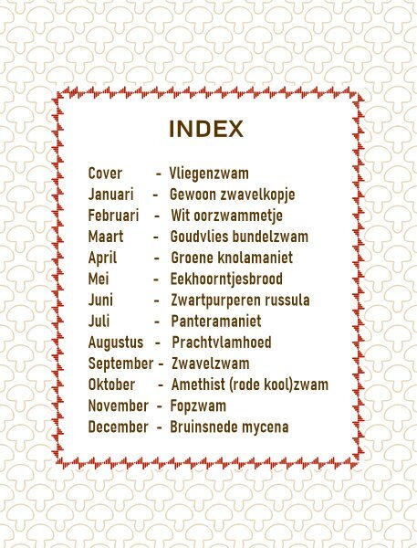
To complete my calendar: this is the index for my Dutch calendar and I'll change the language to German or English but the rest will be exactly the same. I have enjoyed looking at all the different calendars that are made, or are in the making. It was great to see the verity in styles and creativity and I it has given me new ideas for next year.1 point
-
Wow, Ann. In Canada you can pretty much double that. My staples where I live used to be good, now the advice i got when asking if I could use my own paper for the wedding invite printing (and pay as if it's their paper - I did this before for my nieces wedding invites - they were totally cool with it, almost 100% profit for them as I they didnt have to supply the paper but got paid for it!), was to buy my own printer or borrow one from a friend. BIG eye roll. I use staples because they have really black blacks (even though my laser printer has black settings - it just doesnt compare). So I'm quite disappointed, are they not a printing company? Just asking them to do their own job. they have two kinds of white....white and another white that is the same. So nothing slightly warmer, just plain bright white. There is big advantages to living in the US!1 point
-
1 point
-
Can someone give me advice on how and where to have my calendar printed? I keep reading that you have to convert to CMYK colors and 300dpi.1 point
-
1 point
-
1 point
-
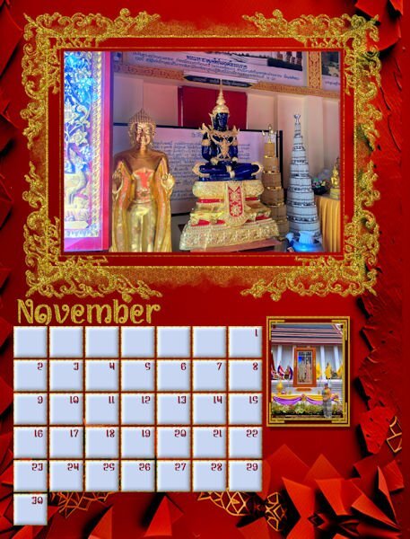
Slowly getting there. Thailand pictures suit my proclivity towards gold and glitter. Red seems to be a prominent color in many of the pictures. The background is Adobe Express AI, but I did make a few adjustments. The ornate frame just called out to me for glitter. The bottom picture is of the King and Queen of Thailand with my future daughter in law in the forefront. I used the same mask that I created on a previous page.1 point
-
1 point
-
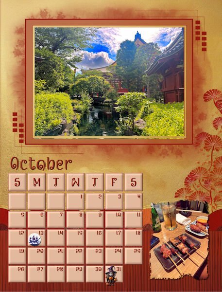
I finally finished October. The background is from Adobe Express just lightened a little. Photos are from David. Columbus Day clip is from Canva. I had to mark Columbus Day because I am Italian and my father would never forgive me if I called it something different. The little witch is from CF. I hope to fiinish today, but now I have to go and exercise.1 point
-
1 point
-
Yes, I discovered that also. I've had fun experimenting with a series of background mats, etc., to control the colors.1 point
-
1 point
-
Yikes, I'm usually a hot mess when I'm playing around and I never write stuff down. I will see if I can recreate it, in steps, again...might be later this week though.1 point


