Leaderboard
Popular Content
Showing content with the highest reputation on 10/28/2024 in all areas
-
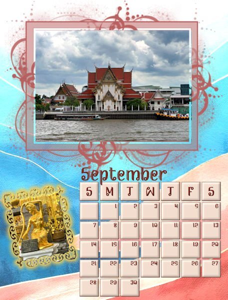
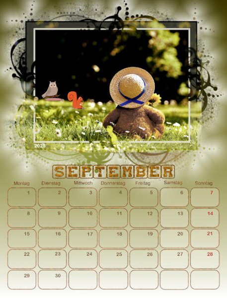
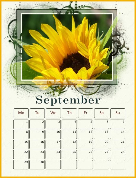
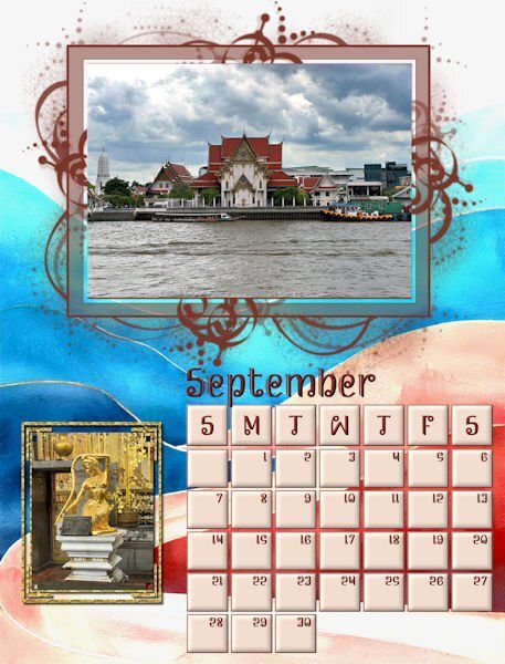
September put me way behind and will get a do over. I changed the resolution to 300, and then my calendar was way too big. That will teach me to leave things alone. Then I had a horrible time deciding on a background and finally resorted to Adobe Express. I had to lighten it a little. All the photos are from David. I made a mask for the golden lady and highlighted it in gold using layer styles to make it more visible. Hopefully, I will finish in the next few days.12 points
-
10 points
-
9 points
-
9 points
-
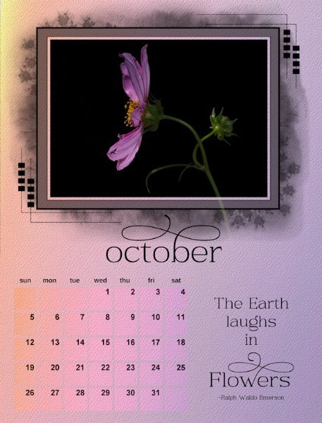
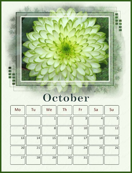
here is an almost finished October. I made the calendar smaller to fit the days of the week across the top and so I could enlarge the Month. Still playing with placements, month in the centre, month to the far left or centered on the date boxes. So, I'll live with this for a bit. The extra space I had planned on using quotes so i will stick with that. I used a gradient on the background (made of one of Cassel's gradients - sunset), two of them, one with an angle and probably a blend mode to blend them together and the fading white as well. kept a copy of all of them then merged the other layers into one layer. Added a texture to the background and to the boxes to make them look like they are part of the background. Havent changed the numbers yet and decided if I'll keep black text or try something else. I did try to blend the rasterized quote and it looked cool, but not sure the calendar would remain cohesive if I did that with all the months. So, this one isnt all the way done but thought I'd show some progress. Now to go back (and forward to Nov/Dec) to complete them all. I'll post as I get each one done. I might have forgotten to take the blend mode of the first part of the quote (it's a separate layer than the word Flowers), it's looks lighter and not black.9 points
-
8 points
-
8 points
-
7 points
-
7 points
-
When you start with an image like a jpeg, it is a "background layer". If you use the eraser tool, it will leave whatever color you have selected as the background color in your palette wherever you erase. When you promote the background layer and turn it into a raster layer, if you erase, it leaves transparency wherever you erase. There are MANY cases and situations where that is much more desirable then leaving a "color" behind when you erase, especially if you have added any layers "below" the original layer.7 points
-
7 points
-
My theme for this years calendar is Kentucky. Last year I kept it wide open for just about anything. I established a basic layout and "pattern" that I was going to stick with and I think I was able to do that. Before starting, I looked on internet to see if "months" have specific colors associated with them and found out it is totally subjective LOL. I don't think I found two charts anywhere that matched or were even in the ballpark with each other. I just picked one and used it. I incorporated each months birthstone into each calendar. Fortunately NOT subjective, they are pretty much set in stone (pun intended har har !!). Here are the first three. I'll do three more posts each with three calendars. They are all in the gallery and I'm linking to them there in these posts.7 points
-
6 points
-
That's exactly what I mean about doing things the hard way. I've been working on the frames too, but I haven't isolated them by promoting to a new layer. That's a great idea will probably make things much easier for me. Thank you6 points
-
I feel flattered you took the time to write that response. I need to study it. Thank you very much! I've used PSP for a couple of decades now to tweak photographs, and my computer generated fractal artwork, but it's all been on a single layer. I'm just venturing out in using layers gradients, masks, and all these other things in the past year. So nearly all the stuff that were learning in these workshops is brand-new to me. I think the reason why my projects look as good as they do is because I have a good sense of color, I'm very creative in a lot of ways, as well as being really good with computers. The ideas just come to me and I figure out ways of getting done what I pictured in my mind. I'm sure that I'm doing many things the hard way!6 points
-
6 points
-
6 points
-
6 points
-
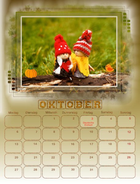
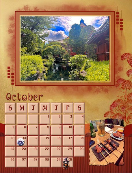
I finally finished October. The background is from Adobe Express just lightened a little. Photos are from David. Columbus Day clip is from Canva. I had to mark Columbus Day because I am Italian and my father would never forgive me if I called it something different. The little witch is from CF. I hope to fiinish today, but now I have to go and exercise.5 points
-
5 points
-
I cannot agree more, Sharla. The great thing about doing workshops together is seeing the different styles, uses of colors, and approaches to the same instructions. There are ideas I could apply to my work now or in the future. We could do this workshop anytime as Diamond members, but it wouldn't be as fun. ------------------------------------------------------------------------------------------------------------ I have the same issue with photos not working with all types of masks. Most Pixabay photos were 1920x1280, so I first had to enlarge them until they fit the mask height. I duplicated the photos, blurred the bottom 100%, and scaled down the top photos to fit inside the frame. Not all were done this way, but most of them... It depended on the time I had or wanted to dedicate to the layout.5 points
-
5 points
-
Quoting Corrie: "I just take one of your posts to tell you that your photos are great and very creative. " Susan, I love not only your calendar but your photos; they are really great!5 points
-
Julian, I use promoted layers a lot as I can select an area, promote it to a new layer and whatever I do to it doesn't impact the original. Usually with these calendars, I'm able to isolate the frame for the photo and work on that, independent of the mask, though in certain cases, I had to slide the promoted layer up out of the group totally.5 points
-
My final September page: I made a new mask for the golden lady, changed template resolution to 300, and everything worked well. Thanks for advice about saving as a png since I am intending to have the calendar printed as a Christmas present for David and Rachel who sent me all the beautiful pictures that they took in Thailand. I had to make the template mask a little small so that the month could be seen.5 points
-
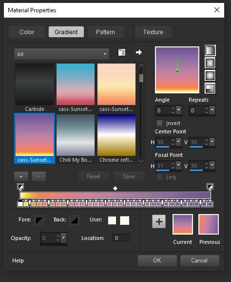
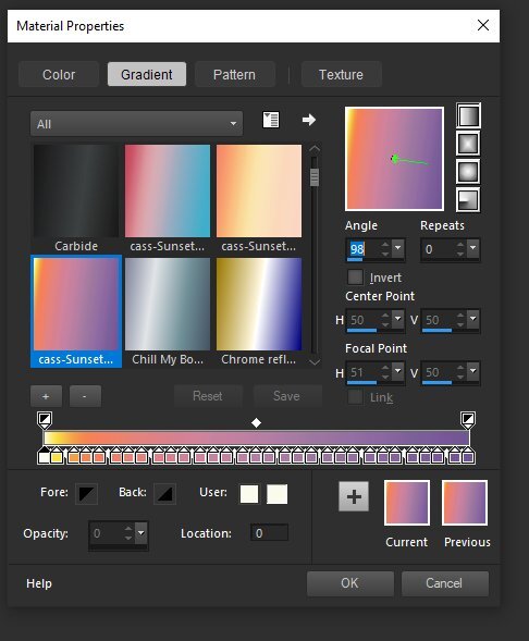
Here is the materials properties box. You can see I've chosen the gradient tab on the top and to the right you can see the gradient at zero angle and and 98 angle on the second image. you can see the name in the drop down list bottom left. Cassel made this gradient...look below to see how complex it is. Blows my mind! And yes, there are master classes about Gradients in the Campus (for Diamond members). And those (The Master Classes) are downloadable. You can also see in the drop down gradient menu/list (?) all the other gradients are showing the same 98 degree angle. I first manipulated it by grabbing that stick--thing in the middle of the gradient box above the words angle and repeats (oh man, you can do crazy cool stuff with repeats using huge numbers!). I used the top of the 4 vertical boxes on the right top side. Does any of this help? I'm not a great explainer. I also probably used the pick tool to pull out from the left side, horizontally. I stretch the corner of the canvas out so I can stretch beyond the canvas to get the effect I want. Sometimes I need to reduce the canvas on the screen to be able the pull out the corners or edges as far as I need to. Probably this is all stuff you know already.5 points
-
Yikes, I'm usually a hot mess when I'm playing around and I never write stuff down. I will see if I can recreate it, in steps, again...might be later this week though.5 points
-
5 points
-
I used that webinar to "remake" all the calendar portions of your templates last year (2024 calendars). This year I decided to use the ones provided with a few small modifications. That was a great webinar and that was how I got "introduced" to you. It was the first time I got the benefit of your expertise.5 points
-
Wow! Daniel, your calendar is full of terrific pictures nicely assembled to match each month of the year with the seasons. I especially like your winterization of the months.5 points
-
Your colors and layout are so tastefully done. I love the boxes with rounded corners. What is the name of the script you use for that? Also I have been wanting to color the frame differently from the frame like you did for November. How do you do that?4 points
-
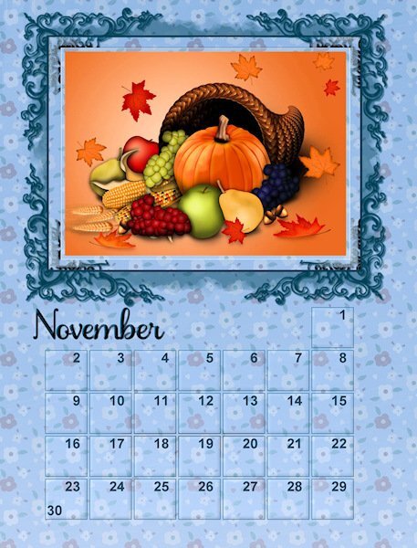
Ann, I love the layout, the background paper, and the pumpkin clipart on the 31st!4 points
-
Wow, Mary, great ideas for doing things differently! This is one workshop I like to play around with, although I keep in mind that the recipient is my mother-in-law and what she likes.4 points
-
Thank you, Susan! I see now what you mean. I guess it happened because I had edited the comment, and suddenly, there were two equal comments. So, I deleted one, which probably had caused the glitch. I edited it again.4 points
-
Thank you Donna. I really like the process of learning how to control the light...not always a success (mostly not) but really engaging to try.4 points
-
Here goes. I'll do two posts. Hoping the images are big enough to see. First is the layers palette, I grouped the layers for my background so I had the originals. I duplicated the group and merged it turning it into a raster in order to add the texture. but backing up, here's how I started. From the bottom (called background in the layers palette) I used cass-sunset07 gradient with the linear gradient (top button on my gradient type list - next post shows the materials palette). Sometimes, I stretch gradients way up or way down using the pick tool; like, WAY past the canvas, I'm pretty sure I did that because there is also yellow in that gradient. Then I added a new raster layer and manually played with the angle until I liked it (turned out to be 98 degrees). I wanted that bit of yellow to be like the sun or light shining on the front of the flower so I used shear and perspective with the pick tool to manipulate the corners. In doing so, I had some of the canvas show through at the bottom right (you can see the white sliver of it in the layers palette). (NOTE: raster 4 added with the same initial 98 degrees, so I had one that was untouched in case I messed up - Raster 3). If I tried to use the pick tool to cover that sliver it moved the yellow spot too much so I used a blend mode: lighten to fill in the transparent part on the canvas. Blend Modes affect the layer below it...there is a Master Class about that in campus if you are a Diamond member. the top two white layers are the fading white gradient, I used two, and rotated one 180 degrees and used various opacities to control the strength of the gradient. Hopefully this isnt way too confusing.4 points
-
4 points
-
I don't understand what promoting a layer does? Could someone please explain? I used the Background layer to color what I want the mask to let through around the photo. Then I created a new raster layer and pasted the image that is to show through the dates there. How would it work by promoting a layer?4 points
-
I can see the difference in jpg and if use Tiff or png and have started using tiff or png to get better resolution. Especially png for anything that needs transparency; and I noticed when I print the png, the margins dont shift around like jpg and even pdfs do. I'm doing wedding invites and need the page to stay centered in the printing process. I though pdf were the most stable for outsourced printing, but testing on my computer shows it doesn't stay centered like the png tests i was printing does.4 points
-
Wow Daniel! Fabulous and cohesive. the photo's were all beautiful and the fit the month and are interesting. Who doesnt love horses? I loved those pages. Very cool to have the state in the background of the date boxes, it was a little something extra to discover.4 points
-
I'm sure Carole has the definitive answer but I always use png, not jpg for printing because the quality of a png is pixel for pixel perfect whereas a jpg always loses a little. The originals are 2400 X 3150 pixels which at 300 dpi would print out at 8" X 10.5". What I did last year was use the AI resize tool to get them to fit on an 8.5" X 11" sheet of glossy photo paper. It wasn't much of an enlargement or distortion so they printed very nicely. I don't understand why you are getting 100 to 200 px. Maybe you're reading pixels/cm not pixels/inch? @Cassel ?4 points
-
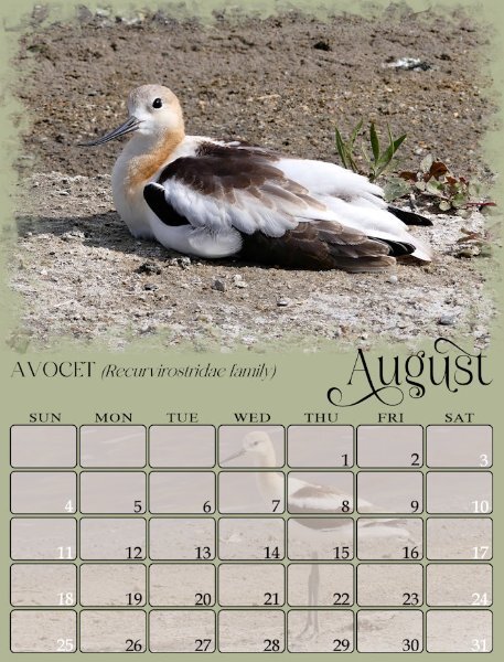
Thank you for all the replies about my August project. I agreed with everyone actually. The original picnic photo is much larger than I need so I was able to resolve the blown out bllacks and whites on the high rez copy (they got blown out reducing mostly) and reduce it and use the frame and background that we all liked better. It is perfect now.4 points
-
Yes, the blend mode tool is next to the opacity. It is impossible for me suggest a blend mode. As you will have to try them all, depending on the image and background you use, to achieve the look you want. Try overlay, sheer, or soft light for example.4 points
-
I haven't got around to filling the date boxes as yet on this year's calendars. This one is from a previous year's calendar. It's a nice way to use more photos of the same subject. Anyway, again it is down to personal choice, but I like the recipient to be able to write, or mark the dates, which in my opinion means keeping the date boxes soft. There are always many ways to achieve an effect with PSP, transparancy is one, but may I suggest you try using the blend mode. I would promote the background layer, add the image, then apply a blend mode. I as like to keep the texture, if any on the background paper only. You can also change the promoted background colour etc, to get the desired effect.4 points
-
Oh, that reminds me. I forgot about slipping a photo or graphic behind the date grid. Actually, I did it on my monthly calendars occasionally. I didn't use a mask, just sized the art to fit.4 points
-
3 points
-
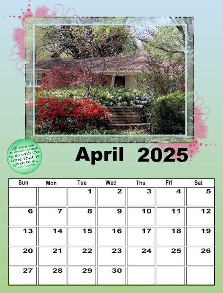
I'm obviously not going to finish this workshop anytime soon, but Carole, this is my first time and it is wonderful. You suggested that we look ay the QP Workshop tuts for ways to deal with the template. I guess that's what I've actually been doing as I had done that workshop several times. This is my April #2. The picture is one I took on a walk in our neighborhood the end of March 2020 - just before 'lockdown". Spring is always the most colorful time of year in Memphis. Fall has more muted colors, except for the sweet gum tree, the dogwood, and the bradford pear which have brighter colors. That particular year, the colors were really spectacular!3 points
-
Yes, I discovered that also. I've had fun experimenting with a series of background mats, etc., to control the colors.3 points
-
I'd love to get a lesson from both you and @Gerry Landreth on the techniques you used in your gradients.3 points
-
Blend mode? Is that the drop down menu next to the opacity adjust? I just use normal. I haven't played with the other options. What are you suggesting? I ♥ your July and August!3 points


