Leaderboard
Popular Content
Showing content with the highest reputation on 08/03/2024 in all areas
-
Day 7 I was determined to finish this workshop and I did! (Pats herself on the back.) I mostly used things from a kit by Billie Irene from Digital Scrapbook. Cassel's twisted strings picture tube came in very handy. I made the embellishment on the top left by adding an inner bevel and some texture to a character from a decorative font. The text font is Miliki. Great workshop, everybody. ❤️4 points
-
Two Peas In A Pod...another ACD template. I asked for 2, 5, 0. I've done 2 and 5. Waiting for 0. The font is by 2 Peas and is called Rubber Ducky.4 points
-
3 points
-
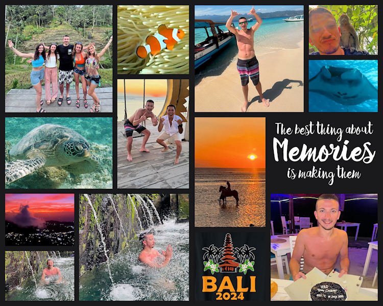
Grandson Tyler had an adventure in July with a singles vacation in Bali, Indonesia. The flight was very long but luxurious hosted by Qatar Airlines. He was delighted to be hooked up with 4 single women for the tours. This is just a template from my stash. The Bali logo is from a search which produced this on a t-shirt, and I added the date. Enjoy!3 points
-
Day 6 (one more day to go!) I don't remember any specific childhood fears so I went with an adult one. It might have just been the mood I was in, but I wasn't inspired by this topic. I didn't want to skip this day so here it is. The background paper was originally in bright colors so I used Image: Greyscale. Then I used Adjust: Hue and Saturation: Colorize until I got a color scheme I liked and went on from there...plaids and polka dots. I went on a Google search for pics to use. The title font is, appropriately, Claustrophobia from CF and the story font is Adventure from Pixel Sagas.3 points
-
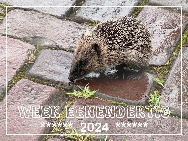
Today when I looked out of my kitchen window I saw something on the street that I couldn't immediately identify. Often birds are searching for little insects or worms between the stones especially after it has been raining. I went outside to have a closer look and it happened to be a small hedgehog! When we lived in our old house we had hedgehogs visiting in the garden, but here I haven't seen them around. This is a more buildup area although there are some small spots like the one where I took the flower photos for the weeks in July. The lady from across the street saw me and came to have a look too. We didn't know what to do because the hedgehog was in danger to get overrun by a car but he was looking okay and walking around. She is the caretaker of a Jehova Witnesses community center and lives on the premises which has a decent garden. We decided to try to get the hedgehog to walk into a box without us touching it and he/she obliged and is now in her garden. Surprise of the day........2 points
-
If I ever get time I will be using ON1 Photo Raw, as an editor, but it has layers too. It would be similar to Lightroom and has a very good masking AI. Alas, I have not even had time to learn how to use it. Sigh. It's another big learning curve for me (never having used lightroom), but it has the fine adjustments I want to me making that PSP doesnt have (nor does Aftershot Pro - I tried it)1 point
-
I have no fear of small spaces but over-crowded situations is something I always try to avoid. 11 Hours in a completely full airplane isn't my idea of relaxed travel but if I want to see my family in California it can't be avoided! I must say that my last trip was way better, on my outward bound flight I almost had 6 rows to myself and a steward to pamper me and give me all kinds of extra treats and he opened all the water bottles for me because I couldn't. The home flight had more passengers but it still had enough spaces left where everybody could make him/her self comfortable. I wish it could be this way every time.1 point
-
Michele I'm so happy for you that you were able to finish this workshop despite you being so ill at the beginning! You finished on a high and with something we all could do to make this world a beter place.1 point
-
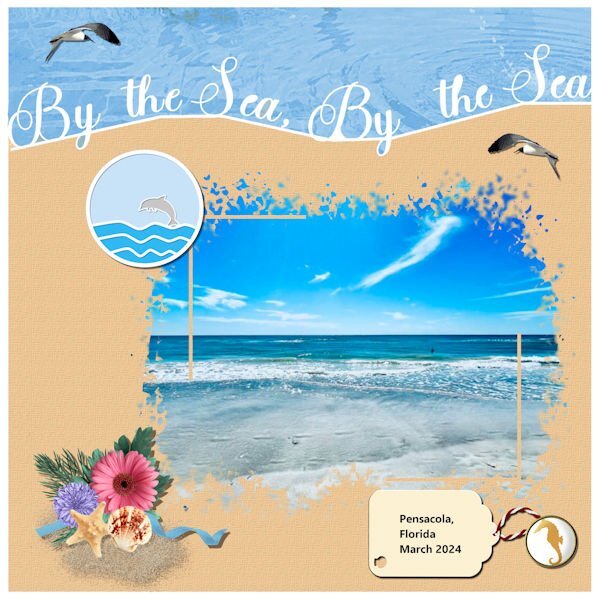
Mary I love this layout! It simply has a beach feel to it.1 point
-
@Michele HOW TRUE HOW TRUE HOW TRUE. Love you for displaying this bit of truth.1 point
-
Microsoft Picture It. I have had this program for many years. It is not supposed to work with Win 10, but so far most of it does. It is quick to load and I am so familiar with it I use it for quick fixes and crops etc. I will sure miss it when I get a system that will no longer run it.1 point
-
What a wonderful find, and saving grace that you could find a safe haven for it. I have always adored hedgehogs, and once upon a time, they were in abundance. Now in the UK they are on the endangered list, and protected. I belive I have mentioned on here, that we had a cattle grid at the bottom of our drive. Hedgehogs used to fall into it, and the children would fish them out when they walked home from school. We would feed them raw minced beef, and water, before letting them go in the garden. From there they were safe to roam the garden and fields.1 point
-
I absoloutley agree with you, her templates are relatively basic, as you say, lines and circles. What you do with the template is where creativity comes into play. Expanding circles, ovals and so on, to delete parts of other layers, is what I have been doing for a very long time. It was a bit of an eye opener for me as I had never been onto her facebook page or website.1 point
-
Donna you will be our Alphabet Queen! You do lovely work with all the alphas you create and I'm sure there will be much more to come.1 point
-
Nothing wrong with the photo but with the watercolor mask it becomes more interesting, especially for a card. As I already said on FB a good reminder of that technique!1 point
-
Beautiful capture! It is in fact a Hover Fly or known as flower flies. They are dead ringers for bees and wasps. Not only are they harmless, they are valuable pollinators of flowers. The easiest way for the untrained eye to tell apart from those that they mimic, is that their antenae are very short in comparision to bees and wasps. Although there are other distinguising features too.1 point
-
I used to do that so I could better see the dingbats, but I didn't save them. Character Map is usually too small for me to see. I now have a few free font viewers that make it much easier for me.1 point
-
The only font cheat sheets I have are the ones that you create for your special fonts, which I have printed off. Sometimes I use them. Although I tend to use Character map or fontiary to view and choose the dingbats.1 point
-
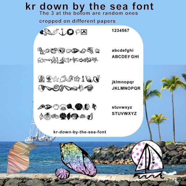
I went in a totally different direction with this. I got to playing with some of the dingbat letters to see what they would look like extracted from different papers. Then I decided I would like to know what each letter looked like. One thing led to another. Well you know how that goes. LOL I did not put any shadows on anything, but I did make the page of dingbats darker to show up better. I also posted this pick on the facebook page in a larger file.1 point
-
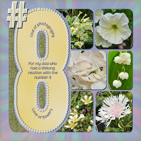
Anniedigitals has a new project Numbers and i noticed this one on time! This is the layout I did with the template for number 8. It was the first time I participated in something on her FB site, I started following her recently. I requested the #8 because my dad had something with that number, major things in his live had to do with it, like the month he was born was august, he was the 8th child, lived on #8 and I was born on the 8th of april and so on. All photos are by me and I use the free script Selection to Path that Carole mentioned in the Featured Resource blogpost in June 2024. After using that script I could run the VectorTube script to get a border with flowers around the 8. I love that Selection to Path script, it worked fantastic and I think I will be using this often!1 point
-
I wouldn't call it claustrophia for me, but there are situations where I'm not comfortable if the space is too small and over-crowded (waiting rooms). And I don't like any crowds at all.1 point
-
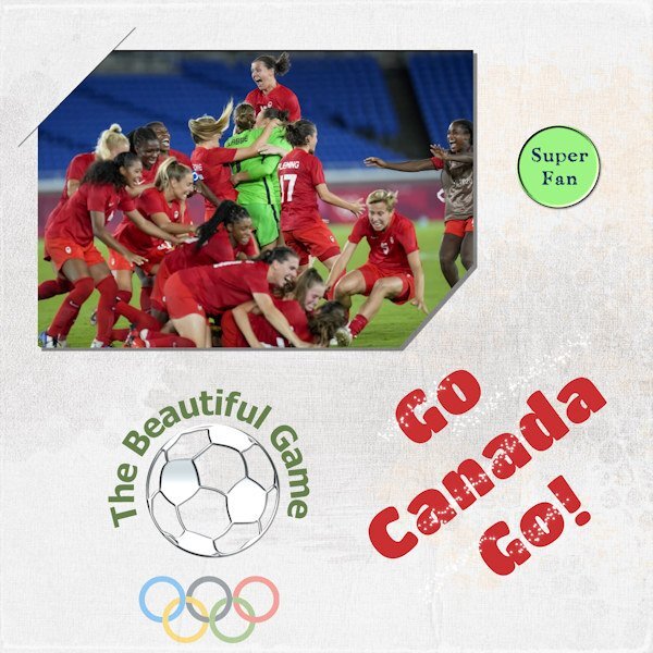
I'm a soccer fan, love watching it. Men or women. It really is the beautiful game! Despite the cloud of controversy that appeared over the Canadian Women's Soccer team, I am still cheering them on. I hope they kick some butt and win gold (again). This is not any sort of political statement. Just my enthusiasm for their efforts. I wanted to use the slit corners. Seems I got only the one and the bottom right looks funny. Oh well, next time.1 point
-
1 point
-
Thanks, Julie. I don't particularly like green, but since the subject was brussel sprouts, I thought it was appropriate.1 point
-
Love the green. Don't see it much in layouts and it's so fresh! I had a friend years ago who had to stay at the table until he ate all his peas, and he hated them. Still does.1 point
-
Your mom and my mom must've being soul sisters. I was told I couldn't leave the table too. My go-to was crying or having a temper tantrum. And my nemesis (to this day) is fish. I also won, lots of tears were shed, but I didn't have to eat it.1 point
-
1 point
-
Too bad you don't have those supplies anymore. I might've contacted you to send them when I decide to move. Getting that stuff is not easy these days! Love the colours you used.1 point
-
since 2023 doesn't have that option anymore (you have to edit selection and choose the pick tool to resize and/or move it) I totally forgot until I watched the tutorial. I think I should go back through all the workshop tutorials to see what else I have forgotten. that might be a good project for the dark, cold winter months.1 point
-
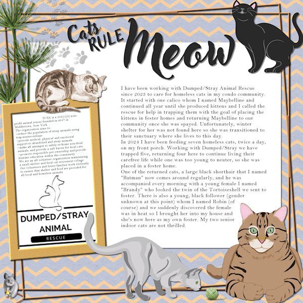
I think the main text is readable but not the Dumped/Stray in the sidebar. Here it is in text form: D/SA is a 501(c)(3) non-profit animal rescue founded in 2017 in Middletown, New York. The organization aims to: ~reduce the population of stray animals using trap-neuter-release ~provide medical, physical and emotional support to abandoned and stray animals ~make all attempts to safely re-home non-feral animals, and provide a safe haven for feral cats ~promote responsible pet ownership and provide humane education within the community We are an all volunteer organization maintaining a small shelter and feral cat retirement village. Our volunteers and foster families work tirelessly to ensure that shelter and food are provided for all local and homeless animals.1 point
-
Day 5 ~ I'm getting there. In my story, I wasn't trying to be a smart-ass. I just really couldn't deal with the taste when I was that young. I love brussel sprouts now along with many other foods I didn't like as a kid, e.g. spinach, @Ann Seeber. LOL I don't often use alphas so I found a wonderful font called Green Delight Leaf on Fontspace that fit my title perfectly. I added texture and an inner bevel to it. The story font is Candy Berry Solid which I got a few years ago in a CF bundle. The various papers are from blog trains.1 point
-
I don't know if I forgot or if I never knew about moving a selection with a right click. Thanks for the reminder.1 point
-
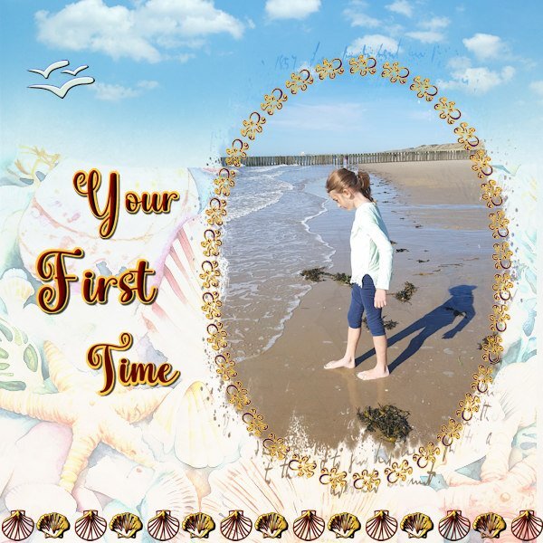
I haven't many photos of the beach, we like it better inland. In summer the beaches at our North Sea coast are packed with people. When we are going to the beach it is in winter to take a stroll along the waterline. My grandkids lived in Switzerland before the family moved to the States. My oldest granddaughter is adventurous and visited us for the first time on her own when she was 7! Of course minors have to be accompanied by airline staff and my daughter brought her to the airport and I met her on arrival, I had to sign a paper that I had collected her and my passport had to be checked etc. But there she was and she stayed a week. One of the days we went to show her a beach, she only knew lakes at home. Now the family goes to the pacific coast and I have been there as well, but she hasn't forgotten her first sight of the sea. I used several fonts: the jelly fish for the frame, the seagulls and 2 shells. I only wanted to use the dingbats that represent what can be found on our shores. The background is made with a couple of papers with different blendmodes and opacities until I got something I can live with. The mask is by Jessica Dunn from Into the Wild and the font is Vallentina1 point
-
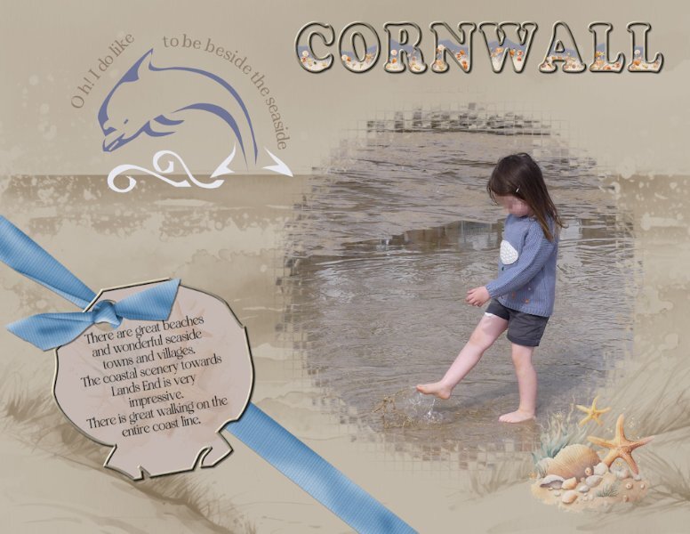
I used a photo I took of Ffion one of my granddaughters at the beach when I was home last. They live in Cornwall. I used a mask from one of the calendar challenges. I used the Dolphin and one of the shells from the font to create the tag, and text on a path on the dolphin. I filled the word Cornwall with water, sand and seashells. The bow is Carole's bow 3 script. It's not the easiest of dingbats to work with. Although it is a fun beach font.1 point
-
There's also enochlophobia which is the fear of crowds and cleithrophobia, the fear of being trapped. So many phobias that I don't fully understand. Maybe I have a little bit of everything. LOL0 points


Resized.thumb.jpg.d25811db03a63358cedab1e79f527635.jpg)

