Leaderboard
Popular Content
Showing content with the highest reputation on 02/02/2024 in all areas
-
Well I hadn't realised how varied his artistic talents were but what a sad shame for the other. Perhaps it's appropriate for that typography joke (shown in the book Just My Type as mentioned) :- Comic Sans walks into a bar and the bartender says, "we don't serve your type"3 points
-
Fiona, I fully understand that particular difficulty; I had the same problem but I solved it quite easily. I rewatched the video and halted it at the point where we got to those floating layers step. Used play and stop for the video and simply wrote down on very "old-fashioned paper" the steps and never had this problem again. For a while I needed my cheat sheet but now I now it by heart.2 points
-
Thank you. Yes it is surprising that there was not much of a change between some of the months. (I didn't cheat! Went up there dutifully every month). I think we had enough wet and sunny weather last year for the trees to like it. Also in south of England not too much cold compared to other years. I will work on other designs when I get inspired and can always use the images for the community magazine. They are always asking for local photographs.2 points
-
Mary if there is a time when you can go a little bit more "fussier" , it is Christmas! This is very nice.2 points
-
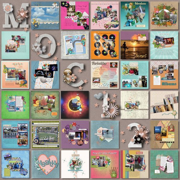
I spent the month of January participating in the Month of Challenges at The Lily Pad. 31 challenges in 31 days. Even with 4 days away from the computer I was able to get them all done. One of the designers graciously provides a free template to showcase all of the layouts. I finished that today using a kit by Bella Gypsy. Also, all layouts must have only product currently on sale at the store or retired products by the current designers. Some challenges were a real challenge! Some challenges were easy because of things I've learned here at Scrapbook Campus (hello Mask Workshop). And some were full of ideas to use in future layouts.2 points
-
2 points
-
I went one step farther, I did screenshots of each step and put them in order on a letter size paper and saved it to my desktop and printed it too.1 point
-
Hi Ann, I get the concept but when it comes to where to put the layers, floating layers and inverting I have not remembered it well. Doing the course again will be good for me.1 point
-
Oh, you are right. Strangely, I had not seen it go through. Usually, I see them because I get a notification for EVERY post in the forum. I must have been sleeping on the job!1 point
-
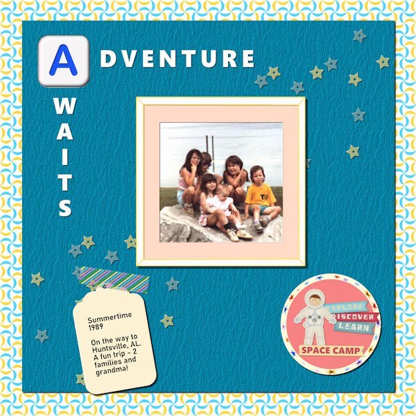
Lab 12 Mod 1. Requirements: Scallops 2: saved it as a pspimage for the pattern and then made the background paper from it. Colored Tape: it’s holding down the tape I created sometime ago; Hand drawn frame: Well I did make it but did not distress it; I made it as if it was a regular photo frame and even shadowed it on the inside as if it was thick and made a mat for the photo. I made the little circle paper in the bottom right corner and placed the spaceman sticker and the 3 journal stickers on the side and made the Space Camp sticker at the bottom. I used “Polar Cordinates” Distortion Effects on my star ribbon to outline the paper. The spaceman and the 3 journal stickers are from Pixel Scrapper – Sheila Reid. The Alphabet is one of a set I made in a Lab. The font used in the title is Segoe UI Black. The star scatter is also from Sheila Reid.1 point
-
Sure, I have no problem with your using it for a group. If you want the original file, I can send that to you for better quality.1 point
-
1 point
-
1 point
-
1 point
-
Rene that must have been a lot of work, every day for a whole month but nice to be able to have them all done and very satisfying too. They look great on this "presentation board".1 point
-
I love this. Seeing the tree change over the months is so interesting. I really love that middle long line of trees. I must say, they are perfectly shaped too. I was surprised that the leaves were on for about 7 months!1 point
-
I looked up Gill Sans and it's creator has a questionable past and that's why Microsoft dropped it from it's line up. It's is horrendous what the creator did (and he even documented in his diary). Having said that....we can't change the past but we can use the good they did cant we? Can you imagine if we find out the inventor of electricity did something heinous in the past would we all be required to give up electricity. What about the inventor of the phone? Are we going to give up any form of phone we have? that is moving backwards and not forwards with trying to wipe out these heinous acts. Sorry, no more politics or soap box rants from me.1 point
-
1 point
-
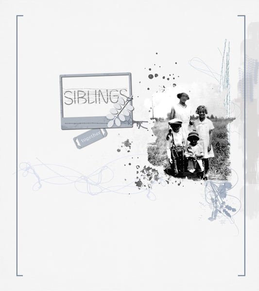
Not much of the font in this layout. I wanted to do a simple layout similar to one I saw online somewhere, and I didn't know which photo to use. Ended up with this old one (from 1930s) of my mother (tall one) and her sister and two brothers. Not a good image of them, but it's what I've got and I didn't want to improve it. They're all gone now, but they stay close to my memory and heart. Three of them lived into their 90s (not my mother).1 point
-
1 point







-SGH-31-01-2024.jpg.02dcbd67007640252c2283d26e915e91.jpg)
