Leaderboard
Popular Content
Showing content with the highest reputation on 10/09/2023 in all areas
-
6 points
-
This font isn't one I would have chosen myself. I can see that it would appeal to some for a particular Halloween project. Halloween has never appealed to me, probably because it isn't that popular at home, certainly not when I was growing up, as it is in North America. I wanted to participate in the challenge. I edited some of the letters to my liking, added leaves from another font. The letters A and E, I resized, moving the letters before them closer, by changing the text to character shapes. Inner bevel. Photos were taken yesterday. Background paper is a photo, 2 overlays, and a texture.2 points
-
2 points
-
2 points
-
2 points
-
I already did a Halloween layout for the theme of this month. We don't have a long tradition of Halloween festivities, nowadays it is more common, but it doesn't appeal that much to me. The grandkids are in the States and they of course participate. If I was there at this time of the year I would take a lot of photos, but over here no.... The Witch Mystery font however is a nice one and I used it for this layout featuring the "Windmills of Kinderdijk" (Netherlands), a Unesco World Heritage Site. Funny enough my cousin, who came along, and I, have never been there! We have both live not very far away from Kinderdijk, but as it is with things that are nearby we never got there because we thought: oh we can always do that. So last week we went to see those mills for ourselves and had a great day with fantastic weather and being offseason it was not congested as it can be in the summer. We didn't have to wait to take the little boats that ferry you along the 19 mills that are there. I have photos of the inside of one of the mills that we could visit, may I use those in another layout. Oh and all the mills dating from the 16th century and up are still in working order. They are designed to pump the water out of the canals to the river to keep the land dry and the other way around. Nowadays there are 2 pumping stations that do the same with electric machinery and the mills are a backup system. For this layout I used template Lab 12-11and 4 of the photos I took that day. When we arrived, it still was a bit hazy and I used one of the hazy photos as a background, copied it and the used the blendmode Burn which made it more like a silhouette, but not as black. Then an overlay called Windy Pastels (Inky deals) with the blendmode Difference. I was trying different overlays to get something interesting and I like this result, it gives a sort of painting effect. Some embellishments from my stock and the other font is Aura.2 points
-
Well Susan! You saw what I was trying to achieve. Movement! I watch the leaves on the trees and on the ground, as the wind blows them in all directions, until they settle in their final resting places. Like myself, you do more than merely look at a page, you interpret what it's trying to saying.1 point
-
quote, I changed the font for the main text Heading. As I didn't like the font used for the font challenge. Although it isn't Halloween themed, it is a very seasonal, appropriate page, for this time of year. We must make choices in this hobby as well as in our daily lives. Subject, A theme, Colors, Arrangement. My first choice is always the subject, the most difficult one. Sometimes I use at the same time two windows beside each other and make them different. In all these years I collected thousands and thousands of scrapkits and single pngs. I've all the mushrooms in one file. Leaves in another etc. etc. And on top I've made color files. Then I open the organizer and make a choice. That's my way of working.1 point
-
I love what you did with the word "leaves", the 'L' and 'E' look like gusts of wind swirly the leaves around.1 point
-
You know, I had my doubts about using the font, before I started the page. Putting off doing the heading until last. I'm sure I'm not the only one that, when having doubts, or not overall happy with something, it reflects in ones work, as this one did in my page. Thank you, I have to agree with you. I much prefer this one.1 point
-
1 point
-
1 point
-
I did another word art for the page too. To be in keeping with more my style, with fonts that I like.1 point
-
I also don't like Halloween, because when I grew up we didn't even know such a thing existed and when my children were little it wasn't celebrated although we had seen it in movies and tv series. Nowadays it is mostly for children but no trick or treat and only some houses have little decorations. The font for this challenge is one I wouldn't have chosen; it was a freebie on CF and I didn't downloaded it at that day. I like what you did with it to make it more "you". I tried to do something like that but couldn't get something I liked, so I kept what I initially did. I want to use this layout and send it to my cousin who was with me, but I will change the font before I print it.1 point
-
1 point
-
R = Redrum: a word made popular by the movie “The Shining,” which is “murder” spelled backwards.1 point
-
1 point
-
1 point
-
1 point
-
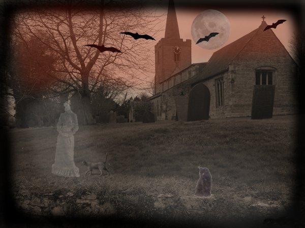
Halloween is something I don't celebrate. It's not new to the British. All hallow's Eve comes from many Pagan traditions. Introduced in to America by the Scots and and the Irish, who then commercialized. I used a photo of a Welsh Church and churchyard, used effects photo effects time machine, added the cats and lady, added glow to them. Bats and a moon.1 point
-
1 point
-
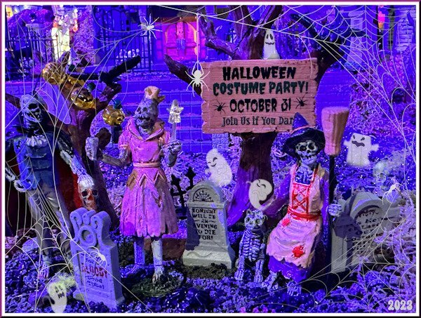
Today I was visiting a garden center, a very big one and they had already opened their yearly Christmas show. There are always many displays of different winter scenes with little villages, snow scenes etc. Among them were a couple of Halloween scenes that I took photos of. So the background of my layout is my photo with a cobweb overlay, some ghost tubes, the freebie for this theme, and 2 skulls. I didn't change the colors of my photo because I think it came out nicely; the cobweb was white and that was a bit too white so I made it a bit darker with the saturation and lightness.1 point
-
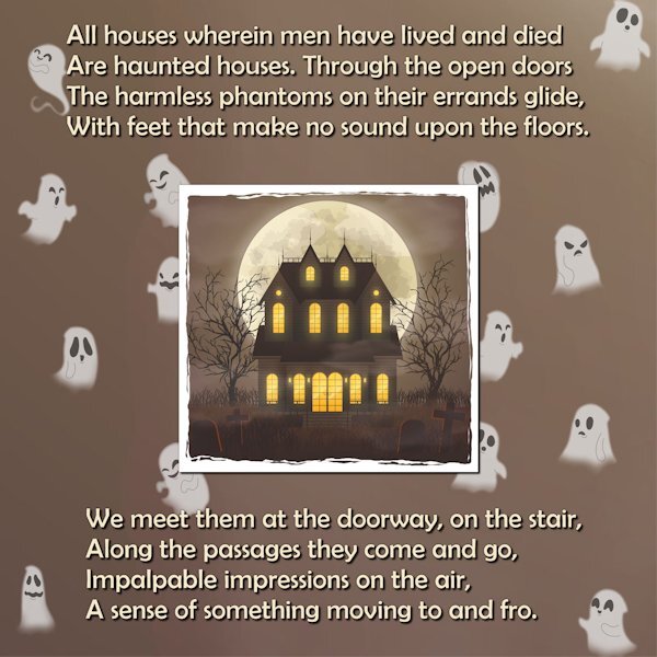
I've been doing a lot of the Creative Scrap tutorials lately. For the vast majority, I've been following the Detailed Handout so I can listen to music while I'm doing them. For this one, I had to watch the video. As great as the handouts are, sometimes I just need Carole's voice to get the technique into my head. ?1 point


Resized.thumb.jpg.d25811db03a63358cedab1e79f527635.jpg)



.jpg.74d3420d2013f8bca83a1d4c0e89cfd8.jpg)


.jpg.7e27adfcd7310495fb84ec42a52d9e2b.jpg)
