Leaderboard
Popular Content
Showing content with the highest reputation on 08/09/2023 in all areas
-
6 points
-
6 points
-
6 points
-
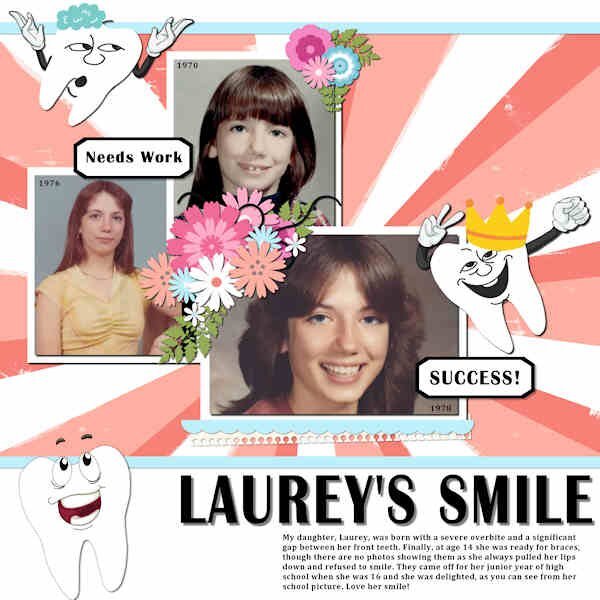
Here's my layout with a tooth theme. My daughter needed braces and this was her journey. The font is Britannica Bold, the template from Miss Fish with several cass-tooth decorations. Here is the text: My daughter, Laurey, was born with a severe overbite and a significant gap between her front teeth. Finally, at age 14 she was ready for braces, though there are no photos showing them as she always pulled her lips down and refused to smile. They came off for her junior year of high school when she was 16 and she was delighted, as you can see from her school picture. Love her smile!5 points
-
2 points
-
2 points
-
I am planning on using some of your layouts in reels and shorts for FB, Pinterest, and YouTube. I would like to showcase the freebies from the blog, and if you have created projects using them, I would love to use them. Do you have some? If so, can you either post them in this thread, or link to them in the gallery?1 point
-
My town has a park with some of the same things you talked about in your newsletter. Unfortunately, it has been vandalized several times with things being broken. Hope your park doesn't have that problem. This park is also right on the edge of the river and has the boat ramp into the river. Not many boats use the river these days but some people do use this to put canoes into the river. On the other side of the river from this park is another area that isn't considered a park but it does have a gazebo and picnic tables. It is behind the buildings in our downtown area so there is a parking a lot as well. They have put fencing along the river to prevent accidental fall ins and have the fencing lined with the USA flags. My town is very patriotic. All the parks around here are geared towards children. I can think of 3 separate parks in town. I know 2 of them do have gazebos that people can sit and enjoy nice weather (I drive by them often). Not sure about the other one. It is the one with the ballfields for little league games and is on the other side of town from me. I have never had a reason to visit it. We do have a dog park but I don't like the location of it. It is near a highway and a pond. It does have fencing but it also doesn't have much shade. However, the city is putting in another dog park near the one park that has a gazebo. This is also near the waterpark (aka swimming pool). But it is also right next to the river. It will be fenced in and there are trees in the area so at least there would be shade. This area is about 1/2 mile from my house.1 point
-
1 point
-
1 point
-
1 point
-
Ik was op zoek naar deze pagina, maar ik tel hem te vinden. de letter is gemaakt van denim maar is bij een groter formaat onzichtbaar. Ik heb een beetje vals gespeeld. 1items was niet zoals in de film. De selectie voor de kleinere letter is niet gemaakt door te dubbelklikken maar in het lagenpalet 'maak een rasterselectie'. de rest oké. Omdat veel naaimachines tegenwoordig siersteken hebben heb ik bij de tweede een variatiesteek gebruikt. OP de bevel na af. Ik ben al heel blij met dit resultaat.1 point
-
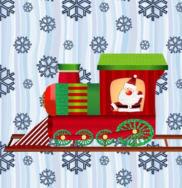
Still playing with vectors. The basic train shape was a preset shape from WmTransport font. I changed it quite a bit. I made Santa several years ago from a PSD tutorial before I really knew how to use the pen tool. The wheels are from Harold's pips font imported as preset shapes. The train tracks are from a vector dash line. I just noticed a few things that I have to tweak.1 point
-
It's quite the beast to tame. The mirrorless is so different, I think I was scared of it and didnt touch it for two months after I bought it. Then i just started using it and fumbling (still fumbling) through using it. The worst is no longer does Canon give you an indepth manual in physical form. I dont have data on my phone so cant download the e-manual onto it. Nor would I want to try reading pages of instruction on a tiny screen. Here was me, running outside to shoot the moon, ugh, I hate this setting, running back into the house to the computer and then looking up/changing the setting and going back outside. Good thing I was only in my back yard. And thankfully John Greego (a photographer/educator) does in depth instructions on certain cameras so without him I'd still be staring at the camera inside the box. And I've been shooting since highschool! I dont know why I had such a block with the mirrorless. it's much smaller thant he robust 7D so buttons and dials arent in the same places or non-existent, found only through the menu system and 13 ways to to get to each one...yeesh, all we need is two ways, the long one and shortcut. Sadly, neither cameras will fit in my purse. Would love to have it with me at all times. Good luck taming your beast.1 point
-
1 point
-
What a cool story. And very inventive of you all. Is your granddaughter older now. Does she remember it?1 point

Resized.thumb.jpg.d25811db03a63358cedab1e79f527635.jpg)










600x600.jpg.4850b41345d2c74b92afb0a05fc6c609.jpg)
