Leaderboard
Popular Content
Showing content with the highest reputation on 06/04/2023 in all areas
-
I have several projects on the go, this being one of them. Although these are advertised as a monogram, it's not a font. They are very large png files. The width is to wide for my liking, had they have been a font (Vector), editing to my liking would have been ever so much easier, whilst retaining the sharpness of them. Anyway, I chose one and used it in a label I created. (Overlay blend mode). I also opted to use a slightly different approach to framing the 2 photos. The butterfly strip was created using 3 butterfly png files.8 points
-
I am the lucky one who won the wool2 tubes from Cassel and I tried something with it. The background paper is by Marisa Lerin Own pictures. Our daughter's dog regularly comes on holiday for a week while she is on the move for work.5 points
-
4 points
-
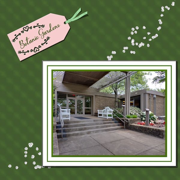
OK, Sue. I added shadows. Since I had merged the papers and frames around the picture, I chiseled the group and then shadowed it. Also decided to do a flip on the ribbon and had separated the shadow for it. Also, decided that it needed something more - just too stark as it was, so I added Cass scattered petals.3 points
-
3 points
-
3 points
-
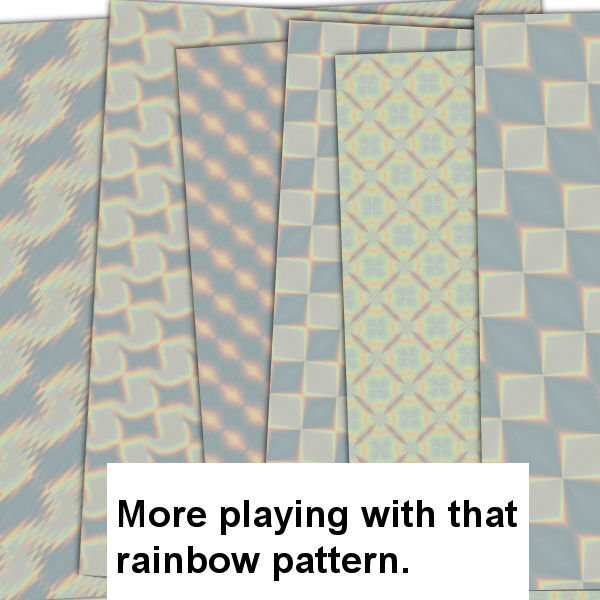
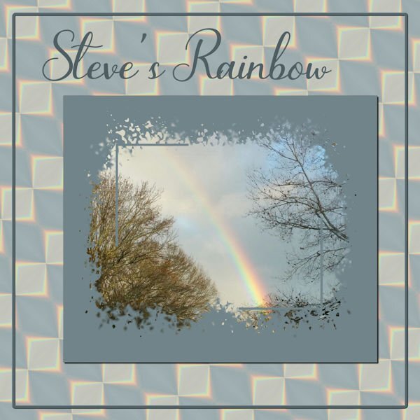
So, I'm playing with Steve's Rainbow again. I took a section of the rainbow and played with Effects>Reflection>Feedback and came up with one I liked; put it on a larger canvas size and duplicated, flipped and rotated it until I had a pattern I liked and then made a background paper of it. Used Cass' Mask from Mask Workshop Extra 3. The font is Bluebell. Canvas frame is of course from a selection and inner bevelled.2 points
-
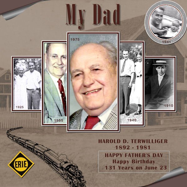
Our theme in June is FATHER'S DAY, and by extension, FaTHERS in general. Of course, that can include grandfathers and other fathers than your own. Maybe it is about you too, if you are a father. Do you have photos and stories to share about the fathers in your life? It could be a great opportunity to remember some of those little details that typically are forgotten. Time to put them out in the open! Let's go! Post your project in the gallery.1 point
-
Freebies are great resources that you can find in many places to build a library of elements, graphics, and tools. Since they are free, they are available to all. For this challenge, grab these graphics from Creative Fabrica (and yes, it is free). You can use these as frames for photos, journaling, quotes, and more. Grab this font HERE. How will you use this font? Remember that you can colorize these graphics using the tutorial in this blog post.1 point
-
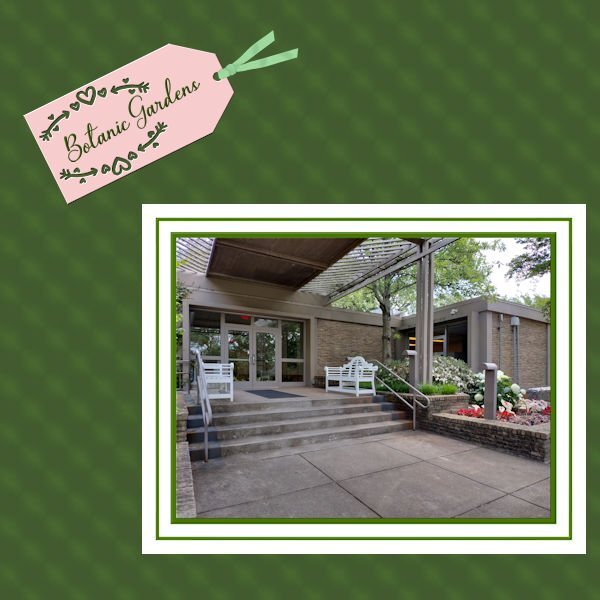
Mary, I agree, it needed to be gardened-up and those rose petals were an inspired choice. This is actually directed to all members, but this photo reminded me of it. Is there any chance you’ll look back upon this page and wonder where it was (broadly and more specifically, so I mean, the Charter House, Dixon Gardens, and the date.). Because renovations happen and 30 years from now I bet this looks different. Now sure where you’d put it, and it doesn’t have to be jumbo in size, but somewhere I like to see a place, names of people and the date. This probably comes from the boxes of pictures we got when we were clearing out my parents’ house. There were oodles of really wonderful vintage pictures of complete strangers in unnamed locations at we-can-only-guess dates. I was really sad to see them dumped in the garbage.1 point
-
1 point
-
1 point
-
1 point
-
It's at the blog train for june at Digital Scrapbook. Hope this link works. Scroll down and you will see Suzy's kit. the photo doesnt come up on my computer, but the links worked fine for me. https://www.digitalscrapbook.com/forums/digital-scrapbooking/digitalscrapbookcom-blog-trains/june-2023-blog-train-final-list?utm_source=newsletter&utm_medium=email&utm_campaign=this_week_at_pixel_scrapper1 point
-
1 point
-
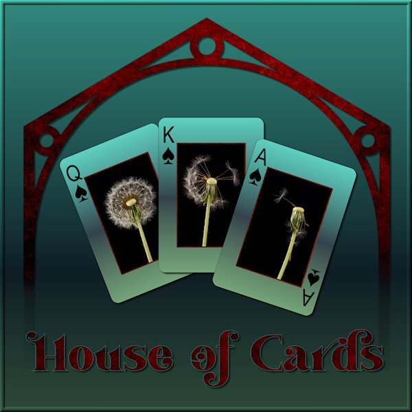
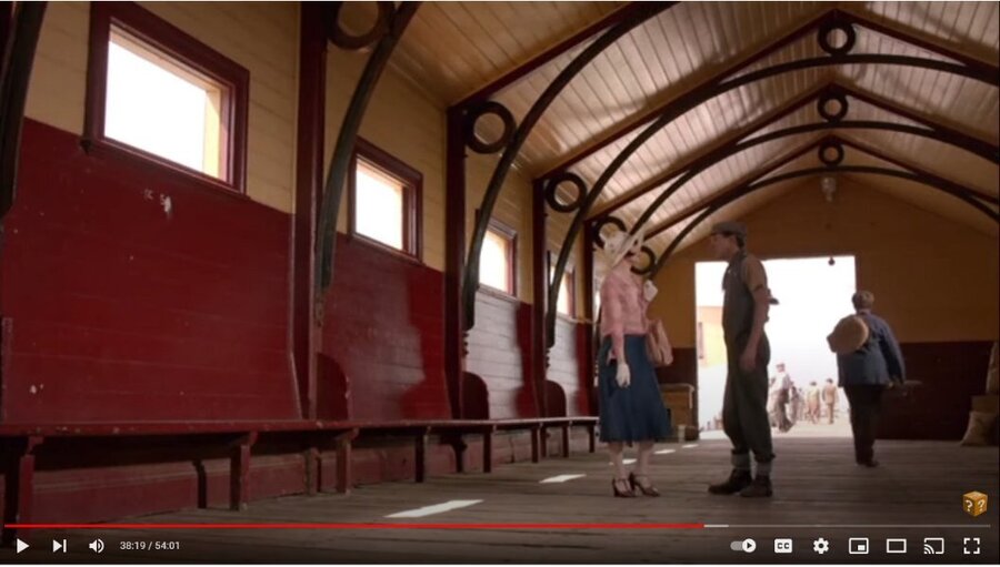
I am watching this Australian Mystery series on utube and there was a scene with a cool design in the building (picture below). I wanted to try and receate the graphic version. I cant wait till we do the Vector workshop. I used vectors to create it and did some problem solving along the way. I'm happy with what I did this time. I didnt quite get the proportions right. When I know better I'll do better. I was playing with what to do with the background when I tried the gradient called "Underworld" so my theme was gambling in the underworld (too much watching the TV show Supernatural). I used the eraser tool to fade out the bottom as if it was descending to the underworld. It was the first time using the Custom Playing Card script from Carole. I LOVE IT. I learned to click "cancel" when choosing a photo and "cancel" again to continue the script and ended up with the layers of, white background and card number/suit. I put the same gradient on the card, lightened, and put my photo's on. I can see a lot of ways to use this script. My original layout was quite dark (my monitor is very light so it's hard to know what it looks like) so I lightened it up for the forum/gallery. My photo's of a recent studio shoot, fun with expiring dandelions. Font is Vanilla Right.1 point
-
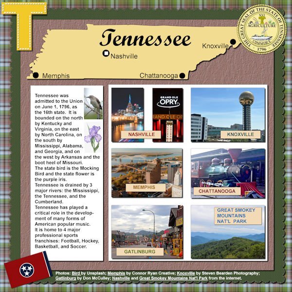
Looks like Happy Birthday to Tennessee is in order. Look at how many double letters in a row is in this State. Now that's something to celebrate! I like the information you give in your layouts.1 point
-
I was surprised to learn I won the Phrase Strips script! I had to play with it which took a bit of time as I made the adjustments to the script itself (as per instructions included) and needed some help from Carole. My deadlines for two projects are now behind me (other stuff) and I can get back to PSP time. I like the "idea" of this layout, but I'm not entirely pleased with the harsh white background. I had to leave it like that b/c I'm not much good at extracting an image and getting a transparent background (the sketch of Mrs. Roosevelt). If I changed or softened the background, then the borders of the sketch were too visible. It's a skill I have to acquire.... Otherwise, I'm happy with the phrase strips and how to use them. Thanks Carole!1 point
-
1 point
-
Leftover Scraplift from May - Six of my grandchildren (the ones who have significant others). The only one missing is Tyler-John who is unattached at this time. The title font is Baby Olivia, the background is color fill treated to weave texture, the curved paper is treated to a pattern using the sculpture texture, the flowers behind the photos are a ribbon called Butterfly Garden-clipart 15. Brad, on the top left, is new to my digital layouts. He and Alycia, top right, are twins.1 point
-
1 point
-
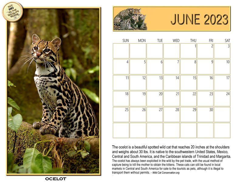
Let's start with a new Wildcat Calendar for June. Here's the Ocelot, a medium size wild cat. Found mostly in Texas, Central and South America, and a few islands. They have been hunted for their beautiful fur coats and recently, females killed and kittens stolen for the sale as pets. That doesn't usually work out once the cat is full grown and they end up in shelters or worse. I'll post a full size image on our Scrapbooking with PaintShop Pro Facebook group.1 point




.jpg.c5c7ecaab5bf116de9f63e018dd7905e.jpg)

