Leaderboard
Popular Content
Showing content with the highest reputation on 05/25/2023 in all areas
-
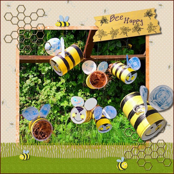
I have finally completed my project 'Bee Happy' so this is what I have been working on in May. I made the hanging bees for the purpose of decorative bug hotels for my garden. In PSP I used the Fringe Effect technique from Lab13 Module 5 for the grass layer & a reverse shadow then added a texture with the grass picture tube. I used various papers and images from the Digital Scrapbook site and studied 6 ways to add borders from the Campus Blog.5 points
-
4 points
-
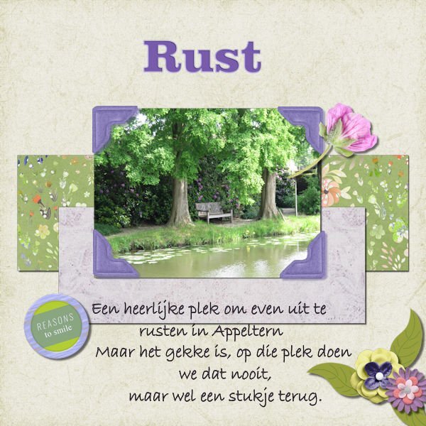
The font is Veni and arial. Kit comes from Marisa Lerin 1000 papers kit. The tea elements were in my stash.(Pixelscrapper, Marisal- England)) The font wasn't suitable to replace one character of, as was showed in the video. I couldn't figure out to use or notuse a shadow on the teapot,cake as it looks like a stamp ?♂️ Photo was taken at the showgardens in Appeltern last sunday. ? It was nice to participate again, some things I forgot, so was a good reminder. ?3 points
-
3 points
-
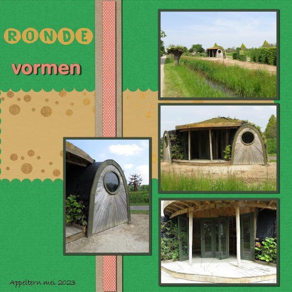
Day 7 Because of the round shape of the "shed" I used a mat with circles on it. And instead of squares to cut out, also circles this time to fit the round shapes of the "shed". The font is unround (The yellow ones) I didn't look nice to have them in different colours, will maybe do that in another project. Vormen (Shapes In English) is the VAGrounded font (Like it!) The shed looks a bit like a Teletubbie house ? I should of added a reverse shadow to the left of the big mat, I thought the map was completly (sp?) to the left of the project ? It's nice to repeat things from earlier bootcamps, I forgot for example to use the magic wand to create borders around the photo's, I always add a mat:). I saw beautiful projects in the gallery, I'm now taking the time to look at all of them in this thread in the forum and add my "likes".3 points
-
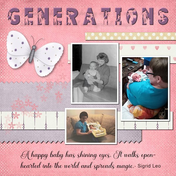
These are pictures of my mom with babies from three generations. She loves babies, and they all have returned the love as they got older. Now she is with me in home hospice. She can still muster a smile when I mention the name of the great-grandkids. The title font is FAMILY from Creative Fabrica. I added an inner bevel to help better define the silhouette. The script is Ernestone, also from Creative Fabrica. The papers and elements are from a kit, Inner Beauty, by Annie C. Digitals. P.S. The black and white picture is me. I wear my hair differently these days.3 points
-
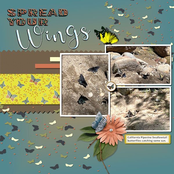
Project 4 - Spread Your Wings Photos by Debbie Lennox-Nevada City, CA Background=jade and yellow gradient Font =Photo caption - Candara Mat with pinked edges= brown fill, weave texture Yellow butterfly mat= jessica-dunn-bohemian-sunshine Flower cluster with shadow= marisa-lerin Yellow butterfly= pngfind.com Label=LF-ChoosetoShine Brad=marisa-lerin-ephemera-butterfly-brad-04 Title Font01=Flora Garden/sculpture texture effect-sky Title Font02=Glamlips/sculpture texture effect-sky Scatters=Marisa Lerin3 points
-
2 points
-
I print my layouts as 12x12 single prints from a service in the USA called Persnickety Prints. I buy print credits when they are on sale and then print when I have a bunch of layouts ready. I do put them in Creative Memories albums in page protectors that are specifically for that purpose. I have also printed gift books using Shutterfly that are 10x10 in size when they have an unlimited pages sale. One project I did many years ago, I printed it at home on 8.5x11 photo paper (layout size 8x8). I then bought an 8x8 scrapbooking album with page protectors to put the prints in. However, I do know of many people that print at home since they scrap 8.5x11. There are scrapbook binders in that size with the protectors that they then put their prints in. Most common sizes for scrapbooks sold in stores are 12x12 and 8.5x11 and 8x8. One important thing for me is to use page protectors that are made specifically for scrapbook pages and not the generic protectors for a binder. Here is an article that talks about various types of scrapbooks, page protectors and lists some vendors: Which Scrapbook Album Should I Buy? It might give you some ideas to move forward.2 points
-
2 points
-
At first I thought about wedding dresses, then I decided baby clothes would be the most sentimental. I downloaded a kit by Janet Kemp from PS and used Carole's Hanging Photos script. I'm so glad I bought it because it takes a long time to get this result manually. And it's great that it leaves everything on its own layer; I did some rearranging. The title font is Lovely Blooms from CF and on the baby blanket I used Mix Stitch from Dafont.2 points
-
Project 4 I used the kit that came with this Project (cpjess-spring skies). But you wouldnt know it, unless you took a peak in my layers palette. I used the blue sky paper, duplicated it and turned it upside down so the clouds above were same below - but you wouldnt even see that now as it all blended in, all these two layers had adjustment layers applied to them and both paper layers had different reduced opacity. I used the blue paper (with newspaper writing on it) with a reduced opacity and above that layer I promoted a selection of it to make my pinking shear effect. And above that layer was a photo of mine of Canada geese flying into the pond. I didnt like the photo background look so I played with blend modes and chose "difference" and it made the birds look like a graphic and the pinking shear was lightened against the background of the same paper below it. I thought it looked interesting. Lots of this was me moving layers around and seeing what would happen with the blend mode. This again, was a happy accident. that works better with the two smaller photos. I made the other little strips of paper from the original blue paper and from the new brownish paper. Used also in the title. Font: NNSafari Serif (Creative Fabrica) Photos: mine This was shot on November 20, 2011 and these geese (over 800) had only 2/3rds of the pond as the rest was frozen, and they had to share it with about 6 other species that flew in. It takes about 10 minutes for the geese (coming from the farm fields nearby) to all get landed. the sky is black with Canada geese, it's really quite a site and fun to watch them come in for the landing. This is a very different kind of layout for me.2 points
-
Project 4 I used screenshots this time taken by me a few years ago , It was again an Explore live cam, one I have been watching and chatting on for 10 years. Hog Island Osprey Nest. I elected not to use any scatter because the background etc was already pretty busy. P S- The bird flying silhouette is one I created (using PSP21) from a screenshot I took this year of an Osprey flying into his nest.2 points
-
I had very little time to do today's daily look pic. But I had this sweet little kitten from Creative Fabrica* that I fell in love with and never used. I added a mask from Lady22 on a background from AnnieC. The font is, coincidentally, Lazy Cuties also from CF. I added very low opacity drop shadows to everything simply to get rid of the "flat" look. *When we celebrated the campus's 10th anniversary, I won a one month subscription for CF. I've been hooked ever since and cannot foresee ever ending it.2 points
-
Carole - I didn't make the connection with the Scraplift Challenge. It's amazing to see the continuity between generations. Mother finally adjusted to the cats, and they rewarded her acquiescence with abounding love. The fonts for this project are Cute Cat and Stay at Home, both from Creative Fabrica.1 point
-
1 point
-
1 point
-
Getting your layouts printed by a professional printing service has one big advantage over printing at home: the binding and cover. If you do it at home, you would likely have to put them into plastic sleeves that are either in already bound books or in those binders where you can add/remove sleeves. That would serve a double purpose: to protect them and to bind them. If you are to bind it yourself with a spiral, consider that you would be punching holes in one edge of your pages. If there is no important detail there, that is ok, but just be careful. As for the cover, I am not sure what I would use. Maybe foam core board to make it thick and solid? Otherwise, keep an eye on those printing places as they would often have sales and specials and it might end up being less expensive than you think. I heard of several people who just keep their layouts "ready for printing" and take advantage of various sales when they come. I personally have only printed one book, and had it done locally, many years ago.1 point
-
yes, I refer to the book too. so much to remember, and thankfully we dont have to if we have the book nearby.1 point
-
1 point
-
I'm usually not a real fan f plaids, but this one is so right for this project! I love it! ?1 point
-
I forget a lot too, espcially when you don't use it a lot at paintshopping. But I have Carole's tips and tricks book nearby and try to find what I want there. ?1 point
-
Thank you Sharla. How lucky you are. I cant imagine what that must be like to see that many geese at once. I have many many bad photos and a few good ones. My timing is usually pretty bad. Thank goodness for digital, I can shoot a lot on continuous and hope I get something. I'm much better taking pictures of things that dont move.1 point
-
I just saw these! And they’re are all wonderful…the texture is just right. Visible, but not too big and aggressive. How many toys did Poncho have? You had the word “selfies” on the LO, so I thought the cat stepped on the phone and took her own photos. ?1 point
-
1 point
-
Have you tried putting the flower under the photo but on top of the green paper? That would hide the stem of the flower. Although my thought on your first layout was to not have as much shadow on the flower and make it look more like a sticker.1 point
-
1 point
-
1 point
-
This is really beautifully done, and those plants!! if you don't know and you see the picture you think they are real. Great! ?1 point
-
layered template : Cassel Digitalscrapbook, blogtrain, Papers of Elizabeth Minkus, from minikit Oct2018 That Smile. Tag of Sharon Dewi, from minikit SpreadYourWings Font, Lucida Handwriting Photos are mine1 point
-
1 point
-
I think God gets mad if you walk by the color purple in a field somewhere and don't notice it. - Alice Walker (paraphrased) I can't walk or scroll by the color purple without stopping to admire it.1 point
-
My hubby and I watch a lot of shows that are subtitled (I hate dubbed) and we often laugh at the translations.1 point
-
This was inspired by an article in The Washington Post about the healing benefits of the songs of birds. The article featured sound clips of the birds in the layout - meadowlark, bobolink, and woodpecker. The glitters were created using Carole's script Glitters-C. The papers and elements are from a kit, Celebrations, by Whispey D'Zines. The fonts are Spring and Ernestone, both from Creative Fabrica. I forgot to note that in the previous project, I used Carole's Smoothener script to eliminate the jagged pixels appearing in a selection's expansion. It did an amazing job.1 point
-
1 point
-
Project 2 I get the opportunity to sing at a couple of Special Care Homes in my province. So I thought I would show my guitar. I don't take pictures of the residents singing along with me as there is usually a warning somewhere about taking pictures. The background papers were from suggested packs for project 1 and 2. I did change the colours on a couple of them. The Treble Clef was from Digital Scrapbooking. I cannot recall where I got the musical notes.1 point
-
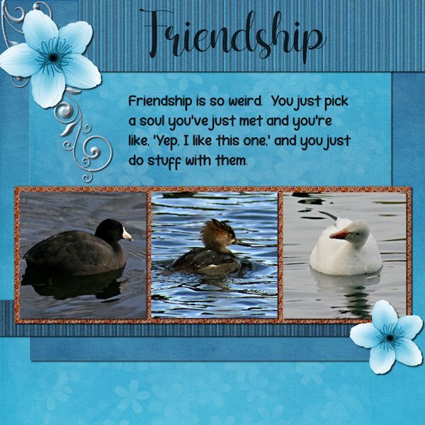
Project 3. I used the kit provided "Welcome Spring" from Digital Scrapbook and by DB Magnolia. And I used the orange glitters. Are you sitting down? Are you ready to hear this? I did not change the blue/white flower or the background paper. I did however change the glitters (darker) ?. I used the background paper twice, once for the background and once upside down for the mat behind the photos/glitters. I used the an extraction of the same background paper and added texture effect>texture> blinds, then added noise, then went back to try a different size blinds on a duplicate copy and accidently applied it again to the one with the texture already on it. it made it look more like stripes. Same for the bottom striped one, which I made darker. I used a scatter of little flower petals and changed the color to white (from pink) and reduced the opacity a lot. It might not show at this resolution. There was no metal element so I extracted a design (part of one) from a card in the kit and then changed the color and added an inner bevel, hoping it looks like metal. Fonts are: Shelly (title) and Robeek (quote). from Creative Fabrica or Google (as my font program came with google fonts as well). Quote: found on internet search "unlikely friends", but could not find who made the quote. it has "human" instead of "soul" that i added because, well, these arent humans. Photos: are mine from the the same photo shoot day, weird changing weather. The layout would have looked best if all the water was the same color as the one in the middle. I may swap out two photos from another photo day that has matching water.1 point
-
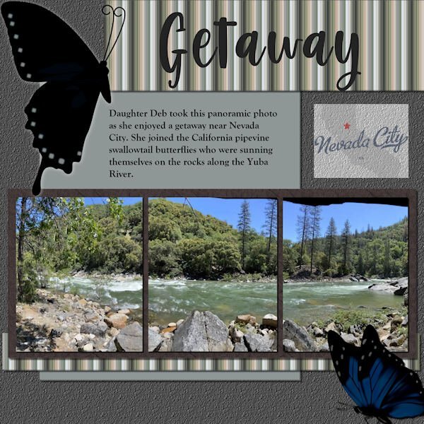
Scrap Bootcamp: Lesson 5 - Yuba River Getaway - Daughter Deb took this panoramic photo as she enjoyed a getaway when she joined the California pipevine swallowtail butterflies who were sunning themselves on the rocks along the Yuba River outside Nevada City. The title font is Berlin Kitchen, the journaling font is Goudy Old Style. Background color fill with asphalt texture, photo mat wood tile01 pattern with hardwood texture. Butterflies are from internet searches for pipevine swallowtails. EDIT: Forgot to mention the stripe pattern; used the directions for making a plaid but stopped before adding a second, rotated layer. The colors are from the portion of the photo that shows on the far left.1 point
-
1 point
-
1 point
-
Project 1 - I tried to add a frame around the flower picture by using shadow on left and right sides. >>> I have found that for me, I am unable to use the frame tool in Paintshop Pro 2022 for large mages like this one (3600x3600) This may have made the drop shadow that I added for the project look bad around this. The picture was taken with my iphone 5S, yes it is old but still works. The papers I used were from the suggested pack from Digital Scrapbook site .. I did change the colour of one of the papers. For the hearts, I just used the Heart from Preset Shape tool and resized using other papers from the same pack. The font used is Varsity Team. I cannot be sure where I got this.1 point
-
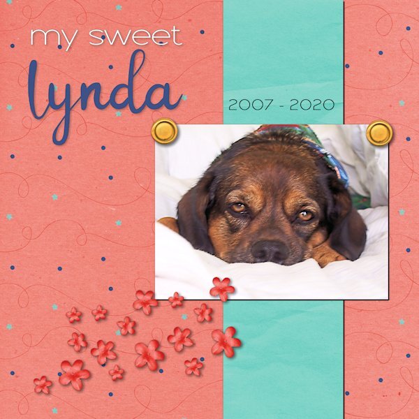
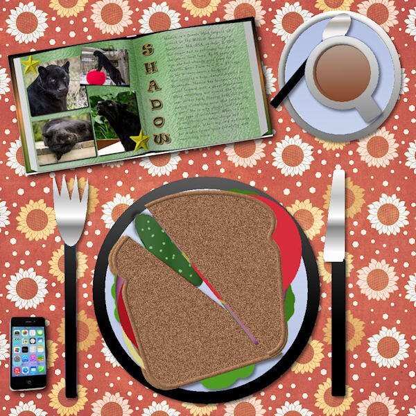
There have been unexpected challenges this week, and I haven't had time to make a sandwich - figuratively and literally. I hope to find a few minutes this afternoon to prepare both. "Linda" means beautiful in Spanish. When she was handed to me, I changed the spelling to a non-traditional one because that's how we do things in our house. She had a beautiful spirit that was always calming. The anniversary of her passing is this weekend. The kit used for the layout is called "Celebration" by whispy's D'zines from GoDigitalScrapbooking.com.1 point
-
Day 3 - Project 1 I used various papers and elements from the bundled kits from Jessica Dunn-Frosty Fall (the mini was provided in the bootcamp). I did adjust some of the colors of the papers and elements to fit my idea. The scatter was from one leaf that I made duplicates of and turned them various ways (then grouped them so I could move, resize and duplicate the group as needed). Fonts are: Night Wolf from Creative Fabrica and Arial Rounded MT Bold from Windows Photo is mine. Carole: I posted in the gallery too, but made a boo-boo and didnt put it in project 1, how do I delete it and/or move it to the project 1 folder?1 point
-
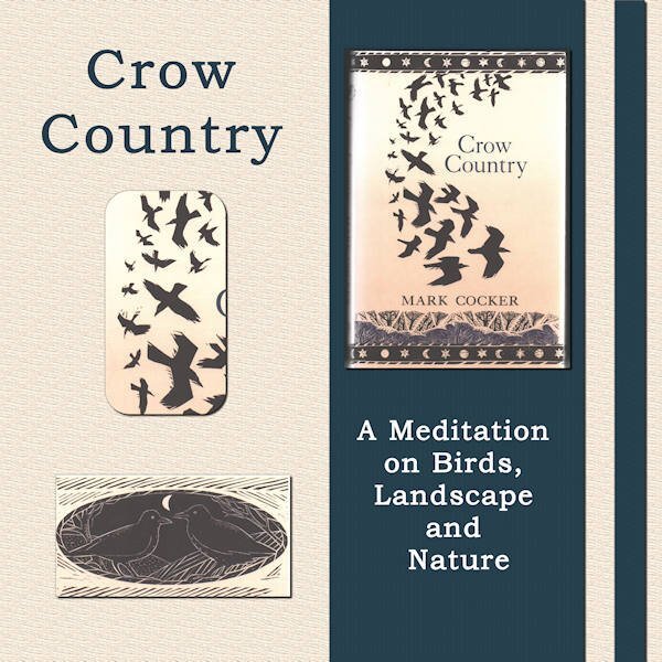
I thought I'd like a change away from my photos of flowers, birds, trees and cathedrals. So, I am going to use books I have loved as my themes for each of the bootcamp projects. Project 1 is Crow Country by Mark Cocker. He writes about his love of birds, in particular the covid family - rooks, crows and jackdaws. It is a lovely piece of nature writing set mainly in Norfolk in the UK and, many years ago, it inspired me to take more interest in birds. The images are all from the book cover. The words are the title and subtitle. The two papers I used were made by me - a simple colour fill with a texture added via EFFECTS then TEXTURE EFFECTS.1 point
-
1 point
-
Hallo! Ik vind het allemaal erg interessant, dank voor alles wat ik al heb geleerd1 point
-
Beautiful table Cindy. Love the marshmallows and really love the monitor. I think I heard that see-through bread has less calories too! ?1 point
-
1 point
-
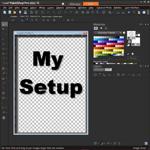
I've illustrated my setup with a little infographic. You'll find there's a Master Class for that, too, though mine here is not the same style. I just clipped a copy of my workspace using MS Office One Note. Cassel - I couldn't use the link to this Forum in today's email. It went back to January, 2023.1 point
-
Here is a photo I think I will use. I am going to limit myself to ONE photo date (November 20, 2011) on a visit to the pond at Sardis Park near where I lived in Chilliwack, BC. A very small pond that takes only 10 minutes to walk all the way around. It is on a flight path of waterfowl; mostly Canada Geese. It was only a 10 minute walk from my house and part of my "rehab" after spinal fusion surgery in May of that year. As soon as I could carry my camera and walk for 10 minutes that's where I went. Looking forward to the bootcamp and looking at all the photo's and layouts from all the registrants.1 point


