Leaderboard
Resized.thumb.jpg.d25811db03a63358cedab1e79f527635.jpg)


Popular Content
Showing content with the highest reputation on 02/26/2023 in all areas
-
I used Ann's template...thank you, Ann! The background was an accident but I like it and decided to keep it. I had used a different color and added a texture. Then I decided I didn't like that color so I floodfilled with the green. The texture was underneath and the green didn't fill everything. One of my pickleball players brought cut flowers and gave them to those who wanted them. My daffodils are not blooming yet...budded but not blooming, so I was happy to receive these.
 4 points
 -
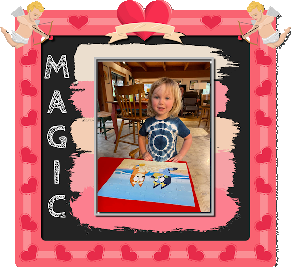
Lesson 7 I made polka crosses? ?The Outlander subject wasn't suitable for dots, a bit ( a wee bit as the Scottish would say) to sweet, I need a though one. So I looked for another brush and found the cross. I was playing with the scale, rotation and size, tried two things on the same layer instead try and retry on a different layer, and both settigs on the same layer gave a fun effect, so I kept it. The sign and flowers are from pixelscrapper, made by Billie Irene and Marisa Lerin. Now up to the extra's ? I think this workshop is one of my favourites ? Thanks again , Carole!?
3 points
-
Lesson 6 Font imprint MT shadow and arial ( I think Arial narrow) I now used the brush variance pallet??
3 points
-
Template 3 by Lady 22, AKA, Bourico Casper.
2 points
-
Template 121 by Lady 22, AKA Bourico Casper.
2 points
-
There is an article (if you want it printed) on the blog: https://scrapbookcampus.com/2015/12/creating-a-layered-template-from-a-flat-image/2 points
-
These are all gorgeous!2 points
-
Scraplifting is one of my favorite challenges. I always start with copying the example and enlarging it to 3600. Then I reduce the colors to grayscale. From there I build a template, keeping the original as my base layer, and filling in shades from black to white for each component, be it full sized paper or embellishment. I make all photo areas black. At the end, I increased the colors to 8bit so there will be a full palette available. Here is my finished template in a reduced version for posting here. I will put the full sized version on our Facebook and the .pspimage in the Files area there for those who want a head start. Feel free to download it and start creating! I will be back with my own new creation in a while. Edit: I did discover that the black areas for photos didn't work in the Raster-to-Mask script until I used Negative Image on them again and they turned white. Then the script was ok.
2 points
-
Learning scrapbooking is often done with practice, looking around for inspiration and trying to recreate projects we admire. This challenge will give you an opportunity to personalize a project while trying to "copy" another one. Of course, you will change the title, the text, and the photos, but you will want to try to replicate the arrangements and some of the effects you see. It is a challenge but in the end, you will learn more about scrapbooking and your PaintShop Pro. Here is a simple layout you will want to "scraplift". And if you want more information on "scraplifting", check out this article.1 point
-
For this I used Cassel's cass-StarburstTemplateMaker. An overlay by Marisa Lerin (digital scrapbook) Font : Brush Script MT1 point
-
The crosses are really nice!1 point
-
The script will only work on LAYERED images, not flat ones like you did.1 point
-
Thanks, Susan. I find them fun to make and I see Carole even has a script that makes templates. I might try that.1 point
-
Here is my completed entry for the Scraplift Challenge. Title font is Showcard Gothic; journaling is Stay Outside. The background paper is ps_melo-vrijhof_winter-day. The embellishments are all Picture Tubes. I added a mat behind the photos and filled it with a woodgrain pattern and colorized to match the title.
1 point
-
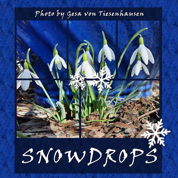
I made a seamless tile to fill the background with the pattern of the blue vase behind the flowers in Gesa's photo. The font is Viner hand. The snowflakes are picture tubes. The layout is a template that came from Lab 9-10.
1 point
-
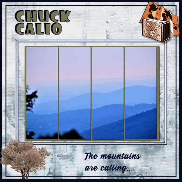
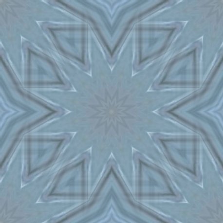
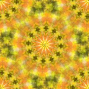
I'll post a few of the many patterns I made during the mask workshop. Most were made either with the West Virginia layout, the ocean layout. Julia - love your perspective stripes - some of them remind me of a pinstripe suit material.
1 point
-
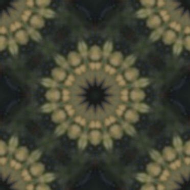
Re-posting this for the challenge. It's one of the extra masks in the workshop. I totally did it over as square to match the frame. I went back and found the colors were restricted to 256 so I upped it.
1 point
-
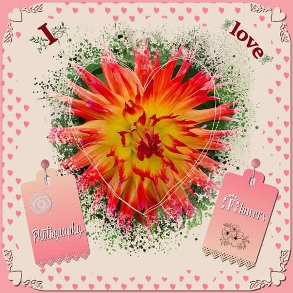
I didn't want to make a Valentine page but the colors lend themselves to a love theme so much! Valentine was and still is not a big thing overhere; it mostly, at least with the elderly people, is looked at as very commercial. Just before Valentiine the flowers are much more expensive and they go down in price after that! It is getting bigger this days with cards and offers of chocolate etc. So I decided to make something with the things I love: flowers and photograpgy which must come as no surprise as you know me by now. I used the Heart Mask that came with this theme and 2 papers from Escale Amoureuze and recolored them to go with the palette. The photo of the Dahlia had much of the colors of the palette in it. Heartpunches from from Caole and the freebie tag from this week; I used the black one and colored it with a gradient made with the palette colors.
1 point