-
Posts
767 -
Joined
-
Last visited
-
Days Won
9
Everything posted by Donna Sillia
-
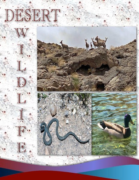
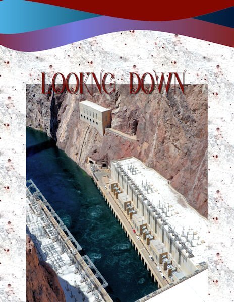
Day 5: I had to use my Las Vegas grandson to fill in some pictures of Hoover Dam, Lake Mead and desert wildlife. Font is carlsonopenfaceBT. The waves are from the cass wave script.
- 374 replies
-
- 11
-

-

-
I got the waves using the cass wave script and colored them to match the background,
-
- 374 replies
-
- 13
-

-

-
- 374 replies
-
- 15
-

-

-

-
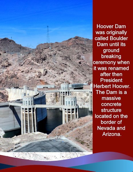
My day 2: I was side tracked the last two days designing a new business card for my son. The photo was an overview of the dam. I used the same background, stripes and colors as the first page. The font is Arial. My photos cannot do justice to the immense size of the dam and its surroundings.
- 374 replies
-
- 15
-

-

-
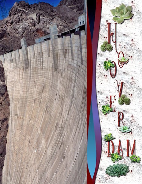
Day 1: After going through my picture file and starting one then another, I finally decided to use my Hoover Dam pictures, although mere pictures cannot do justice to the size of this amazing work of engineering. The font is Star full inline from deeezy,com. The separator waves are from the casswaves script. The background is from one of my texture photos-granite. The succulents are tubes.
- 374 replies
-
- 12
-

-

-

-
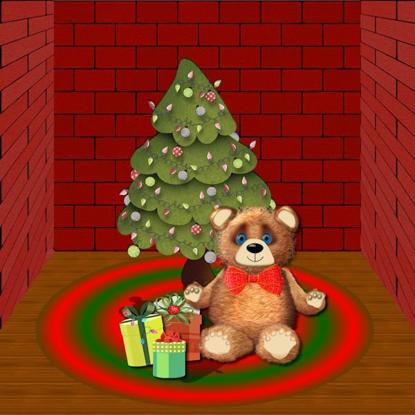
I am definitely not an artist, but I wanted to try to make a Teddy Bear. Starting with vector shapes to which I applied plush using the cass plush script, I used a lot of what I have learned about shading. The paws are tubes which I modified. I used a vector to trace the ear of a teddy that I downloaded using AI and the script to merge and cut out the inner shape. The background is from the Masterclass on Pop ups that I never completely finished. The tree is from Digital Scrapbook, and I'm not sure where I got the presents. All the other shapes--head, body, legs and arms were made from vectors.
-
Particle shop is trial and error for me. I just keep playing with it until I have something that I like. The dandelion seeds were easier than most.
-
I love dandelions, and this project was inspired by the June Forum Challenge using a Creative Fabrica Font. The pictures are all my own. The background is from a nighttime desert photo by my grandson. The dandelion seeds were made with Particle Shop.
- 303 replies
-
- 17
-

-

-
This puzzle was addictive. I couldn't stop looking until I found all the pieces. Number 3 was the hardest for me.
-
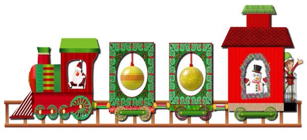
The Vectors workshop inspired me to make a Christmas train. The engine was a preset shape that I modified. I made Santa a few years ago. The Christmas ornaments and the snowman are from Cassel, and the elf is from an elf Christmas card that was also from Cassel. The wheels are preset shapes.
- 303 replies
-
- 14
-

-

-

-
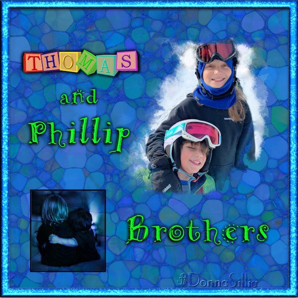
My first introduction to Masks and the linoleum background: Masks Workshop – Lesson 6 | Scrapbook Campus.
- 303 replies
-
- 14
-

-

-
One of my favorite workshops was the Text Workshop Workshops Index | Scrapbook Campus. I constantly use these techniques when creating titles and text for my projects. The background paper was created using the Embossed Patter Tutorial Lab 12 – Module 5 | Scrapbook Campus.
- 303 replies
-
- 22
-

-

-
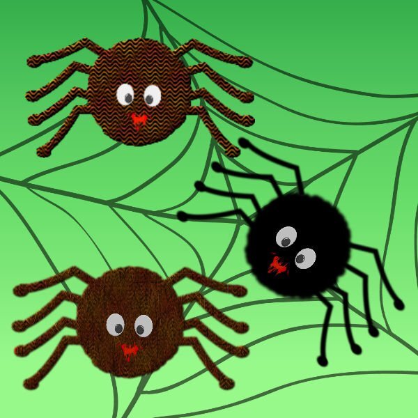
I'm in a Halloween mood and was inspired by the Grunge Masterclass. For the body of the spider, I used the VectorStoke part of the video. The eyes are from the google eyes tutorial and the legs were created from vector lines. The web is from a Janet Kemp graphic. I used the fur texture on the black spider, the second one I used a black and orange wave pattern and the third is the wave pattern with fur added. The background is a Resource Boy green Gradient. The mouth is just a dozi brushess.
- 158 replies
-
- 10
-

-

-

-
Mary, did you put the whole folder in your file preferences? Mine didn't show up until I put the whole folder in my plugin site. There are two files 64 bit and 32 bit. My folder is GmicPluginx64.
-
GMIC is a free plug in for Photoshop, but works with Paintshop.
-
Susan, I have a plug in called GMIC that makes all kinds of different effects on your papers. I used some of those papers as backgrounds.
-
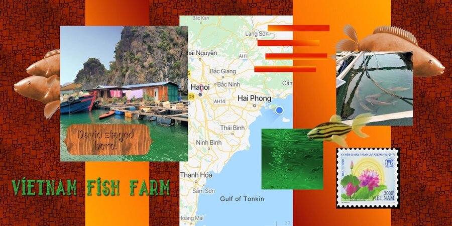
Finally finished! I decided to use my grandson's pictures from his stay at a river fish farm in Vietnam. I didn't have a lot of pictures, but I made some fish using Filter Forge filter "Aquaria." The water picture is AI from Adobe Express. The map is from a photo that David sent me when he sent the fish farm picture. The font is a grunge font called "sailor 1 grunge." I couldn't divide it in half because I placed the map in the middle. Papers are mine; two columns are a gradient.
- 275 replies
-
- 13
-

-

-
-
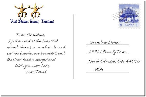
Days 4, 5 and 6 - Continuing the Thailand theme. Page 2 is actually Page 1 and Page 1 is Page 2. I numbered them incorrectly. The pineapples and coconuts are from AI. The shells are photos of shells picked up on the beach, except for the middle one which is from Marisa Lerin. Pictures on the stamps are pngs downloaded from favpngs. Palm tree is a tube, and the coconut string is a directional tube that I made with the cass script. Background papers are mine. Fonts are Hallmark fonts.
- 275 replies
-
- 12
-

-

-
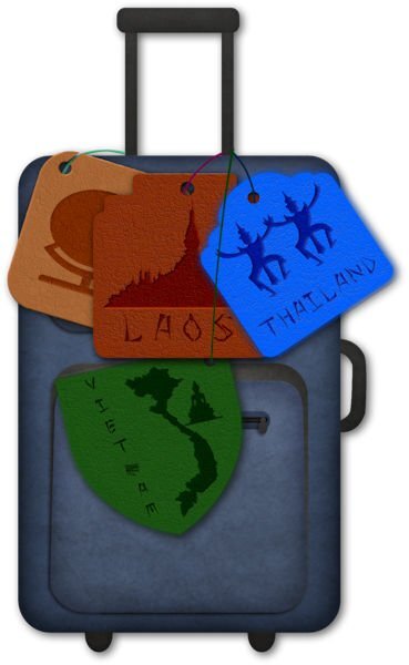
Finally, Day 4 - I didn't use a template, but decided to attach my leather tags to a suitcase provided by lsj kit called" world geography101." The font is an open license font called Peel. The graphics were downloaded from pngtree.com. I tried to use pngs to reflect the different countries.
- 275 replies
-
- 14
-

-

-
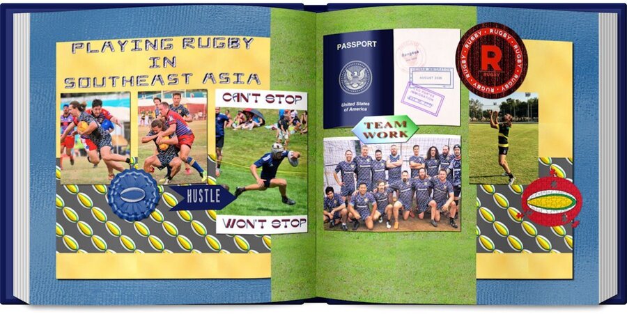
Day 3: During the time my grandson was in Southeast Asia, he played rugby with the Bangkok University rugby team and with a team of his friends who played a tournament in Laos and Vietnam. The pictures are some of the ones that he texted me. I used some elements from a Marisa Lering kit featuring sports. The background papers are my own. The rugby ball pattern was made with cass seamless script which I love. I made the passport and the visa stamps. I liked Anne's idea of making it a book. I am way behind since for the last two days I have been dealing with printer problems.
- 275 replies
-
- 15
-

-

-
Sherie, some time ago, I had problems reinstalling PSP 2023 and found this page [Sticky] -- Clean Up Tools for: PSP X4 through to PSP 2023 - Alludo USER to USER Web Board (corel.com). I used the clean up tool and was able to reinstall. Note: Corel has stressed that the cleanup tool should only be used for problem installations. You should always use the Windows Control Panel to uninstall first and if there is an issue then use the cleanup tool.
-
dozi's-brushes-01 (archive.org) I had this site saved in my bookmarks.
-
Thank you, Carole. If it weren't for your classes and workshops, I wouldn't be able to make my own elements and papers. I haven't been downloading so many kits since there is so much I can make myself.


