-
Posts
766 -
Joined
-
Last visited
-
Days Won
9
Everything posted by Donna Sillia
-
I found this site for open source fonts: 1600+ Open Source Fonts (OFL) › Fontesk
-
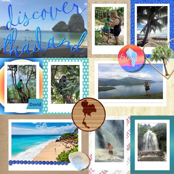
I used a qp that I downloaded a while back from Digital Scrapbook. The original file was a PSD and opened in Paintshop with layers. I could not figure out how to make the picture files into masks probably something to do with the PSD layout. The photos were sent to me by my grandson when he visited Southeast Asia prior to Covid(He made it home just in time.) The font is CallieHmk that I got when I installed the Hallmark card program. The palm tree is a tube, the map of Thailand is from Pixabay and added to the wood based on a Scrap tutorial. The shell is from shell pictures that David sent from Thailand. Escape is from a Digital Scrapbook kit.
-
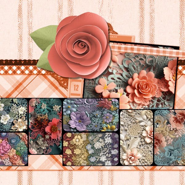
Day 7 extra: the flower pictures are called floral lace seamless patterns from deeezy.com. I tried to match the color of the center flower, but the leaves on the original template were orange. Since I could not change the leaves to green, I added a flower from songbird blog train in my kits.
- 382 replies
-
- 13
-

-

-
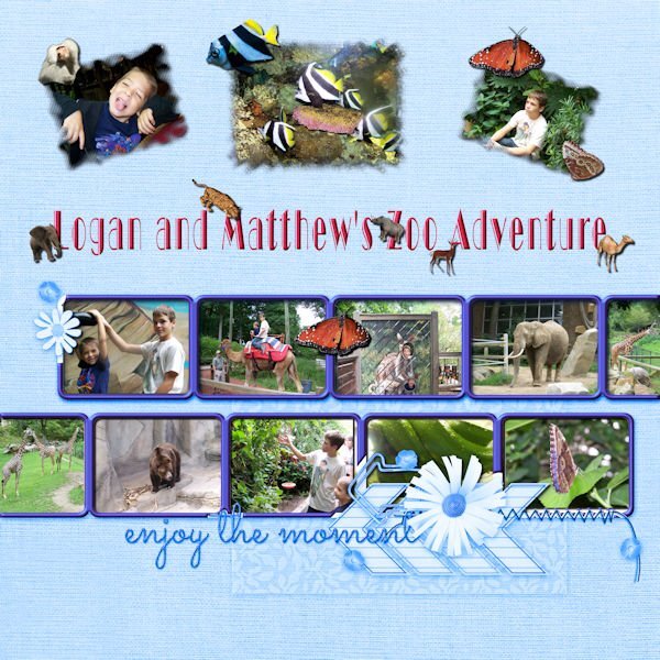
I had to go way back to find 10 pictures. My grandsons in the photos are now 21 and 28, but we had a really great time at the Cleveland Zoo. The font is Broadway display. The additional animals are tubes except for the baboon which was also taken that day. The butterflies are tubes from my own butterfly photos.
- 382 replies
-
- 13
-

-

-
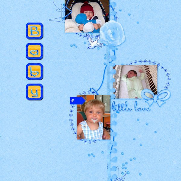
Slowly catching up. Photos are of my grandson, Phillip, who will be 16 in August. I created the baby blocks for his baby shower.
- 382 replies
-
- 12
-

-

-
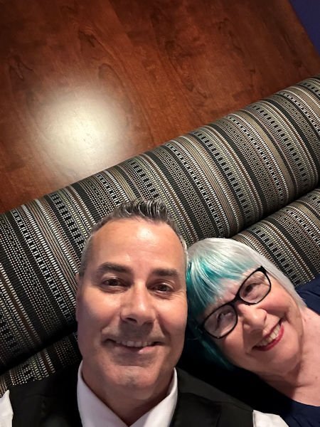
Julie, we are about 2 1/2 hours from Windsor and love to visit. We went to Nero's for our 55th dinner and Vito's the day before. Food is Canada is wonderful. They ban a lot of additives like corn syrup which I think makes the food taste better. I also love shopping at Devonshire Mall where I have been buying my make up for years at Caryl Baker. The photo is a selfie of me and Pete, taken by Pete who has been our server at Nero's for over 30 years
- 382 replies
-
- 11
-

-

-
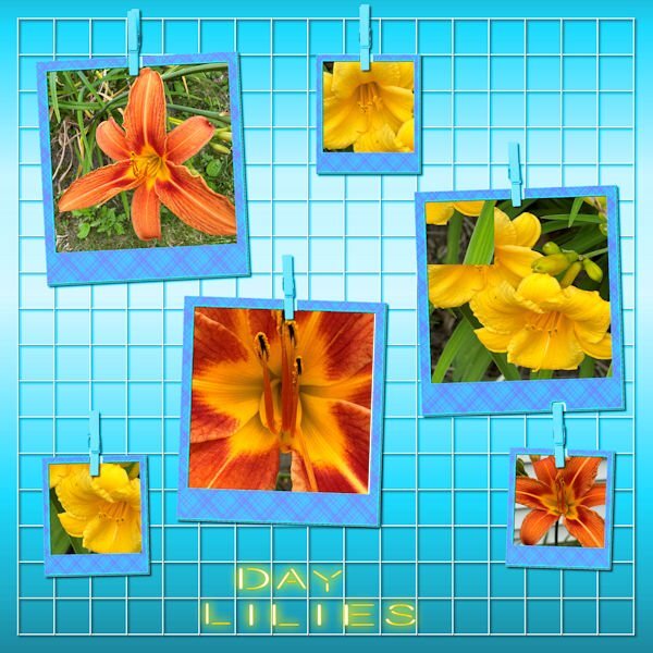
Yesterday I spent some time photographing my day lilies, one of my favorite flowers. I changed the background color and added one of my plaids to the frames. The font is Beon to which I applied the cass neon script. For the text, I used individual letters, but got too impatient with lining them up to fit the squares.
- 382 replies
-
- 12
-

-

-
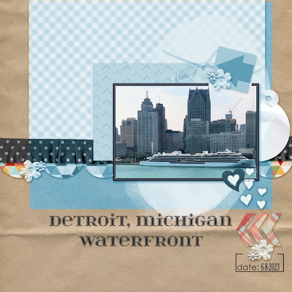
For our 55th anniversary, we traveled to Windsor, Ontario. I took this photo of Detroit from our hotel room window. I changed the hue to better match the photo and changed the white frame to also match. The frame was beveled. Since there was still a little white showing, I added a heart that I created using a cass script offset cutout. The font is itsadzokeS02, an olf font.
- 382 replies
-
- 11
-

-

-
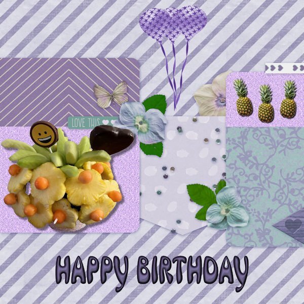
Someday, I will have to remind myself that not every empty space needs to be filled. The edible arrangement photo was taken after I received it from my lovely daughter, Beth. Pineapples are from an AI program, and the balloons are from my build a kit. I changed the hue because I love purple. The font is an olf called Mrs Beasley. The glitter paper background is from one that I made some time ago.
- 382 replies
-
- 12
-

-

-
I didn't change the heart shape at all, and the flower mask layer is over the heart. I think some of the mask was so light that it didn't show giving the appearance that it was under the heart. I never noticed the effect until you mentioned it.
-
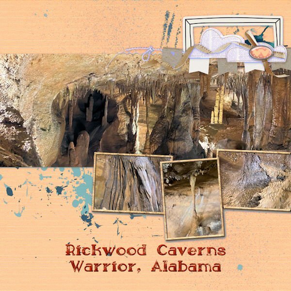
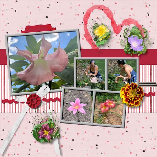
Day 4 is an homage to my daughter who has seriously started taking pictures for me, including photos for just texture. The first one has pictures of the cave at Rickwood cave in Alabama. She remembered how I love caves. I made a texture from one of the photos and used it to fill in the picture frames. I also changed the color to be more compatible with the pictures. The second one is of Beth taking the photos at the Botanical Gardens near Birmingham, Alabama and some of the flower pictures that she took. I added the marigold flower from one of my own photos. I used masks that I made for some of her other flower photos and added them.
- 382 replies
-
- 12
-

-

-
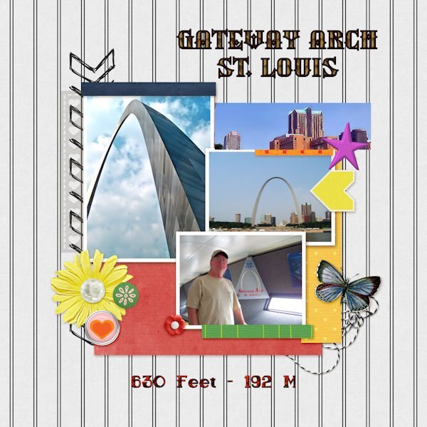
The photo is of my husband, but we both went up the arch. It was so exciting! You don't have to walk; they have little cars that take you to the top.
-
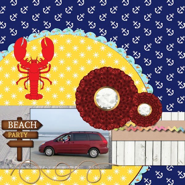
I am just getting to page three, partly due to beautiful weather and partly due to taking so long to decide on pictures. Beach Party is a picture of our van on the beach in St. Augustine. I changed the flower to two of my own from my build a kit. I changed the background under the van to sand from one of my own photos. The lobster is a Summitsoft clip art. The St. Louis Arch pictures are my own photos. I changed the little houses to a picture of buildings in St. Louis. The top font is an olf called Silverblade and the lower font is sailor bold 1 grunge, a Windows font.
- 382 replies
-
- 14
-

-

-
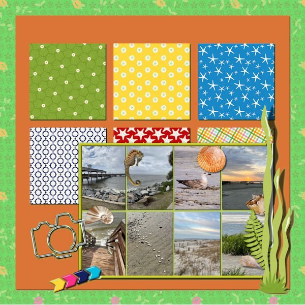
Day 2: By the sea. Photos of the beach are mine or my daughter's. Seahorse is from Digital Scrapbook, one is from Filter Forge, and the others are photos from my grandson. I changed the colors to brighten it up. The frame color is from the plant on the template.
- 382 replies
-
- 14
-

-

-
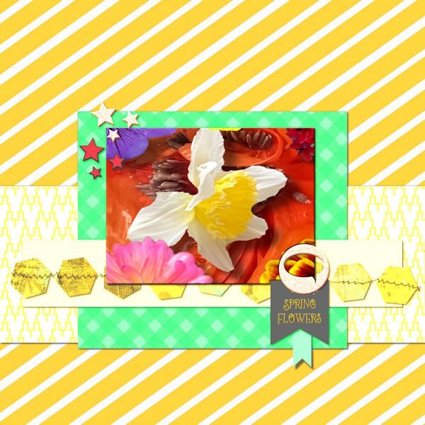
Day 2: I changed the color to better match the picture which is a seamless pattern from a cass script. I erased the text on the black flag and added my own.
- 382 replies
-
- 13
-

-

-
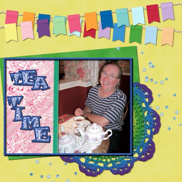
The crochet doilies immediately reminded me of having tea. The photo is of my husband when we were having tea at Miss Molly's Tea House. Since the photo was too narrow, I added a background paper from Digital Scrapbook. The letters are from my kit with the outline and the fill changed.
- 382 replies
-
- 19
-

-

-
Thank you, Cindy. I had the script for a long time before I even knew how to use it. I just started using it over and over until I got some nice masks using some of my brushes. I had to remember to make the opening very black.
-
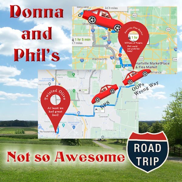
We were headed to the Hartsville Flea Market, but the parking lot was so helter-skelter that Phil decided to leave since he couldn't park his baby (red Toyota Camry SE) safely to avoid dings. We will be taking more day trips now that hubby now longer has to pick up kids. GPS has greatly improved now taking construction and traffic jams and rerouting you. It saved us hours in traffic once returning from a trip to Windsor, Ontario.
-
I made this for the Paintshop Maniacs page from a photo that I took at Colonial Beach, VA and my own mask. I used the shape cutter for the letters, then applied the cass-edges script. I applied a layer style bevel and emboss to the blue layer.
- 276 replies
-
- 13
-

-

-
Phil and I decided to make some day trips, one of which was hilarious because he told me he knew where he was going. After going about 15 minutes in the wrong direction, I finally turned on GPS. I have made a vow to always use GPS, especially when he says he knows the way. In fairness to him, he did a good job navigating Windsor Ontario with no GPS.
- 276 replies
-
- 13
-

-

-

-
I love dandelions even though there are none in my grass. My flower bed had some nice big ones that I managed to photograph before the landscaper put weed killer on them. I extracted the fluffy dandelion and added it to my dandelion picture with some extra leaves that were also extracted. The seeds were created using Particle Shop; the sky background is from a desert sky sent by my grandson. The mossy boards are from a photo sent to me by my daughter. Font is Anabel 1 grunge.
- 14 replies
-
- 10
-

-

-
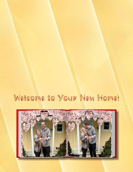
I have been working on a congratulations for your new home card for my niece. I may have already posted the front. The inside was suggested by my husband since we were gifting them a Home Depot gift card. The tools are from Digital Scrapbook and the ribbons and balloons from Creative Fabrica.
- 181 replies
-
- 11
-

-

-
Let me know if you want me to send it to you, or try support. They were very responsive.
-
Mary, I'm glad that I inspired you. I lost the license key when I changed computers, and I must tell you that their customer service was excellent. I received a reply within 24 hours, although the support is only for paid for versions. Try making a folder and pasting the 8BF file into it. Then direct your PSP file locations to that folder. That is what worked for me, although I have most of my plugins in a separate folder called "plugins64." It took me quite a while to figure it out. I used it with a shimmer paper with lines from Abstract Curvees for the background on the card that I am making, although my husband wants it to be a more colorful blue.
-
Carole, Abstract Curves installed into my Program Files and not into Paintshop 2022 or 2023. This happened quite a while ago after I purchased the program. Maybe you could just direct file locations to the Abstract Curves folder in the Program Files. I seem to remember having difficulty finding it until I finally pasted it into my separate 64 bit plugins folder and directed my file locations there.


