Donna Sillia
-
Posts
766 -
Joined
-
Last visited
-
Days Won
9
Everything posted by Donna Sillia
-
I have a separate folder for my 64 bit plugins. I copied the Abstract Curves plugin to that folder and directed my file locations to that folder, and it shows up under Effects plugins. Here is a sample of a background where I used Abstract Curves to make a background for a card that I am making for a new home party for my great niece. I thought the lines sort of echoed the slats in the house. You can easily change colors, and I wanted to match the house colors.

-
You have to go to the GiveaWay of the day Website: Giveaway of the Day. Abstract Curves 1.190 + 2 Bonus Presets Packs - AbstractCurves is an image generator to create stunning wallpapers or posters.
-
I didn't know if I could post a link, but here it is :Giveaway of the Day. Abstract Curves 1.190 + 2 Bonus Presets Packs - AbstractCurves is an image generator to create stunning wallpapers or posters. I also posted it on Paintshop Maniacs and so did Brian Smith.
-
I'm not sure where to post this, but Abstract Curves is free on Give Away of the Day today.
-
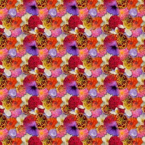
Last one for today. I am having so much fun playing with my old and new scripts. I made a flower paper using the seamlesspattern script. I am not that fond of the paper but it is part of my learning process. I love the script!
-
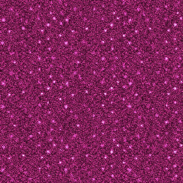
I am not very good at scattering which is why I purchased the scatterbrush script. After experimenting, I created a star scatter to use on the glitter papers that I made in my kit. The original image was 500 by 500 px, made seamless with Effects and put on a new raster layer above the glitter paper. I added the pattern and changed the blend mode to dodge. The script was just what I was looking for to make scatters.
-
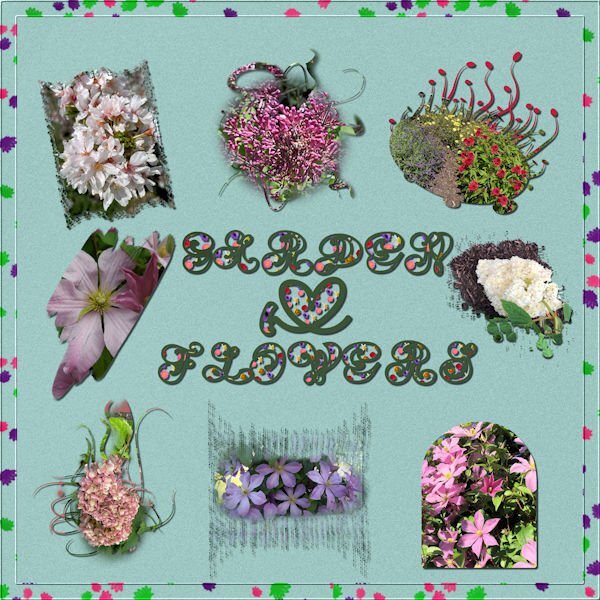
This thread made me realize that I had already purchased the raster to mask script. I used it on my flower pictures. They are all from flowers in my yard. I also used the seamless pattern script to make the letter fill and the scatter script for the border. The font is Amen which was on my computer. It is not as clear as I would have liked it. The background paper is a solid paper from my kit. Most of the masks are from brushes except one.
-
My scripts were a mess when I transferred everything to a new computer. I had purchased scripts that I never downloaded. I now download all my scripts onto the desktop. After I have opened them and placed them in the 2023 scripts folder, I then save both the zipped and unzipped into a folder on my external hard drive specifically for scripts. That way if one is missing in 2023 or other version, I can recopy them. Because of this thread, I discovered that I had the script raster to mask and had never used it. I have been playing with it, and I love it!
-
We are looking for some day trips from where we live in northeast Ohio. Zanesville seems like a good place to visit.
-
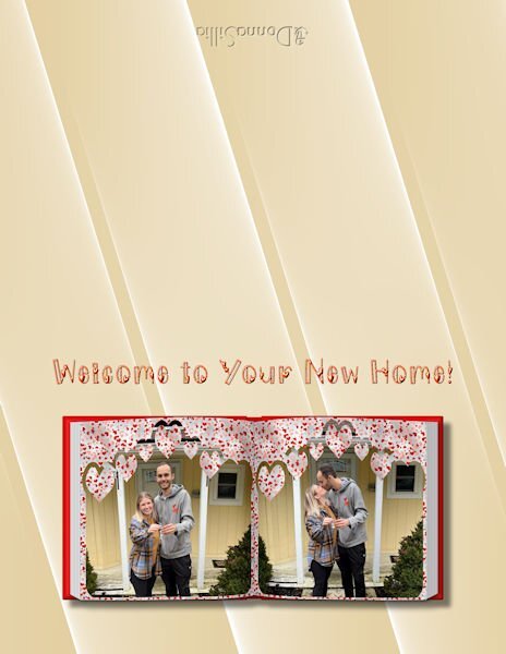
I'm still playing with the scripts that I purchased. A new one is cass-scatterbrush which I love. I made a heart pattern and used it to fill a border on an 11by14 image for my grandson's engagement that I would like to have printed on canvas. If there are any suggestions for improvement, please let me know.
-
My favorite script is cass-alphaseparator which I actually downloaded by accident. I have found this script really helpful in making adjustments to my Titles and words because the script does all the work of separating and formatting for you on the vector letter.
-
I just ordered a canvas print 12 by 24 for my daughter for Mother's Day. She loved the file that I sent her. The only online shop that I could find that let you customize your size is Easy Canvas Prints. I will let you know how it turns out.
- 203 replies
-
- 11
-

-

-
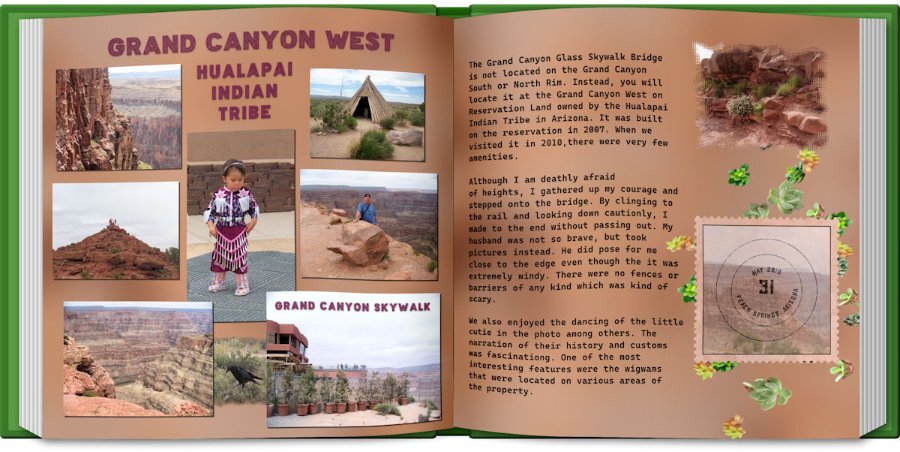
Day 6: The photos are old, but we enjoyed this trip to the reservation so much. I made the grunge background per Carole's instructions. The Title font is an Open font License called "Baltic Boden." I am loving the ofl fonts that I found on the Internet. The text font is "Cascadia Code" and was in my font list. I used cass-shadow for the pictures. The Title shadow was done manually because I didn't like the shadow used by the script. The postage stamp was made by FF, but the stamp is from a scrap tutorial. The stamp font is "atara grunge" which was purchased from Deeezy.com. I used a mask on the photo on the second page and the cass-scatteredelements script using the succulent tubes. I also used the book script.
- 203 replies
-
- 13
-
-
-
Carole, I used both bevel and shadows on the Title because it looked so flat without it. I used a layer style bevel since I could control the visibility of the texture better. I love the shadow script although I had to test it a few times, and the alpha separator script is one of my favorites now.
-
Lesson 5: The only panorama that I had was the last Iceland template that I made. I used it as a faded background, but it is much better full color. I also had to reuse some of the photos since he didn't send me a whole lot. The Title font is Guinness Stout, and the lower font is Gill Sans since it had the first letter its character shapes. The background is the ice texture that I made in Filter Forge. The icicles were also made in FF. I used the cass-shadows script that I just downloaded today. I am not sure if I used it correctly, but it looked ok to me. BTW, Happy Birthday, Carole. I celebrated with a bunch of new scripts.
- 203 replies
-
- 14
-
-
-
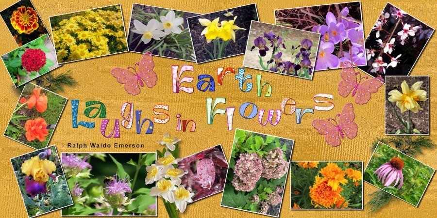
Lesson 4: I decided to use my flower pictures since I had so many of them. I used batch processing to add the white borders but not the size because of the different orientations. I used a script to change the sizes. The background is my gold shimmer, the leaves are from a kit that I purchased and the daffodil bouquet is my own. The font is Ambidexter, another open license font. I had downloaded the cass-alphaseparator script by mistake, but it came in really handy with the title. It not only separated the letters, but they were already formatted to change the fill and the stroke. The butterflies are from my kit and are beveled because a shadow ruined the transparency. I also beveled the title letters(saved the unbeveled file in case Carole doesn't like the bevel) because I thought that they stood out better. I also remembered to save the shadows on a new layer in case those need to be changed. Love that script, Carole!
- 203 replies
-
- 15
-
-
-
Carole, on Lesson 1, I forgot to add the shadows on the pictures. I will redo them tomorrow and use your suggestion regarding the line and increasing the shadows on the embellishments. I really would like to send the layout to my daughter. Thank you for your assistance.
-
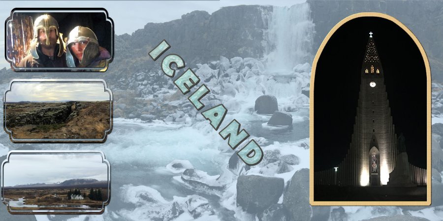
I finally gave up with trying to remove the line. The mask had created some spots where the canvas could be seen, so I made a new layer underneath which I matched to the gray of the mountains. The pictures are from my grandson who visited Iceland in 2019. The masks are from preset shapes. The font is Berlin Sans FB and filled with an ice texture that I made with Filter Forge.
- 203 replies
-
- 12
-
-
-
I am stuck on Lesson 3. I cannot get the line between the two pictures to disappear even though I am using the Blending Pictures technique. Is there something that I am missing?
-
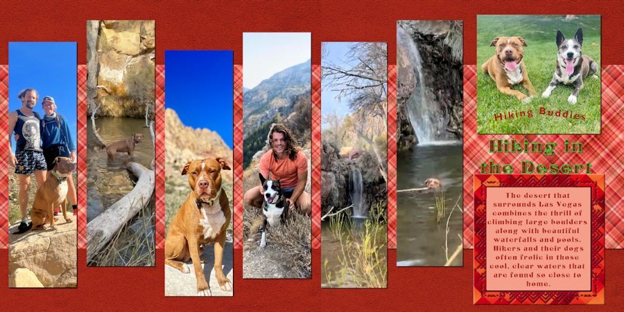
Day 2: The pictures are from my grandsons who live in Las Vegas and frequently hike, taking their dogs with them (and sometimes a girlfriend). The background and frame are from my kit. The font is an open font license called Centaury Display. I filled the Title with some help from Carole using a rust texture in my pattern files and outlined with a green grass texture. I finally figured out how to combine the two images and how to eliminate the line between the plaids thanks to the Blending Pictures Master Class. My grandsons are also trained to send me interesting pictures.
- 203 replies
-
- 13
-
-
-
Thanks, Susan. I forgot to merge the mask groups and add the shadows.
-
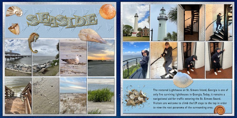
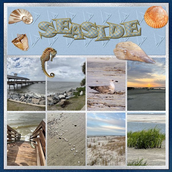
Here is my first double page as I am running behind. They are pictures of that my daughter sent me after her vacation at St. Simons Island. I have her trained to take pictures for my projects. The first page is of the sea and the second is the lighthouse and her climbing and descending the stairs. Two of the shells and the seahorse are downloads from DigitalScrappers. Two are from Filter Forge, and the rest are mine extracted from shells collected by my grandson in Thailand. The font is from my kit with changes to the stroke and fill to a plaid that is also in my kit. The papers are my shimmer papers. I had to edit to change the size of the pages.
- 203 replies
-
- 11
-
-
-
I posted a 3600 px dark gray paper in the FB group.
-
Mary, I made a 3600 px page and used your settings without distorting the pattern. I started with 1000 px 300 and resized to 3600. I also used brightness and contrast to lighten the file, but it came out darker than yours. Do you know how I can post a 3600 page?
-
Oh, Mary, I do love that one. How did you make it silver?