-
Posts
773 -
Joined
-
Last visited
-
Days Won
9
Content Type
Profiles
Gallery
Forums
Everything posted by Donna Sillia
-
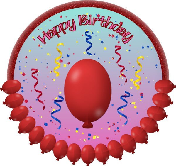
I am still so fascinated by the cass directional tube script that I bound it to my workspace. There was a simple tutorial for a balloon which I made into a directional tube. The font is Ambidexter, a free font. The confetti and curled ribbons are tubes.
- 714 replies
-
- 14
-

-

-
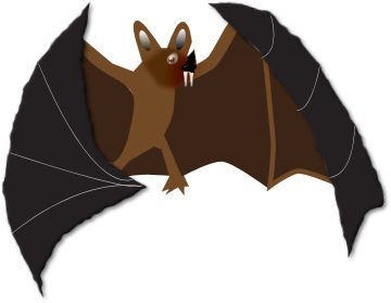
I am still playing with vectors. Today, I created a Halloween bat that I traced from a Halloween clipart from Summitsoft. I added the mouth and fangs as well as the gray lines on the wings.
- 714 replies
-
- 18
-

-

-

-
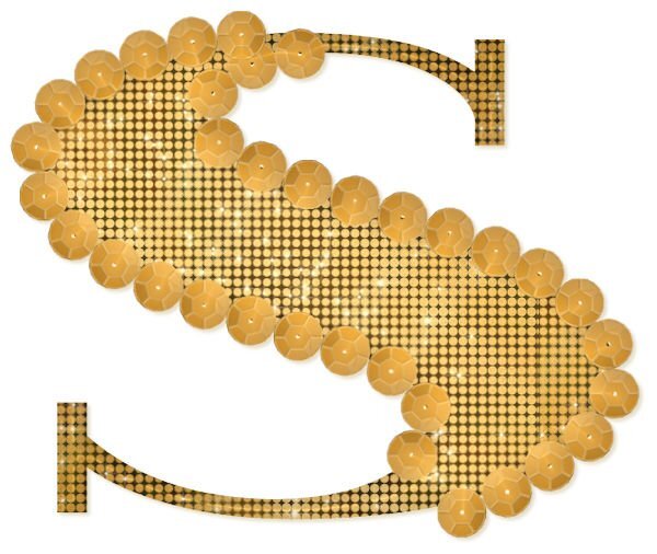
Between Lesson 7 and the customdirectionaltube script, I cannot stop playing. Today, I made a sequin using a Scrap Tutorial. The fill is a pattern created in Photoshop. The font is Farewell Angelina.
- 714 replies
-
- 17
-

-

-

-
I made a Christmas rope using the customdirection script. I adjusted the size to 50 with 8 across and 9 down. I think it came out a lot better than my previous ropes.
- 714 replies
-
- 18
-

-

-
I found that I have been skipping the step size. I started using 50 for the starting size, 5 across and 3 down, which seems to be working ok. I going to try increasing the rows across and down and see if that makes a difference.
-
I tried to make a string with the cass customdirection script. It saved a lot of work, but it doesn't seem to be as tight as the ones from Carole. Carole, am I missing something?
- 714 replies
-
- 17
-

-

-
Carole, thank you so much for a wonderful workshop. I am going to repeat it so that maybe some of it will stick for future use. The directional tube script is addictive, and I love playing with it. I need to make some more elements to use with it. All your workshops are great but this one was outstanding because the subject is so difficult for me.
-
I purchased the cass directional tube script and spent a lot of time today converting some of my graphics to directional tubes. It was so much fun that I couldn't stop playing with it. The diamond and the amethyst are from my Build a Kit. I made the heart today.
- 714 replies
-
- 18
-

-

-

-
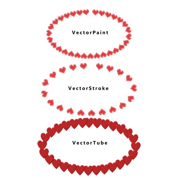
Experimenting: Carole, is there a method to distributing the hearts equally? I used the brush palette to change to direction for vectorpaint and vectorstroke.
-
I would not have been able to make the shape prior to this lesson. The vector stroke is very familiar to me since I use it a lot. The diamonds were made from the cass gem script, and they were made into a tube since I am addicted to bling. The font is MrsBeasly, a nice thick font which is free.
- 714 replies
-
- 11
-

-

-

-
Carole, I remembered you once before recommended the brush, and I did try it. It didn't work because I forgot to change the brush variance to directional. I am still trying to perfect the project. Once it was published, I noticed several things that I want to change. Fortunately, I saved it step by step so that I don't have to start from scratch.
-
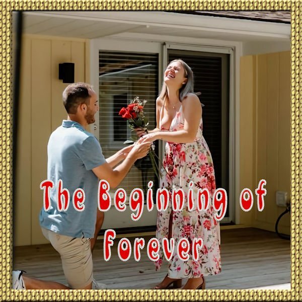
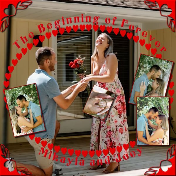
My niece was kind enough to send me some of her engagement photos. I had no problems with the text, but it took me forever to decide how to treat the photos. I made an ellipse and used the Vector Tube for the hearts. I also used the cass edge brushes. I had to go back to add the shadows that I forgot initially.
- 714 replies
-
- 10
-

-

-
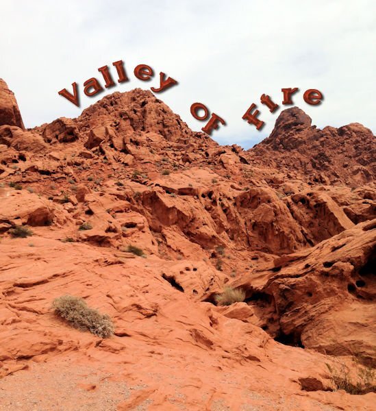
I love using text on a curve. I usually have to play with it a little to make sure it is placed properly. The font is sailorboy grunge with a layer style applied.
- 714 replies
-
- 13
-

-

-

-
- 714 replies
-
- 15
-

-

-
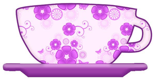
I should have made separate vectors, too. That is probably why my saucer has jagged edges. Thanks for the tip!
-
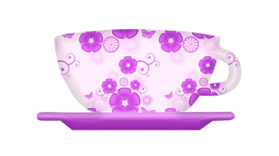
I forgot to make the hole for the coffee or tea, but it is getting easier. I had the nodes set to medium and changed them to small, and a lot of problems vanished. I also changed the DPI on my mouse and lowered the speed. The mouse is no longer jumping around so much that the symbols changed so fast that I couldn't grab them. I forgot the second hole, and there are a few things I could change. Since I saved the original vector, I will be able to do that. I am not happy with the jagged edges on the saucer.
- 714 replies
-
- 14
-

-

-
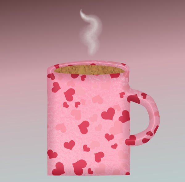
It's actually getting easier, but I am not good enough to save a preset yet. The mug has a layer style applied with my own pattern. The smoke is from a brush. I wish that I had added rounder corners to the bottom.
- 714 replies
-
- 14
-

-

-
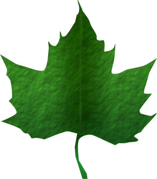
I spent most of the day trying to put lines on my leaves. I finally gave up, although I copied the spine of one my leaf pictures and pasted it on my leaf. It was very straight so I used the Warp noise brush, blend mode, and some gaussian blur. I darkened the middle and used a cloud texture under Effects - Texture. The green is a gradient. I just noticed a little tag left over from a misplaced node and just erased it.
- 714 replies
-
- 17
-

-

-
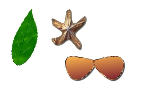
It's hard to follow the lesson when you have to keep stopping to assist a needy husband.? I finally finished. I'm not happy with the leaf. I tried to make a texture from a picture of one of my leaves. I hope you will cover how to make the lines on a leaf and flower. As you can see, my lines were too straight. The starfish texture was generated in Adobe Express. The sunglasses were originally black, but when I created them from my preset shapes, I had the starfish texture and color in my material palette and decided that I liked it. The stroke in the label was made in Procreate.
- 714 replies
-
- 19
-

-

-
That's happening to me, too. I tried resetting to the original, but that didn't work.
-
I increased the size of the nodes to medium. The small nodes are hard to see.
-
Still experimenting. It is difficult to make the shape symmetrical. I used some guides which helped, but it still took a long time for something that is still a little off. I used the barbed wire line since it can look like stars. I could not resist using my new custom confetti script.
- 714 replies
-
- 14
-

-

-

-
Thanks for the reminder that you can save your shapes!
-
First experiment. All the textures are mine. The bevel on the heart is a layer style. The bevel on the arrow is on a raster layer. This lesson clarified a lot of things, but I will continue practicing with the different nodes.
- 714 replies
-
- 18
-

-

-
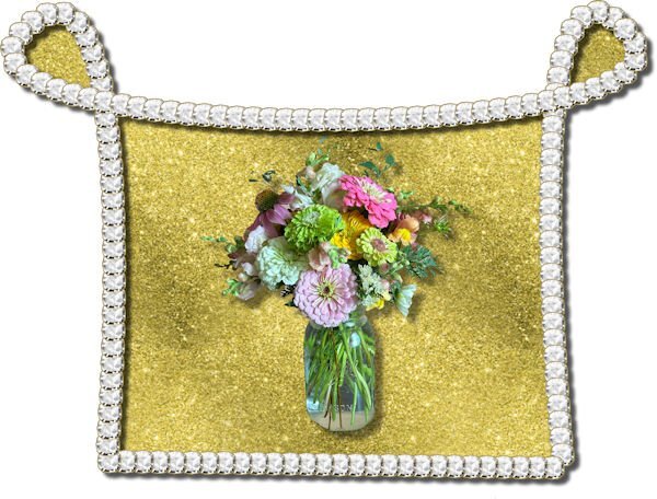
Thank you, Suzy. I love glitter, and I love to fill in my text with patterns. I used the cass script seamless patterns for this fill with my own flower pics. There is an Adobe Express for your desktop. I think it includes some Adobe Stock in the free version. As long as it is free, I will use it. Adobe programs are really expensive and not worth it to me, but I do have PSD 5 which comes in handy at times.


