

Susan Ewart
-
Posts
3,884 -
Joined
-
Last visited
-
Days Won
119
Content Type
Profiles
Gallery
Forums
Posts posted by Susan Ewart
-
-
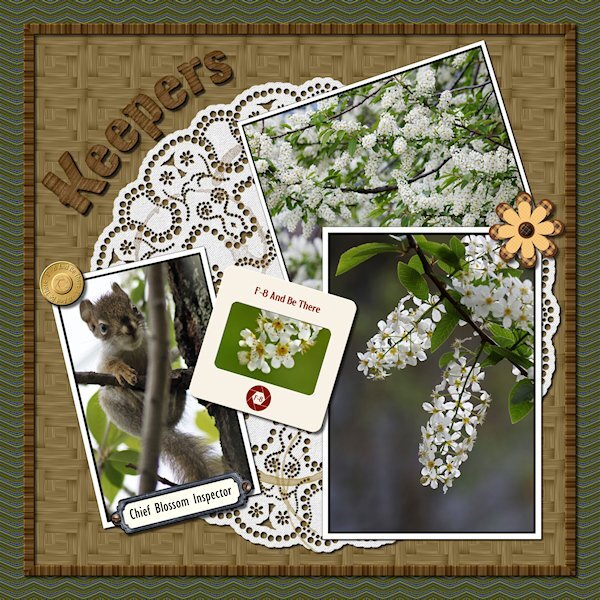
8 minutes ago, Suzy said:
Holy cow, Susan, that doily is gorgeous! And even more gorgeous is the detail on that Chevron tile! The pattern, the colors, everything. I just love it!
I use those kinds of patterns to make “fill” I call it. Where I just need to use it as a pattern fill for the border of a card, or maybe something I would use instead of a ribbon….or maybe a ribbon. Or a full for a shape or letter or text. Chevrons are hard to use, but I would use the mitered corner frame script to make it all go the same way when doing a border. Well, it’s gorgeous.
Thank you Suzy. It was really absorbing to make the pattern. It was too busy as a full size paper, for me anyway. But I played around with sizes and changing color and made something I liked. I managed to mitre the corners on the frame around the parquet. that was brain teaser....might have to get that script. I like your idea of using that patter in a letter or shape. Same with the doily, you can get absorbed in making the dots. They will always be one of a kind elements.
-
 1
1
-
-
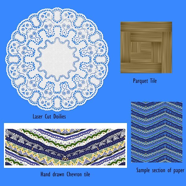
here's the elements from Lab 6-10. I left the background off the chevron so you could see just how crazy I made it.

-
 2
2
-
 2
2
-
-
Lab 6-10
- Hand Drawn Chevrons
- Laser Cut Doilies
- Parquet
This was a fun Lab. My hand drawn chevrons were too busy so I had to make them really small in the layout (background paper). Good learning for next time. Fun to make though. The doily was cool how it comes together. Thanks to great directions I managed to get it done. Again, i was a little too ambitious with the design. My favorite was the parquet tile. Funny, I neve liked parquet floor, but I loved this tutorial. the color I chose makes it look like bambo (albeit a little darker). I used the original tile (used to make the parquet square tile, which is used as a pattern for a paper) to make a frame around the "table" my pictures are on. I used an alpha instead of a font and changed the color a bit to match and really liked the look. Go Alphas!
Here's the deets:
- Flower/brass button/slide frame: from my kit in the Build a Kit workshop
- Bookplate: KMRD-A Good Day-bookplate (Digital Scrapbook)
- Screws: cass-screwheads (picture tube) from Creation Cassel
- Alpha: Digi-Dewi-Kumbaya
- Photos: mine

-
8
-
5 hours ago, Cassel said:
I have considered doing a class on making fonts, but it would involve a paid program so I am not sure how well-received that would be (I got some complaints when I did classes on Filter Forge). On the other hand, making an alpha is so much simpler and very accessible to all. Maybe that can be another class!?
Weird to get complaints about FF, I know I had asked for it(the class). If you have something I dont have or do, it's still interesting to me to see what it's about so I know if I want to get it or not. And usually later on, it does become something I want and I am pretty grateful there's a workshop on it.
-
3
-
-
6 hours ago, Bonnie Ballentine said:
Two more...
These are fabulous. You will make good use of them, and they are one-of-a-kind too.
-
3 hours ago, Mary Solaas said:
I've posted the patterns (*.png's) on the Facebook page. Seems like that accepts all forms (*.pspimage, *.png, *.jpg - and all sizes). Anyway, someone mentioned the heart paper and triangle paper so I also posted them. All are free to use.
Susan - could you post the *.png overlay you made on Facebook? I would like to have it just as you used it since I won't have to extract it, etc. LOL
It's all done Mary, the illicit contrand has being uploaded. Enjoy! And thank you for the signs and especially the snowflake. I love snowflakes.
-
49 minutes ago, Suzy said:
Susan if you also post the original photo, I will show you what Cass Whitener script will do and post it. One click, baby!
(I think. I won't know for sure until I do it, but it works for my stuff which is more along the lines of concrete parking garage walls and hotel walls LOL, that sounds potentially gross -- I think it's a plaster treatment they use. quite random.)
I just posted the original in the files section on the FB page. Cant wait to see the script in action. I love concrete and have my eye on a chiped out piece on my steps that would make a cool mask. I'm happy to say I am a fully fledged texture-holic.
-
 1
1
-
-
1 hour ago, Ann Seeber said:
What I should have done was posted the original photo so you could see the difference...
WOW! unreal, the change. You are doing really good works with this tool. I loved your layout, it's well done. And the photo, it's cuteness overload.
-
 1
1
-
-
2 minutes ago, Mary Solaas said:
I've posted the patterns (*.png's) on the Facebook page. Seems like that accepts all forms (*.pspimage, *.png, *.jpg - and all sizes). Anyway, someone mentioned the heart paper and triangle paper so I also posted them. All are free to use.
Susan - could you post the *.png overlay you made on Facebook? I would like to have it just as you used it since I won't have to extract it, etc. LOL
I sure can. Just running out for an errand and will do it when I get back. Good information about what FB lets you post.
3 hours ago, Michele said:I don't know what it is with me and "cute" pics this week, but that looks like the best ice cream date ever! The frame (it started out as a paper) is from a Scrap Designers Blog Train; the tricky part was changing the dimensions from 3600 x 3600 to 3000 x 2000. Facebook changed how it displays pics a while ago so if you don't change it, FB adds its own borders. I wish I had enough time to create more of my own stuff, but I only have an hour or two every day from inspiration to fruition. Anyway, I thought the frame really complimented the little girl and her puppy. The little waffle cone heart in the top right corner is from CF. I used two fonts, Summer's Ice Cream and Ferrero Rocker; the first one was all cones which I thought was too much.
This is so cute. You make good use of your hour or two. What you create in that short time would still take several days.
-
1
-
1
-
-
5 hours ago, fiona cook said:
I also liked your clever use of a basic texture from your own photo. I take photos like that usually of dilapidated buildings or foliage but have not used them much as you have done here. Inspiration indeed for textures and that Lab tutorial. Thank you.
I love old dilapidated buildings too. Same with old machinery, industrial stuff, etc. Not much around where I live though. I like going to resconstructed ghost town attractions, train museums as well, there is a lot of texture in places like that.
-
1
-
-
6 hours ago, Mary Solaas said:
Suzy and Susan. It is not easy to use and since it was free I just messed around with it. PSP is easier and especially since Carole is so good at explaining things and knows so much. You all can have the patterns I managed to make as noted above or I can post them as png's on Facebook (can I?) Only if you want to. I have to quit. I made one more pattern and 1 more paper but it is too time consuming for me to continue with it. It won't do what I would really like it to do. I have a few ideas in mind since fractals are just repetitive patterns in nature. I'll post the new pattern and the new paper here.
I'm glad you told me about it. I think I will pass on it. I have to decide where best to spend my time. I think I need to really concentrate on learning PSP before I lose time to learning another complicated program. I really like what you did in a short time using that program, the papers are very nice and I'd love to have them.
-
1
-
-
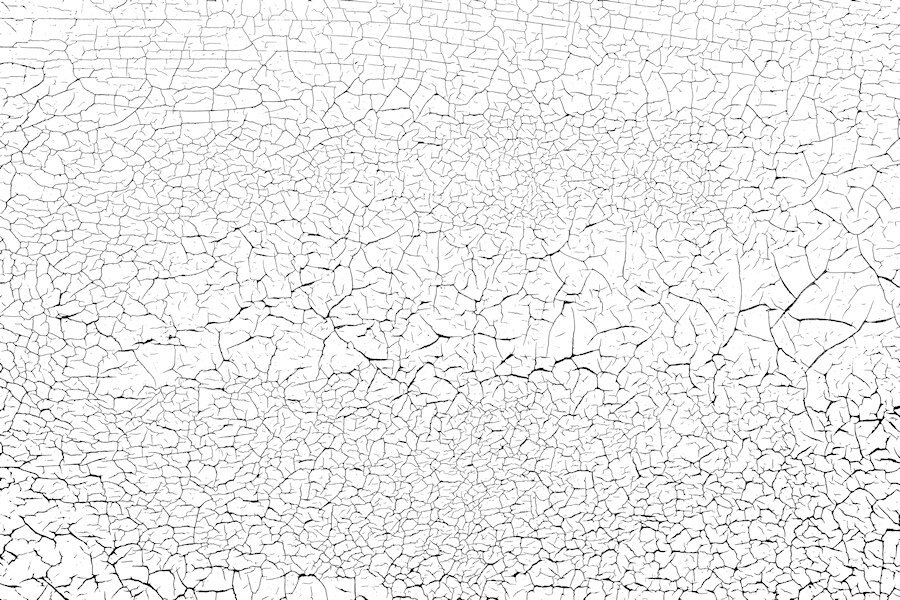
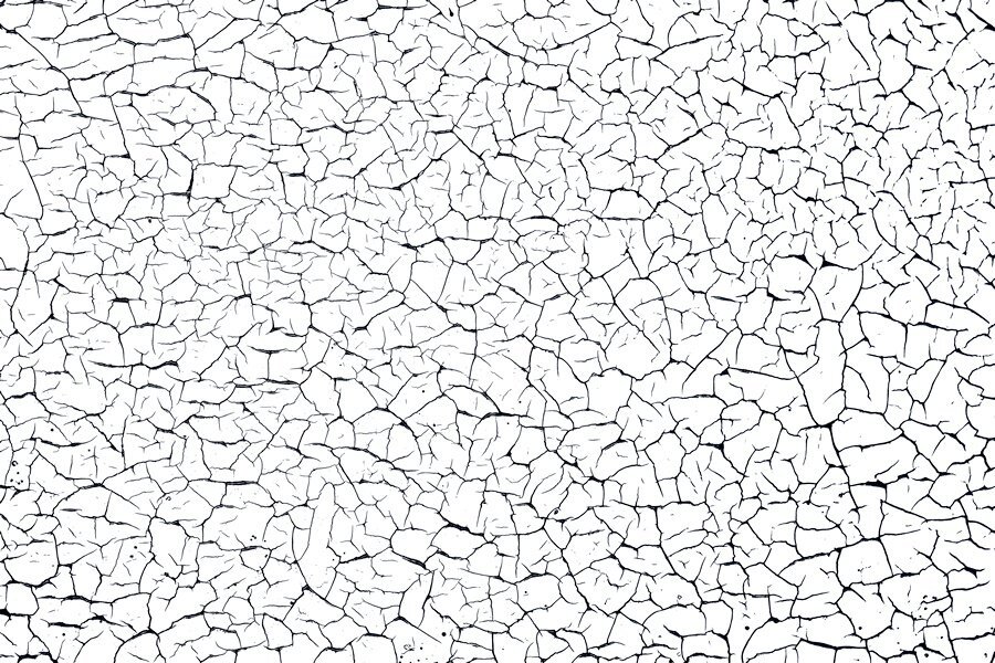
Here's another one I can also send. I shot quite a few (it's actually the horizontal slats on my garage door) different areas and will try shooting with my wide angle lens if it ever stops raining. I love shooting this kind of thing. Once I learn how to zip and use something like drop box I can send more and the orignal photos for you to make the overlay in the way you would like. these are reduced size so might not be that great. This overlay was made using a lower tolerance with the magic wand where the one above had a higher tolerance and produced thicker and blacker blacks. that's why you might want the photo as well.
-
1
-
3
-
-
Of course you can. Just home from work (late) and need to hit the bed. I will get to it tomorrow. I think I can put the file on the FB page. Do you want the overlay and also the original photo as well so you can make an overlay. I changed the brightness contrast when I was trying to make an overlay (never done that before) to emphasize the black lines and used different tolerance levels with the magic wand and got different thickness of black crack lines. to me they are a little too thick so next time I would try and contract a pixel or two and see what that does. I also just left the photo and did unspeakable adjustment with the brightness and contrast and came up with a cool paper on it's own. I'm just learning how to make them and guessed my way through it. Here is the one I used, a smaller sample. i will upload the full size file tomorrow.
I would love copies of what you made too.
-
5
-
-
2 minutes ago, Corrie Kinkel said:
And one more for my book. This one is of the village and the surroundings where my daughter lives with the places we visited there like Stanford University! I kept this page in line with the others qua style and font to get a somewhat cohesive look for my book.
Mary Solaas, thank you for the shield which I adapted for the road where I was. It made this page come together a bit quicker. I have one more to do and then I can assemble the book with all the individual photos and send it to the printer.
Love the background map paper. Good idea there.
-
1
-
-
11 minutes ago, Corrie Kinkel said:
Susan I like your layout and your idea to take photos of your garagedoor and use it for an overlay I definitively must remember. We don't have a garage anymore but enough other suitable places like the gardenfence.
I find myself looking at textures everywhere now that I know they are good to have for layouts. Finally the old wooden garage door is good for more than just opening and closing. we have a fence that needs replacing that has some promising textures too. Garden fences would be great, especially if they are old and weathered. Thank you for your kind words on my layout.
-
1
-
-
16 minutes ago, Suzy said:
Yeah, what was that triangle one? Part of PSP? I hope. Because I didn’t download that fractal program.
plus the texture on the sage green heart….how can I make that?
the germ or smoggy snowflake has two sides cut off, so 4 of the 6 points are sheared, Does the program do that? Or did you crop it?
If you look closely at the snowflake, it is all sheared off (all sides). In fact it would fit perfectly into a hexagon shape. It's pretty cool and would make an interesting mask. I like the papers and hearts too. Looks like an interesting program.
-
23 minutes ago, Mary Solaas said:
and 1 more
I really love this one. Is it fairly straight forward to use? what was it called again?
-
1 hour ago, Ann Seeber said:
I started by clicking on the tutorial on the bottom left from the center collection on my Edit workspace. It walked me through it. It turned out to be a combo of using the edit selection tool and then just choosing a background photo. I used one of PSPs built in suggested beach photos but now I'm on a hunt for suitable background for my icky bird photos that show mostly my parking lot. I'll display something once I'm happy with it.
I cant wait. I have an itchy old green corrugated fence in the yard this is often my "background". Be nice to change it. I'll have to find some time to try out those tutorials. I really liked what you did.
-
1
-
-
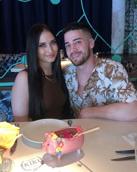
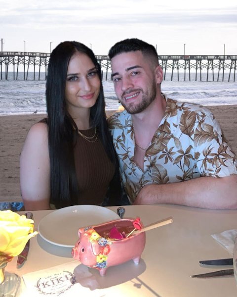
5 hours ago, Ann Seeber said:
I posted this under its own topic but in case you missed it, here it is, also. I was reviewing the Back Off Master Class when I realized with the newer versions of PSP we have Artificial Intelligence built in that promises to change backgrounds easily. I tried it with a photo of my grandson, Brad, and his girlfriend, Livia. The original background was quite dark and I replaced it with a beach scene offered by my PSP 2023 Ultimate. Here is the original and the digitally changed version.
This is really cool. I would have thought that's how it was, the only 'tell' was a piece of blue above the yellow flower. I wouldnt even know how to go about using this tool. Hopefully when I grow up I'll be as brave as you. (I'm not sure I'll ever grow up though ?)
-
1
-
1
-
-
3 hours ago, Michele said:
Thanks so much, Susan. First I used a black outline on the font. Then I added 1) a small black drop shadow at a low opacity and 2) a larger orange drop shadow at a higher opacity and moved it below the first one. Does that make sense? I'm glad you liked the low-opacity lady on the background; I thought it might have been too much.
Thank you Michele. The lowered opacity lady is that little extra that elevates the design. it's subtle enough that it's one of those wonderful discoveries you make while looking at the layout.
-
1
-
-
46 minutes ago, Suzy said:
Susan, this is wonderful. You have made me excited to do this lab!
Thank you. The flower is something you could really use in kits. I think they are really quite pretty. next time I do one I will make it bigger to start, so I can downsize or keep it larger without it getting fuzzy. There is tons of possibilities in the wire clips with different shapes. Enjoy the lab. they (the Labs) are a good challenge. And a good way to get some vector experience in a number of them.
-
1
-
-
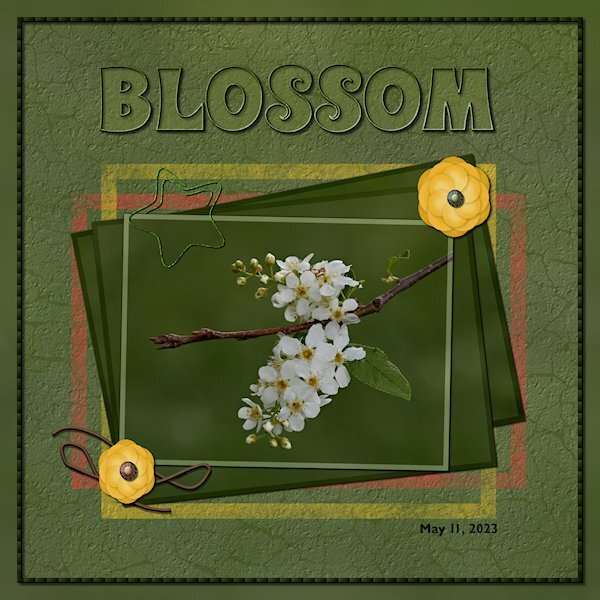
Back in the Lab again! This time Lab 6-9
- Wire Clip
- Flower 2
- Overlapped String
The wire clip was fun to make, making sure I read the WHOLE instructions on how to use the clip properly in my layout is another story. At first I thought my flower was going to be ho-hum boring but after getting to the end and adding the shadows and the color on the edges it really took shape. They are quite pretty when they are done. The string, well, let's just say I did get two parts overlapped. I wont be known for making fantastic string. I used the see-through technique on the title. And I used the painted frame freebies from the store blog. I put the same asphalt texture (or is it called cement?) on the layer so it looked like it was painted on the asphalt/cement. I also used the eraser tool to make it look scuffed up. The cracks are from my garage door that I photographed and extracted the cracks and made an overlay. Fonts are: Wonderbar 2.0 (title) from Creative Fabrica and Gill Sans MT for the date (windows). Photo is mine. two little brads on the flowers are from Gina Jones Delish Brad 09 (Digital Scrapbook)
-
7
-
4 hours ago, Mary Solaas said:
I really love what you did with the background paper. And, looks like I'll have to order the mitered frame script.
me too!
-
1
-
-
5 hours ago, Michele said:
The background paper I used is from CF's Tangerine Dreams set. I found the illustration years ago, probably on a Google search (the game is repeating the daily themes from 2016, but I'm trying to create new pics every day). I clipped the girl and added her on top of the background layer several times at very low opacity; I'm not sure if that made the BG look too busy. Cass's Mitered Corner Frame script is one of my favorites and saved me a lot of time creating this frame. You can't see it at this size, but the ribbon frame has a Multiply blend mode, letting the background show through a bit. The font is Anton.
I love this style of layout. The font has a darker glow around it, is that a layer style or drop shadow? i really like how you used the lady with the lower opacity on the orange background.
-
1
-


Quick-Page Workshop - June 2023
in Showroom
Posted
I'm in too. I might do the non scrapbooky layouts this time around. Or not. I dont know.