

Susan Ewart
-
Posts
3,884 -
Joined
-
Last visited
-
Days Won
119
Content Type
Profiles
Gallery
Forums
Posts posted by Susan Ewart
-
-
57 minutes ago, Sue Thomas said:
(Michele, what size image do you start out with and what are the settings you use for the Grid? (Totally clueless about grids..) ) It would appear I completely misread your comment. The size of your image I interpreted to relate to the vector element Michele created, to use the settings she used for the grid. You didn't mention FB page layout sizes, or scrapbooking layouts. This workshop is all about creating vector elements, to be used in projects. I will refrain from sharing any helpful suggestions or advice.
Please dont stop with suggestions and advice. You push me to be better, I appreciate it.
-
 3
3
-
 1
1
-
 3
3
-
-
1 hour ago, Suzy said:
All these overachievers on page 5! They quite put me to shame with their fancy work and creativity!! ?
Hahaha, yes, aren't we all wearing our fancy pants today. In fact, I just incorporated a business making hearts and arrows! Maybe I shouldnt quit my day job, eh?
-
2
-
 1
1
-
-
My attempts at lesson one. My problem was also getting two nodes when I was adding (i just did undo and it went away). The other problem is when I want to move the nodes I would inadvertently add a node or it would move the whole vector object. Do I have to click on the node to make it active then move it? What does the cursor look like when I can move it? I see squiggley line, a plus sign and 4 arrows. My heart comes to a weird pointy point, how would I get rid of that? Good lesson and I see how you can fiddle around with nodes for some time. Good idea from everyone who said use the grid/guide lines. I will try that. I need more practice. I see some very cool hearts and arrows from everyone. So cool to see so many posts when I got home from work.
side note: does anyone remember the spoof movie Airplane. The pilot says to the co-pilot, "What's your vector Victor?" hahaha. Now it's running through my head as I learn about vectors.

-
10
-
5
-
5
-
-
I use a mixture of what most of you have said. Sometimes I print and find it easier to follow along, or if I dont want to start and stop the video (I have two screens). I follow along with the video with the labs and will print something I've done before but have forgotten the steps and it's not part of the lab I'm just doing. I will sometimes print the blog PDF if I want to practice what it is teaching and dont know where a certain video might of a technique that is the same. I dont discount any ways of using tutorials, I got by what's right for the time. I do however want to start a list (digital or otherwise) of where to find the tutorials I use most often or want to use for sure, otherwise "out of sight out of mind".
I do confess to loving printed instructions and there is very few books on PSP so I would gladly purchase a book if you were writing one Carole.
-
1
-
-
2 hours ago, Cassel said:
Yes, you will. And although nobody is "graded" on their homework, it will just make sense for learning and practicing. I am sure some people won't do the homework, others will do them but won't post them. But I know that many of you WILL do both.
And to make it fun, there will be some variety in the homework so everyone's results will be slightly different.
And since I love you so much, the DIAMOND members get even more (optional) practice!
YIPEEE!
-
3
-
-
6 hours ago, Cassel said:
Isn't it amazing how many "silent observers" we have around? Hopefully, a lot of them will post in this thread so we can welcome them all!
FABULOUS! I hope to see some new names too.
-
2
-
-
7 hours ago, Rene Marker said:
That's why I download the pdf files for the master classes. I make notes on them.
I have downloaded as well, but never thought to make notes on them. Great idea.
-
2
-
-
3 hours ago, Corrie Kinkel said:
That is a good idea, although I'm pretty sure this has come up somewhere in a class, tutorial r workshop. Only I don't remember in which one; I once intended to make a list of all the different topics and where they are mentioned but I never did....
Me too, I want to start my own list of the techniques I use or want to use but it never got as far as my thinking about it. And I know I've done the cutout effect and seen in possibly several videos but cant remember when or where. I should be making notes as I watch masterclasses, but then I'm so busy writing I dont see what's happening.
-
2
-
-
4 hours ago, Michele said:
Thank you so much, Susan. I think the beveled look is due to using both a cutout layer and a drop shadow. I use the 3D cutout effect fairly often without the interior fill. It gives what might be described as a drop shadow that is applied evenly inside an empty space. At least that's how I use it. If you go to Effects: 3D Effects: Cutout and click on the Help button, it will open a page in the PSP Help database showing you how to use it. I'm not a great teacher so maybe Cassel can address it, perhaps in one of the Q&A sessions.
thank you Michele, I will give it a try.
-
1
-
-
49 minutes ago, Suzy said:
Susan, that’s really interesting on the background remover removing it to a solid white color. Not useful for the bulk of our projects, except that picture of Magic’s tea party. With a white background, Ann Seeber could use the same garden background and set Magic’s pic to screen, I think, but maybe it’s multiply. One lets the background show thru white.
I’m at the App Store, looking at Adobe Express, but being that shiny things capture my attention, I saw Adobe Scan + OCR in the same listing. “Oooh”, I think, “that sounds perfect!” Well guess what? I was looking for a trap because you had found one (IMHO) on that background eraser.
You can do the OCR just fine, but you can’t *do* anything with it because it puts it in .jpg format - a picture of text. Might as well take a picture of it. Or .pdf format. Where you need to PAY MONTHLY for being able to manipulate the text. I’m thinking of scans I could take of text for my newsletter, but either thing, .jpg or .pdf would not be helpful since you know 99% of the time, it would be the wrong size for legibility, or too wide or narrow as a block for the amount of space. Plus I usually edit heavily because my contributors talk and talk… ooh, look how long this post it, ROTFL,
!
that's my problem, I see something or someone talks about something new and shiny and I just have to have it. then I never use it. It's my downfall. I'm trying to narrow my learning for a little while and learn what I need to learn even when I dont know I need to learn it. hahaha, both of us with similar names (and similar last names) are quite wordy. that's hilarious. I'll be quiet now...because I have to go to work. But you can sure, I'll be talking a lot there.
-
2
-
-
1 hour ago, Corrie Kinkel said:
Susan I have the same problem. I already have an Adobe account from way back when I needed one for reading ebooks but I never looked at Adobe Express. So now I did but like you I find that I have to learn a lot and I don't think I have the time nor the gusto to study a new program while I have so much more to learn about scrapbook. For the time being I stick to PSP. Maybe if you and others are getting exceptional lovely results I''ll change my mind
I'm more with you. PSP will get better and more than that, I will get better at using PSP's tools. I feel the same, it's another program to learn, taking me away from PSP. I dont want to be mediocre at several programs when i can strive to be good at one program. It's one of the hardest lessons I've had to learn. I'd have saved a lot of money if I'd realize that sooner in life. If someone is familiar with the Adobe products already then it's a no-brainer for them.
-
1
-
1
-
-
I tried the Adobe Express. Some learning required. I managed to make an extraction, it did pretty good. Only I cant figure out how to get a transparent PNG, it puts it on a white background. I did my own extraction to compare. Mine does result in a larger size, but it's sure fast to do it with Adobe. I just need to learn yet another program. ugh. Now that I have a shiny new Adobe account I should take the plunge and download Bridge too. When will I have time for PSP.
-
1
-
-
5 hours ago, Michele said:
Playing with layers, cutouts, shadows, and Gaussian blurs. Sometimes creating something in the right dimensions for FB takes some work. The original painting is by Anna Ewa Miarczynska. The font is Black Chancery; I've had it so long that I don't know where it came from, but you can find it for free as it's in the public domain.

I'm always blown away when I see your layouts. this is really beautiful. I did a layout recently where I had turnd off the frame layer to see something and saw that the shadow layer on it own looked better than having the frame layer. Your frame also has a beveled look, is that because you used cutout. I dont quite understand how to use the cutout even though i think I used it in some of the tutorials. So much to remember with PSP.
-
1
-
1
-
-
Love the rhyme! Great picture, the smiles say it all.
-
Congratulations Bonnie! What a great accomplishment. Maybe we'll see some scrap layouts from the games?
-
17 minutes ago, Donna Sillia said:
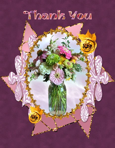
Yesterday, a dear friend brought me this beautiful bouquet. I decided to make a "thank you" card with an extracted picture of the bouquet. I used Adobe Express to extract the image since I have found that Adobe Express does the best job of extracting that I have found. I used vector tube to make the oval using the cass tube, gimptrim2 and under that added a circle filled with one of my gem glitters. The patterned shape is a preset shape filled with one of my patterns. I made the shape in back using the preset star with a little node moving, filled with a gradient and stroked with my glitter gel. The roses are from a package that I purchased and changed to gold using the gold tutorial. The mask was made using rastertomask, and the background for the vase is from Filter Forge. The font is Ambidexter filled with a seamless flower pattern that I made with the cass seamless pattern script. I tried to make a velvet pattern from the tutorials, but wasn't very successful.
I am loving all my scripts which save so much time. I am learning so much!
WOW! This is really interesting. I love the glitters! You can never have enough glitter. And that preset shape is really neat as well as the pattern. I've never used Adobe Express before. I will have to look into that.
-
1 hour ago, Julie Magerka said:
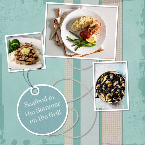
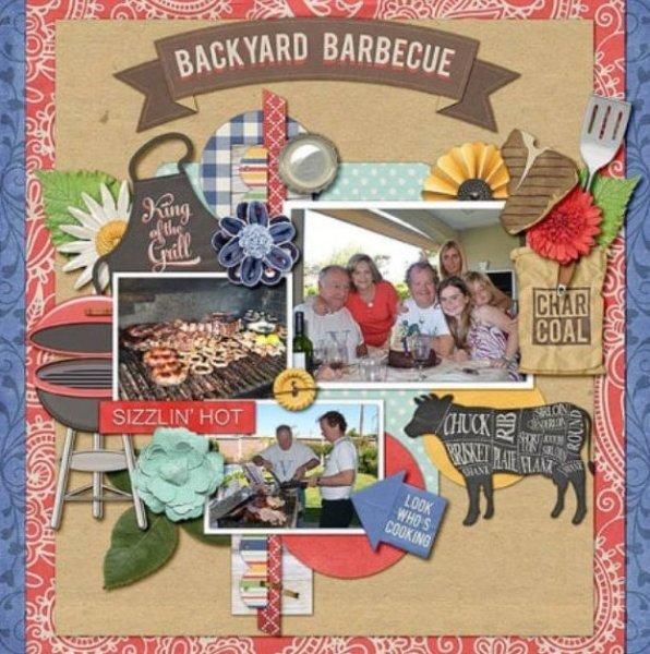
I was glad to see something I could work on with this scraplift. My layout is loosely based on one of the grilling examples in the July theme (as pictured). I was more interested in colours than in theme. The edge overlay is from Billie Irene at DS; the photos all come from online; the tag and string are from my stash from DS. And, I do adore seafood, cooked on the grill or any old way.
That is great. It looks like an advertisement for a restaurant. Really good design Julie.
-
1
-
-
I will try. I'm shooting flowers this week, they are colorful so it will be fun trying to change colors and see how they turn out. I'm shooting on Black, white (for easy extraction if I want) and on grey (for blend modes). That is if they turn out okay. Tripod, cable release and manual focus...YIKES!
-
2
-
-
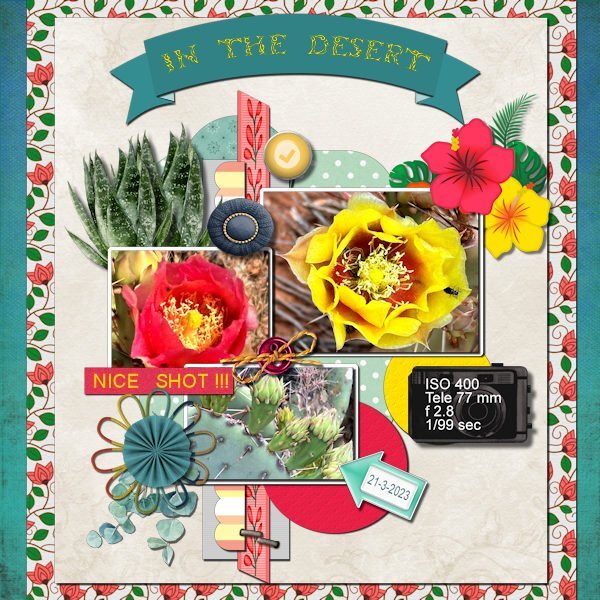
47 minutes ago, Corrie Kinkel said:
This is the layout I choose for this scraplift and the result. I had a hard time choosing one of the 8 layouts given and in the end I choose for one a bit out of my comfort zone. Mostly my pages are not so busy. To get all the colors working together I used the Hue Map a lot. Thanks to the Q&A of last weekend I finally know how to use that map, it was an eye opener and now it so easy to use!!! I didn't made all the papers and elements myself but used the things I have in my stash or had made on another occasion. The photos are my own and a lot of the papers/elements I used are from Marissa Lerin and from a blogtrain (May 2021). The fonts are Arial and Tribal Case for the title in the banner. Had I realized when I started that it was a lot more work then I anticipated I probably would have gone for one of the less busy layouts.
Corrie, this is outstanding! The colors are perfect. I am looking forward to getting better results than I have a had with the Hue Map. It seems like a powerful under used tool.
-
1
-
1
-
-
4 hours ago, Michele said:
I always keep a pspimage file with all the layers. That way I can edit the font to reflect the new name.
that is a good idea. then I'd make a duplicate and make the quick page from the duplicate. But I would not put any text on the quick page, that would be added after, according to the occasion. Since I am notorious for forgetting birthdays I don't have to worry about making a quick page for such occasions. ?
-
2
-
-
6 hours ago, Jannette Nieuwboer said:
Sorry, I can't be behind the pc long as I have a slight inflammation in my eyes. I'm wearing sunglasses all the long, also in the house. So colors al slightly false. So no PSP for this lady. Today is our wedding anniversary. we are 55 years married. I buy a few cakes.
Congratulations on your milestone anniversary. Sad to hear about your eyes. I hope you have a speedy recovery.
-
1
-
-
38 minutes ago, Donna Sillia said:
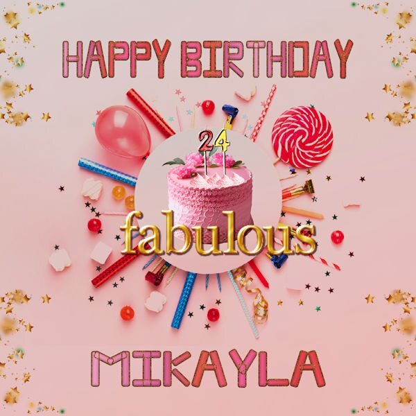
When my FB friends have birthdays, I have been creating files to post on FB. This is the latest one for my niece. All the graphics are downloaded from Adobe Express AI, except for the "fabulous" which is from a Digital Scrapbook kit called "all the princesses" by Melo Vrijlhof. The font is a free font called Moodtype. I am working on a way to convert this file to a quickpage. Any suggestions would be greatly appreciated.
To make it usable for any occasion you could leave out the text and make the circle in the centre the photo area (transparent) and leave the rest as is, with all the shadowing etc. I love that centre part and the stars at the corners. This will be a great quick page for many different occasions.
-
1
-
1
-
-
5 hours ago, Michele said:
I found a wonderful editorial beauty photo shoot that I felt was perfect for the theme; model Kristy Kaurova and photographer Jamie Nelson. The font is Spac3 tech. I had a happy accident while making this. I originally created a frame with the background paper and added a cutout layer. While playing around with the layers, I hid the frame and ended up with this look. I'm probably not the first to use an effect like this, but I learn a lot from my happy accidents. When I find more time, I'm going to experiment with it more.
This is fabulous. The photo is perfect for your title. I love that green too. Your happy accident is very cool, it a great feeling when you stumble upon something. I wonder if those "accidents" are the universe's way of reminding us to remember to explore and discover.
-
1
-
1
-
-
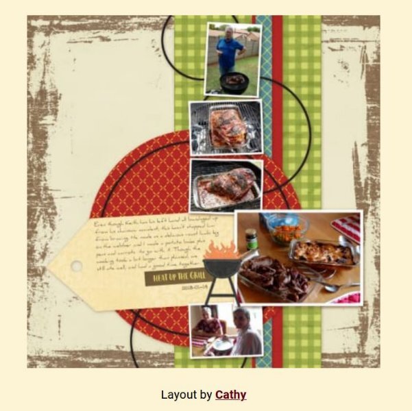
6 hours ago, Corrie Kinkel said:
Wow Susan, you excelled with this layout, so many things to look at and colorful too, just a "real" game.
Thank you Corrie. Normally I struggle with ideas or design. But when I get one, it's a joy to run with it.


Vector Workshop 2023
in Showroom
Posted
These are awesome!