

Susan Ewart
-
Posts
3,884 -
Joined
-
Last visited
-
Days Won
119
Content Type
Profiles
Gallery
Forums
Posts posted by Susan Ewart
-
-
4 minutes ago, Jannette Nieuwboer said:
I couldn't find suitable photos for this commission. so I had a look at my stock scrap kits. I have first resized the original as I'm used to working on smaller boards.
I played with some scripts (got the most from here) number 1 is the original, and number 2 is photo edges, number 3 is the dot method.

These are so awesome. I never thought to do that to a completed layout. Great idea.
-
 1
1
-
-
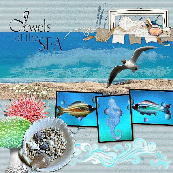
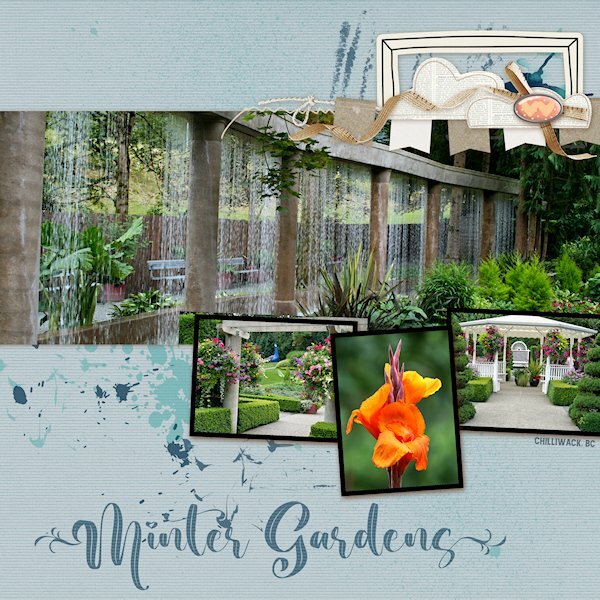
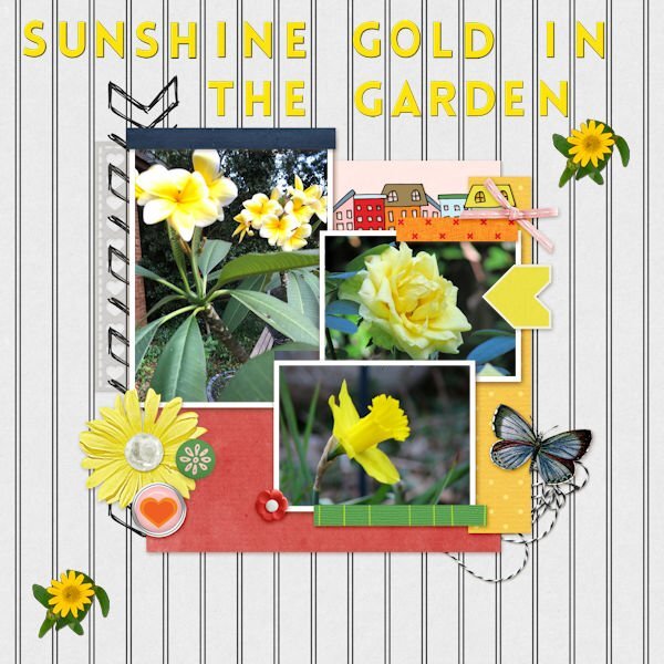
QP Lesson 4
I'm still doing a deep dive into old photo files. This was (and is no more ?) a garden close to where I lived in BC. It was a beautiful place to walk around even without a camera. It was very peaceful there. I did not change anything on this layout and only added text.
Fonts: Beauty Nature and Amnestia Normal (creative fabrica)
PS Beauty Nature has some nice glyphs, it's described as a "leaf" font. I used a glyph on the first and very last letters. It's from Creative Fabrica I believe.
-
 3
3
-
7
-
-
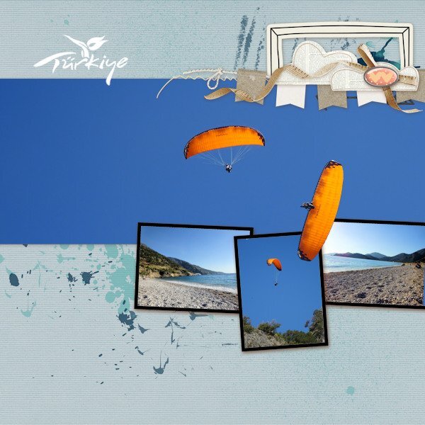
1 hour ago, fiona cook said:
I've just managed to create one page so far for Lesson 4. This year we had a short but lovely holiday in Turkey. On the beach all day, the power gliders would be landing having taken off from the huge mountain behind us. The angle of the power glider image that I have placed on top of the frames is the actual angle he/she was flying...crazy guys.
The Turkey tourism logo was a white on black background and using the 'Screen' blend mode in the layers palette it turned to a white logo with no background. Perfect!
This is stunning! love the colors. Photos are perfect for this layout and a glider on the loose I see (out of bounds technique?). Great idea.
-
1 hour ago, Mary Solaas said:
I'm now on Day 3.
Wowzers Mary, beautiful and great color combo. I might have to make that FB header.
-
 1
1
-
-
They are so cute! Yes, I need to remember...this is supposed to be quick. But it's oh so fun to change stuff...cause we can(more likely we cant help ourselves). Have tools, must change "stuff". ?
-
 2
2
-
-
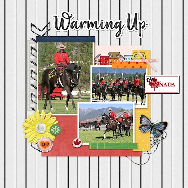
QP Lesson 3
More from the RCMP Musical Ride. These are some warming up shots and one just before they get lined up to parade in to the arena.
I used extra elements from KMRD-The great White North (brad 1 and CANADA with Maple Leaf)
Fonts: Afifla (words 'Oh' & 'Eh?') and Aesthetic Violet for the the title, both from Creative Fabrica.

-
4
-
9
-
-
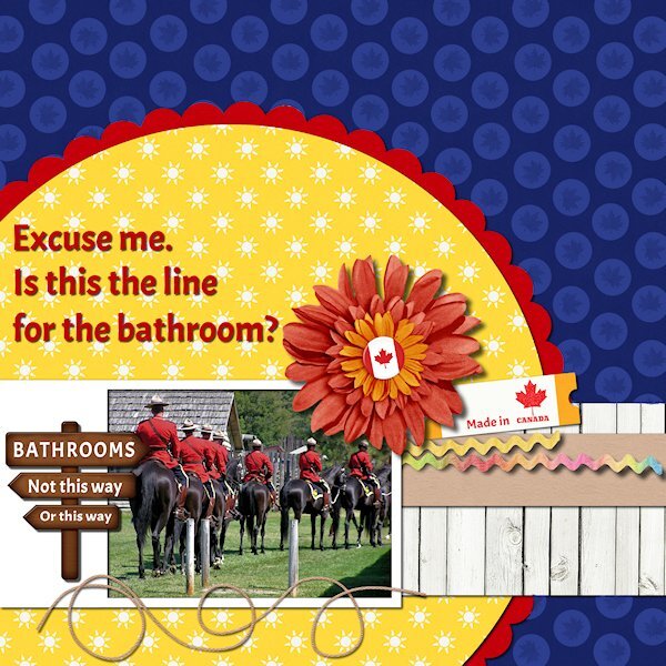
QP Extra Lesson 3
I managed to get one made today. Came across some old photos circa 2005 (pre-DSLR days) from Ft. Steele Heritage Town in the Kootenays (British Columbia). I used the brush tool to put circles over the anchors as it didnt fit. I added a maple leaf to the circle for some texture. Changed the sign (I used the clone tool) and added a few Canadiana items. I had fogotten about these photos and laughed when I saw this one. Looks like they are all lined up for the bathroom.
Font is Acme, I think it's a google one that came with my font viewer. Onto the other lesson 3 QP.
-
2
-
8
-
-
2 hours ago, Suzy said:
Susan, I love this! I went to go get the font at CF and it isn't hollow. For some reason i expected it to be hollow based on this.
So my idea is to have Cassel write a script to make a plain old font like Amnestia become something like this. All she really has to do is get close, and the person can tweak it. Is this correct, do you think? It looks a little like and outline + enamel, gradient, and a tiny shadow. easy peasy! :))
Aww, thank you Suzy. I followed the See-though tutorial, but this font mis aligns, so having a script would be awesome. I forgot to say BIG THANK YOU for the making the cracked paint image whiter (and the blacks blacker) and you fixed the out of focus spot too. I think I need to get that script if I want to keep making overlays.
-
1 hour ago, Cassel said:
Yes, I will have to find a picture of the cliffs and rocks from around here! About the misalignment issue, are you using PSP2023? I have noticed something like that affecting some fonts, but not all.
I do have 2023 but have gone back to 2022 and that's where it didnt work. I wondered if it was the font that could be an issue. I've had other font issues where part of the font is cut off so it could be the same thing. I did it before in 2022 and in 2023 so it must be the font.
-
I've tried (just now) all the links in the forum and the email. I only get the collage. I'm quite happy to have that instead as my trade off for a FB header.
-
2 hours ago, MoniqueN. said:
I love the way you used the lines on the mat to add your text ?
Really nice color combo.
-
2 hours ago, Sharla said:
The photos are from pexels.com. Again I couldn't resist a little tweaking and added 2 rectangles filled with the blue on the quick page and some text - font is courgette.
Adding the rectangles and fonts look great.
-
1
-
4
-
-
42 minutes ago, Mary Solaas said:
Kasany - WOW - You just WOW me every time with those fractals.
I know, right. Keep them coming!
-
QP Non-Scrap Lesson 2
I didnt have any people to congratulate, so I put a floral shot instead. One could say it's congratulations to getting through all it's stages of life and sending it's babies out to the world before the lawn mower got to it.
-
3
-
2
-
6
-
-
Quick Page Xtra - Lesson two
I did so much stuff to get to this color (for the Quick Page) that I wouldnt be able to replicate it. I just tried different tools to make changes and went back and forth to see where it would go and ended up here where I liked it. I did duplicate the QP and added a blend mode and ended up with a nicer blue than I had and a whiter white on the one paper. I tried to use the see-through-letter technique which I used recently with no problem. today the outline misaligned everytime. I ended up getting it to work a different way so I could add a bevel to the outline. I've done it several times with no issues, but tonight I must be missing something. Photo is from the same beach as the other quick pages.
Font is Amnestia Normal (Creative Fabrica)
-
4
-
 1
1
-
11
-
-
Lesson 2
same locations as lesson 1. Fun times walking all over the rock formations. I think you have really interesting rock formations where you live Carole. They seem bigger, or older or something like that. I didnt change the QP at all on this one.
-
4
-
8
-
-
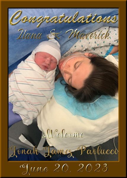
3 hours ago, Ann Seeber said:
Well, this is perfect for my BREAKING NEWS! Introducing my 4th great-grand, born this morning, it's a boy, Jonah James Paolucci. Parents are granddaughter Ilana and hubby Maverick, also Logan now has a little bro!
Contratulations Ann!
-
1
-
3
-
-
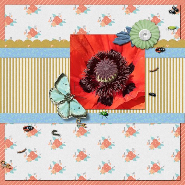
36 minutes ago, fiona cook said:
Like your idea Susan with the bird prints so I have made a version with my photo on the QP Extra image. I used 'Bugs' Picture Tube and dotted them about.
Wow Fiona, stunning photo! And the bugs are a perfect fit, even if I'm a bit squeamish looking at them.
-
1
-
1
-
-
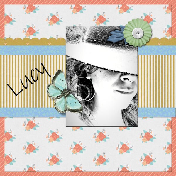
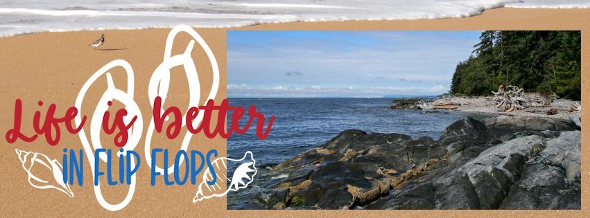
54 minutes ago, Ann Seeber said:
This time I did all 3 layouts for QP-1. First is a new bird at my feeder, well, actually, a regular but in a new color morph. Never saw an orange-headed house finch before but Merlin confirmed my sighting. This is the Merlin photo. The alpha is Fiesta from Annie Tobin-R.I.P. The text font is Ink Free. Second is the flip flop banner, featuring my daughter's flip flop birthday cake from last September when she turned 60. I used a gimp picture tube for the top border. Last is my granddaughter-in-law, Lucy, mother of Magic. I thought the black and white photo went well in the busy layout. I enlarged the photo area with my eraser tool.
That house finch is a "ginger". I love the flip flop cake, that would be perfect for my sister-in-law and niece who live in flip flops (how do they walk in them, I'm always tripping over my feet in them). I never thought to enlarge the photo space, good idea. Love the black and white photo.
-
1
-
-
QP FB template Lesson 1
Again, another shot of the beach. You can walk for miles there with sandy sections and rocky sections to explore. I miss living near the ocean.
-
4
-
6
-
-
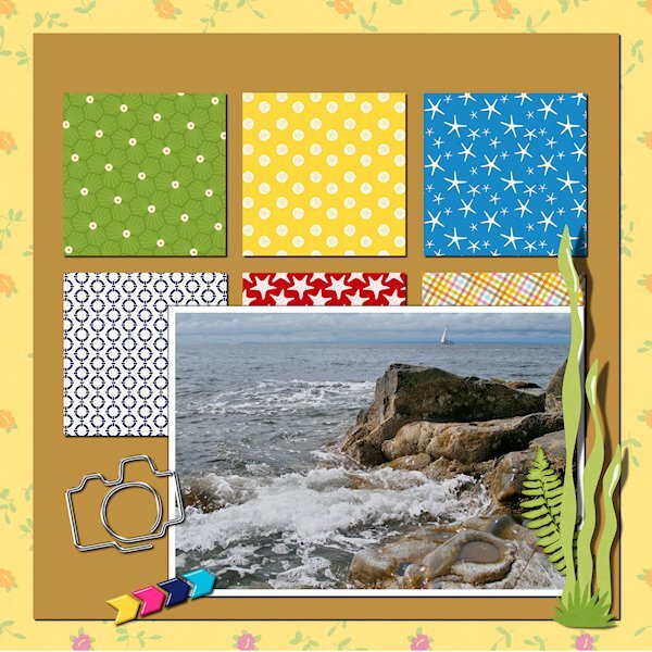
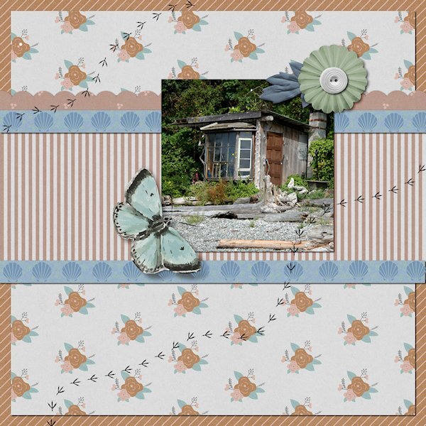
QP Extra Lesson 1
This was another little odd shack we came across on our walk. I would love to see inside these places. My friends cabin had been in the family 3 generations and they have a sizeable property going up the hill with another cabin and creek beside that they had the water rights to. Because of the close proximity to Vancouver, there is now huge mega houses on this beach. I love the quirky odd shacks, too bad they are all gone now.
-
5
-
7
-
-
QP Lesson 1
Front used: Brush King
Photo: mine from 2007, Visiting at a friends cabin in Gibbsons, BC. Also known as the Sunshine Coast along the Straight of Georgia. It is 31 kms from Vancouver, BC and 40 minute ferry ride...even though it's actually on the mainland BC and not an island. My friends cabin is right on the beach (Pacific Ocean) and this was one of the old cabins we came across while walking on the beach. All you could see was these three windows and bit of the roof, the res was covered in greenery.
-
6
-
7
-
-
47 minutes ago, Julie Magerka said:
You're really cooking in the kitchen with all these great lab results and projects. Way to go!
They are a good challenge and keeps me focused on actually creating something, instead of sitting down and staring at a blank screen and not knowing what to do.
-
3
-
-
21 minutes ago, Ann Seeber said:
Thanks, Cassel. I'm pretty sure I got your 60%off discount in FF10 so the price was under $25. I'll study these two classes and hopefully, in the future, there will be a week-long workshop so I can hone my skills. ?
I'd like that too. I dont use it as often as I want. I still have much to learn about PSP. It's hard to find the time to fit everying in that I want to learn.
-
2
-
3
-


Quick-Page Workshop - June 2023
in Showroom
Posted
I love the color version.