Susan Ewart
-
Posts
4,245 -
Joined
-
Last visited
-
Days Won
141
Content Type
Profiles
Gallery
Forums
Everything posted by Susan Ewart
-
I love this and would never have thought of any of it. Great job and it's a really cool font.
-
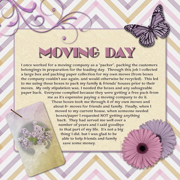
Day 7 I used the pretty finished page. Although, on the lower right hand side by the pink flower, there is a weird line. Does anyone else have that? I happened to have a recent lilac photo and thought's I'd use it even if it has nothing to do with the subject of the journaling. I wanted to try the technique. I like it. I hope I remember it so I can use it again. I did all of it in 2022 and forgotten how nice it is to be able to right click on a selection and move it. I'm so used to using edit selection and the pick tool to move (or resize) my selections. Fonts are Marline (title) and Marko One (journaling). Thank you for this workshop Carole. there was techniques (feathering) I had forgotten how to do.

-
I grew up with a girl who's mom was from the Netherlands (not exactly sure - my memory isn't what it used to be, or maybe it never was😄) and she thought her didn't have an accent. Her mom had a strong accent, yet clearly understandable to us. I think I might find it unnerving if I did hear my parents voices...would I even know if someone played the voices to me without telling who it is. Thank goodness for photos, they are my memory's storage system.
-
I love your style so much. I know what you mean, having to look at photos to remind you. I wish I had taped my parents voice, I don't remember the voices anymore. Makes me sad.
-
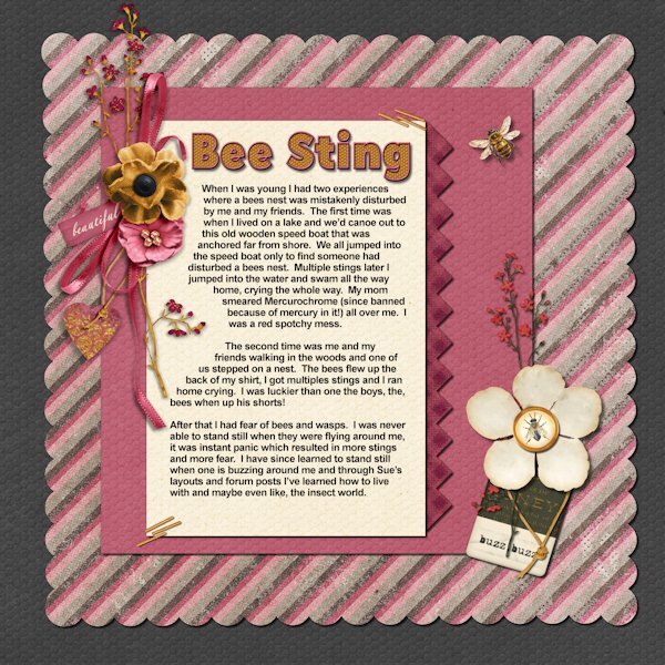
Day 6 I use Jessica Dunn's bundle, "Heard the Buzz", except for the bee that is from Creative Fabrica. the font for the title is Hillray Reg. (probably CF) and I duplicated the vector, added more outline and had not fill on the second version. Convert them to a raster so I had an outline version and a fill version in raster form. I used Inner Bevel on the outline and Used Effect>Texture Effects>Tiles (hexagon shape) on the fill layer - I learned this from Digital Scrapbooking Made Easy book. I'm already referring to the book for techniques.
- 229 replies
-
- 10
-

-

-
This was me also. And going down the stairs to the basement, the light was at the bottom. when I had come back up I had to turn the light off, then go up the starts. Soon as I flipped the light switch I raced up the stairs so nothing in the dark could get me.
-
What a beautiful story Corrie.
-
Me too, I have never even seen or heard of some of those games. I know I would have liked them.
-
Yes, i was using 2023, then I tried 2022 and 2021. So it's something I'm doing wrong. The sad thing is that it took me 2 days to realize I could just add the fringe with the brush tool. If I just clicked the eraser once it erases, if I right click it would un erase. But to do it in the already deleted selection, it just wouldnt do, either with the selection selected or deselected. I truly think it is a step I'm doing out of turn.
-
Me too, she is my favorite at the moment. Currently using another one for Day 6.
-
you crack me up! Being the "good" Canadian that I am, I failed French in the most spectacular way.
-
Here's my day 5 again, fixed. I dont have time to take over the world today, as I have some folding to do. PS...My husband asked if my "coup" involved locking my parents in the basement and taking over the house. I said yes, so you better toe-the-line or there might be a take over in this house too! 😨
- 229 replies
-
- 10
-

-
-
Yikes, Susan the overthrower of govt's. Thanks for the heads up. Now that I read "coop" and "coup" (and we just discussed this in this very forum a few pages back). I stand by what I said before, "English is weird!". It will be a no-brainer, since I did it in 2022, if I had done it in 2023, I'd be crying right now and it would just be easier to overthrow a govt than it is to get 2023 to text wrap...am I right? Glad to know you got my back. Get your pitchfork and come help me overthrow a govt.
-
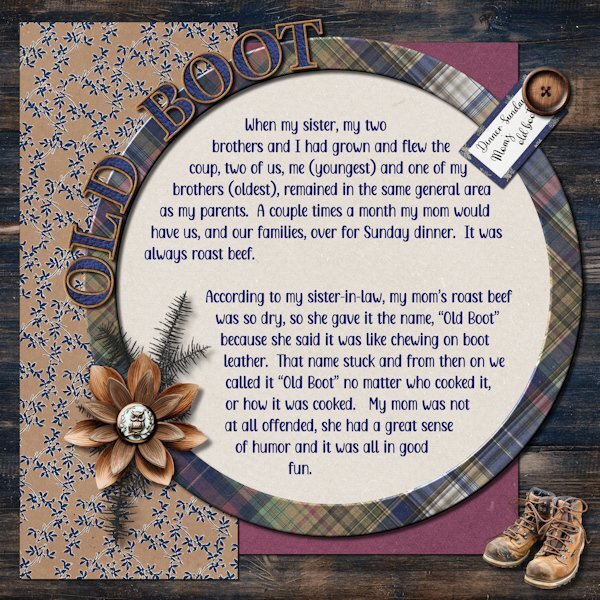
Day 5 Fonts are Adorable Mother and Adinda Sayang. I used Jessica Dunn's Wildwood Thicket bundle for everything except the boots that I found on Vecteezy http://<a href="https://www.vecteezy.com/free-png/hiking-shoes">Hiking Shoes PNGs by Vecteezy</a> the Alpha is by Marisa Lerin and just says it's called Alpha 59 cork. I filled in the middle with a leather texture. Again, used 2022 for the wrapped text for a more smooth workflow. This is one of my favorite templates so far.
- 229 replies
-
- 11
-
-
-
-
I would love doing this!
-
Wow, these look like the real deal. great job.
-
When I moved out with my husband I thought a good wife made liver and onions once a week. So I did. My hubby thanked me for dinner then quietly asked me to never make it again. I was so glad, because I agree totally with you. I love meat (beef especially) but organ meat is just wrong!
-
My brother loves this stuff. I eat it fresh as salad, but seeing it all soggy and wilty in a can makes me a bit gaggy. I gave my brother a can of spinach for his 50th birthday (among other stuff).
-
new and Knew gave me a laugh. English is weird. Sad for the kids in from your church.
-
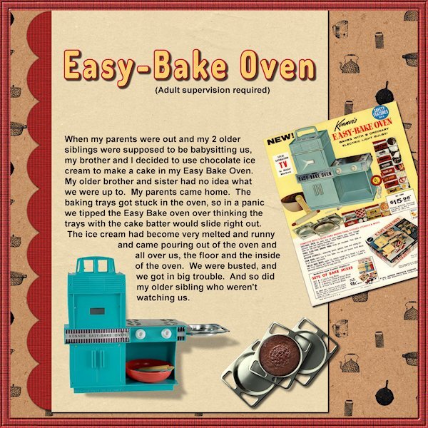
That's so awesome. I have a little Christmas ornament (Hallmark) of this very one, it has the box and everything. I've had it over 20 yrs now and it still has the cake smell.
-
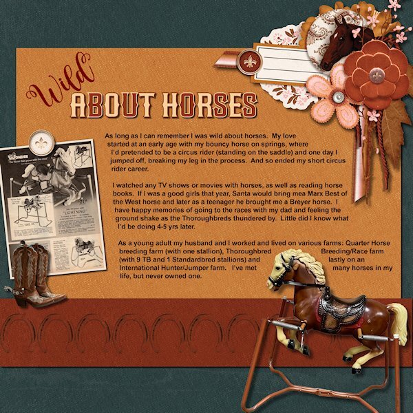
Day 4....only 3 more (it's rhyming day in my house, for me and my spouse 😄) Kidding aside. I wrote last time about the sports I liked as a kid. This time it's just something I was crazy about since I can remember. Horses! Who doesn't love the majestic horse? Fonts used are Best Baru and Blustina (CF). I used a kit from Jessica Dunn called Wild Horses. The bouncy horse I found on a google search and extracted it as well as the Sears Wishbook page for 1968. I don't quite remember what my bouncy horse looked like but my parent would have bought it from Sears. the cowboy boots and horseshoe (blended into the strip at the bottom) came from Free Pik. I look forward to learning how best to shadow stuff like the horse, does the shadow go below the horse or how using the shadow effect as normal. Is this a horse laying on it's side on the page or standing up like it looks like? Using three dimensional elements makes it more complicated.
-
Day 3 At this rate I should be done the workshop in about 2 weeks. 😁 I found on the web pictures of the color Easy Bake Oven I had and extracted it. Also I found a pan and extracted it and a cake that had the right highlight, extracted it and put it in the cake pan. Even found old advertising. tried to be fancy with shadows (and failed). the top cake pan I did lighter and bigger because it's sitting on top of the bottom pans. The Easy-Bake Oven shadow I took a wild guess. I am looking forward to doing the shadows workshop and trying the shadow on the oven again.
- 229 replies
-
- 11
-
-
-

-
Wow Michele, that text on a path around the candle is awesome. I laughed at giving your brother your second L in you name. My mom's last name was Sears, which people would of course ask...THE "Sears" and we'd say, yes, we are the poor relatives (compared to Sears at the time, now they are gone in Canada).
-
Me too. I wish they'd spend less time making their uber fabulous resource hungry AI better and just make what used to work...work! The more AI stuff a program has the more power it needs to run properly. And the more money I have to spend on upgrades to my computer.
-
I'll try this way, it's what I'm actually doing but soon as I go back to the original (to fix a spelling mistake) it goes to one line and especially when I duplicate the original goes to one line right away. Did you leave the selection selected before duplicating?