Susan Ewart
-
Posts
4,245 -
Joined
-
Last visited
-
Days Won
141
Content Type
Profiles
Gallery
Forums
Everything posted by Susan Ewart
-
Stunning Sharla. My kind of photo! Dont you just love the side lit and back lit flowers? Mother Nature is the earths first artist. We are artists capturing an artist in action.
-
I'll check that out, thank you.
-
I think we would all love that, it must've taken some time and a lot of patience to make it so precise. Daniel, you did a superb job on it. There is only one question left to ask.... Where's Canada? ...we NEED that too!😁
-
That's fabulous Corrie. There is so much variations in the color and the veining looks so cool. Petunias remind me of my mom, she always had them.
-
We also are heading back into to rain next week. Should be sunny and in the high 20's (Celcius) by now. the sun really helped my plants sprout up.
-
Wow Donna, that's a STUNNER!
-
me too. I wonder if it locks the settings in no matter if you try and change them in the F11 Variance palette. oops i just saw Ann answered it for you. I was WAAAAAY off.
-
me too. Echo is a grey tabby and Zeppelin (older now and does really wander anymore) is a black fuzzy long hair dude. My black cat (Sumi) is in love with Echo, so you can imagine her surprise at him attacking the window screen (he's actually a chicken and make all these noises if a different cat comes into the 'hood). we usually head out the door to stop the meeting. They have a Chow named Jasper, barely ever hear him bark.
-
I love that, it's moody and mysterious. Beautiful shot.
-
Good ideas. Echo and his brother Zeppelin have been part of my backyard landscape since their owners moved in. While I don't like it (especially when they try and attack my cats through the window screen and Zeppelin sprayed my downstairs window - with white frames, that are now spotchy yellow!), that they hunt in my yard and use it as a giant litter box (I dont care if they "go" in the bug hotel....the bugs probably think it's a feast), I want this to also be a cat-safe yard as we have lots of coyotes around here. And the neighbours are great people. We usually just knock on the window or go outside and call his name and he knows it's time to go home. And I don't have weed...that's the main takeaway for me. You'd almost think I planned it this way. 😁 I love what you are doing, it's so awesome that you take action and care for these disadvantaged cats. It's sad to think they have to survive all the seasons, the predators and manage to feed themselves. I'm glad my girls are safely inside! the world outside for cats is scary.
-
I agree, and some weeds are quite pretty. I also have a bug hotel (very exclusive!), well, it's just some logs from the dead parts of a tree we had to cut off (now the tree is spindly but doing fabulous). The Magpies keep eating the guests at the hotel! So, it's a stay-at-your-own-risk kind of hotel. I'm lucky my hubby pulls the weeds, I don't because the neighbours cat does his business in the garden 😪. My husband has a stronger nose, and his icky-factor sense is higher than mine.
-
I like what you do with the layer styles. You have good control. I find I'm usually having to put it so low in the settings, wish there was more fine control on them.
-
Julie, what a wonderful thing. It must have felt surreal for her.
-
That's fabulous Mary!
-
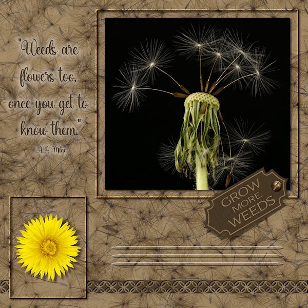
Here the sketch I did. Pretty much followed the sketch. The three photos are mine (one was extracted- yellow dandelion). The little tag was a vector shape I made in the first Vector Workshop. I made frame by promoting the background layer and gave them a bevel. the lines below the tag are the effect>cutout and i used a vector ellipse shape to have tapered ends. It's the first time I made something I could use "Selection from Vector Object". The background paper is a photo I did of dandelion seeds on a black background. I first did negative image, then used a blend mode, then I think I used HSL and reduced the opacity or something like that. the bottom tiling is a CASS punch (cass-Edge12), then a small inner bevel and small shadow which made it stand out more. Fonts used are Adorn Copperplate on the tag and Amanda Sunshine for the quote. Both from Creative Fabrica. My text tool was acting very strangely today. I couldnt move it or resize it, it would just jump back to where it was. Also I used cass-screwheads picture tube for the screw on the tag. I'm not sure about the quote. I couldnt find any color that showed up well against the busy background. I tried the paint behind technique but I did a dismal job at it so I used a layer style so the quote would at least be readable.

-
So beautiful Corrie. I love those soft tinty colors. At long last summer has arrived for you. I think we had our two days of summer and now it's fall, with constant rain.
-
Thank you for the link to the flowers. I'd have loved being in that class. A sense of humour makes life so much less stressful. it must've been fun watching the students, knowing what was coming.
-
Works great for the rest of us!
-
Thank you Fiona. It was fun to do. The colors of the photo work well for the top portion to get a texture to look like matching paper where I could write my message to her.
-
Wow Anne, this is so cool.
-
I got 9 out of 10, #7 wrong, I kept going back and forth and thought the one I chose was more important I laughed at the answers from #4 - the last answer. it was a fun quiz to do. I did much better from last year.
-
hahahaha, no kidding about book stores. We still have the big ones here, just a 5 min drive from me. I haven't been in it for some time. My husband is a voracious reader so i tend to buy used (thrift shops and used book stores) and only fill in a series with new. Usually it's Amazon though, only because this huge bookstore doesn't have much variety, just a whole bunch of the top sellers. I used to buy lots of books and magazines, but they take up too much room now. I will buy Caroles book as it's a great reference to have and i'm still a newbie at only 4 yrs into this. I still love a book better than looking at a screen. I've only bought books at Walmart twice, they have hardly anything useful. The books I buy are very specific (types of photography, like product/still life or PSP related) so they'd never show up at a place like that.
-
Doska, I hope you are feeling better soon. We will all be here when you feeling up to returning. Take care of yourself first.
-
I agree, one piece of pie is never enough!