-
Posts
4,847 -
Joined
-
Last visited
-
Days Won
187
Content Type
Profiles
Gallery
Forums
Everything posted by Susan Ewart
-
It must be such a worry knowing at those temperatures it's got to be hard for them to keep themselves warm if they don't have enough food. It's a battle to keep thawed food when it's this cold. I wonder if there is heated dishes like the heated dog bowls for water. Another high protein food is the Hills Urgent Care a/d. In Canada it's only available at the vets but it's high protein. I've had to use it on my prev. cat that were very sick and not eating. I hope it warms up for you and your charges.
-
Great job Corrie. I'm glad to see you posting both Anna Aspnes and Affinity layouts.
-
This is striking Donna!
-
Rene, this is so interesting to hear about. Your words make me see it in my mind. Doesnt if give you goosebumps to know these people were walking in the same places you walked. My friend who moved to Scotland was telling me about an 800 yr old castle they went to. I got goosebumps reading about her doing that. I asked if she thought about what were people doing on that very day 800 yrs ago. Who lived there, who was walking around outside. What were they doing. It boggles the mind that people were living there at that time.
-
I'm really impressed at your knowledge.
-
This is so cool. My best friend married a guy of Scottish ancestry (his parent came from Scotland) and they've since moved there on an ancestry visa. It has got me to thinking about my dad's ancestry (it's only my ancestry by adoption). That's neat that there is two tartans. Like sports team with 'home' and 'away' uniforms.
-
I am getting more interested in that, of course not part of my father's side remain, no one left to ask. I do remember this coat of arms thing we had (I was 12) but I do not know what happened to it. Too many moves and some things get lost or toss'd.
-
I did not know the difference between Tartan and Plaid, that is really interesting. I should know this since I have a Scottish last name (my dad's side, his father was the first Canadian born generation I believe).
-
Thank you Cristina. I got lucky with the title and journaling by using a blend mode with a starting mid-grey text.
-
I agree, this plaid is real looking.
-
...and I gladly accept both of them with a happy warm heart.
-
Thank you Julie. I had a good laugh at it and the fact that they have spears and are so happy is even funnier.
-
I love old barns and old abandoned homes too. It's hard to imagine who lived there and what they'd be doing right now (in their timeline). Ghost towns are also favorites of mine. When I walk through the houses I wonder how they lived and was it cold because there was no heating, you know, the detail of comfort that we have and how did they manage to live without what we have.
-
Julie this is so pretty and you really are good at the mixed media layout. I love them and looking forward to more and more of you bi-app'd (great word) layouts.
-
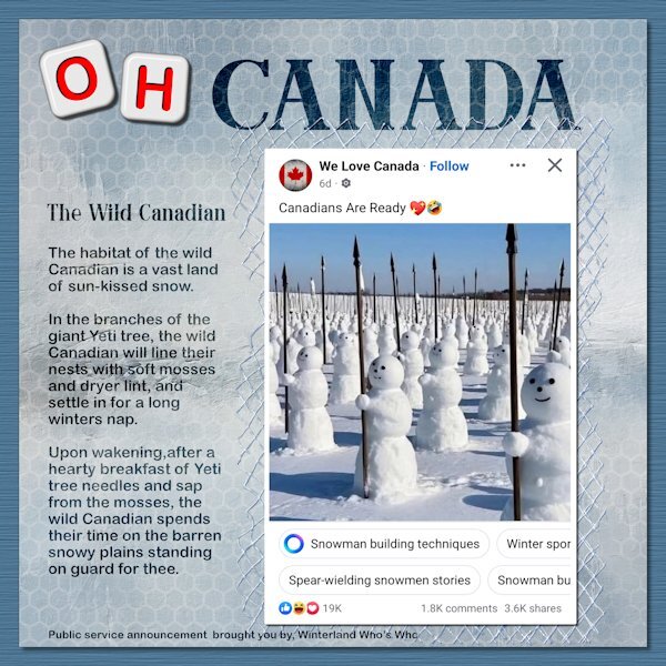
Lab 10-6 Alphabet Beads Nettings (2) Honeycombs I really enjoyed this lab. I have always liked honeycomb shape and now I have one in my patterns folder. I like how the alphabet beads come together after all the "cutouts". How do you come up with these things, Carole? A co-worker sent this image to me which I found amusing. What I find really funny is that there is such a thing as "spear-wielding snowmen" in the world. I took liberties from the National anthem (stand on guard for thee) and the old Hinterland Who's Who commercials. They were 60 second public service announcements profiling Canadian Animals, produced by the Environment Canada Wildlife Service (according to Dr. Google). I used Caster Serif Font and Arial Rounded MT. the background is Riley B Graphics and I blended the honeycomb pattern into it as well as the text.
-
I'll be sure to tell all the bad spellers...."that Ann, she's FREE!" kidding aside, I am grateful for you and Julie and everyone else in the Campus that helps me.
-
Rene, this is a really nice layout. And it's refreshing to see something positive regarding politics. What a nice memory to have.
-
I would love going to this fair. The background is fabulous and my favorite photo is the horses. I've always been fascinated with heavy horses.
-
😩 Yikes, I'm hopeless. I will get on it once I get home from work. That's what I get for working into the late night after a long day. I might have to employ a proofreader. My cats could do better than me and they work for cheap (cuddles and treats). It's a good thing I took it into 2022 to the wrapped text.
-
Beautiful Mary. Your pinwheels are exquisite (hmmm sp? - keepin' it real by guessing). I can't wait to get there. I am trying a new tactic this year, since going in order seems so daunting when I know how far I have to go. I put all the labs (written on a piece of paper) in a jar and I will pick at random. My next lab will be 10-6. I'm hoping that gets me excited to get a mix of the cool new ones as well and the previous ones. Right now while TV is booooring, I've been watching lab tutorials and really cant wait to get to them. I started watching for stress relief (it works!) and now just finding the Notebook Lab is the best channel on TV (TV= my monitor).
-
You would have laughed at me learning it. I think I was all thumbs.
-
I love shades. But they come with shadow woes. With them not showing up as nicely. Although when I toggle the shadow layer on and off you actually do see the difference. I need to start giving equal time to some tints too.
-
I guessed on the word succeed. had two "c's" in it at first and thought, that's not right 🤔. Thank goodness for you and all the peeps in the campus that catch my boo-boos. Silly English language. Good thing I already put it on FB for the world to see. What will Trump think? I'm sure he wont want to annex Canada now, 'cause them Canadians can't spell worth beinz!
-
Here's my try at it. I did find myself on the wrong layer and erasing, but thankfully I could just undo and switch to the right one. I found some elements from Jessica Dunn and I used the Vector Tube script (had to resort to notes, forgot I had to convert the text vector to a path first). The font is called Arima and I suspect it is a google font that came with my font viewer. All but two of these long bead crochet pieces are unfinished. I sold all my silversmithing tools and supplies so I can no longer fabricate the end caps and clasps. Now they are just shiny things taking up space that I dont know what to do with. Oh, and I used one of the cass crochet tubes.
-
You had me on the floor laughing. I only read what my car said on the dashboard. My house is in Fahrenheit and my thermometers too! I should jump to using Celsius, only because it's easier to spell.


