-
Posts
4,589 -
Joined
-
Last visited
-
Days Won
170
Content Type
Profiles
Gallery
Forums
Everything posted by Susan Ewart
-
I actually worked for a retailer at a Scrapbook retreat 4 yrs in a row. I wasnt a scrapbooker or a PSP person (but I was a papermaker and bookbinder - paper is paper, not matter what you do with it).
-
I would have loved to see that. I love the old Poirot movies (from the UK with David Suchet), such cool decor.
-
I think it might be a ice tea container perhaps. the silver thing in the middle is like metal flask that has a screw top. I imagined it to be filled with ice. Can you imagine seeing water and lemons floating around in it. Of course I'd never drink from these older metal tea pots, sugar and creamer as they are full of lead I've read. They make great photo props though. I'm still surprised I havent dropped and broken it yet.
-
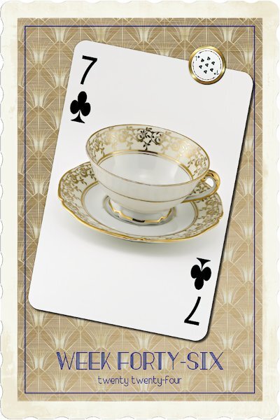
Week 46 I used Effects> photo effects> Time Machine>Early color. The frame doesn't have transparency on the outside of the scalloped edged, I wonder why. I had to do some selecting to delete them. I'll be asking that question in the next Q&A, how I can use that effect but have transparency past the outer edge of the frame. Wish it also put the frame on another layer, I was able to select and do it, but I'm sure I did everything the long hard way. Still I like the effect. I used an art deco background with a another color above and used a blend mode. Picked an Art Deco font.
-
Week 45 I was in such a hurry I ripped the darned sticker. I think the tutorial is called Torn Photo. It's a quick and easy one too. Gradient background, nice and light for a change, with a little texture on it.
-
Apparently (I heard), that it wasnt that great. I'm curious to see if anyone has tried it. A tripod is a must and a program to line up the images because you are changing the angle of view each time it focuses on a different spot. oops, I should have read ahead, I see the question has been answered. I've seen some stunning results of photographers using this technique. It is tedious, I agree.
-
Wow Corrie! This is stunning.
-
Sad face, because of the climate change. we just had our first real snowfall, about 1 month late. a week ago it was 17 Celsius, the next day, below zero.
-
I love the old Christmas music best. the ones you mentioned and Bing Crosby, Andy Williams, Frank Sinatra, Doris Day, and Vince Guaraldi (Charlie Brown - one my all time favorites) and so many more. My parents has the Time-Life Album set. It is a special memory I have when my mom would play them for me.
-
Actually, I like the music...further proof of weirdness. I will listen to it anytime I'm creating or doing photography (in studio). Also, when we used to camp in the summer, my hubby would turn on the Christmas music for me because that's what we listened too when we were driving. He actually hates Christmas, but tolerates it and encourages me to put up decorations and lights. I think aliens abducted him and I'm actually living with an alien (who loves Christmas).
-
Absolutely beautiful layout Julie.
-
me too. Although I'm adopted, my dad's heritage is Scottish.
-
Thank you so much Cristina.
-
My friends just moved to Scotland and they said there is castles everywhere and ruins that you can go walk around for free. If you look on a map they are in Nairn right across the land to the coast on the the other side from the castle. I wonder how far that is. I really like the elk (?) statues. Can you imagine wandering around that castle?
-

November ALL ABOUT ME Challenge (2024) - Hobbies
Susan Ewart replied to Cassel's topic in Challenges
This is so neat. I was never good any kind of needle or crochet/knitting works. I'd be begging you to make my snowflakes for my tree. I have crochet ones from my mom and I love them. She tried to teach me crochet but I'm a lefty and it was hopeless. Later, I would learn how to bead crochet and make bead crochet necklaces with sterling silver endcaps/clasps. -

November ALL ABOUT ME Challenge (2024) - Hobbies
Susan Ewart replied to Cassel's topic in Challenges
I love this layout as well as the story. I too left photography for holidays only when I quit working in the photo business (as a photo lab supervisor), it was too expensive. It wasnt until I was doing warm/hot glass work and silversmithing that I needed to get a record of what I was doing that it revived. And then I really found my passion when i joined the Campus and needed to have photos for layouts. -
That's what I'm worried about. That it wont feel like Christmas and I'll regret it. I agree, it's so much work to put out and the same amount to put back. That's why I like to get it out early, so it feels like all the energy is worth it.
-
So true. the Magpies are a little disgruntled because it's a tighter squeeze, but they make due.
-
That's wonderful news. They will be all toasty warm and you wont have to worry about them. I'd say they must be the cutest black blobs ever!
-
Same here, I group and ungroup and regroup as needed I will often duplicate and keep the original group hidden and convert the duplicate to raster if I am testing ideas but don't want to lose where I started from. And especially any vectors if there are a lot of separate ones I will throw them all into a big group. I subscribe to CYA (cover your %#&). You all know how good I am at spell-checking.😅
-
I might need to borrow your stick! Glad to hear you took advantage. Reminds of of the old Ikea commercial where a woman is running out the store. She thinks she's gotten a "steal" of a deal and she's running and yelling, "start the car, start the car." (to make quick get away before she's found out).
-
We do much the same. Move the cushions and lawn furniture in one of the garages. I have an extra step of taking my herbs in to the little garage (which is also part of my second workout area, with equipment too tall to fit in the house). The herbs are parsley, thyme and rosemary and it smells great in there right now. they are happy with their lights and the warmth and there's even water in there so I don't have to lug water around in the winter. The bird baths in early October (very late for me this year) get washed and sanitized, dried and put away for the winter and the winter bird bath comes out. it's just a big plastic dog dish with a big rock in it so the LBJs don't drown. Hubby does the leaves with a special something-or-other on the lawn mower which chews up the leaves so small it fits in the organics bin. No more hours of raking and putting it the back of the truck to take to the organics dump. I put light outside only if it hasn't snowed or isn't too too cold yet. Or sometimes not at all. I love Christmas, but I'm not outside so I decorate inside. It's a lot but contained only to the living room and dining room. I'm finding it a big job these days and I am contemplating not putting anything out this year. I have a 12 long wall unit that I have to UNdecorate before I decorate. It's two full days of work if I do it all. However, I also don't want to have regrets because of the greyness of winter I love the warmth the warm white and colored lights and I like to see my decorations once a year. I have been known to take everything down on the 25th. Yes, I love Christmas, but only up to the 24th, my favorite day, after that, I don't care about Christmas anymore and usually want it gone and get on with the new year. I am a weirdo.
-
This is a cool shot. Is there two doors into your unit? I like the little Cat Cabin. Are they using it yet?
-
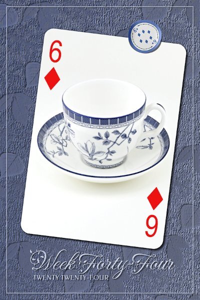
Week 44 I used a PSP floral pattern, selected the background color and inverted and promoted the leaves to a new layer. I added a negative shadow to recess them into texture (which was tin foil), which looked to me like the tree trunk outside my window. the blue in the background came from two gradients with different opacity. the fonts are Fleur De Leah (yes, that's the spelling of it), and Federo from CF or Google(via FontBase).
-
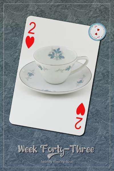
Week 43 Started with a PSP floral pattern, turned it gray and did a high pass sharpen and added noise. Then added a gradient paper above and used a blend mode and lowered the opacity. The vectors are all filled with the pattern, cass-steel, and I added a tiny bevel and shadow on all. Fonts are Dustin Hunk and Arial (CF and Windows).


