-
Posts
443 -
Joined
-
Last visited
-
Days Won
4
Content Type
Profiles
Gallery
Forums
Everything posted by fiona cook
-
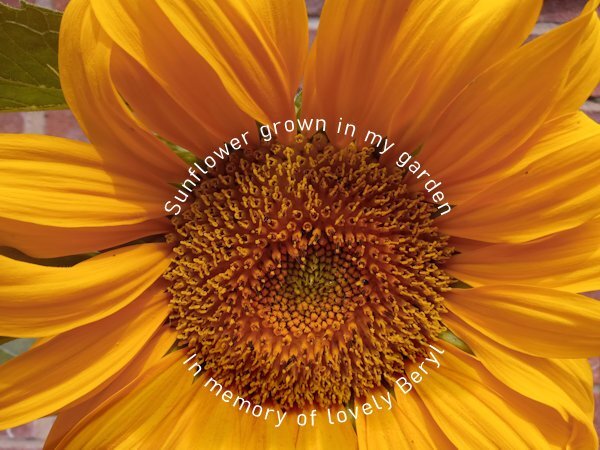
Thank you Carole for the link to the tips on the PDF. They are very useful so helped me to adjust my text. I've only just got around to it so quite a bit later than your comments. I made an additional adjustment to my image as the white text on the bottom of the circle didn't show up enough. I used the Lighten/Darken brush and right clicked to darken the image under the text.
- 714 replies
-
- 13
-

-

-
Clever. The medium is the message. I think I would like to copy your graphic and add it to my notes to remind me.
-
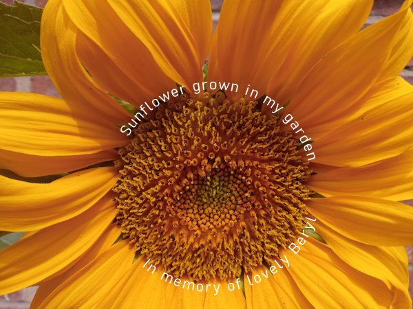
Lesson 5 Text around Circle. There is something odd with the balance of the centred top and bottom texts as the top one is too high on the left and the bottom one starts too low on the left. The first font didn't work too well so I changed it. When you convert the circle to a path at the start is it the Elipse tool you are in or the Text tool? I tried the Text tool and it didn't work so then had to go back to the elipse tool on the circle layer. Definitely getting trickier but the effects are worth it.
- 714 replies
-
- 13
-

-

-
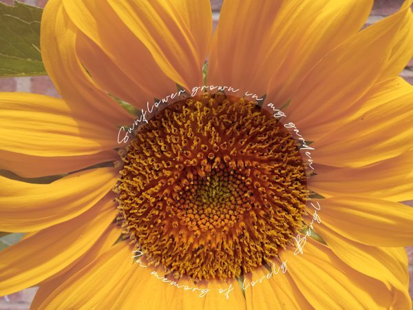
Lesson 5 Text on a path. First attempt the font distorted too much as I had too wobbly a path. Carole did warn us to start with about that but I found I could go back to the path with the pen tool & Edit/Merge to get remove some of the nodes that were distorting the text.
- 714 replies
-
- 14
-

-

-
As these techniques are quite tricky, I have found it easier to do my first examples at the same time as watching Carole's video so I use the same image as in the video. (My version had finger grips for the handle only by accident!). I haven't had the time to do other ones yet but have taken notes and tried to summarise the main stages. I have a question on the CRAC and Paste stage. Should the Pen Tool be still in the drawing mode or Edit mode?
- 714 replies
-
- 17
-

-
- 714 replies
-
- 11
-

-
Good questions Susan and I think Carole's answers are clear so thank you both. I have used undo quite a lot in this process.
-
This is marvellous. The script really fits the subject matter. I love all those colours too. Striking.
-
Image3 - This one worked and I was able to draw the preshape and change its colour. Image2 - After drawing the objects how best is it to move to reposition them? I used the pic tool. With my star shape I wanted to remove 2 of the points that extended past the green rectangle. I made selections of the areas to delete but it deleted the whole star layer! StarImage - The image saved as a preset and looked the same as my original (centre of picture) in the Pre-sets list but when I drew the presets the rounded nodes of the central star did not appear rounded. If I changed the colours in my materials palette and drew the preset I got the effects that you see here. And something I discovered when drawing the preset, don't have the original vector layer active or it draws into that layer. Select the raster layer first then draw and a new vector layer is created.
- 714 replies
-
- 17
-

-

-

-
I quite like the 'weirdy pointy point'. It has an elegance. Bet I can't replicate it.
-
I know what you mean Suzy and Julie. I hid my chewed up hearts and wonky arrows. It helped to do a little summary of the stages. One of which, like said before, to select the Pen Tool !
-
Hi, I find manipulating the nodes awkward too so as some of us are saying, practice is the way forward. My first attempts produced more of a biological shape than the love icon but then I found having the guidelines active made it easier for positioning. Still not fully clear on the difference between the nodes so will have to go over the tute again.
- 714 replies
-
- 16
-

-

-
Ann, I saw Snow Leopards a few years back in a wildlife park in Hertfordshire, UK. It has charity status for endangered species I think. You can get quite close to them. I took this photo.
-
Striking image and beautifully balanced picture. You are very clever.
-
So funny. Thank you for explaining how you made this. I love the little spider perched on the top as well.
-
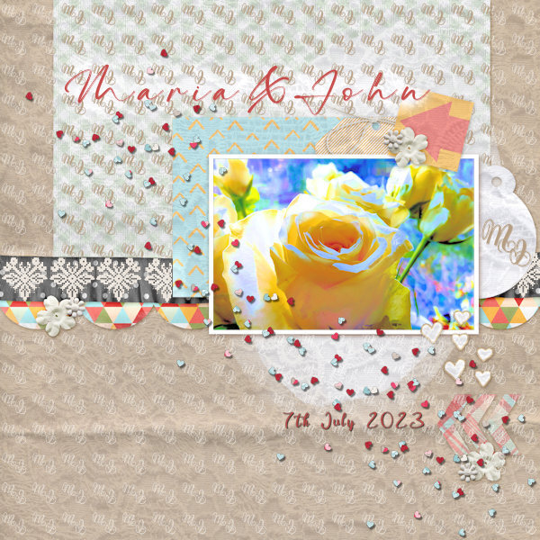
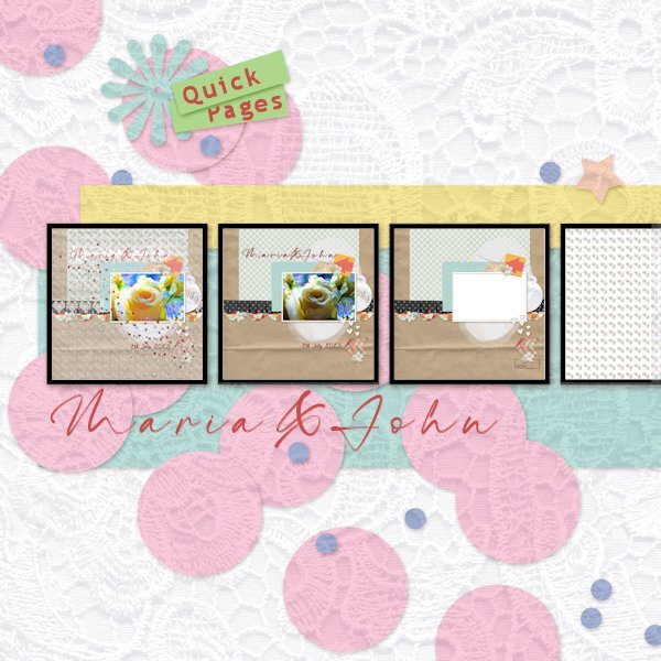
Just finished the wedding card for our neighbours that is based on one of the Quick Pages in Carole's recent workshop. They marry at the end of this week so it's timely. I have put the development stages on a template (from Marissa Lerin of Digital Scrapbook) to show from the original template supplied with the workshop to the finished card (the left hand image). I created a monogram of their initials and made a pattern for an overlay and added a lace effect texture for the background. Lightened up a few things here and there and dotted a bit of heart confetti. Voila! Typefaces 'Maria & John' = The Billion and 'Quick Pages' = Trebuchet MS Since doing the workshop I have been inspired to look at templates differently. Digital Scrapbook has a heap of them.
- 255 replies
-
- 11
-

-

-
Good story as well.
-
This is a lovely tribute Ann and beautifully created. Creating something like this helps you and all those who see it who knew him. Very sad but beautiful.
-
Now I have that song on my brain too. Love the monkey especially. Really fits the template.
-
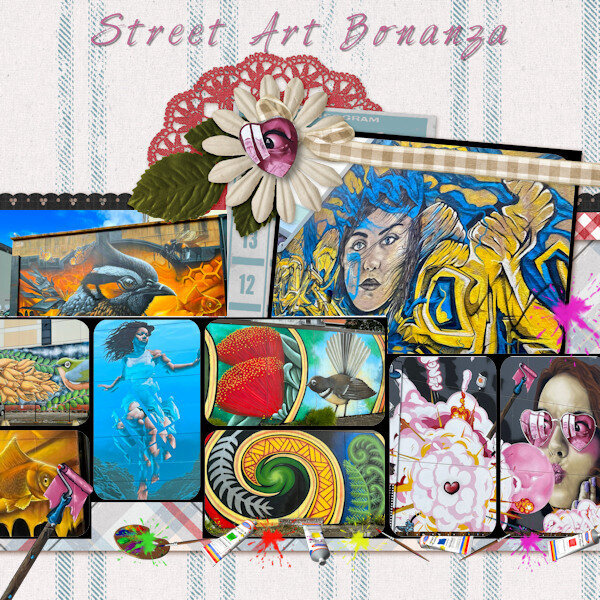
Thank you Monique and Susan. When my friend sent me the images when they were on holiday each one wowed me. The imagination and the skill those artists have. Yes, I can't resist the colours. The little bit of black helps.
-
The subject matter really fits the template. Bet we all have that song on our brain now.


