fiona cook
-
Posts
443 -
Joined
-
Last visited
-
Days Won
4
Content Type
Profiles
Gallery
Forums
Everything posted by fiona cook
-
For me there is such a lot still to learn and practice in PSP that I have no desire to start up with another software package (re Affinity) so I hope tutorials and such like can continue in PSP. A big thank you to Carole with what you have to offer in the past and hopefully in the future on PSP. It is sudden that there was no warning from Corel about the discontinuation and it is an unfortunate sign of the times re the employee layoffs.
-
Lesson 7 I've noticed when using the ClipTo It script, if the placeholder is in grey it is automatically turned to black and white mask layers. No need to change the grey to solid black beforehand. The papers I have used are from Digital Scrapbooking (pussy cat paper from elif sahin, sand by jessica dunn). Thank you Carole for the workshop and your comments throughout. Although I have been on the Template Workshop before, some more techniques have sunk in better.

- 450 replies
-
- 13
-

-
Lesson 6 A day behind and still have the last day template to look forward to. My wave design background paper is from Marisa Lerin 'the captain paper'. The shells are from Digital Scrapbooking too. My photo groups when merging down did not show the Merge Group as an option but it worked in Merge Down to include the white border mat.
- 450 replies
-
- 17
-
-
Jean, Can I ask what method you used to place the stars around the stitching? It looks good to me.
-
Ann, thank you for sharing the architecture design with us. What an amazing building. It looks like something Zaha Hadid would have designed. Your page reflects the design as well.
-
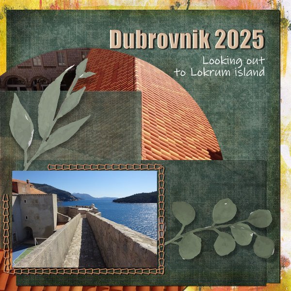
Lesson 5 My photo subjects, still on my chosen theme of Dubrovnik, are fabrics, artifacts and a painting from some of the visited museums. I have used the placeholders in the template to create a design rather than as realistic scrap elements on a page. To change the 'stitching' colour I couldn't get the flood fill to work so used a brush instead which worked fine. I drew a border around each photo group to make them stand out and added Noise to the overall background image to soften it. Because I was mucking about this took longer to do than the template afforded but is enjoyable as ever!
- 450 replies
-
- 14
-
-
Lesson 4. It was good being able to create a page of memories so quickly. I enjoyed this one. My background photo had strange colouring at the edge so I used the Warp brush on the Mask to cover it up. I hadn't heard of the 14 stations of the Cross before I went up that mountain in Dubrovnik. Elating walk back down the mountain with a sculpture on each corner of the zig zag path. Croatia being a Catholic country each 'station' represents the crucifixion and events leading up to it and afterwards.
- 450 replies
-
- 14
-
-
Wonderful architecture. Your page looks good.
-
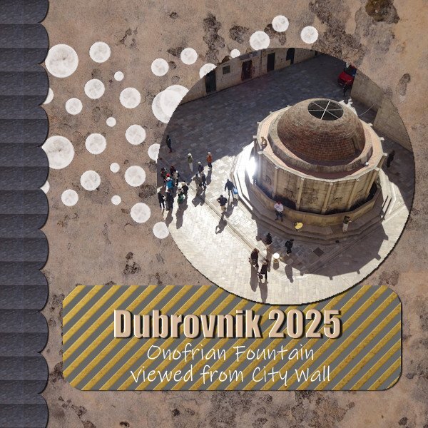
Day 3 Very useful having the shortcuts and I have added a regular command to my toolbar for the standard paper element shadow. I must get used to using all these clever settings. The stitching layer design shape in the template is similar to the rooftops in my theme so I have taken a colour from the rooftop photo that I used as the circular element.
- 450 replies
-
- 14
-
-

-
Day 2. I was unable to log in to either site yesterday afternoon when I tried (Campus or Creation Cassel) yet I could other websites. Strange. (Happy Birthday Carole for yesterday anyway). So a bit late presenting my efforts for lesson 2. Continuing same theme as I have lots of photos from Dubrovnik.
- 450 replies
-
- 15
-
-
Same for me in England. I had never heard of it until I saw some of your graphics illustrating the sport and then last year I noticed a local group playing it weekly.
-
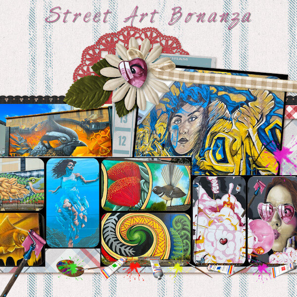
For the Template workshop week I have decided to use a recent holiday to Croatia to showpiece some of the photos whilst I was there. The background layer is a photo of mine rather than a paper. The scallop edge is a fill made from a pattern created from the pavement area of the main photo. The text panel background is a paper from Marisa Lerin's Picnic mini from Digital Scrapbook called Vellum Piece 2. I kept the grey panel underneath as it seemed to work better.. I left the bubbles from the template as they blended with the colours in the main photo. Typefaces are Impact and Ink Free. Seeing examples by others above I am a bit confused as they don't appear to be the same template that I used for PSP. ? Two questions from mine are: 1. How to align two separate text layers with each other. Objects/Align horizontally but what order do you select if this is the right method? 2. How to smooth the outline of the circular photo as it appears jagged.
- 450 replies
-
- 15
-
-
I have just signed up to the workshop too and will be using PSP only. Hoping to have the time this week to keep up. I haven't been very active using PSP recently so hopefully can get refreshed with it.
-
Thanks Carole for extra info. Is there any info on how to convert MP4 files relating to Photo Mirage to GIF please?
-
My sympathy Janette. Can't imagine what you are going through. Brave of you to share.
-
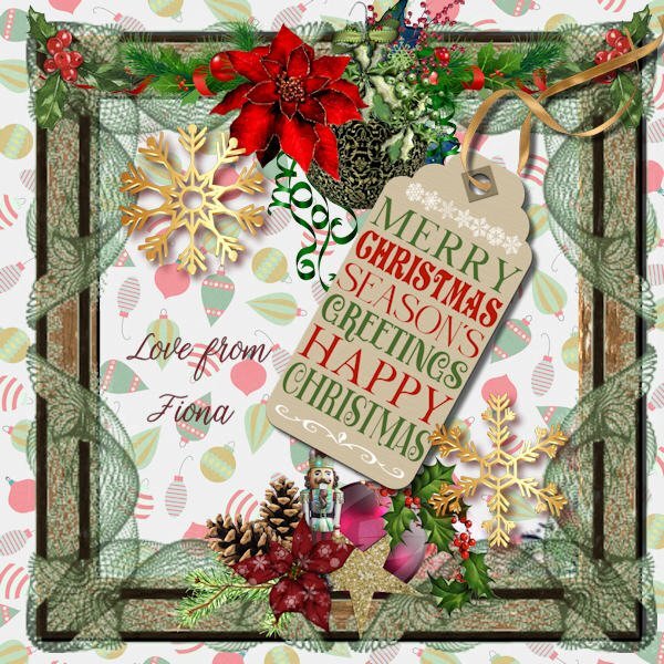
A big thank you to Carole and her fun and expertise throughout the year and a happy Christmas to you all. Hope to join in more in the new year.
-
-
-
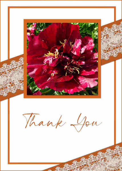
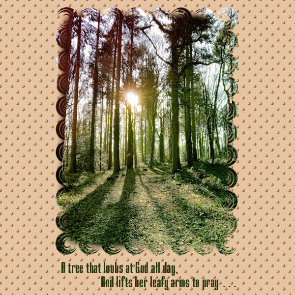
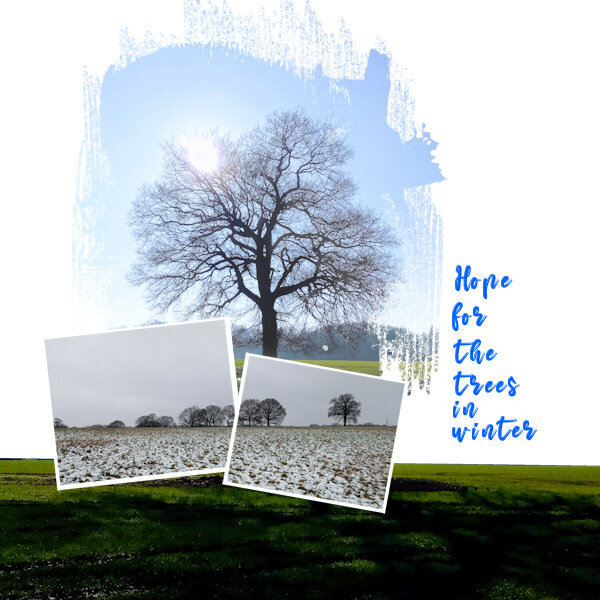
From the album: Fiona's projects
-
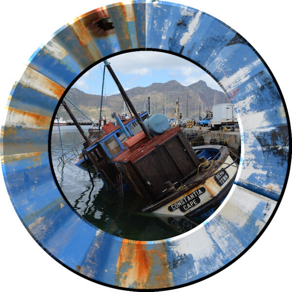
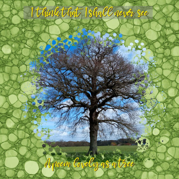
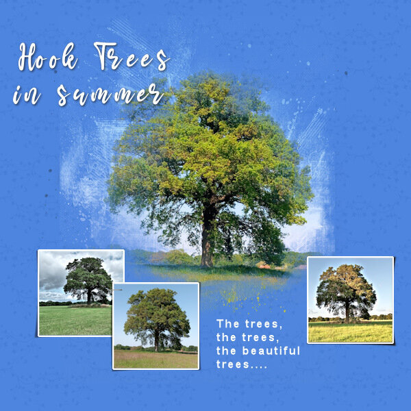
From the album: Fiona's projects
-
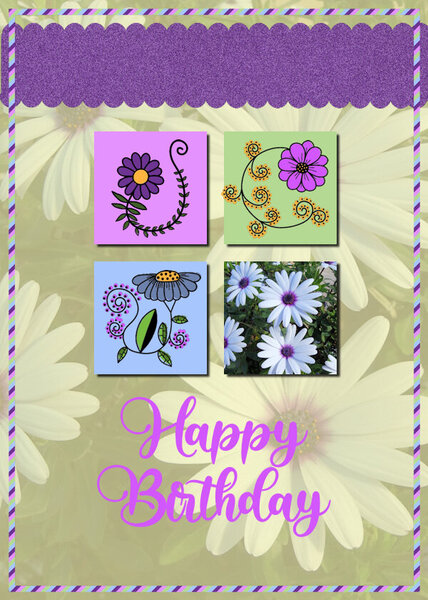
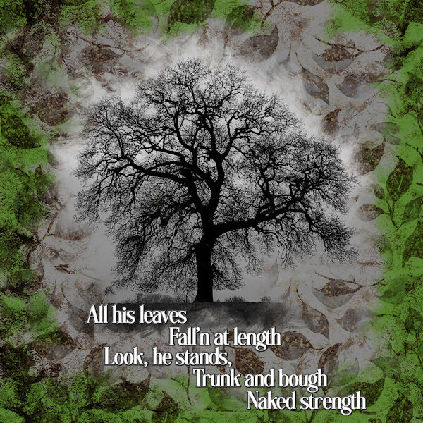
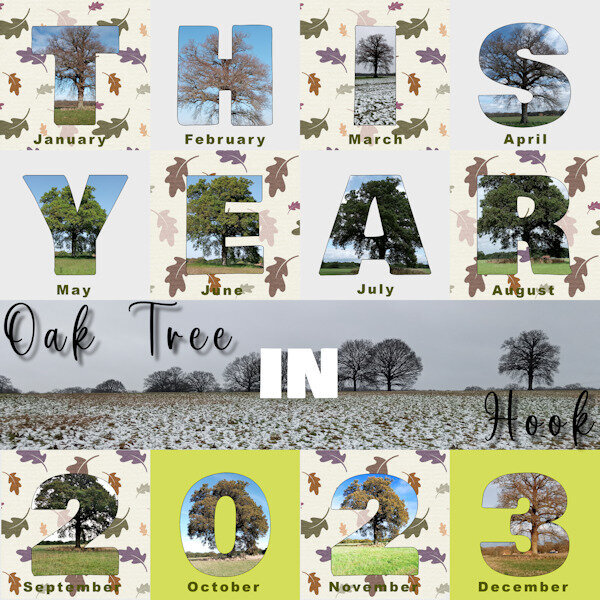
From the album: Fiona's projects
-

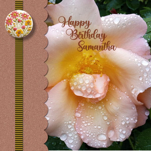
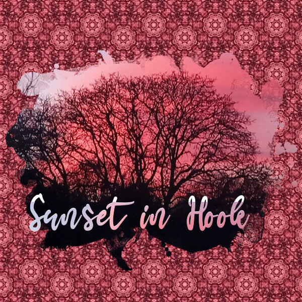
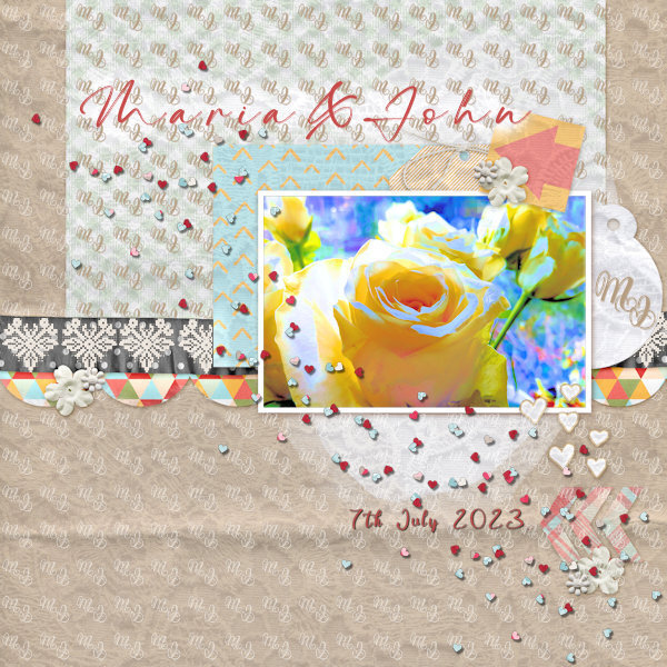
From the album: Fiona's projects
-
From the album: Fiona's projects
-
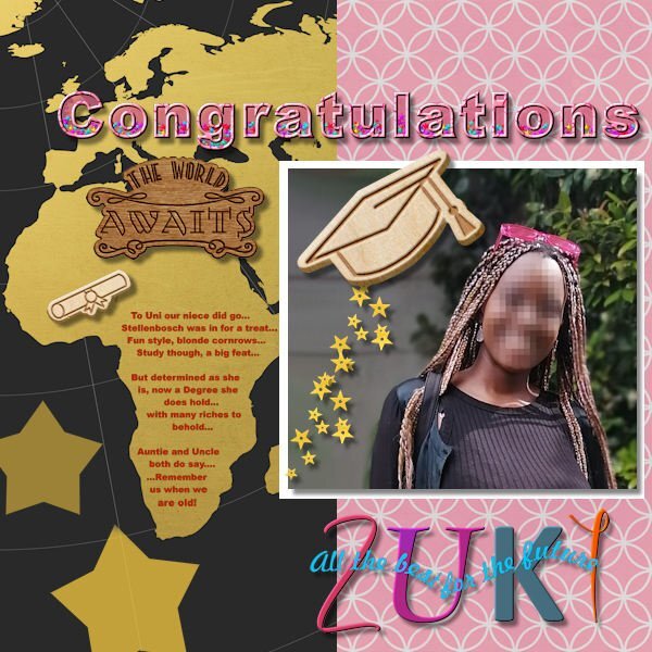
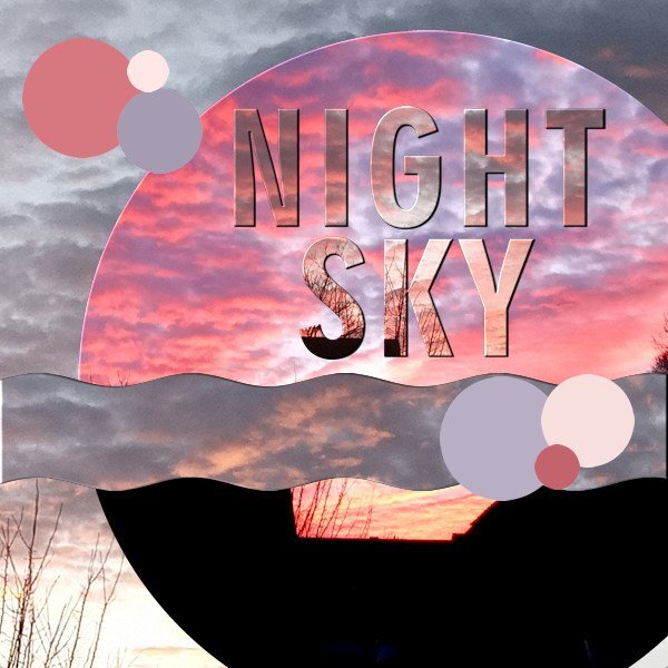
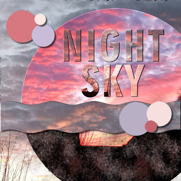
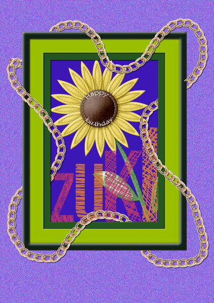
I have worked on two of my projects for the Text workshop taking into account some comments. I have really enjoyed this workshop and also want to say thank you to Carole. For my Night Sky image I added a few shadows as suggested and then having looked at 'A Beautiful Mess' Masterclass again, played around with effects to make the blank area look more interesting. There is so much spontaneous creativity demonstrated in that Cassel tutorial. For the Zuki project, I put a few of the Text Workshop techniques together as I knew I was due to make a greetings card for her. I had to fiddle a bit getting a larger font to fit into my Africa shape. Apologies for corny poem though. Thanks for all your ideas participants and thank you again Carole.
- 339 replies
-
- 11
-
-
-
Day 7 Font Geometr706 BlkCnBT with leading -0.3. Slight drop shadow and inner bevel white. Used different photos of mine of the sky from my window.
- 339 replies
-
- 10
-
-