fiona cook
-
Posts
443 -
Joined
-
Last visited
-
Days Won
4
Content Type
Profiles
Gallery
Forums
Everything posted by fiona cook
-
Thank you Carole. I can see the Classic Materials Properties for the Materials Palette looks like the set up you tend to use. I will give it a go.
-
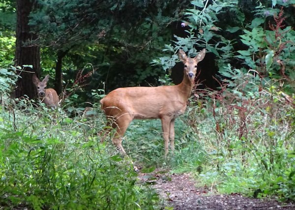
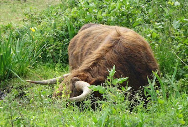
My husband 'Phil' knew all about the groundhog. Maybe his friends chant 'Phil' 'Phil' like they do in February! All crazy but the groundhog in the video looked so sweet. To follow the close encounters theme. Sometimes when out walking locally I have managed to photograph animals that we have stumbled upon. The deer were so close but the Highland cattle were a bit more worrying although they are not really interested in walkers thankfully.

-
Card 5. My male friend is retiring so my card isn't too 'pretty, pretty'. The photo is one I took in an Illusions Museum of a kaleidoscope pattern. The border is a wave pattern fill. Effect on the paper is Fine Leather. Font: Evelyne. I've used a shadow on the text in white instead of black just to lift it from the background but I am taking a gamble with the effect.
- 356 replies
-
- 15
-

-

-
Well, you live and learn. He looks like the beavers we have here in the UK that they are trying to re-establish in our waterways as their numbers were dwindling. I think they have a more rubbery tail though. He looks a bit naughty. I will look up "punxsutawney phil". (My husband's name is Phil so should be funny!)
-
Carole, from your email, what's a groundhog? Is it like a hedgehog?
-
Card 4: I didn't use a punch but a heart shape that I colourised. Font: Blackbird, Loved making the hearts. No idea why I chose alpacas. Maybe because they have big lips for kissing!
- 356 replies
-
- 17
-
-

-
-
Card 3 : I haven't varied much with the design from Carole's tutorial but I liked the idea of the texture to the background that Sheila has used. Font: Blackbird. I am not sure when adding textures how you can change the colours from the choice in the box that opens up to any colours in your swatches. It always opens up with the wheel without a way, that I can see, of getting to your swatches in the Materials Palette.
- 356 replies
-
- 17
-
-
-
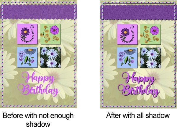
Carole suggested either add shadows totally or not at all so I have added them now so we can see the improvement with finishing all the elements with shadow. Thank you Carole for your eye.
- 356 replies
-
- 14
-
-
-
Thanks for the shadow observation Michele. I'll have another look. It wasn't as noticeable on the printed smaller card but I take your point. Like you I downloaded a few of those buttons. So elaborate. Sorry you are injured. I injured my hand at the beginning of the year. You just have to find ways around and hope you have the best medical attention.
-
From the album: Fiona's projects
-

From the album: Fiona's projects
-
From the album: Fiona's projects
-
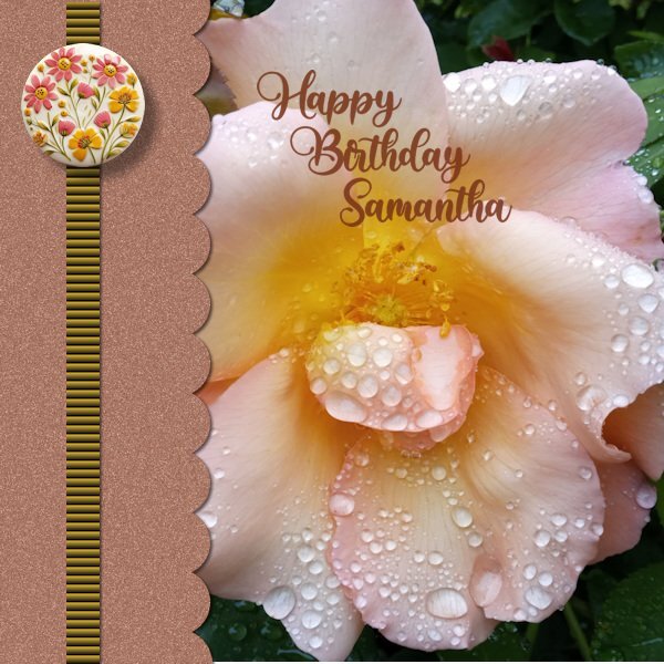
My Card 2 follows on the flower theme. I used my photo of daisies to sample the colours from and decided to use it as a reduced opacity background over a plain background. Font: Babylone. The stripey frame was fun to see take effect. I took note of how to create a back but didn't do it as I tend to print off a design on paper and attach to a pre-folded plain greetings card.
- 356 replies
-
- 19
-
-
-
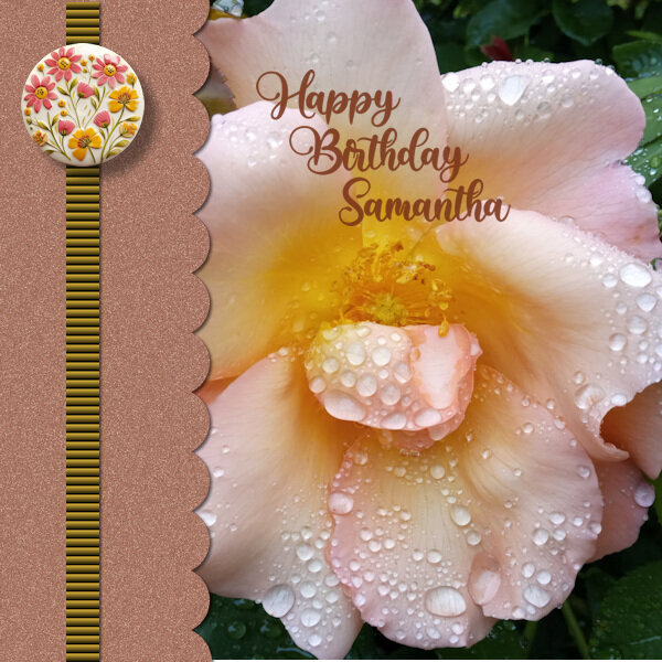
I just love flowers and flower photography plus I have a niece's birthday coming up so the ideal subject. I changed the canvas to 1500 x1500. Used a Random Noise Effect to the scallop paper. The texture effect, 'Blind' on the strip is bold at 100%. The round element is 'happiness is homemade' by Marissa Lerin form Digital scrapbooking.com. The font I have used is also from Creative Fabrica called 'Babylone'
- 356 replies
-
- 20
-
-
-
Templates I think go with producing Masks and useful for scrapbook projects for repeating and adapting styles. How about volunteer examples for the beginnings of chapters in the book from Scrapbook Campus scrapbookers similar to what Marisa Lerin produces in her weekly roundup for Digital Scrapbook.com
-
Wonderful, painterly photo.
-
I lIke the use of the bunting from the masterclass recently. Fits the bill. ha ha!
-
Thanks Susan for the encouragement. Sorry to take so long to get back to you.
-
I went back and had another go at the bevel and reset to default settings and it worked. Not sure what I had it on before but thank you for the suggestion Rene. I think you are right. It gives more of a realistic 3D effect.
-
I have registered too. I have been out and about lately so not been too active with PSP. I hope I can stick to the daily workshop and be able to contribute. Looking forward to it and sharing ideas as ever.
-
Hi Rene, I think I know what could be achieved by that...to make the frame look a bit like a tyre? I like the idea (and thank you for your interest) but am out of my depth on how to do it. I have tried making a selection and then using the Inner Bevel command but nothing seems to register. Any suggestions?
-
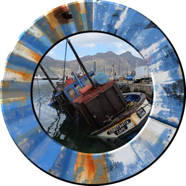
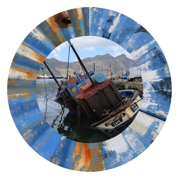
Now got rid of the corner of the image sticking out of the frame. Didn't notice at first because of the excitement of the technique working!
-
-
Then my imagination got going so I used a couple of my photos that I took in South Africa a few years back, one being of a painted, dilapidated, corrugated iron wall. The colours caught my attention at the time and it has been useful to use as a neutral background for other images. This time I made a rectangular selection strip from it (like a flat ribbon) and carried out the Circular Elements technique to make a circular frame around another photo that I took not far from the wall. Because of the irregular pattern of the paintwork, the circular elements join up line in the frame is not much of a distraction.