fiona cook
-
Posts
419 -
Joined
-
Last visited
-
Days Won
4
Content Type
Profiles
Gallery
Forums
Everything posted by fiona cook
-
Another image from the Masks workshop.

- 303 replies
-
- 16
-

-

-
I enjoyed the Masks workshop from February 2022 and used my photos throughout.
- 303 replies
-
- 17
-
-
-
There you go Michele. Use away!
-
It seems where there is the greatest love, the suffering is also the greatest but then I know of people who have run away from the situation - what must they be feeling when it comes to the end?
-
Just finished relooking at the Grunge Magic MasterClass with all those creative ideas. I tried out one but as I am on PSP 2021, I understand from the class that the Brush Variance size increments are not effective until PSP version 2023. However I used the Bokeh brush instead for my example and finished off with the Mosaic Texture Effect and got quite an interesting design as a result.
- 158 replies
-
- 11
-
-
-
I planted a golden rod plant this year as reminiscent of my parents' garden. I will have to have a closer look at it for little bugs. These photos are amazing.
-
I have really enjoyed putting these pages together especially as the visual memories are so good of the holiday and the gorgeous scenery. The difficulty was in selecting the photos as I took so many. I may tweek some more but these are how I have left it at the moment. I've tried to be consistent across the 3 DPSs by using the same background image; that of a distressed wall snapped from the holiday and stretched across the pages. Since joining in the various projects on Scrapbook Campus I tend to see things a lot more than I did before that are worthy of photographing specifically for backgrounds.
-
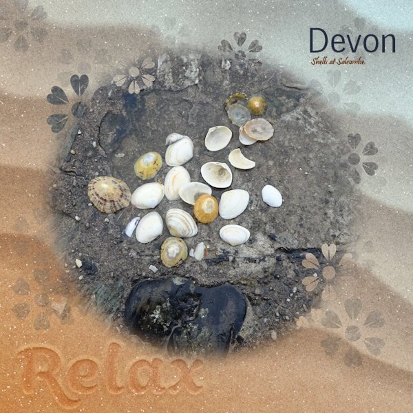
Day 7 Imprint. I wasn't successful with the images I had chosen using the tutorial for the imprint. In the end I used Cassel's script: cass-imprint which gave a slightly different effect but is very easy to use. So glad I purchased it. Thank you Carole. My sand background image and my starfish are from Digital Scrapbook and the font is Swiss721HV BT. I intend to use the image I have created on another of the templates supplied. As I ran out of time at the weekend to complete each one I hope to have them ready by the end of the week.
- 275 replies
-
- 11
-
-
Halfway through finishing uploading my holiday photos and creating masks for them from the template, I suddenly realised that I had previously purchased Cassel's 'Clip To It' script and not only that had been useful and bound it to my layers palette! Duh! Much easier now changing the template areas to Masks. I haven't tried it yet but wondering if the photos would benefit from a drop shadow like on the pots card. I am not sure what layer to use for each Mask group in the template though.
- 275 replies
-
- 10
-
-
-
Day6 postcard. I have made a crumpled version as my postcard got messed up in the post. I suppose I should have warped the text to match the crumple. The font used is Harabara Hand. I used a white fill with a large stroke to try to give a scratchy look.
- 275 replies
-
- 12
-
-
-

-
Day5 Decided to add the postage stamps to the second DPS which is still in the making. Yet to have a go at the focus template as such a lot to do on the others. Only just caught up to Day6! It's a bank holiday weekend in UK and at the moment the sun is shining so may be the outside backons.
- 275 replies
-
- 13
-
-
-
Love this idea and what you have done here. I have the script too so may give it a go.
-
Days 3 and 4 - Badge and tag in situ for the time being. Will reposition at the end when I finish off the page or may put on a second DPS with lots of photos. The video for the leather tag was handy. Thank you Carole.
- 275 replies
-
- 11
-
-
Love how you have used their colours
-
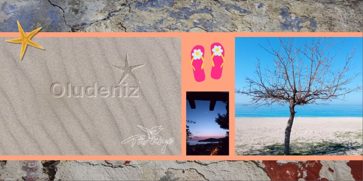
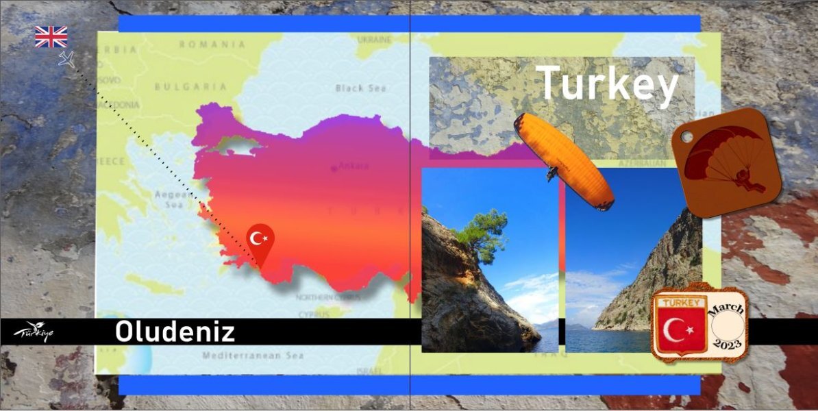
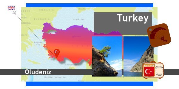
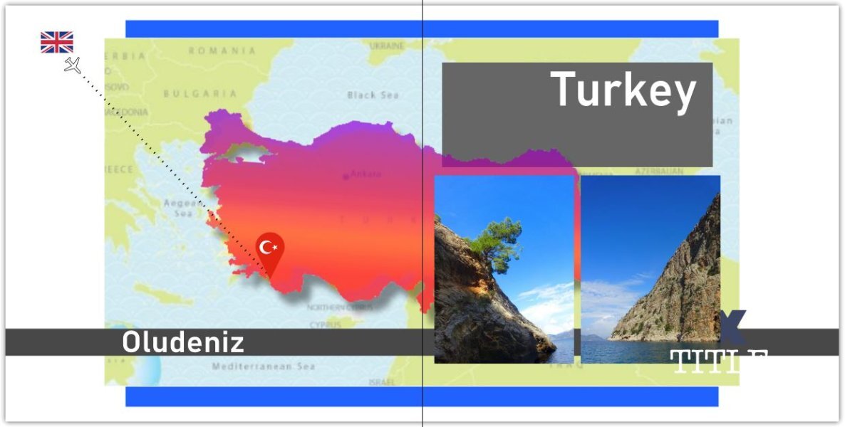
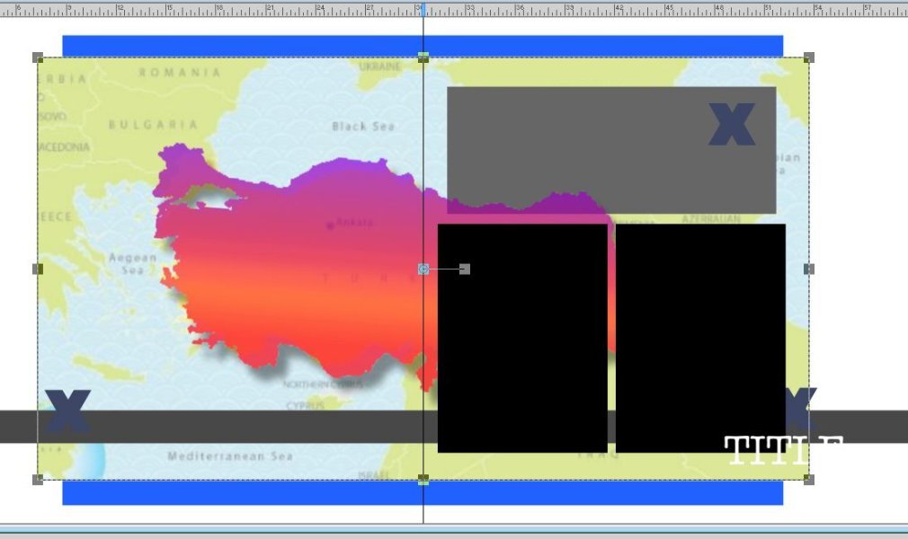
Day 2 I needed to look up how to make parts of the template into masks but did so in the end for the photos. That same thing-'practice makes perfect!' I didn't need to do a trail of where we had been as my journey was from England to Oludeniz, Turkey however I must admit I likewise found the instruction to layer the routes difficult to understand should I have wanted to do trails here and there. This is when a video of how it's done comes in handy. I think it's just me though, not grasping the idea, not your instructions, Carole!
- 275 replies
-
- 12
-
-
Day 1. I'm a little late starting mine but am focusing on a holiday to southern Turkey this year. Should have used the same map for my background and to make my Turkey overlay as they are slightly different in perspective. The examples shown so far from you all look inspiring. I have used a gradient fill for my main shape and added the shadow.
- 275 replies
-
- 10
-
-
-
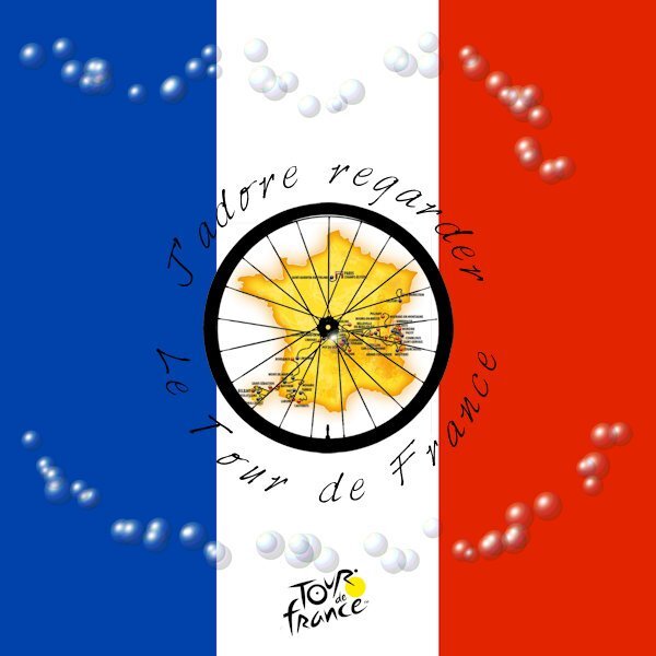
For the last 3 weeks I have been glued to The Tour de France (except for when I attended the workshop!) so now the Men's race is over I thought I would make an image for it practicing some of the vector workshop skills. I used one of Cassel's Picture Tubes trying to represent the polka dot jersey but I was fascinated by the accidental effect I created so left it at that; The background colours show through the transparent bubbles. Coolio! I think my French here is correct.
- 714 replies
-
- 19
-
-
-
I have had another look at my gold' Cook' and have been inspired by others using cutouts so I have made another version. I made an outline of the text with no fill as the basis. Duped the layer & filled to make a cut out using Selections From Vector Object. Then created the Picture Tube, bevel outline & shadow effects.
- 714 replies
-
- 18
-
-
-
Thank you Carole for a very creative workshop with all your valuable help (and for everyone's inspirational and varied ideas and comments). The Picture Tube reminded me of embossing so I tried to make my surname look like it was made of gold metal. I presume that the VectorTube script knows to run with the settings for the last selected Picture Tube. Is that correct?
- 714 replies
-
- 14
-
-
-
Royanne, for this one did you make the cut out images for the text first, before you created the paths?
-
Thank you Michele. It is effective and you are good to experiment.
-
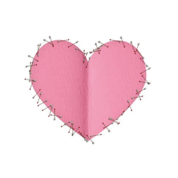
This is getting lovely and creative now. I took the image of the heart from Digital Scrapbook and drew a path around it. Then ran the Cupid Arrows Picture Tube with the VectorTube Script. Would there have been an easier way of converting the original heart to a vector in order to convert to a path?
- 714 replies
-
- 10
-
-
-
Beautiful cat indeed. The text swaggers too.