fiona cook
-
Posts
443 -
Joined
-
Last visited
-
Days Won
4
Content Type
Profiles
Gallery
Forums
Everything posted by fiona cook
-
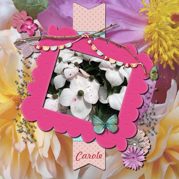
Thank you Carole for your OpenHouse. Although I didn't join in the interactive activities, I did manage to get into some of the tutorials. Going over ones I had seen before also helps to refresh techniques I find. It is bank holiday weekend here in UK so lots of other things going on for people but it is good to be able to self indulge with your PSP. The technique that really caught my attention was the Circular Element where you take a flat element like a ribbon and turn it into a circular frame. The first one I made as an exercise was using a ribbon from cass-RibbonFactoryC-Spring from Creation Cassel and made a circular frame to go around the thumbnail image of the ribbon pack.

-
Happy Birthday Carole and thank you for your inspiration and support throughout the year.
-
This is what happened for me. I re-read articles and some I wasn't familiar with so all good.
-
Black cats are beautiful. So slinky.
-
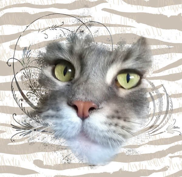
The most historic naming for one of our cats has been 'Pippy', a black and white moggie, rescue cat who lived 21 years. She was named after a soft toy dog of my Mum's that I have inherited, which was given to her by her father in the 1920's. The toy was named after a British cartoon character 'Pip' of 'Pip, Squeak & Wilfred' (Before my time!). We've had two cats named after our favourite English F1 world champion drivers, Lewis and Jenson. The latter was a huge cat and he had possibly the same condition as Carole's Pouce (Polydactyl) extra digit on each paw. Nearly all our cats have been rescue animals, even one of our Maine Coon pedigrees, prenamed 'Connie' who is currently ruling the roost. This is my photo of her created using 'Into the wild' mask from Jessica Dunn (Digital Scrapbook.com).
-
Me too but I felt good that the PSP ones were right. Must be flook or a good teacher!
-
A Brush Workshop sounds good. This Masks workshop, although I did it before, I have got a greater understanding this time around. Thank you Carole for all you put in to it.
-
From the album: Fiona's projects
-

-
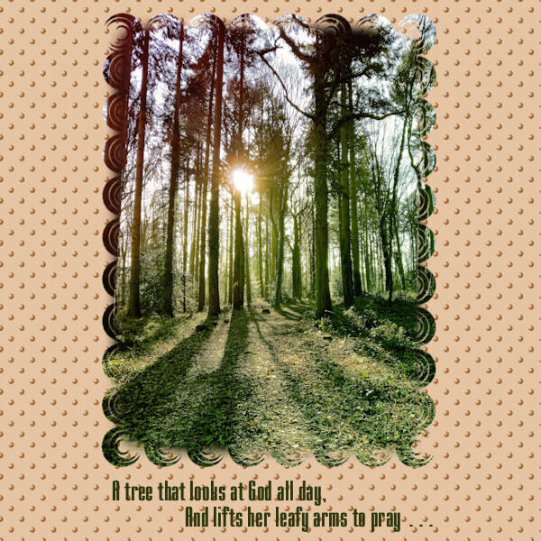
Lesson 7. For my local woodland photo I ran a Corel freebie script called Gradient_8, which made the light flare stronger and brightened the colours overall. For the mask I used a brush tip called Shape7. The circular design was not solid like a dot so I filled the centre of the mask with a rectangular selection flood filled black. I needed to move my mask but made a silly mistake and didn't duplicate the Mask Group before Merging the Group so was able to move it but lost the layers for future editing. Duh! For the dotty background effect I used the same circular brush tip Shape7, Text: I chose a condensed font to replicate the tallness of the trees, called Mekanik. The words are from another verse of the poem, Trees, by Joyce Kilmer. Ann, I have just read that the poet died at the age of 31 in WW1. What a waste but what a legacy of words.
- 359 replies
-
- 11
-

-

-
Great Ann that you recognised the quote. I forgot to credit the author with my design. I also hadn't realised their gender. How interesting. Thank you for spotting.
-
Hoping to look at this article too on Extractions. Thank you Carole and Susan for the suggestions.
-
Thank you for your explanations of each step. I like the way the kaleidoscope effect blends in and doesn't dominate. The creative use of that LetterPress script so fitting too. Love It!
-

From the album: Fiona's projects
-
-
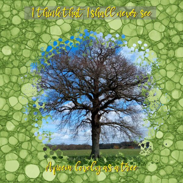
Lesson 6. My tree photo with Vibrancy adjustment. Mask from DigitalScrapbook.com Yvette;PhotoMask:01 by Rachel Martin. Lino effect repeated 9 times for the Distortion effect. Duplicated the layer and used Overlay Blend Mode.
- 359 replies
-
- 14
-
-
-
The kaleidoscope really suits this image and design I think.
-
Great design and sentiment. Not sure I understood how you would use a brush stroke as a PNG. Doesn't that make your file overall huge in memory size?
-
I like how you used the kaleidoscope pattern
-

From the album: Fiona's projects
-

-
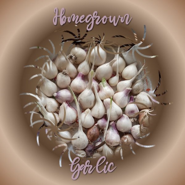
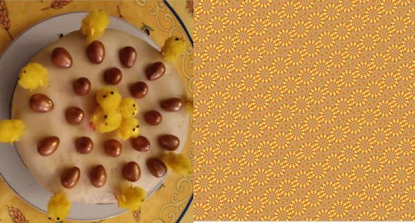
Lesson 5. I made a kaleidoscope pattern originally to use with my garlic photo but it didn't suit it. I was so fascinated though with the way the colours and shape from my original photo of an Easter cake worked in the pattern, I saved it for viewing. For my garlic photo: Brush tip ' Twirly Star. Text: Mama with white inner bevel and black shadow. Off to make my dinner now. Looking at garlic has made me hungry.
- 359 replies
-
- 13
-
-
-
Love the moon pic and the stars leading to it.
-
From the album: Fiona's projects