-
Posts
428 -
Joined
-
Last visited
-
Days Won
4
Content Type
Profiles
Gallery
Forums
Everything posted by fiona cook
-
I thought of you and your Divas when I vent to an exhibition in London recently called Divas. It's at the V&A museum. Wonderful costumes from actresses to musicians and a few male Divas too (Elton John, Freddie Mercury),
-
Beautiful. Hope your design can be used for some of the remembrance activities on Armistice day.
-
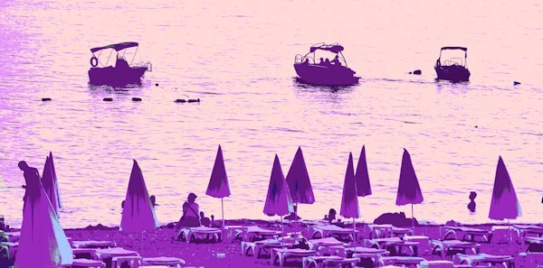
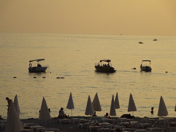
Yes, Happy November, weathers permitting! UK due for a winter storm soon so battening down the hatches! I have just read the Campus newsletter 31 October and was interested in the Colour Replacer article so had a quick go with a photo that I took on holiday that originally I had intended to make into a silhouette. I turned the colour photo into black and white in Effects/ Photo Effects and then applied the Colour Replacer using the dropper tool to source the colours I wanted to change. Just a bit of fun but it opens up more creative possibilities.
- 201 replies
-
- 13
-

-
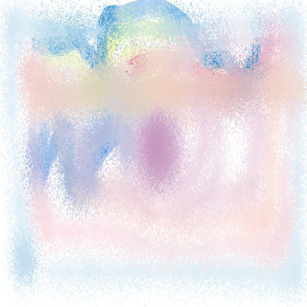
After the Q&A session last night I tried to find ParticleShop but via 'Effects', I still couldn't find it. With PSP, however, Painter was included so I opened Painter 7 and found the Speckle brushes and so so much more. Don't know why I hadn't looked at it before. Maybe thinking too much to learn. I Speckled away and think there must be so much we can do with it. Thank you for mentioning ParticleShop in the Q&A.
-
- 303 replies
-
- 12
-

-

-
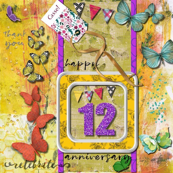
Well I was a little late for the party (as having Sunday lunch at the time) so didn't have anywhere to upload my images for it. I had kept a look out for the start but I think the zone time differences put pay to me seeing the invite. I also do not have a web camera on my PC. Never mind, it is a great achievement Carol to have taught yourself, set up businesses and taught all of us, especially in the friendly manner that you do. In this day and age it is a pleasant approach. My greetings card to you is based on a card I made for your 60th which I have adapted. The other image is the one for the party.
-
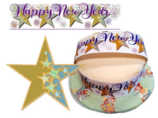
As a Diamond member at the time I used LABS13 Stencils to create a star that I replicated to make a cake band for a new year family party.
- 303 replies
-
- 15
-

-

-
And a creative Masterclass that I very much enjoyed was the Beautiful Mess Masterclass so we could turn our own images into creative effects.
- 303 replies
-
- 13
-

-

-
- 303 replies
-
- 14
-

-

-

-
- 303 replies
-
- 17
-

-

-
- 303 replies
-
- 18
-

-

-
There you go Michele. Use away!
-
It seems where there is the greatest love, the suffering is also the greatest but then I know of people who have run away from the situation - what must they be feeling when it comes to the end?
-
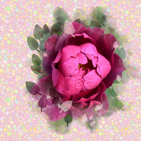
Just finished relooking at the Grunge Magic MasterClass with all those creative ideas. I tried out one but as I am on PSP 2021, I understand from the class that the Brush Variance size increments are not effective until PSP version 2023. However I used the Bokeh brush instead for my example and finished off with the Mosaic Texture Effect and got quite an interesting design as a result.
- 158 replies
-
- 12
-

-

-
I planted a golden rod plant this year as reminiscent of my parents' garden. I will have to have a closer look at it for little bugs. These photos are amazing.
-
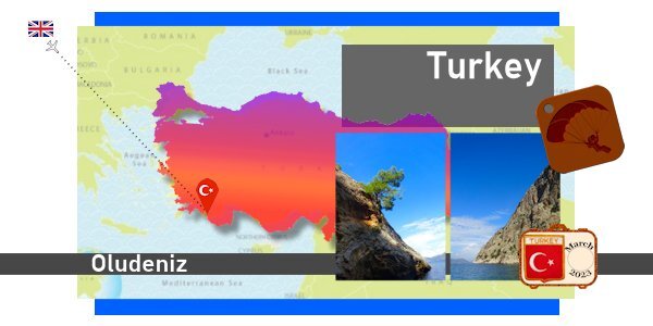
I have really enjoyed putting these pages together especially as the visual memories are so good of the holiday and the gorgeous scenery. The difficulty was in selecting the photos as I took so many. I may tweek some more but these are how I have left it at the moment. I've tried to be consistent across the 3 DPSs by using the same background image; that of a distressed wall snapped from the holiday and stretched across the pages. Since joining in the various projects on Scrapbook Campus I tend to see things a lot more than I did before that are worthy of photographing specifically for backgrounds.
-
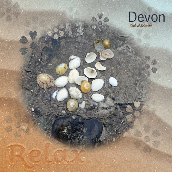
Day 7 Imprint. I wasn't successful with the images I had chosen using the tutorial for the imprint. In the end I used Cassel's script: cass-imprint which gave a slightly different effect but is very easy to use. So glad I purchased it. Thank you Carole. My sand background image and my starfish are from Digital Scrapbook and the font is Swiss721HV BT. I intend to use the image I have created on another of the templates supplied. As I ran out of time at the weekend to complete each one I hope to have them ready by the end of the week.
- 275 replies
-
- 12
-

-

-
Halfway through finishing uploading my holiday photos and creating masks for them from the template, I suddenly realised that I had previously purchased Cassel's 'Clip To It' script and not only that had been useful and bound it to my layers palette! Duh! Much easier now changing the template areas to Masks. I haven't tried it yet but wondering if the photos would benefit from a drop shadow like on the pots card. I am not sure what layer to use for each Mask group in the template though.
- 275 replies
-
- 11
-

-

-
Day6 postcard. I have made a crumpled version as my postcard got messed up in the post. I suppose I should have warped the text to match the crumple. The font used is Harabara Hand. I used a white fill with a large stroke to try to give a scratchy look.
- 275 replies
-
- 13
-

-

-

-
Day5 Decided to add the postage stamps to the second DPS which is still in the making. Yet to have a go at the focus template as such a lot to do on the others. Only just caught up to Day6! It's a bank holiday weekend in UK and at the moment the sun is shining so may be the outside backons.
- 275 replies
-
- 14
-

-

-
Love this idea and what you have done here. I have the script too so may give it a go.
-
Days 3 and 4 - Badge and tag in situ for the time being. Will reposition at the end when I finish off the page or may put on a second DPS with lots of photos. The video for the leather tag was handy. Thank you Carole.
- 275 replies
-
- 12
-

-

-
Love how you have used their colours


