

Michele
-
Posts
2,730 -
Joined
-
Last visited
-
Days Won
22
Posts posted by Michele
-
-
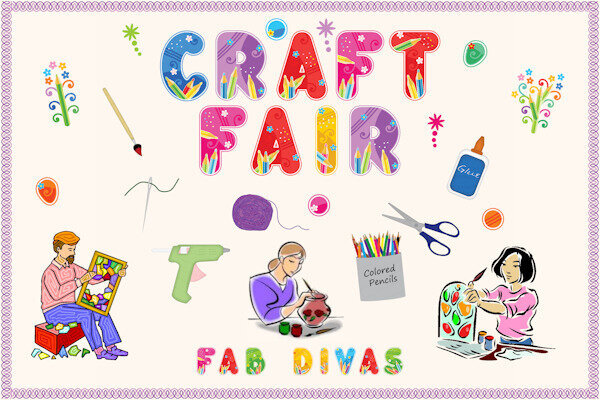
Sharing to show how wonderful Cass's Two-Toned Stitch Fonts are. I used them to make the border. I've had the fonts for a while now, but I plan on using them more often and not just for borders.

-
 1
1
-
 3
3
-
-
Sharing to show how wonderful Cass's Two-Toned Stitch Fonts are. I used them to make the border. I've had the fonts for a while now, but I plan on using them more often and not just for borders. (Lots of clip art and an alpha were used for this layout.)
-
2
-
9
-
-
-
Expand
Font is Almond script.
Thank you for feeding my font addiction! It's gorgeous, especially with the extra glyphs.
-
1
-
 3
3
-
-
Expand
B = bananas flambe
I want to know where to get fast food bananas flambe!
-
1
-
3
-
-
A = Apple Pie
-
1
-
-
Expand
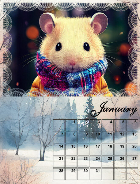
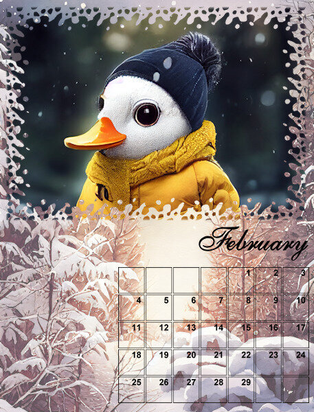
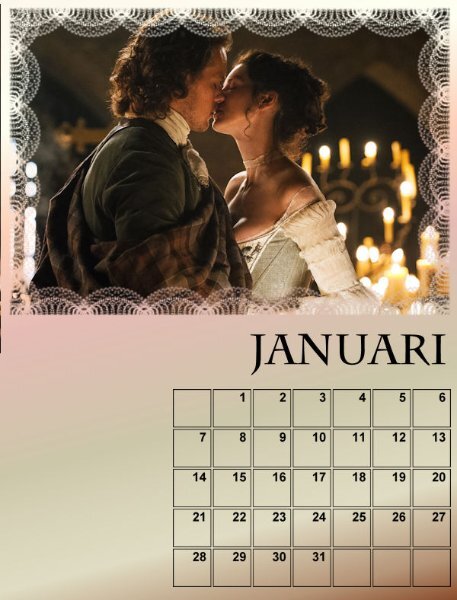
Michele, Is the bottom picture on top of the January template? It has a "line" which you can see clearly. In the February layout it seems to blend more with the template
No, it's below the masked layer. I have it as a background. I lowered the opacity so the text was more visible. Maybe I have to raise the opacity and change the color of the text.
-
2
-
-
Here are my first two months. I thought I would go whimsical this year. Then again, I may change my mind. LOL
-
5
-
7
-
-
-
W = Waffles
-
1
-
-
Take all the time you need, Doskba. We'll be here when you're ready.
-
1
-
1
-
-
P = Pickles!
-
1
-
-
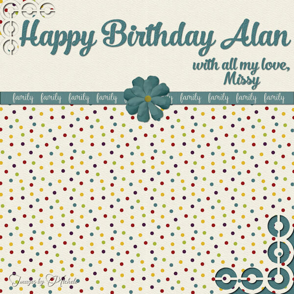
I had birthday cards to make for two people. I ran out of gas after the first one so I simply changed the name. Don't tell anybody. All the butterfly stuff comes from CF. I used a bunch of layers and a mask from Mask by Ginny. The font is Octagon Calligraphy.
-
4
-
10
-
-
L = Lettuce which is on most fast food sandwiches.
-
1
-
-
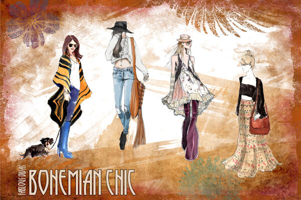
I resurrected an old one from 2016 for the Daily Look and made some adjustments. I probably got the ladies from Google, but I didn't record the illustrators back then. The first one looks like Inslee Haynes Farris' work, but I'm afraid I can't give credit to the other three. I used various frames and flowers from Pixel Scrapper. The font is Runy Tunes Revisited.
-
3
-
8
-
-
D = Diner (We have a lot of diners here on Long Island, almost one in every town and village.)
-
1
-
-
Too funny! I'm guessing this was in a small town.
-
1
-
-
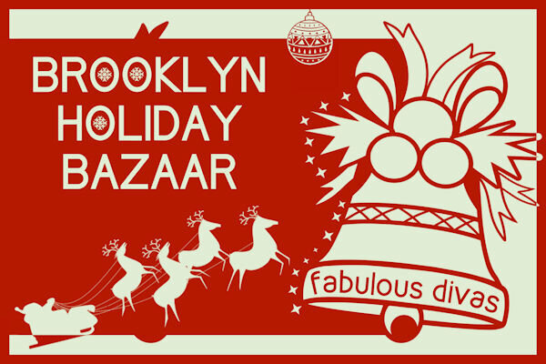
Daily Look for today. I decided to go with a poster feel. The bell and the ornament on the top are from CF. I've had Santa with his sleigh for so long that I don't remember where it came from. The snowflakes are a picture tube I made several years ago and the font is Kirvy (I know; you'd expect it to be curvy!). I had fun changing the color of the overlapping portions of the elements.
-
1
-
10
-
-
V = Veggie burger
-
1
-
-
Expand
Thanks, @Bonnie Ballentine. I found a couple of them here on Long Island. I love anything pasta-related.
-
1
-
-
@laurie solaas When layers are linked, if you use the "Move" tool on one layer, all of them will move. It doesn't work with the "Pick" tool unless you select all of the layers.
-
2
-
-
I have a tough time making cards for men (in this case, my brother) as most scrapbooking supplies I have seem to be fairly feminine. I used some papers and elements from a 2018 blog train for this. I used one of Cassel's corner punches and the font is No. 7 Regular.
-
1
-
9
-
-
Expand
N = Noodles & Company
Ooh. Where do I find that place?
-
2
-
-
K = KFC, formerly known as Kentucky Fried Chicken.
-
1
-


Calendar Workshop 2024
in Showroom
Posted
On the subject of fonts, which font managers does everyone use? I desperately need one. I currently add the different categories to the zip filenames. It's a terrible method as it simply brings up the zip files which don't show the fonts. I'm sure (?) I would download fewer fonts if I could organize them better.