

Michele
-
Posts
2,299 -
Joined
-
Last visited
-
Days Won
15
Content Type
Profiles
Gallery
Forums
Posts posted by Michele
-
-
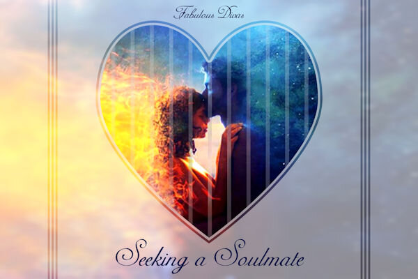
Today's gaming theme fit the valentine's day challenge. I found a wonderful fantasy picture; I always try to find the original artist, but sometimes I just can't. Anyway, I used cass-Slat Heart-Template and adjusted it as needed. The background is the original pic with gaussian blur and a lower opacity over a white layer. I gave the original black outline of the heart an overlay blend mode. Then I added some selections I flood-filled with black for the stripes and changed the blend mode to soft light. The font is Adine Kirnberg, free from 1001 Fonts.

-
F = Flowers
-
Fashion Illustration is by Megan Hess. I used a combination of fonts: Veria Monogram and Bodoni MT. I like the monogram, but not the actual letter in it so I converted it to raster and erased the letter. Then I used Bodoni. The lace was a png that I've had for a long time so I don't know where it came from.
-
 3
3
-
 6
6
-
-
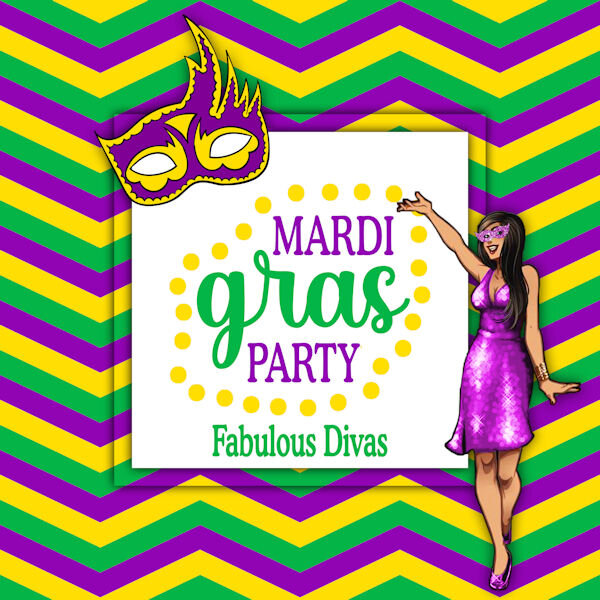
A bit early for Mardi Gras, but I use the theme that the game gives me every day. lol The mask clip art is from CF. I recreated (used as inspiration?) the word art, also from CF. The fonts I used are Cooper MdBT and BetterValentina. And, of course, the woman is a character from the game.
-
4
-
4
-
-
S = Sweetheart
-
1
-
-
If there were an animal shelter/rescue near me, I would love to volunteer. I modified a Corel template for this project. Finished it with just a couple of minutes to go!
-
2
-
9
-
-
J = Jewelry!
-
1
-
-
A = Amor
-
1
-
-
19 hours ago, Ann Seeber said:
Here's my monthly big cat calendar project for February 2023. I'll also put it up on Facebook with a large jpg in the files. The originals are 4200 x 2550. I think they came from Corel as a freebie.
Aw, sleepy cheetah.
-
1
-
-
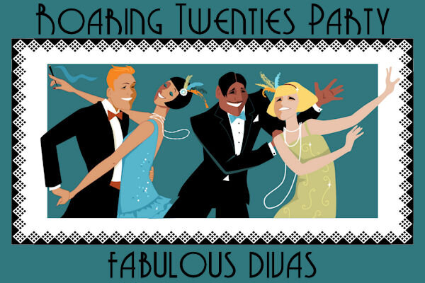
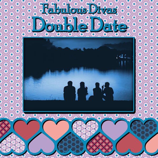
I just LOVE Cassel's Punches; I used her Edge Punches to make the black border around the dancing people. Such an easy way to "dress up" your page. I would love to see a new set of Edge Punches (hint-hint). The font is Grenadier NF from 1001Fonts.
-
2
-
9
-
-
I signed up and hope I make the time to participate.
-
2
-
1
-
-
17 hours ago, Corrie Kinkel said:
Another great use of the stencil tutorial in Lab 13-01!
Thanks, Corrie, but as Ann pointed out, they were part of the template. I'll have to try the stencil tutorial!
-
1
-
-
1 hour ago, Colin Hooson said:
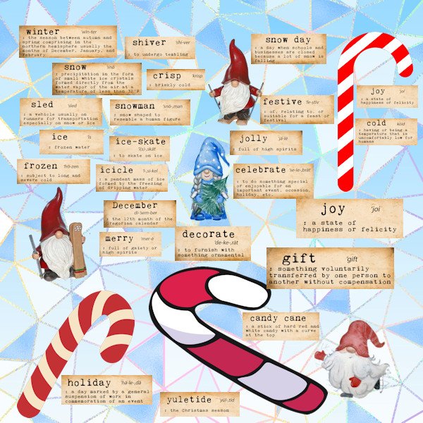
OK the last one for this month, it a gnome word wall. I took the words from a free download from Creative Fabrica the gnomes moved in and set up home in the depths of my computer; they pop up from time to time, I don't remember where I got the candy canes from, I have about 80,000 clip art items mainly on two discs. Keeping track of that lot is a nightmare
I LOVE gnomes!
-
1
-
1
-
-
Inspired by a layout from Promethean Concepts by Laurel Stone in the ALFLT January 2022 Blog Train, Heart Full of Love. The font is Poor Richard; I have a lot of valentine/heart fonts, but I thought the template had enough hearts already lol. In fact, there was another bunch of hearts on the top that I deleted to have room for my titles.
-
2
-
5
-
-
15 hours ago, mireille said:
My scatter brush paper made with script in shop Creation Cassel.
I love it, Mireille! Just added this to my favorites in the store!
-
1
-
 1
1
-
1
-
-
15 hours ago, Susan Ewart said:
WOWZERS! She's a beauty. Did you also do the polka dots on the dress. I like how the the dots in the middle are the black and white in one dot. Very cool.
Thanks so much for the WOWZERS, Susan. I have to give credit for the dots in the middle to the original illustrator, Bahar. But I have done half and half on some things I've done.
-
2
-
-
G = Games
-
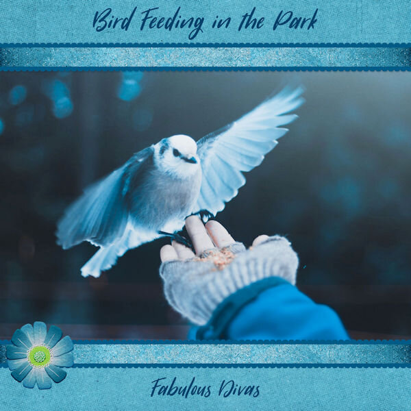
I got started really late for this daily pic so I relied on my scrapbooking supplies. Found this gorgeous photo on Unsplash which is a wonderful resource; the photographer is Lane Jackman. I used a paper from the ALFLT Jan 2021 Blog Train for the background and another one to make the ribbons. The flower was also in the blog train. The layout was inspired by one of Marisa Lerin's templates from Digital Scrapbook, formerly Pixel Scrapper. The font is Sugarstyle Millenial free from dafont.
-
2
-
6
-
-
Created the polka dot paper using a pattern I made (I'm sure I learned it from Cassel). The yellow stripes were simply rectangular selection on different layers flood-filled with the color from the original illustration by Bahar. The font is Morebig Sans found through the Free Design Resources newsletter. Lately I've been using drop shadows with zero blur to give my text a little more depth (don't know if that's the right word.).
-
2
-
 2
2
-
5
-
-
15 hours ago, Anne Lamp said:
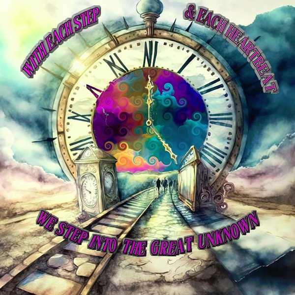
I created this starting with one of the papers from Pixelscrapers freebee today (Watercolor-Time-Travel-Backgrounds-51580778) and cut out the center of the clock and added a background from Fire-in-Wonderland-Backgrounds-54289383 (also from creativefabrica but not a freebee) & I added swirls to it.
Being a big Doctor Who fan, I downloaded those time travel backgrounds, too. I love what you did with this one!
-
1
-
-
21 hours ago, Mary Solaas said:
Michele - I use point-to-point, connect segments, show nodes. I use a tablet and pen (getting used to that).
I use my mouse on my laptop which is definitely not as good as a tablet and pen. I've never entertained a tablet and pen; as I told you earlier I cannot draw to save my life. LOL
-
1
-
-
18 hours ago, Mary Solaas said:
OK. I've been playing around ((SO OCD)). I couldn't make the curved papers with the pen tool UNTIL I made the path go around the sides of the layer to meet with the beginning of the curve. Then I could make the magic wand select the inside of the path in order to color the "curved paper". Then trouble with using the Vector paint script - maybe it had to do with F11 ???? I'm not sure at this point. I also used the Vector Tube script to make the chain edge and the rope edge. The scalloped edge was made with the Vector Paint script. So here are my results. The 2nd layout shows how I had to go around the edge of the paper in order to make the different colored pages (I pulled the edge made with the rope forward - that's why it is not actually on the edge of the page).
I absolutely love this, Mary. Not being gifted with drawing skills, I have a tough time using the Pen Tool. Do you remember which mode you used?
-
For today's daily theme I had these wonderful illustrations by Lorraine Dell Wood from her Flirty Hat series. I used a template from Corel and made it my own. In order to get the borders around the pics: 1) Merged each of the groups; 2) Selected the outside of each one with the magic wand; 3) Inverted the selection; 4) Select selection borders and flood filled. I followed the Lined Paper tutorial in the Campus for the background. The font is RiotSquad, free from DaFont. I actually had a tough time picking a font and settled on this one as my deadline was quickly approaching.
-
1
-
1
-
5
-
-
19 hours ago, Susan Ewart said:
Michele, I hope you keep posting your illustration type layouts. I love the 60's-70's vibe of them and especially gratefull to see how you achieved it using "ingredients". I think it's important to see all styles of layouts with PSP to open our minds to greater creativity. You the know how it is, "we dont know what we dont know". It's inspiring. I have seen digital designs and often wonder how they were achieved, your explanation really shows how to look at individual elements and put them together in a cohesive package. I love this group for the diversity of layouts. Keep it up.
Susan, your words of encouragement are both appreciated and inspirational. I'll try to remind myself to share other non-"scrapbooky" layouts.
-
1
-


What are you working on (in February 2023)?
in Showroom
Posted
Me, too. I have several of her illustrations that are in black and white, but I thought this one was far more interesting. Thanks so much.