

Michele
-
Posts
2,299 -
Joined
-
Last visited
-
Days Won
15
Content Type
Profiles
Gallery
Forums
Posts posted by Michele
-
-
Back to my gaming group now. I've had the illustration for years so I don't remember where it came from; I used a mask to frame it. In order to balance it out, one of Cassel's corner punches came in handy. The font is 11S01 Black Tuesday Offset; I got it free from somewhere about ten years ago. I didn't have a system for saving information about the fonts, etc. back then. I'm doing a better job now. lol

-
 9
9
-
-
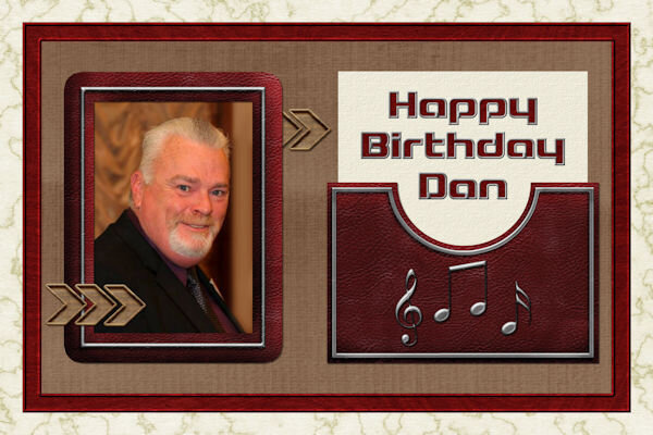
Here's a card I made for an old friend. I used a mini kit from Gina Jones at PS. The musical element is a nod to how we met years ago...Concerts at Jones Beach Theatre. The font is Blaster and it's in my system fonts.
-
 1
1
-
6
-
-
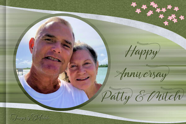
Most of the elements are from a template by AnnieC included in the March 2021 ALFLT Blog Train. There was a lot of improvising to fit it into FB's new pic size. I had the opportunity to add a paper fold I made in the Creative Scrap tutorials; it helped balance the l/o. The font is About Loving from CF. Hope my cousins liked the card.
-
5
-
-
@Suzy You're probably being too hard on yourself. I understand that as I agonize over almost every detail of my projects. I've had a tough time with the border punches, but the more I use them, the easier it gets. When you have time, just play with them. That will give you more confidence as you'll be learning while you play.
-
2
-
-
32 minutes ago, Sue Thomas said:
That's a great envelope Michele. Over the years I have created a vast majority in template form of the creative scrap and lab tutorials. They are then readily available to edit to suit a project I'm working on. Without having to start from scratch each time. Plus, I have learnt so many techniques that can be used in creating other elements.
Thanks, Sue. I keep most things I create in pspimage format so I don't have to start from scratch either. It makes our creative life much easier. ?
-
1
-
-
I've been doing a lot of the Creative Scrap tutorials lately. For the vast majority, I've been following the Detailed Handout so I can listen to music while I'm doing them. For this one, I had to watch the video. As great as the handouts are, sometimes I just need Carole's voice to get the technique into my head. ?
-
2
-
4
-
-
I was wondering where you've been, @Sue Thomas. I should have figured it out after knowing you all these years. Looking forward to seeing the results of your summer photography.
-
1
-
-
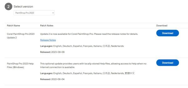
I have 2023, but I never installed it due to all the bugs people were experiencing. I downloaded the updates, but I'm curious as to why one of them is called Update 2. Where is Update 1?

-
1
-
-
They are absolutely adorable!
-
1
-
-
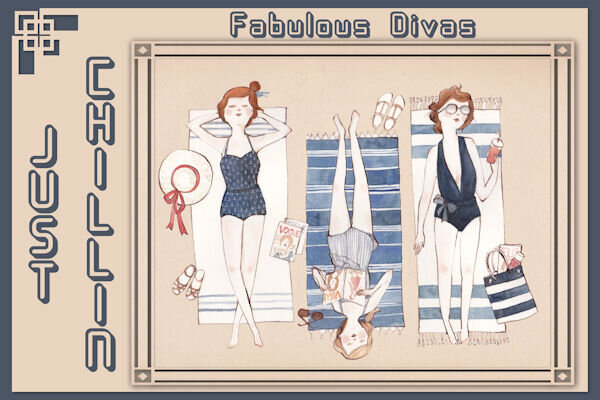
Sometimes it's fun just to use picture tubes, clip art, and a gradient. The background sky gradient is mine; the grass, trees, rocks, and cloud are from various picture tubes; the flowers are from GoF Designs; the ladies in white are from CF. Oh, and the blanket is a paper that I changed with the Perspective Mode of the Pick Tool. The font is Amastery Script.
-
 1
1
-
7
-
-
19 hours ago, Sue Thomas said:
I remember that technique. It was someone in the maniacs group, as you said several years ago. I can't remember who it was that posted it though. I use it often, I have the steps printed off. Fabulous work Michele!
Thanks so much, @Sue Thomas. It was Linda Bloodgood, but she's not in the maniacs group anymore. I don't now why.
-
The original illustration is from Freepik by Sketchpedia. For the background I decided to follow a "Swirls and Twirls" tutorial. It was shared by someone in another group and I hadn't used it in a few years. The background is made using the original pic and there are a whole bunch of layers. The tools used were mainly the Radial Blur and the Twirl Effects. If I didn't have my daily deadline, I might still be playing with them. The font is Hesthia Austine from Creative Fabrica.
-
1
-
6
-
-
14 hours ago, Mary Solaas said:
So I had to try out that special border in another way. It seems that you can use anything that will go from border to border and have no gaps. So I tried with a banner that I had created in one of the labs and it works. All of the elements and papers are mine as well as the pictures (which I've used many times). The font is Nandola (probably from CF).
I love the color combo you used. In fact, I'm going to save them to a palette! How did you make what looks like a flower chain that's above and below the main blue part?
-
 1
1
-
-
4 hours ago, Cristina said:
Such a beautiful layout, Mary! The border makes the page stand out even more... I never tried this technique.
I totally agree. I've never thought of extending anything beyond the border. I love the look of it, @Mary Solaas
-
1
-
1
-
-
Happy accidents!
-
1
-
-
I've been working on the creative scrap tutorials and I love how this one came out. The first one was adding noise with monochrome checked which was cool. But then I did it with monochrome unchecked and what a nice surprise!
-
4
-
-
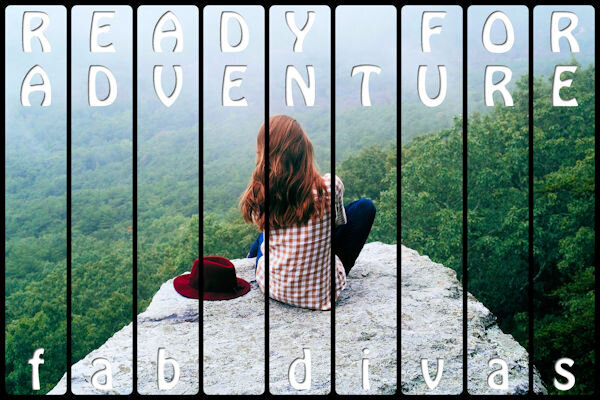
I used Cassel's WordSlats script for this one. I started with a black background and ran it three different times for each row of text. Copied one on top of the other and moved it to where I wanted the second line of text to be. Using the magic wand selection brush inside the new words, I switched to the original layer and hit delete. Once I hid the second layer, both lines were on one layer. Lather, rinse, repeat for the third row of text. Finally, all three were on one black layer with the words cut out. I used the magic wand again to choose the black and copied/pasted into selection the picture of the woman on the rock. The font is Hobo Std which is what Carole used on her free samples.
-
4
-
8
-
-
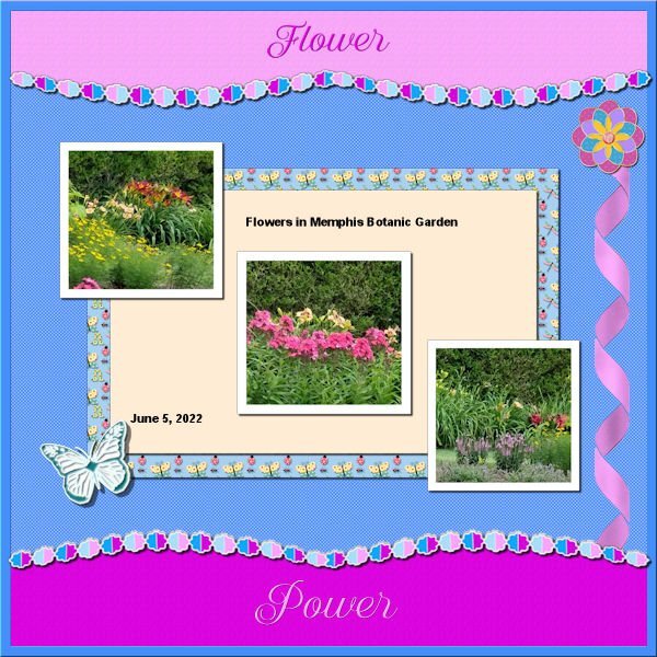
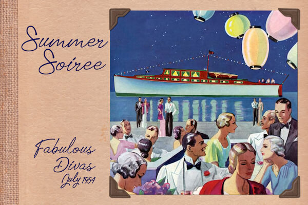
Thought I would go for an old photo album look for this theme. The photo corners are by Sheila Reid from PixelScrappers. The main font is Tomatoes (free from Fontspace), but I used Lazy Ride (free from FPTFY) for the numbers. I've had the background for so many years that I can't recall where it came from. Given more time, I could have created my own paper with everything I've learned in the Campus. Also don't know where the party pic came from. I've been doing a much better job recording the origin information in the last several years, but the old ones are from who knows where.
-
3
-
7
-
-
My daughter had a Fisher Price camera, but that was long before digitals.
-
17 hours ago, Cassel said:
And for once, I made a layout that is NOT part of a workshop!
And a good time was had by all! That waterslide is awesome.
-
1
-
-
36 minutes ago, Jannette Nieuwboer said:
Michele I hope to fix my laptop like you. From what I can see, YOU LIKE PURPLE. ?
You think? LOL
Denk je? ? -
1 hour ago, Susan Ewart said:
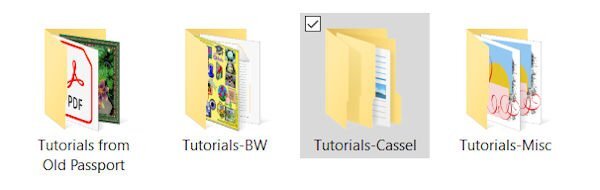
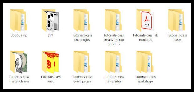
I have a similar structure as well. I like that you put "cass" in the name too. I think I will add that, it would differentiate them from other tutorials. I like to see the file structures people use, it gives me ideas on better management.
I have a level above those, too. Sometimes I think I have too many levels. lol
-
S = Sausage
-
1
-
-
This is how I keep track instead of a spreadsheet. I have a folder called Tutorials with sub-folders for the different types of tutorials. Within each category, there are more sub-folders for the tutorials.
-
1
-
5
-


What are you working on in August (2023)?
in Showroom
Posted
Thank you so much, @Sue Thomas. I try to challenge myself as I am not intuitively creative. I get so much inspiration from everyone here.