

Randy
-
Posts
173 -
Joined
-
Last visited
-
Days Won
2
Content Type
Profiles
Gallery
Forums
Posts posted by Randy
-
-
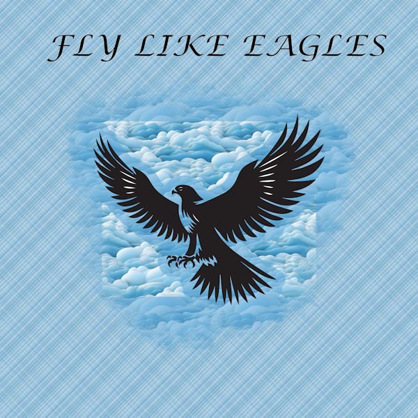
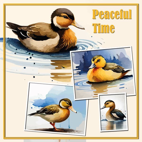
Day 4
Eagle and clouds from Creative Fabrica
Font is Lucida Calligraphy

-
 3
3
-
 8
8
-
-
17 hours ago, Susan Ewart said:
Randy, I love the cat pictures. I have one that looks just like this. I am way behind too (four days now). It's been a long hard/physical work week and it's not over yet.
Thank you. I have jotted down the steps for the masking stuff and I find it so helpful to use as a guide as I move ahead. And of course, sometimes, I extend beyond the mask as I did for the bird picture so that I did not crop off the tail. Always nice to learn and use what you learn. Thank you for all of your good things you share with us.
-
1
-
1
-
-
Day 3 - variation
I decided to try to make a copy of the image and use that, as smaller, for the background. I could have taken more time to clean around it, but I like the effect.
-
1
-
8
-
-
Day 3
-
6
-
8
-
-
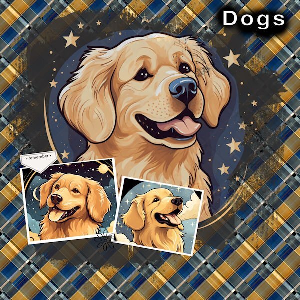
Day 2
I really like what the background has done.
It looks really nice.
Thank you, Carole, for the turorial..
The Dog images are from Creative Fabrica.
-
3
-
8
-
-
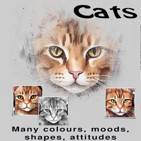
Day 1 - Yes, I am just getting started.
The pictures are from Creative Fabrica.
I saved the full size image also as pspimage as I should be able to change the pictures and add things as I want.
For the short term, there is a family member who loves cats and I am thinking of changing the cat pictures to actual pictures.
Thank you to all who are sharing their creations.
-
5
-
7
-
-
I am late. But still looking forward to this refresher on masks as I really don't remember a lot from last time.
I have been enjoying PaintShop Pro Scripting and because of time spent there, I had forgotten to sign up for this course (until today).
I have been finding Scripting very enjoyable though a bit hard a times (like if you use a variable and spell it slightly different in one place (such as using an upper case in one place and lower case in another - Okay that was me recently 🙂 ).. It is nice to know that Carole is available to work alongside us and provide assitance when we need it.
-
1
-
3
-
-
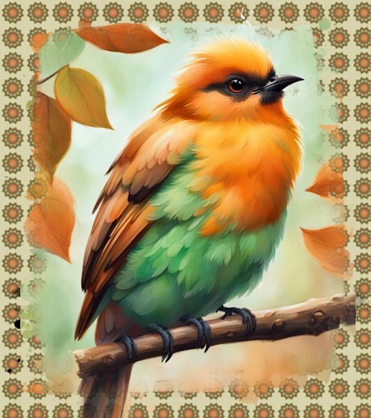
Day 4
I got the photos from Creative Fabrica
-
5
-
10
-
-
Template 3
Font Candara – which is free at https://www.dafontfree.io/candara-font/
Dog images were free this week at Creative Fabrica
Valentines Day Dog Sitting in Tea Cup Graphic by PrintExpert · Creative Fabrica
https://www.creativefabrica.com/product/valentines-day-dog-sitting-in-tea-cup-9/
I played around a lot with colors with different things including accidentally creating a new layer with colour and used blend mode.
>>> Carole, regarding the spacing between lines of text, the Leading was not zero so I changed it to zero. But the font I was using was also adding space above and below the text. So I chose a new text and this helped a lot too.
-
10
-
6
-
-
Carole,
Day 2 - response to your note about 'T" at the bottom.
I see the "T"
I had a problem with spacing and obviously did not notice this "T".
Whatever I did, when I enter a line of text and go to the next line, there is a huge gap between lines.
So each line was actually a separate "new" text.
I know I have run into this before, but I don't remember how to fix it.
-
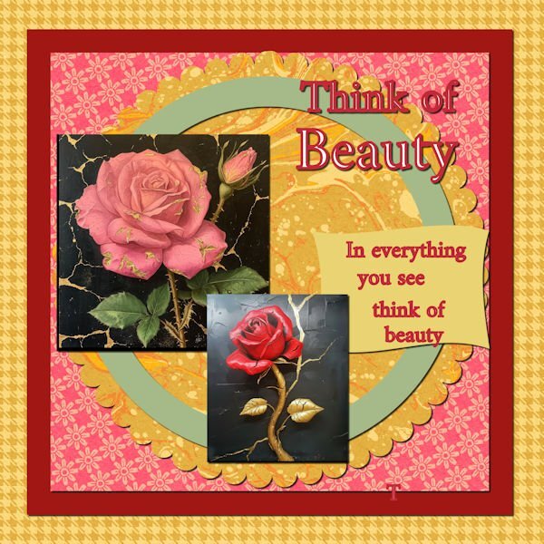
I did most things according to directions.
The flowers were taken from Creative Fabrica
-
9
-
10
-
-
Thanks everyone for sharing your beautiful creations! Very inspiring!
-
3
-
-
12 minutes ago, Randy said:
Notes on Template 1 exercise
I recently showed my wife the flower (actually, it was on my desktop after downloading, and she noticed it) and she liked it, so with Valentine's Day on the horizon, I decided to try to incorporate it into the workshop.
1. Radagund font available at https://www.dafont.com/radagund.font
2. Flower was from Creative Fabrica.
3. I wanted a red background for the flower so just did the selection and filled with red, then used the flower on top of that. As I sized the image down, I ended up with parts of the flowers extending beyond the circle and liked that so left it that way.
4. I wanted the hearts on the paper on the left to be red so I used the color changer tool.
5. I also wanted the lines in the layer over the top of the background layer to be red so I used the color changer tool to do that also.
6. Since the red circle and the flower were both separate layers, I added a drop shadow for each.

-
1
-
-
Notes on Template 1 exercise
I recently showed my wife the flower (actually, it was on my desktop after downloading, and she noticed it) and she liked it, so with Valentine's Day on the horizon, I decided to try to incorporate it into the workshop.
1. Radagund font available at https://www.dafont.com/radagund.font
2. Flower was from Creative Fabrica.
3. I wanted a red background for the flower so just did the selection and filled with red, then used the flower on top of that. As I sized the image down, I ended up with parts of the flowers extending beyond the circle and liked that so left it that way.
4. I wanted the hearts on the paper on the left to be red so I used the color changer tool.
5. I also wanted the lines in the layer over the top of the background layer to be red so I used the color changer tool to do that also.
6. Since the red circle and the flower were both separate layers, I added a drop shadow for each.
-
5
-
11
-
-
I am looking forward to this workshop. There is always something to learn or re-learn and I look forward to what folks are going to share as well. I have seen some pretty nice things in other workshops that I have been involved in.
Thank you, Carole, for making this available.
-
1
-
-
@Cassel I have realized with the text instead of icons on the Layers Palette that I will just work with what I have. It is fine for now as I can always go to Layers in the toolbar at the top and get the options at bottom. Mostly what I use is "New Layer" anyway.
-
@Ann Seeber Thank you for the information and link about borders.
-
1
-
-
@Cassel Regarding your reply about being to "Snap" objects together, my most recent version of Paintshop is 2022 Ultimate.
-
On 5/25/2023 at 10:35 AM, Cassel said:
@Susan Ewart That is a LOT of birds! That must be quite noisy too as they are usually pretty loud birds.
@Randy Glad you reposted the image! Did you take those pictures? Maybe you were taking pictures of the same geese as Susan!
@Ann Seeber My eyes might be playing a trick on me but is there a shadow (or a bevel) on the left side of the word "Wings"?
@MoniqueN. My brain is happy now! LOL Simple layouts have great advantages: they are faster to complete and can be just as effective in showing off the photos! As for the snap, yes, it should work vertically and horizontally. I am glad to see that you used a different shape for the "pinked" edges. As you can see, any shape can be used. That is actually the basis of my edge punches in the store: just different shapes.
@Gerry Landreth That is such a cool font!! Looking at your layout, it reminds me of the one I used for the Scraplift challenge, where I have pictures of my grandmother, holding 3 generations in her arms. I was just lucky to have the older pic.
@Sharla It is nice to see that although you have the same theme and topic for every page, each of them end up looking different. It would not be boring to browse through your list of books because of that!
-
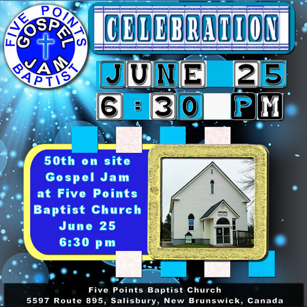
Project 5
<<< Thank you Carole >>>
I knew that I needed to put something together for this upcoming event in June but I have difficulty making decisions on so many things. Well, with the push from Carole, I went in different directions than I would have. I did (and redid and redid) and have something completely different from what I would have done. AND I LIKE IT!Thank you for this bootcamp and for other things I have been involved in with your teaching.
<<< ADDING SHADOWS TO EVERYTHING? >>>
I was a bit skeptical with this one about adding shadows but after doing it, I was really pleased with the effect. I am hoping that it will still look good when placed on the facebook site.<<< CONTINUING USE OF BLOCKS >>>
I was trying to determine how best to highlight the date and time.
I decided to use the colour blocks beside each other rather than spaced out as in video.
But I liked the spaced out ones too.
So I have both.
When I put the text with the font chosen over the blocks, it was a close enough fit after some moving with the Pick tool.
I made a mistake for text "PM". I reversed the black and white but actually like the way that turned out. So I kept it.<<< BACKGROUND PAPER >>>
I did not even know that I needed this but when I got it, I knew it was just right.
It, to me, conveyed the idea of celebration.
When I purchased it earlier this week (May 2023), it was free. I do not know how long that will be the case.
Bokeh Paper - Creative Fabrica - https://www.creativefabrica.com/product/bokeh-sparkle-light-effects-118/
- I stretched the image to get the starburst where I wanted it and to have the full page covered<<< BLANK LAYER - BUTTONIZE >>>
I used the 3D Effects Buttonize to get the colours on the right and left of the background
height - 20
Width - 909
Opacity - 100
Edge - Transparent
Color - #2e99ee
- I stretched this to get the effect that I wanted just the right amount on right and left sides, rather than trying to adjust values within the Buttonize to see if that would give me it.<<< THE BUTTON >>>
I used the button that I place on announcements for the event and thought, especially after adding the sunburst, that it fit just right.<<< SUBSTITUTE FOR SOME PAPERS >>>
I could not get papers that I liked for some backgrounds of picture so just selected areas and flood filled them<<< CELEBRATION TITLE FONT >>>
Film Letters - Creative Fabrica
https://www.creativefabrica.com/product/film-letters/
- I could not get what I wanted for the TITLE using the method in the video so I just used the font with a background added<<< DATE and TIME FONT >>>
Baby Blocks - Creative Fabrica
https://www.creativefabrica.com/product/baby-blocks/
NOTE - I could not get the colon to work correctly so left a blank, then used Arial Black Font to create the colon and moved it into place.<<< ALL OTHER TEXT FONT >>>
Font - Arial Black<<< PICTURE FRAME >>>
The frame is from one of the kits mentioned with Project 5<<< FRAME GOLD EFFECT >>>
To get the gold effect on the frame, I used a script that I created related to a tutorial in Beginners Workshop that I was enrolled in but the site is no longer active.
https://bw-forums.com which points to bw-forums.net which no longer is Beginners Workshop and has caused problem for anyone trying to access it.
I was disappointed to see it go as I was only part way through the training.<<< PICTURE >>>
This was taken from the Church's Facebook Page
https://www.facebook.com/Bill.Parks62<<< SHADOW ON PICTURE >>>
Because I placed the picture completely behind the frame, when I added shadows, there is no visible shadow for the picture.<<< NOTE TO SELF (or anyone else) ABOUT SELECTIONS >>>
A number of times, I found that I seemed to be stuck.
Upon further investigation, I found that I had some selected place and had forgotten to deselect.
So, whenever I get stuck now, I deselect and then I can proceed.
Yes, even when I don't think I have anything selected.
It would be easier if I could remember to deselect, once I am done with the selected area, but at least I am not "stuck" if I just remember to deselect when things stop working.<<< Problem encountered >>>
I have "Guides" and "Snap to Guides" selected and have placed guides in my work, but it does not seem to work for me, it does not "snap". I have to be exact in placement. I am, no doubt, doing something wrong but I am not sure what.<<< CAN I DO THIS? SNAP ONE OBJECT TO GOT DIRECTLY BESIDE ANOTHER? >>>
When I placed the blocks beside each other, I did my best to have them fit side by side but I know it was not perfect.
I think of the video software that I use often, Corel Pinnacle Studio Ultimate, in that if I have two video clips and there is a space between them, I can "close the gap" in the software and it moves it directly beside the other clip.
I would like to be able to do that with PaintShop Pro with two items placed directly beside each other.
-
2
-
4
-
-
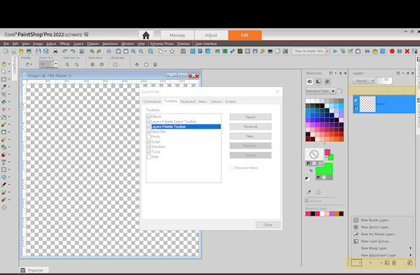
@Cassel I tried what you suggested for View/Customize to get the icons for New Layer \ New Adjustment Layer, etc
I could not determine where I was supposed to right click so
1) I clicked on the Toolbars tab at top of Customize window
2) I selected "Layers Palette Toolbar"
3) I clicked on the Reset button at the right
The text disappeared and the box is smaller so that I have more at the bottom. but the box is now blank(no text and no icon). If I hover over, I can see the help text which identifies what should be there.
NOTE: the icons show for
New Layer Group
Delete Layer
General Preferences
>>
I did the same thing for Layers Palette Option Toolbar
now all text is gone from there and I can tell what each box is by hovering over and seeing help text.
I highlighted places that I would like to see icons (where text was previously).
>>> EDIT <<< After I made the changes, I took Paintshop down and brought it back up again.
The text is back in the area that I highlighted.
-
7 hours ago, Cassel said:
@Anne Lamp The first time you mentioned the cam, I thought it was YOUR cam, but now, with all those animals, I know they are not on your property! Good work! Good extraction on the bird!
@Randy I have some versions that tend to do that and change to text instead of icons. But you can change that. Go to View > Customize and while that window is open, right-click on the text instead of the icon and select Icon in the list that will pop. Your project #4 does not show. Can you repost it?
@MoniqueN. Great page. The only thing that "annoys" me is the flower showing behind the paper. Even if it is showing as a "paper image", my brain still thinks that the flower should be on TOP of the paper! ?
-
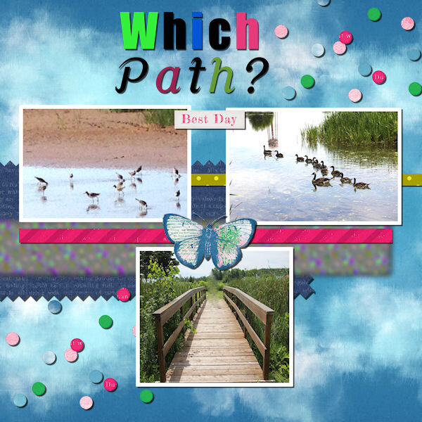
PROJECT 4 - REPOSTED WITH PICTURE (I HOPE)
Fonts used
Which - Impact
Path? - Cursive Serif - https://www.dafont.com/cursive-serif.fontAll elements came from the suggested pack.
I did modify one paper
I used Color Foil
Then I used TypographyCarole, Thank you for the information on the Music resources.
-
2
-
4
-
-
PROJECT 4
Fonts used
Which - Impact
Path? - Cursive Serif - https://www.dafont.com/cursive-serif.fontAll elements came from the suggested pack.
I did modify one paper
I used Color Foil
Then I used TypographyCarole, Thank you for the information on the Music resources.
-
1
-


Mask Workshop (2024)
in Showroom
Posted
DAY 5
One of my granddaughters really likes this treat. So I took a picture of it.
I wasn't sure exactly how to put this together so did some dots on the image and decided to add a coloured background and punched holes in for it. Then added the black background behind it.