

Randy
-
Posts
173 -
Joined
-
Last visited
-
Days Won
2
Posts posted by Randy
-
-
Project 2
I get the opportunity to sing at a couple of Special Care Homes in my province.
So I thought I would show my guitar. I don't take pictures of the residents singing along with me as there is usually a warning somewhere about taking pictures.
The background papers were from suggested packs for project 1 and 2. I did change the colours on a couple of them.
The Treble Clef was from Digital Scrapbooking.
I cannot recall where I got the musical notes.

-
 2
2
-
 5
5
-
-
Expand
LESSON 3 - My House Finches Love Grape Jelly ... who knew? I thought it was for the Baltimore Orioles who are not here yet. Meanwhile the finches are loving it!
Your composition looks good enough to be in a magazine!
-
3
-
 1
1
-
-
Expand
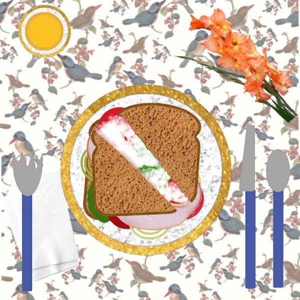
I got a little carried away with this 1st project. The sandwich is ham on rye with vegies and mayo, I didn't want anything hot to drink so I am having orange juice. I get sloppy so I gave myself some paper napkins. . I chose the tablecloth because I think I am going to be doing mostly animals for my projects.
Thank you for adding the story along with this. It is nice to hear how you made your decisions.
-
2
-
-
Expand
Randy: Here's a little tutorial that Cassel just published all about making borders on photos. https://scrapbookcampus.com/2023/05/6-ways-to-add-borders-with-paintshop-pro/
Thank you. I got hung up on the frame tool and forgot all about adding borders. Thank you for the link.
-
4
-
1
-
-
Project 1 -
I tried to add a frame around the flower picture by using shadow on left and right sides.
>>> I have found that for me, I am unable to use the frame tool in Paintshop Pro 2022 for large
mages like this one (3600x3600)
This may have made the drop shadow that I added for the project look bad around this.
The picture was taken with my iphone 5S, yes it is old but still works.
The papers I used were from the suggested pack from Digital Scrapbook site .. I did change the colour of one of the papers.
For the hearts, I just used the Heart from Preset Shape tool and resized using other papers from the same pack.
The font used is Varsity Team. I cannot be sure where I got this.
-
6
-
7
-
-
Day 2 Exercise
Here is my day 2 exercise. Just trying to catch up so nothing fancy today.
I did take a shortcut to get my sandwich on the plate. I selected all layers from the sandwich, used Copy/Copy Special/Merged and then just pasted the entire sandwich to the plate.
I did make sure that I could drag an individual item to the new image.
-
5
-
4
-
-
I have taken the bootcamp before but a refresher is nice. As far as colour, I prefer the light gray. For background, I use black.
palettes/toolbars
Palettes
I keep (but auto hide) Instant Effects - I have set up a number that I use off and on ... actually, I have had this up always but decided that Auto Hide is okay for now and if I need to, I can always keep up all the time.
Toolbars
I keep Effects Toolbar _ I like what Foil and a couple of others can do
I keep Scrip Toolbar - I have saved a number of scripts and now taking the Script course
I have not decided which photos I will be using yet.
-
3
-
-
This was quite a challenge for me related to working through it, understanding what was done, and getting time to do it.
Images – Created using the Kaleidoscope in Paint Shop Pro from the same original image. It is good that we can save Instant Effects because getting the right rotation with the five points is something I would not want to have to figure out each time.
Materials - from the kit mentioned by Carole (Maris Lerin's kit called Change ) but sometimes different colours than what Carole used.
Change Colour – When I changed one of the flowers with Hue and Saturation, there was a bit of red colour which I thought was Okay so I left it that way.
Font – Microdot
I really like learning how to do things better with PSP and this was certainly containing good things for me.
Thank you, Carole. This template workshop has added a number of things AND reinforced what was taught in other workshops and other learning I have been involved in. Maybe some things will become automatic someday.
-
1
-
-
Carole #74302
1.
SCRIPT PROBLEM SOLUTION FOUND
Carole, Regarding the problem with the Script, I found a solution.
Somebody had posted on the Corel Forum with the same problem.
It turns out that the Script Recorder added a Path line to the LayerArrange part of the code. Following the instruction from the Forum (and the example that was supplied), I was able to remove the offending line and get my Script to Run exactly as I wanted.
In case anyone is interested (or someone can reach out to Corel to have this bug addressed), here is the link https://forum.corel.com/viewtopic.php?t=68584
2.
Carole, as always, thank you for your valuable input.
-
1
-
-
MASK with irregular shape – After trying to work with it, I could not get what I wanted so removed it.
Pictures in the frames – I think I asked this in another workshop – the pictures were duller so adding in frame seemed to cause this – what should I do?
Frame showing lightly inside other frame – this may be related to my problem with Pictures in the frames – what should I do so that the frame does not show within another frame?
Frame – picture inside not wide enough. I chose to just try to center it and it is probably okay. I never thought until now that maybe I could have resized the sides of the frame to the picture.
THE BORDER (FRAME) – I wanted to keep the elements where they were and also to keep the border but did not want it intersecting some of my elements, so I moved it just above the background, behind all the other layers.
Script Question – creating my own CLIP TO IT – I thought it would be nice to try myself as I try to understand SCRIPTS – I thought I would use the script recorder to capture the steps to create the mask and a script was created – but when I run it, I get an error when it tries to move a layer down (happened when I tried to move the Floating layer down) and (happened when I tried to move the picture below the mask).
The error says – The arrange command is not valid in the current program state.
If you have any suggestion as to what to do, I would appreciate knowing.
NOTE: I created a second script that begins immediately after I manually moved the Floating Layer. The second script executed fine until it reached the part where the picture is moved below the mask ... where it failed.
I am learning and trying to challenge myself.
Thank you for these interesting videos.
-
1
-
-
Thank you for the direction, Carole.
-
1
-
-
Carole, #73905
Thank you for the information on what is the correct way to do it.
-
1
-
-
I decided to try something that Carole had shown in another workshop to use a pattern (which I created using colours from the pictures) to fill to create my papers.
I know that Spring has officially arrived but I am looking forward to warmer days and the appearance of the spring flowers.
-
1
-
-
THE PICTURE -- I used a picture I developed using PaintShop Pro. I actually started with something that I set up in Corel Particle Shop and brought it back into PaintShop Pro. There I used it as a seed to play around with and come up with interesting things using Kaleidoscope. - used also for the background and the bar on the left by selecting as a pattern (I actually took the cropped picture and pasted as new image to be able to get from the pattern - without the surrounding part that I did not want, allowing for a transparent part between each occurrence).
THE FONT -- Cinerama - The Up and Down effect was accomplished by using lower and upper case alternatively - one has up hill and one has down hill. I really liked what the bevel did to this but I decided to reduce depth to 15 from Carole's setting as I liked that better. It was nice that the number of letters allowed me to have an even number of letters to have the first and last letter in opposite orientation.
THE PAPER -- from DigitalScrapbook.com - used as background for the text and for the bar on the left.
OTHER THOUGHTS - I was thinking that it might be nice to work with each of the while circles with this picture also but maybe that would be too busy.
THE SIDE BAR NOTE - I decided to keep adjusting the setting for the pattern until it fit with the border. If I had been doing this without the template, I probably would have worked a circle to set the pattern in, or made it part of the pattern.
LEARNING GOES ON - As noted by others, these workshops have the benefit of teaching new things and reinforcing what we have learned in the past.
CTRL+Y (Redo) - in one of the things I tried, I wanted to add Gaussian Blur and tried multiple times to get it more and more blurry. I wondered if there was a way to get a Gaussian Blur with attitude so that I did not have to apply so many times.
QUESTION - With the Font, I had to stretch using the pick tool to get to fit to the height and width I wanted. Are there settings on the TEXT tool that I could have used to make this fit without using the pick tool?
Thank you, Carole for your instruction.
Thank you to everyone who has posted. Really great works of art have been presented.
-
1
-
-
Sue Thomas (#73392) ... thank you for the suggestions ... this is a great start!
-
1
-
-
Pirkko (#73243), I like the simplicity of your design. The message of "Thank you" is front and centre.
-
1
-
-
Carole (#73158), thank you for the tags. I am considering how I may use them.
Inspired by the birthday card by Corrie Kinkel (#73364), I am thinking of making a card for myself for an upcoming milestone birthday.
I know; who makes birthday cards for themself? Well, I will. I will want guitars and a font (or graphics) for musical notes and a nice font for the number. Any suggestions are welcome.
Thank you to all who participate at Scrapbook Campus. You always make me feel welcome. I appreciate feedback and suggestions on how to do things differently and better - or just nicer. I am inspired by the works of art which you share.
-
1
-
-
Sue Thomas (73345) . I really like the way you took the butterfly with part cutout and part filled extending beyond the tag. The whole thing is lovely but this part really caught my eye.
-
1
-
-
Christiane (#72862),
I did not use a script to create the Linoleum background.
I just followed the instructions in the video.
As I worked through the video, I made notes so that I can go back and do this again (and again).
If you were responding to another Randy, my apologies.
-
1
-
-
Sue Thomas,
I noticed a comment by Ann Seeber, instead of an adjustment layer, she suggested using Adjust >> Brightness and Contrast. I tried and that worked.
I think the adjustment layer would have been fine if I did not have to be concerned about the oayer with the background.
Thank you. The Freehand selection was a good start.
-
1
-
-
Ann Seeber, thank you.
I took your suggestion related to the use of the Adjust / Brightness and Contrast tool. It did just what I wanted, actually more than I had hoped for. The leaves which appeared so dark actually seemed to glow after doing this.
What I did ...
Adjust >> Brightness and Contrast >> Brightness/Contrast
I set the values as follows
Brightness 45
Contrast 70
Linear Mode - checked
Note: I did not want to blur the background.
The greenery is not from the tulip but I think it adds to the picture.
Here is my work after the adjustment.
-
1
-
-
Sue Thomas, Thank you for the tip.
>>> I tried this but the adjustment layer applied to all layers below it, not just the picture.
As I lightened the green around the flower, my background faded out.
I tried this with brightness/contrast and also with levels in adjustments layer.
>>> I tried turning off all layers below the picture and applying the adjustment layer and it looked okay for just the picture, but then I turned on the layers below, and the same fading out of the background occurred.
>>> Were you thinking of something else?
NOTE: I combined the mask group to a single layer before trying this.
-
1
-
-
Sue Thomas - thank you - I will try your suggestion.
-
1
-
-
The Polka dots process is something I will use.
So I also tried making a simple with lines and liked how that turned out with this same technique.
I assume that I will be able to use the technique for the border to make a postage stamp border in white.
I was wondering about the green background of the picture. In Lightroom, I can work with just the green and lighten it. Is there a way to do that in PaintShop Pro?
Thank you for making this workshop available to us, Carole.
-
1
-


 mages like this one (3600x3600)

Scrapbook Bootcamp - May 2023
in Showroom
Posted · Edited by Randy
Project 3
Butterfly - since I did not have same butterfly as in video, I used the same Drop Shadow as other elements such as pictures.
Heading Font - Bailenson from Creative Fabrica - https://www.creativefabrica.com/product/bailenson-font/
Digital Scrapbook -- all of the elements listed below were obtained from Digital Scrapbook
Green background paper (I used the colour changer tool to change the polkadots to more green)
ps_marisa-lerin_1622_polka-dot-8-green_cu.jpg
Paper with coloured diamonds in circles (I reduced brightness for part I used behind the title)
ps_janet-kemp_137036_memories-traditions-quilt-paper_cu.jpg
Paper with diagonal slashes
ps_janet-kemp_352811_galentines-day-pink-chevron-paper_cu.jpg
Butterfly (I changed the colour to white using the colour changer tool)
ps_jessica-dunn_353814_baby-dear-stamp-butterfly_cu.png
Folded Paper Flower (I lightened the colour using Adjust/Brightness and Contrast/Brightness and Contrast and adjust just the brightness)
ps_marisa-lerin_11181_paper-flower-20-pink_cu.png
Sunburst (behind the upper left folder paper flower)
ps_jessica-dunn_167072_sunshine-and-snow-mini-sunburst_cu.png
................................
Challenge with font
When I add a second line, the spacing is too large.
So I created a separate text layer for each line. The spacing between lines is probably not exact.
My settings were
Offset 13 (I was unable to change)
Kerning 69
Miter limit 10
Leading 0
Tracking 0
Challenge with "New Layer" text instead of icon
In the layers palette, at the bottom is where I can select "New Layer" and other options.
Mine is in text but would prefer to have the icon.
I think I tried this before without success, but cannot remember or find the steps to take.
I think I even tried reinstalling PSP but still the same thing.
This is PaintShop Pro 2022 Ultimate.
In PaintShop Pro 2021 (not Ultimate), I have icons.