-
Posts
3,099 -
Joined
-
Last visited
-
Days Won
44
Content Type
Profiles
Gallery
Forums
Everything posted by Corrie Kinkel
-
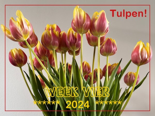
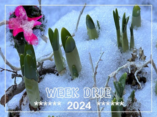
Week four and the start of the Tulip season! 🌷 Tulips are now widely available in the shops and I bought a bunch. It will take 3 or 4 months before they will be in bloom outdoors; the ones we can buy now are grown in glasshouses. The start of the season is always on Tulipday, which is the 3rd Saturday of January and is celebrated in Amsterdam on a square in the city center. There is a huge display of tulips and when the official opening is over, people can come and pick a bunch of tulips for free. I have never been there because it is not where I live. I'll buy them in a shop, but it always gives you the feeling that Spring isn't that far away!
-
S = Swimming for seniors, which I'm doing for many, many years now. It is a mixture of aquafit and aquajogging and a coffee afterwards with a lot of chitchat is our reward
-
All of this sounds great and exciting! I think you are definitively on the right track.💜
-
P = Perseverance
-

January ALL ABOUT ME Challenge (2024) - Birth place
Corrie Kinkel replied to Cassel's topic in Challenges
It did me too and he hasn't seen this photo of mine because he died 40 years ago. However he knew that I liked photography and I have showed him lots of my photos. He would have loved all the new digital ways of editing. -
I will be very thrilled to see the results of your photography project and leave the exercise up to you 😉
-
Cristina thank you and over here in the night from last Sunday on Monday all the snow (we had less then you got) melted away and the temperatures are now + 12C, but with a stormy wind and some showers. I was happy to go for a walk today as I always do on Tuesdays with a friend; we are doing that for almost 20 years now!
-
I don't think it is PSP that that is causing this. As long as I pay attention when I save my work everything is ok. Only when I'm in a hurry and just click save, assuming I'm on the right spot then it can go the wrong way. A script would be handy though!
-

January ALL ABOUT ME Challenge (2024) - Birth place
Corrie Kinkel replied to Cassel's topic in Challenges
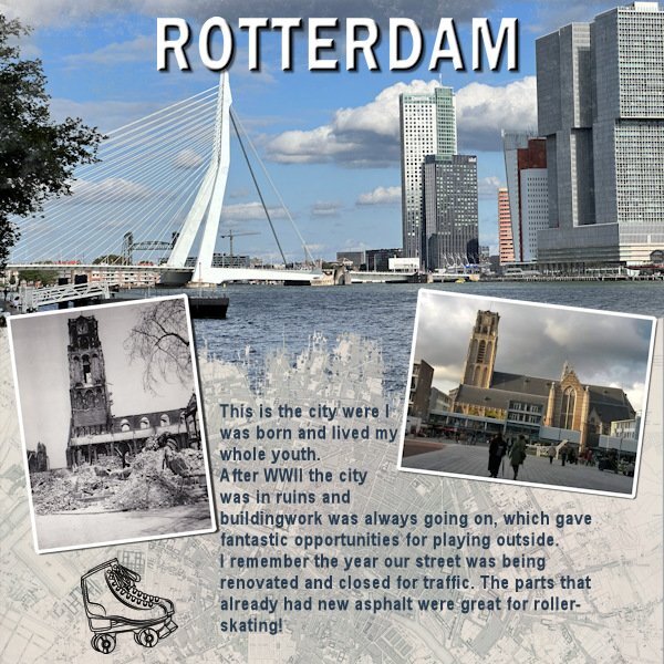
As this challenge will generate a new prompt every month or so and we had the Template Workshop to do, I only now had the time to make something for this new challenge. I liked what Bonnie did and made a page for the city where I was born and lived my whole youth. A little detail that is not mentioned in the layout is the black and white photo which is taken by my dad some time after the bombing of the city center of Rotterdam in WWII. The photo to the right is of the same church and I took that one on more or less the same spot a couple of year ago. My dad passed the love for photography on to me! -
Susan I have done that so often, saving something in the spot that I had used to get a paper or whatever. When I now can't find my layout where it is suppoost to be I think where was I last and most of the time: hurray found it!
-
Isn't it great those blendmodes!!! I use them so often and in psp 2023 it has become much easier to see the changes in real time!
-
Very nice with that dark background!
-
Bonnie my husband just turned 79 last week and yes he is getting "old" in his behavior and thinking and that frightens me! Of course he has been seriously ill but while it is better now he is stuck in the feeling that he can't do things anymore and won't undertake nothing, only a couple of things he knows well. I know that there is help available but he categorical refuses that! So I sympathize with you not being able to travel with Judy; it is so sad when you see a person you love slipping away from you. I hope this trip will turn out better then you fear and with the help from trusted friends you won't be totally on your own.
-
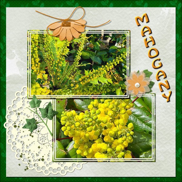
Day 7 Before we got the cold and snow I noticed that the mahogany bushes in my neighborhood already had big fat buds and I have a couple of photos from another year where they are in flower. They mostly flower somewhere in January/February at least where I live. I wanted to use those photos for day 7 and used the diamond template but I rotated t because my photos are landscape format. When I work on something else I often start with a template and rotate it to give me what I want. The colors were a bit of a challenge because the colors of the photos are vibrant and I didn't want to overpower those with vibrant colors of the papers. I couldn't find a kit to my liking so I used what I have is my stash where I store all kinds of things that I find somewhere, mostly for situations like this. So most of it I can't attribute to someone. Besides that I changed some of the colors as well. The doilie is from Marissa Lerin in the kit Fire and Ice and the font is Hobo.
- 426 replies
-
- 14
-

-

-
I have that one too but I have no idea where it came from. As I have many fonts from Creative Fabrica I assumed it came from them, sorry haven't documented where I got it, will have another look.
-
I agree but the problem is that people older than me are really old (between 80 and 90! ) so that means I'm getting old!😢 However as long I can learn a new skill like script my brain does what it is suppoost to do! Which is a reassuring thought and yah "always look at the bright side of life" according to Monty Python
-
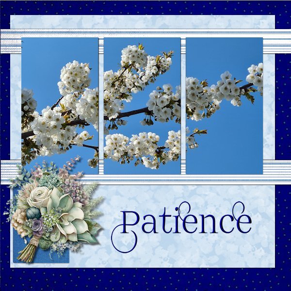
Day 6 Today I'm sticking with my flowers but this photo is from last spring and I choose it because I'm fed up with the cold and the remnants of the snow that makes the footpaths slippery! The timing of this workshop is great as we, my hubby and I are getting a little bit afraid of taking a fall on those slippery paths/roads and that is maybe a sensible thing regarding our ages. Why don't I like being sensible.............. I wanted to use this photo and therefore I used the extra diamond template because I could combine the mask layers in one layer (something we learned in the Magazine Workshop). The papers come from a kit called Denim and I got the dark background by using 2 papers and a blendmode. I really like using the blendmodes and in PSP 2023 that has become so easy. Instead of using the flowers that are in the kit I have chosen I bouquet from my stash. The font is Prida01 and that one has nice glyphs and I gave the text a bevel.
- 426 replies
-
- 18
-

-

-
Nice trick to only use the shadow. In this layout it works perfectly. I must remember that!
-
Week 3 and here the week is also dominated by some snow and temperatures below zero and I use the same photos from the Template Workshop. I couldn't choose between 2 photos and decided to use them both although one is very small with a mask otherwise it overpowered the bigger photo.
-
Day 5 Again a layout with purplish colors, I hope that is not becoming a new trend, but the color seems to suit the layout and photos. Although I love seeing colorful layouts, the ones I make are usually more subdued. The papers are by cpjes in the 2022 augustus blogtrain; the doily is by Sheila Reid. The ribbons and flowers are by Marissa Lerin and recolored. The brads come from my stash and the font is Bremlin
- 426 replies
-
- 18
-

-

-
Thanks for the info, I was curious and I always want to know! Sometimes a good habit but not everybody likes it. And yes every new thing comes with its own learning curve and may we have not enough patience...............
-
Susan glad that you have started! I like all 3 of your entrees with those wilted flowers and they look their utmost best on the black background and the subdued colors of the rest of the layout. What do you use as background when you take the photos? Black paper, cloth, a painted surface and in a studio setup with lighting?
-
Good for you to do it manually, but the Clip-to-It Is a free script in cassel's store Creation Cassel. It saves you a lot of time!
-
Day 4 I hadn't planed to use flower photos this time but after the photos of my plants in the snow I decided to stay with flowers/plants. So here are a couple of thistles. I like the idea of making the hard edge of the mask softer by using a blur! I must have forgotten that trick..... now I'll hopefully remember. The background paper is again made by using 2 papers from the april 2022 blogtrain with the blendmode lighten and the font is Bilderberg. I haven't put the names of those thistles on the page because I don't know the English names and most if not all belong to the Echinops family.
- 426 replies
-
- 20
-

-

-
E = Eye exercises, after having eye surgery I had to do some and it included looking up, down, left, right and go round in circles. Close and open your eyes quickly and slowly. Some I can't even remember and all this a couple of times a day.


