-
Posts
1,500 -
Joined
-
Last visited
-
Days Won
68
Content Type
Profiles
Gallery
Forums
Everything posted by Mary Solaas
-
- 203 replies
-
- 11
-

-
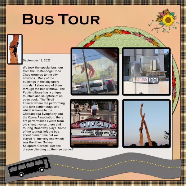
Back to the drawing board! Back to the Chattanooga trip. This is about the bus trip we took the day after we got there. Unfortunately I didn't take as many pictures as I should have. Too busy just looking, I guess. The dragon climbing the sculpted tree trunk really fascinated me. Woops - the file I saved as 600 px wouldn't load - just over size. Hold on and I'll change it. Well - seems I didn't check to see that it was resizing by % and not by pixels - increasing the size to 600% was quite a load!! LOL.
-
Another mask I made the night I stayed up and played. Oh, the background paper was one I was playing with that night also - used a Blossom gradient and effect - colored foil
- 101 replies
-
- 10
-

-

-
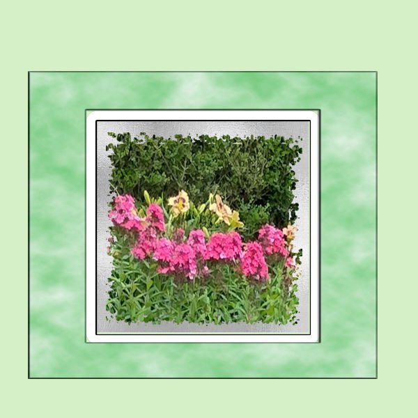
Just playing one night last week when I couldn't sleep. Made a mask, and just leaving the mask group as a group, I played with adding the silver shimmer paper as a b ackground to the picture, and then still without merging the mask group I added frames on different layers. Fun.
-
I've always enjoyed your pictures of your Drive-In.
-
Carole, it seems that we need a "real shiny" texture(?) to use after you apply a canvas texture. I've played and played with this as you can see with the later posts. My next take will be to look at Filter Forge for something to use that is "shiny".
-
I'm posting here because I didn't join the double page workshop. Sorry - after looking at the postings, I'm sorry I didn't. It might have helped the kit i'm working on - the Chattanooga trip my daughter and I took last year. I've been working on it for some time, and after the Build-A-Kit Workshop, I'm finally trying to make it a kit. I had done a few extractions in some of the pictures, since that is what I like to do. But, today I decided on a palette (Yeah, I know, it is a little late in the game!)
-
Disc is full! Oh, my disc is not full, but I have an old computer (it tells me it cant handle Windows 11) and my 1T SD Cdrive that my son put in for me is 1/2 full+ which slows down my working in PSP. Cleaning up unwanted data is a chore I'm in the middle of. Some pspimage files have a hard time saving and some in opening. Life is interesting - I'm not ready to get a new mega mega PC.
-
What you posted is a 600 px. I did try AI resizing to 3600 and it keeps the shininess but the weave is enlarged. I could post the 1000 px but we cannot post 3600 px as it is too large for the forum. I was able to post it in the facebook group so you can look there.
-
Adjust>Color>Channel Mixer Output channel: grey; red: 94%; Green: 101%; Blue: -6%; Constant: 15%; Check Monochrome. You can see how OCD I am! I played with that greyed pattern with everything I could find: Adjust>Color; Adjust>Hue, Saturation, Lightness>colorize and everything else. And I even played with AI resize to increase the 600 px size to 700, then to 800, then to 900, and then to 1000. This was because I couldn't get a good pattern to cover a 3600 px page. If it takes it, I will post it as 1000.
-
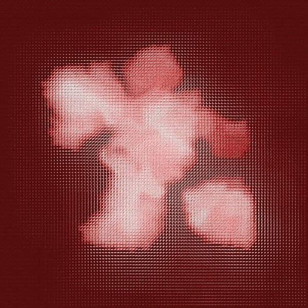
Donna, I did play with your pattern and colorize and color (RGB) and my favorite is this one in silver.
-
Donna - may I copy this and play with it????
-
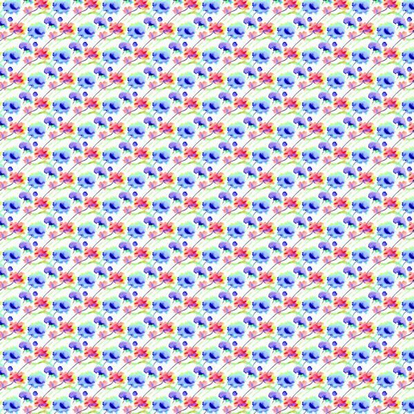
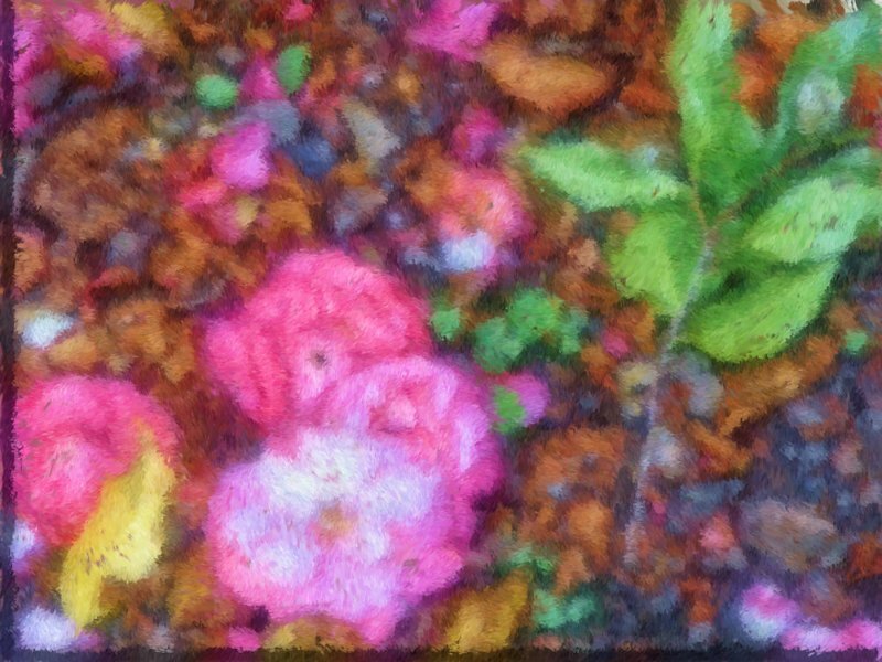
and while i'm at it -- I also worked with the CF Spark images I showed previously. With my camillia picture which I ran through pic to painting and CF Spark, I finally chose the one that Susan liked and made a pattern from it in a smaller size and made a paper with it - playing with it on a 45 degree angle really came out interesting. I also made a paper from one of the patterns made by another artist in watercolors that was posted in Spark.
-
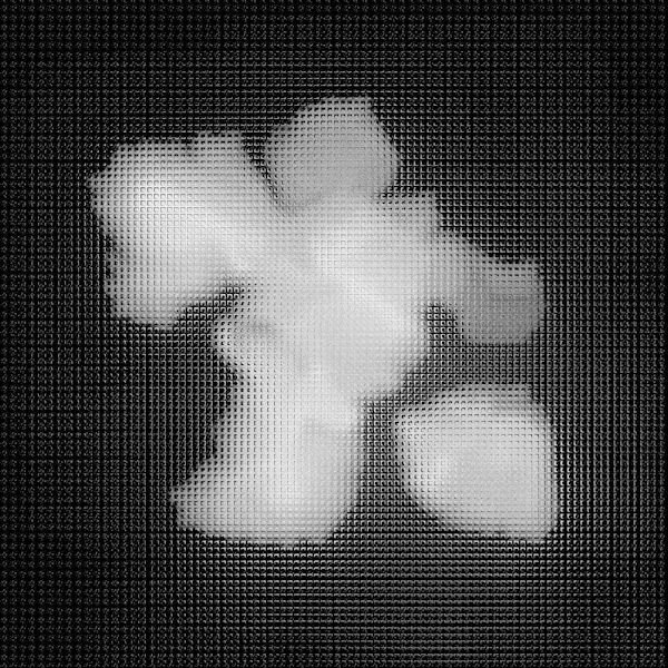
This is the black and white one. I made it on only 1 layer - using the above steps. I tried changing color with Adjust>Hue, Saturation, Lightness - but you can see that it doesn't work very well so maybe you need to choose the color first and then create it.
-
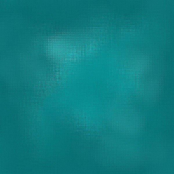
I'm too OCD. I couldn't stop working on that glimmer effect. I'm going to post the last 2 I worked on last night and took down the steps I took to achieve the result. Donna, maybe this is what you are looking for. I did try to do it in black and white thinking that I could colorize them with some of the tools in PSP, however, that doesn't seem to work and keep the shininess we are trying to achieve, but I'll show it anyway. I worked in a 1000 pixel square. 1: Fill with a light color; 2: New layer: use a darker hue of the same color; 3: Use the paint brush (I chose the cloud brush - used size 50, but you may like a larger size which I used in the 2nd one, hardness 50, step 5, density 100, thickness 100, opacity 100, check Smart Edge - and brush all over the layer; You can merge the 2 layers - I merged visible to a new layer; 4: use a small gautian blur - I used 5; 5: Effects>Texture>Mosaic Antique - I set it with # of columns 75, check Symmetric, tile diffusion 100, grout width 10, grout diffusion 15; 6: effects>texture>mosaic Glass - I set it with # columns 100, check Symmetric, glass curvature 75, edge curvature 3, grout width 3, grout diffusion 0; 7: Adjust>Sharpness - I did this about 3 times. I did save as a pspimage as well as a jpg. Since it won't post at 1000 pixels, I resized it to 600 pixels square.
-
I have played with this for the past several days as I have had time. I am very OCD. I cannot, for the life of me, recreate what I did to get this result. I cannot figure out which pspimage I used to get this result (as I had made several). So, what you see is what you get and I have to leave it at that.
-
never mind - I found it.
- 1 reply
-
- 1
-

-
-
I'll go back and look at the steps I took in several different pspimages. However, there has got to be a way of doing it without all the playing around I did. What finally helped was having your image up alongside the one I was working on. But, now I have to get dressed and get real and get ready for the 3pm service at Resurrection Church.
-
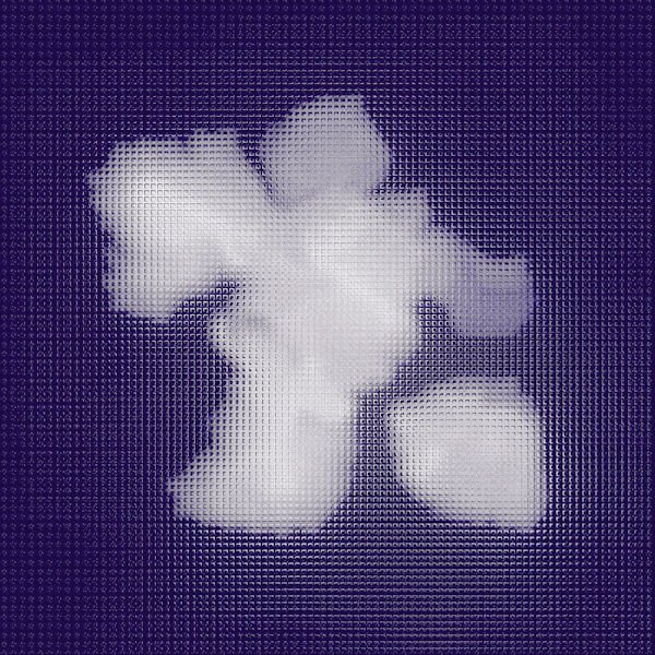
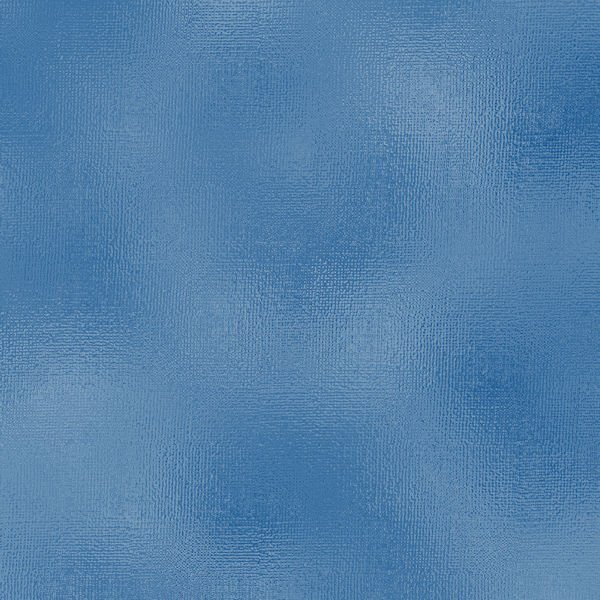
I've been playing with that reflection effect. I'll post the dark blue sample that was posted by Donna and for the comparison the one Ive been playing with. Many different layers but really using a glitter by Cassel and using different blend modes (mostly soft light) and then playing with effects>texture effects>mosaic glass several times, and then sharpness several times, this is what I came up with. Oh, yeah, also effects>distortion effects> fine weave also. While I was playing, I had Donna's image up for comparison with what I was doing.
- 101 replies
-
- 10
-

-
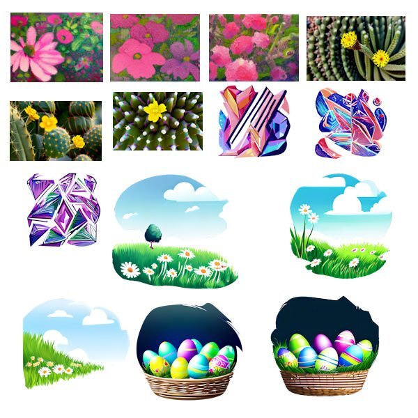
That was my favorite too. The picture I started with was one I took in Louisiana some years ago of some camillia flowers that had fallen on the ground. There was some green leaves in the picture too and I had taken it and put it through pic to painting before I put it through CF Spark. The last 5 I was just playing around with thoughts and spelled them out and they were the results. The abstract pics were the result of taking a presented pic of a bouquet that I asked for enameled lines. Just fun and I'll see what I do with it all later.
-
I've just discovered what CF Spark can do. So I will show what I have been playing with today. The last 5 are something I just asked it to create with a description. The others are from a beginning picture.
-
I took a picture i took of Camillias on the ground in LA several years ago and brought it into Painter and this is what I came up with.
-
I'm done in. Workshop 7. Changed many times, but this is what I finally came up with. I'll post it and then I have to restart my computer as I overloaded it working on this. The font is Dragon Kids from Creative Fabrica. The lower cluster is from PS - Jessica Dunn.
- 331 replies
-
- 15
-

-

-
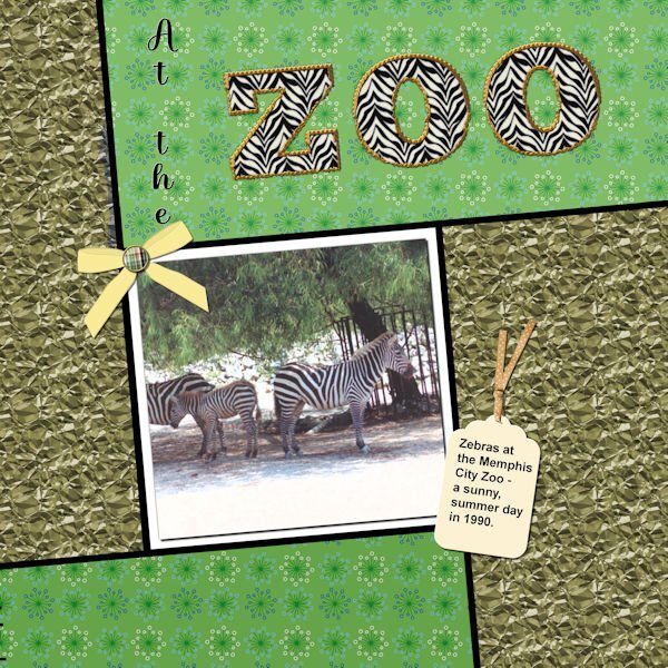
Well, I did complete workshop 6 and will go on to 7 today also. Not too happy with my last couple of layouts - however, the different ways to use text have been interesting. With this one I used a pattern in the letters instead of a color - it was interesting resizing the layout - the zebra pattern didn't want to resize; so I had to close the jpg and then call it forward again - and this time the zebra pattern also resized. The ribbon on the tag is from PS - Gina Jones; the rest of the elements are my own. I think the font I used for the Zoo was something Big Chunk.
- 331 replies
-
- 17
-

-


