Sue Thomas
-
Posts
3,002 -
Joined
-
Last visited
-
Days Won
101
Content Type
Profiles
Gallery
Forums
Everything posted by Sue Thomas
-
Ah, good it was in the blog. I have been using layered fonts since before Carole did the blog post. I make sure that everything is centred, that way all the fonts in the folder are aligned with each other. I will download that font, and see if the layers line up for me, using my way of using them.
-
Another beautiful colourful festive page, but not overly bold.
-
I feel you can't go wrong when you choose colours from photos. I did lower the brightness a touch on this one.
-
A beautiful colourful festive page. Is the font a layered or a coloured font. If it is a layered font, it is easy enough to colour them. Using all the fonts in the folder, including its shadow font. There is a tutorial, but I can't remember at the moment where it is located in the campus. Try the blog. I use layered fonts.
-
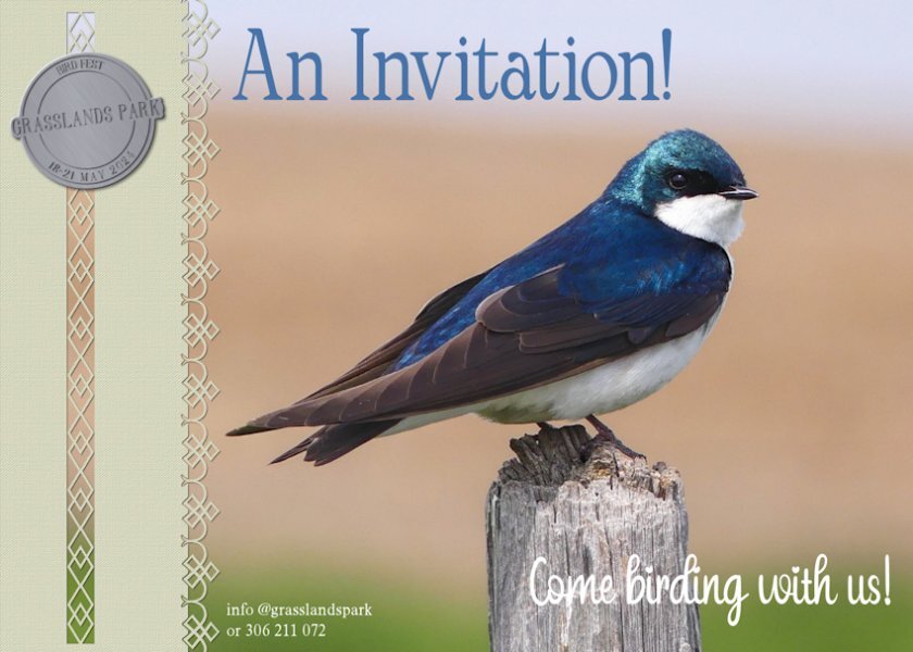
Day 2, continuing with the Invitation theme. I complied with the video, with the exception of grouping the 4 photo slots into one large one to accommodate the photo of the male Baltimore Oriole.

- 356 replies
-
- 20
-

-

-
This time I'm taking a slightly different approach, instead of the usual greeing cards I have decided to go with Invitations. Primarily birds and mammal invitations. The recipients of the invitation, will get a nice surprise when they open the card. You will have to wait until the last day to find out what it is. These cards can be randomly placed into nature magazines, picked up at conservation offices, or just posted to memebrs of a particular nature organisation. One of three pairs of Tree Swallows, that are nesting in boxes fixed to the horses fence posts. This one is a handsome mature male, guarding his family. I created the token, and used one of Carole's paper punches and edge punches
- 356 replies
-
- 24
-
-
-
You and I are quite predictable with our choice of topics. You with your flora and fauna and myself, birds and other creatures to showcase our photos. Great first page, love the colours.
-
As I would say to my Welsh family and firends 'you have done a tidy job'. Check out the Masterclass Dynamic frames, the last technique demonstrated in the class. Like all techniques, and I'll use masks as an example, once you have done it several times, it will become second nature, and you will become proficient in using the technique. It doesn't matter which you use to cut and promote, sometime I will use the photo, and other times it will be the frame. I could have cut and promoted the letters in my layout, but I chose to cut the squiggly line. Use which ever is easier for you. I don't use the freehand or the point to point, I always use the rectangle tool, or at least whenever possible. As it gives a nice clean cut, the other tools I have noticed will leave a very slight gap. Which promoted layer goes where, in time will, make sence, and done automatically. Always make sure that you have done your shadowing, placement of your elements and any beveling prior to any cutting. I won't confuse you, but there is another way of doing it. Duplicate the layer you are going to cut, place the layer at the bottom. Making sure the shadow is on it's own layer. This time use the eraser tool, remembering to also erase the shadow. Using this technique, eliminates all of the moving of promoted layers, which can but in excess of 10-20 layers, depending on the layout.
-
https://scrapbookcampus.com/tips-tricks/interlacing-elements-with-paintshop-pro/. It's actually in the tips and tricks. Although I could direct you to many other tutorials and masterclasses which demonstrate the same technique.
-
It's in the hints and tips. Give me a minute and I will send you the link.
-
Thank you Corrie, coming from you that is quite the compliment. As over a relatively short period of time in the Campus, compared to more seasoned Campus members, your work has evolved into something quite spectacular, as have so many others. Yes, I started off with the best intentions of doing stitching. Had I been allowed to make the stitching much larger, it would have been feasible. The embossed effect is a good substitute.
-
That is very kind of you. I do appreciate it. Are you going to take up the challenge? If so, I look forward to seeing your page.
-
I have to agree with Susan, your page is fabulous, with lots of subtle informative elements. Making the viewer eager to turn to the next page in the album
-
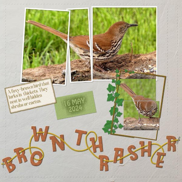
I maintained the sizes of all the pieces. As for the dashed shapes, I started of by trying to create proper stitching, with holes and all, but they proved to be to small. I opted for creating an embossed effect instead. As for the squiggly line, which I'm not fussed on, I decided to create alpha, weaving the letters through the line. I used two of the pieces for journaling, and the other two, to create a sort of split photo. All the original pieces are clearly recognizable. The framed ivy, is one I created some time ago in gold, all I had to do was to colourize the ivy, and frame. As per usual I used tutorials from the creative scrap on the two journaling tags, to make them less boring. Due to the piece on the top left being a little taller than the other two, I opted to tilt the pieces, so it wasn't obvious. Keeping everything exactly the same size and recognizable is a bit of a challenge, but none the less fun.
- 20 replies
-
- 14
-
-
-
You are certainly on a roll, I hope you can keep it up. Lots to look at, without being distracted from the photos. Lots of well executed details. Did you create the arrow paper, using the arrow tutorial in lab 13-11?
-
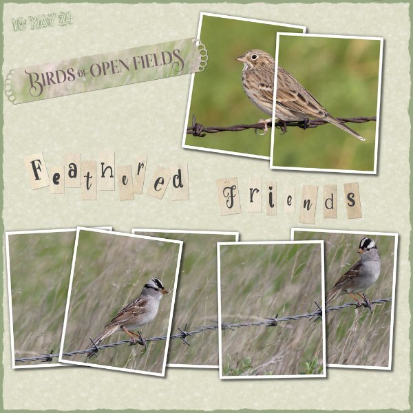
Since Tuesday I have had an influx of birds. A large flock of Goldfinches and Siskins turned up on Tuesday. A Pair of Brown Thrashers turned up a fortnight ago, and another pair arrived on Wednesday. Two female Rose breasted Grosbeaks arrived yesterday, along with the first of the Wrens. I have photos of them all, as I have erected several new feeding stations out in the trees using loose and fallen tree bark. You will no doubt see many of the photos in upcoming layouts. The remaining white-crowned Sparrows with their eloquent song, are here to stay, as the majority them had moved on over a week ago. I chose this image to showcase, as between his posture and expression, he simply melted my heart. The trees are now teaming with birds and bird song. Photo taken yesterday afternoon.
-
Now I remember, it is a script. You downloaded the freebie from creation cassel blog. Looks good.
-
The Creation Cassel Store, has so many goodies, to remember all that we have purchasd over the years can be a challenge. I don't have that many element scripts, but as far as the brushes and fonts are concerned I have them all. I also have a collection of corner, swashes, and divider fonts from outside sources. All of which I use. The store isn't unlike the campus, it can be quite overwhelming. Thankfully with what we post here, it can trigger a memory of a use of a font, or a brush or anything else for that matter. The campus is a powerful source of inspiration, across the board.
-
I remember the rustic alpha, which Carole created in a masterclass. The letterboard you used from the cass- letterpress alpha, is that a script, or a freebies from a script?
-
Perhaps I have given you some ideas for your own layouts. I know I will look at a layout and think ah, I like that, why didn't I think of it.
-
Not at all Julie! I feel the main goal on here is to influence, motivate, stir up ideas, that we may not have thought of through each other. Feel free to copy, it can be a starting point, until your own style kicks in, which then makes it your own. I'd say that Carole's punches would look fantasitc in your delicate layouts.
-
I downloaded Carole's multi framed collage template. I have never used a multi framed template, although I have seen several of them. As I have said previously, I was hooked on this technique after watching the photo split frame technique in the creative scrap. Since them I have created my own, using up to as many as 8 frames per image. I blended two photos of the White crowned sparrow. Created the Alpha, (can't remember what the tutorial is called) burnt edge, which isn't really burnt as I used green. The background paper is an edited favourite of many the linoleum pattern. I don't see many using Carole's corner and paper punches. I love them and use them a lot. I used one of them on the strip. They are ever so versitle, quick and easy to use to add that extra touch to any layout.
-
I always appreciate your kind words Cristina, and others of course. I find that cutting the papers is much more appealing on circular photos than square/rectangle. I think it may have something to do with with the smooth flow of circular shapes. It also makes a welcome change from the traditional framing. Giving possibly a little more depth to the page.
-
Thank you, those are my own words. She provides the stage, the subjects to photograph in all their colours, textures and shapes. From the tiniest of insects to the largest of mammals, flora and fauna. I get a glimpse into her introcate ecosystems.
-
I have to agree with you. Julie's work is quintessence of her style. I have described her work as ethereal on more than one occasion. Now then do you know how to correctly pronounce ethereal? I ask, as when I was a child in school, the english teacher asked who can pronounce it correctly. I stuck up my hand, of course I was completely wrong. How some things stick your head for ever. This is the correct pronounciation, e th ee r ee ul.

.jpg.6ac278c135af67af0a513f7def6ec603.jpg)