Sue Thomas
-
Posts
2,789 -
Joined
-
Last visited
-
Days Won
84
Everything posted by Sue Thomas
-
Here is my Day 3. I used Infinity for the most part. The title was done in PSP.

-
Here is my day 2 page. Carole, dropping photos, and papers into their layers is ever so easy, compared to in PSP. (masks) I stopped using the text wrapping tool many years ago in PSP, as editing the text within has its limitations, hence I do it manually. Applying shadows, is also a sinch and time saving. I don't use kits, what I do use, after discovering them in a masterclass are paper layouts. Otherwise I create my own papers, and elements. With practise, I can see myself replacing lots of techniques within PSP with Affinity. Which will allow me more time out in the field with my camera, and other outdoor persuits. Good to see the campus up and running again so quickly. Those gremlins, must have got overly excited at all the wonderful pages submitted. lol Sending you birthday wishes. Thank you for making us aware of Affinity, which I hadn't previously heard of. Along with the easy to follow tutorials. I have said it before , and I shall reiterate. Using the same template, every completed layout is uniquely inspiring.
- 88 replies
-
- 13
-

-
Here is my day one.
- 88 replies
-
- 15
-
-

-
I bought Affinity photo the other day, installed it. It immediately did an update, now I have version 2.6.2. I have started to familiarize myself with it. I started with the Start here with Affinity tutorials. Here is one of my pages. I will use predominantly Affinity for this workshop, along with PSP.
- 88 replies
-
- 13
-
-
-
It looks galvanized to me. It has that dull grey look about it, with a hint of speckling in appearance. It's a coating of zinc applied to steel and iron to protect against rust, and prevent rusting. You could try rubbing it with a course abrasive, to make it less silvery looking. Galvanzing metal here is usually dipped. Due to our wet climate, we have cattle trailers and horse boxes here which are galvanized, especially the chassis. Not the aluminium trailers though, as they are naturally corrosion resistent.
-
Many flower species close at night. It is called nyctinasty. They have evolved mechanisms, which allows them to guage the time of day, probably by levels of UV, or visible light. That signals to the plant to not waste resourses and risk of damage to itself unecessarily by remaining open without any repoductive gain. It has been proven that they can feel pain, also hear. They are after all living complex organisms. Their complexities are beyond my comprehension.
-
Enjoy your trip, having a fabulous time with your family, as I currently am with mine. Everywhere is ablaze with spring flowers. Whilst back home the ground is still frozen.
-
During yesterday's masterclass, which inspired me. An idea sprung to mind, well two in fact. I am going to use this neon word in a page, as part of the title. From subtle to shocking. Where colour enhances the beauty of the natural world, where colour is a language to many creatures, including birds. I will probably break up the word, in order to tilt, and move the odd letter. At present it is in it's reliminary stage. I can see this technique will have many uses. The other page, would be a night sky page. As I love shooting the moon, and other planets.
-
Actually, the technique is relatively easy, providing when you add the word of choice all the letters must be joined, and touching the edges on both sides. Otherwise, when you come to select either above or below the text using the magic wand, you will encounter problems. If you want to include the inside of some letters, simply change the magic wand to add. Once selected you have so many options available, including changing the image. If I am not mistaken no kit 2 masterclass covers this technique.
-
Due to the compression reading some text can be a challenge. Adding some text separately, makes it easier for the viewer to read. Which helps to tell the story behind the layout.
-
I used one of my own oval templates. I wasn't certain whether I was to write the words myself, or use a hand written font, or either one. I decided to write my own , using the scribble text technique. Coloured tape tutorial fitted the bill for this brightly coloured layout. Scotch tape. The rectangle doily is one of Carole's. Like everything else in nature, flowers never cease to amaze me, especially when I get right up close to shoot them, then research them.
-
Hue
-
Here is the link, but you can find it in the forum, click it (left side of the main page) then click on showroom, there you will find what are you working on in April 25.
-
You captured the vibrant colours, I love the silhouette trees. Layout is lovely.
-
Astronomical dawn. (Twilight, the beginning of morning).
-
The window is small to capture sunrise and sunset shots, as the sun moves quickly, and the quality of light changes rapidly, due to atmospheric conditions. The light is at it's most dramatic just before it peaks the horizon at sunrise, and after it dips at sunset. At this time the sun is low, and the light is scattered, creating a beautiful, diffused glow. I always arrive early to capture the best light. I often look for locations with interesting foregrounds, and backdrops that compliment the monring and evening colourful event, on the prairies, that can be difficult to find. You can never take to many shots at each magical hour, as you will never capture the same shot twice. The golden or magic hour period, creates stunning images, with rich colours and dramtic shadow. Mother Nature truly is remarkable! Today there are mobile phones which have sophisticated cameras, which take stunning shots. For me I Love my DSLR bridge camera. In my opinion, there isn't a better start to the day, than to enjoy a spectacular sunrise.
-
I can only imagine through your photos, what an experience it must have been.
-
Bravo! You summed it up simply perfect, that even my little girls would know the difference between the two words. It did cause some controversy though, which I had not anticipated. By slightly changing the sentence, one word in fact, the word peak was correct. I have never done, nor known any proof readers, but surely they look for more than just spelling mistakes. Such as Grammar, punctuation for instance in the context that it is written .
-
I'm relieved that I didn't offend or upset you, as it wouldn't have been my intention. I'd like to think that any errors I may make, would be brought to my attention, and greatly appreciated. At what altitude were you when you took those photos?
-
I frequently drive across the lake, when the ferry stops running, and the goverment gives the ok to drive across it. They maintain and check the depth of the ice road. Otherwise, to drive around adds an extra 2hrs to the trip. I must admit, I'm not unduly concerned about driving across the lake, in my pick up.
-
I'm going to agree to disagree with you on this. After all Anne is the creator of the page, and it's up to her how she words it. I merely made a suggestion, about the wording "glow peaking the horizon" with a definition, which in my opinion is correct. I'm not going to discuss this further.
-
From my point of view, peak is the correct word to use, and not peek, which means to look. To my mind, the wording would read ' as the sun's glow peaked the horizon". Which means the sun's glow first appeared over the horizon. I may be wrong. Anne, I am not being critical in the slightest, but on the contrary, I make countless mistakes, even more so as I get older. I love all of your layouts, and your photos are always fabulous. I do hope that you have saved psp copies, which means that all amendments can easily be made. I often correct my layouts, especially after I have left a layout for a few hours, and go back to it.
-
Beautiful captures! It looks as if you are above the clouds, possibly at the summit of a mountain, to capture such beauty. Did you know that the time just before sunrise, when the atmosphere is lit by the sun is called Dawn. It marks the beginning of twilight before sunrise. May I point out 2 spelling errors. As I assume you have saved a psp file to correct the text. As you have showcased the 2 stunning photos beautifully. Photos and appearance.
-
I am extremely appreciative of your comment. I consider simple and minimalistic to be the best for my layouts. Allowing the photos to speak volumes above everything else. I would very much like to see Carole do a blog post or a masterclass on creating with circles and oval shapes. Now that I am going through a circle phase, which I find has so much potential when creating layouts for specific and non specific photos to showcase. lol
-
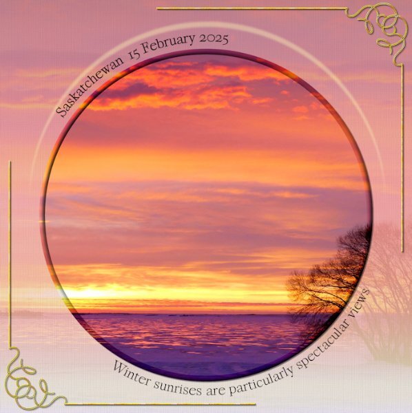
One of the last shots I took before leaving to come home. A view of Lake Diefenbaker, where I walk across the Lake, several times a week, to photograph the cotton tail rabbits, which I have showcased and posted on here recently. The ice freezes to a thickness of around 18 inches.Vehicles drive on it, setting up shacks for ice fishing. I used the same photo twice, using it as a background paper. I created a crescent shape over the top of the main pic, used blur to give some depth. Inner bevel on the main round pic. I extended the corner stamp by using the pen tool, making sure the thickness was the same. Duplicate, mirror, flip. Text on a path.


.jpg.c6605f738b1156bd36c4d372ebf46bdd.jpg)