
Sue Thomas
Members-
Posts
2,652 -
Joined
-
Last visited
-
Days Won
80
Content Type
Profiles
Gallery
Forums
Everything posted by Sue Thomas
-
A tip, I like to keep one whole vector circle, as it makes it easy to use the magic wand to select inside, in order to copy and paste an image, or flood fill.
-
Now I've really got the hang of adding multiple images. The first time I went back into edit, then added an image. This time I simply added one at time. I feel so silly, as initially I was making a real meal of it, and failed. 🙂 I will summarize how I created these, and others, as I have lost count of the tools I used. I'm in my element doing intricate stuff like this. The gold rings are vectors. The most difficult part is aligning the vector elements to the rings. (Making them one) (used the pick tool, free, and sheer) warp brush, push. I also used the warp brush push, on the rings to have then higgledy piggledy. Lock transparency to colour the berries red. I used the create a gold element technique on the holly and berries, Using the blend mode I liked the screen effect. Selected the elements, expanded and deleted the one ring. Keeping the outer frame consistent. Floral elements from CF.
-
You did a professional job on the straightening the poster, using the perspective correction tool, also an equally as good job on the extraction. Did you use a mask or several masks for the extraction? I do.
-
Clever word art for the title. The whole page is simply so sweet.
-
I thought I'd try adding more than one image to a post. I'm still playing a round creating gold decorated frames. The ivy was an ivy green in colour, which I turned to gold. It worked, now I know how to add more than one image.
-
You may say that I'm knit picking, if so, disregard my suggestions. Firstly, I'm pleased to see you moved the title and year into the photo, on your cover page, more specifically the year. You months are obstructing the days, bar for one. Even though we all know the days of the week. Minor tweaking would make those days clearly visible. For me that would be an important detail. Saying that, you are the creator, and it's what you are happy with at the end of the day. I'm merely making a suggestion.
-
I didn't receive that notification. I found it easily enough once I signed into the store. Do I need to delete the old version, as I see they have the same title.
-
Disregard previous message, as I saw that I have an active download for the Calendar Script. I have downloaded it. Thank you!
-
Where will I find the updated version? Do I need the updated version, as my original works perfectly?
-
I also have the original script. Which I bought back in 2016, or there about. I have never encountered an issue with it. That is strange, the script has worked on several versions of Windows. On the other hand I have issues with the 2 date stamps, and the alignment. Carole and I have tired to fix it, but to no avail. I wonder if there is something within the system which throws elements of the scripts out of wack. I'm thinking aloud here, as I don't know anything about making scripts, and it's coding.
-
Ann, that looks like a very nice kit. A fitting layout for the word cold.
-
You have a whole week, although there isn't really a time limit to participate. Meanwhile concentrate on getting better. We will look forward to seeing what you create.
-
Regardless of how cold it must have been, with clear blue skies and sun's rays radiating above, it's an invitation to go outside. The radio sends out wind chill warnings, and extreme cold warnings, stating how long it can take before frost bite sets in. Usually within a minute or so. I frequently sit out with the horses, out of the wind and in the sun. Their coats are toasty warm to the touch. Quite often I will have to open a coat, as there is still a fair amount of heat in the sun, eeven in the dead of winter. At least I get a small dose of vitamin D on my hands face. Our sky is almost always a clear Caribbean blue year round. Unlike Wales, which has an endless cloud ceiling. Which I'm looking forward too in a funny sort of way. I think to much time in one ambience, makes me long for something new. In a way the blank sunny skies has deprived me of the visual diversity that I may crave.
-
COLD is the word to be used throughout this challenge. It isn't the same as the STRING OF WORDS CHALLENGE, we did a short while back.
-
Thanks, I didn't ever consider trying that. I'll make a note and try it the next time I need to post more than one image.
-
I don't know why, but unlike many I can only ever post one image at a time. Even when keeping within the parameters of the file and page size.
-
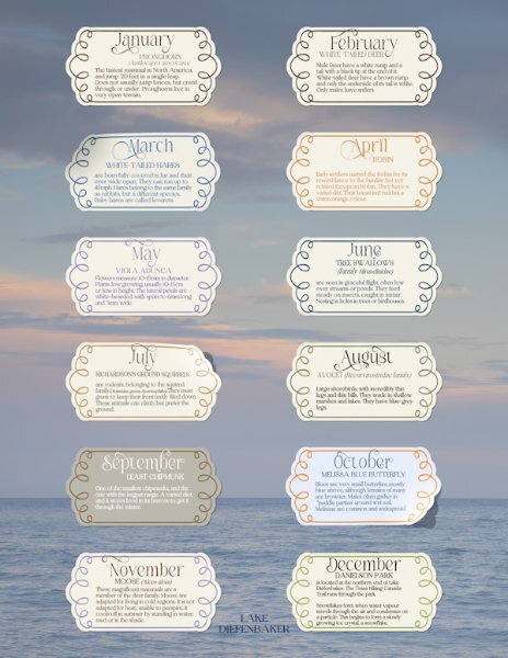
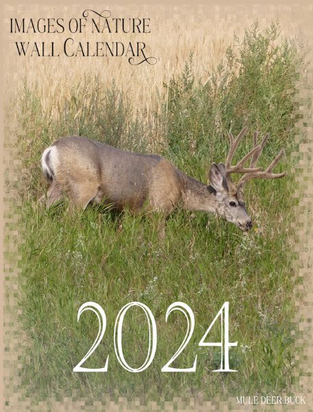
I posted the months of Jan and Feb from my mammal calendar, because I used the the same templates. Here is the front cover and a little information on each mammal showcased in the calendar. Which is printed on the back of the front cover. My personal choice of preference is to maintain a minimalistic consistent flow throughout my calendars.
- 486 replies
-
- 11
-

-

-
I concur with you! It's an absolute pleasure to scrolls through all the pages.
-
The wind here is a force to be reckoned with, at any time of year. There isn't anything natural to curb it. The cold itself is tolerable, with adequate clothing.
-
I have to admit, it isn't difficult to create a page containing the word COLD. Here on the Prairies the winters are brutal. There isn't a happy medium between Summer and Winter. It's either plus 35c or minus 35c. The Main top photo was taken on the 18th January of this year. The wind chill was -50c, with wind blowing at 75km. I was going shopping when I took the shot of the blowing snow. The other photos were taken in Jan and Feb of 2021. Embossed metallic element. For the round tag, I used one of Carole's special fonts for the outer decoration, wove the gold under and over for a different effect. Word art sticker I created for a previous page. Used Carole's free stacked wooden alfa again.
-
Yes, it's a BLEND MODE, there's Luminance and Luminance (legacy). It isn't a filter, which may cause confusion when referred to as a filter.
-
Thanks Corrie. I see copious frames, most decorated, which is where I get inspiration from. Same goes for labels. I choose not use the majority, as I like to create these using vectors. The edges are more crisp, also I can jiggle the layers around to create different ones.
-
I've added it to my wish list. To use in my nature pages. They will look equally as great on anything.
-
I have these, use them a lot. Try using them on a vector shape, using the vector shape script. They really do jazz up a page.
-
- 201 replies
-
- 11
-





.jpg.c4227bef427e2a5dbabb416c70227bc4.jpg)
