Sue Thomas
-
Posts
2,652 -
Joined
-
Last visited
-
Days Won
80
Content Type
Profiles
Gallery
Forums
Everything posted by Sue Thomas
-
Using vector shapes makes it easy to add gold borders using fonts.

- 201 replies
-
- 13
-

-

-
I found a use for Carole's latest script. Stacked wooden alpha. I've been creating gold frames, and gold bordered tags, decorated with festive clipart.
- 201 replies
-
- 12
-
-
-
Although I made light of being a fontaholic, with a little banter, you took it as it was intended. I can also see it as an issue for some. We'll help as much as we can. Let us know the next time you get the urge to download a font, we'll try to find a way to restrain you from doing so. 😀
-
There are a host of free font sites on the net. If you know the font name, type it in the search and a ream of sites will appear.
-
Cor Blimey! I'm aghast at the number of fonts some of you have. I genuinely feel we need to set up a Fontaholic support group, where we can help you to refrain from clicking that font download button. I see now that Michele isn't an isolated case. I see this is a real problem for some and it needs to be addressed immediately. I'm with Rene on this one. If I see a font which really catches my eye, I firstly double check to see if I have something which is almost identical, if I have, I leave it well alone. I have my favourites, which I use repeatedly in my pages. I think my disposition may have something to do with it, as I don't like, clutter, whether it's in the kitchen, in the office, or on my laptop. I think I may have over dramatized a bit, but I couldn't resist. 🙂
-
Meerkat Manor! Has anyone watched this British television programme. Produced by the Oxford scientific films, which first aired back in 2005. It ran for 3 or 4 yrs. I didn't miss an episode, one of the best natural dramas ever made. Its a drama series, following a family of Meerkats in the Kalahari desert. The kardashian family isn't a patch on the Whiskers family.
-
Thank you so much Cristina! It appears, I have my stamp written all over my work, making it unmistakably mine. 🙂 I have also created other different shaped boxes. Including cut box effect. A certain person will know, I won't mention any names, but you know who you are. I love the theme you have used for your calendar, quite ingenious. Like Michele's theme, it goes to show that you don't have to use photos.
-
Yup! You did a smashing job! I'd say you looked at it with a whole new perspective. I'm delighted that you posted the updated version. Doesn't those shadows make huge difference! Well done, keep up the good work.
-
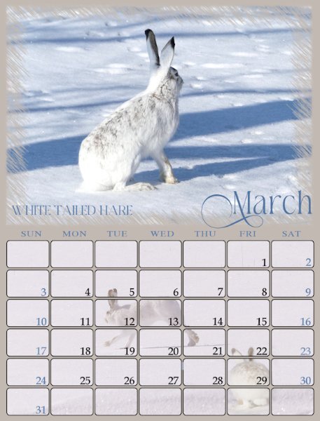
When adding photos to the calendar grid, it can be a bit tricky, as for me I have to have their face, more specifically an eye/eyes unobscured by the grid. In this one I used two photos, adding the hare in the bottom right corner. Making sure everything was in proportion. I'm hoping that if I hadn't mentioned it, everyone wouldn't be any the wiser, thinking it was one photo.
- 486 replies
-
- 10
-
-
-
Thanks Lynda. It's also a nice subtle way to use more photos, as I don't have a shortage of photos. I will point out that it has to be a subtle addition, as the days have to take precedence, being clearly visible and legible to cater for all ages of eyes. Creating a calendar isn't any different to creating a magazine or newspaper, as it has to accommodate a wide audience.
-
Thanks Ann, actually I don't have the Echo Text script. As I did with the Great Horned Owl page, it's my interpretation of that script. It's a lovely way to showcase photos. As for the Rusty Blackbird, they are of concern, as their wintering grounds are as far as Texas and Florida. They are loosing their natural habitat to crops. Their numbers are at a minimal, they nest in the length and breadth of the Canadian Boreal forest. Being secretive birds, little is known about them. That is why I am going to cherish the memory of seeing this one, as it graced my trees out back, en route south.
-
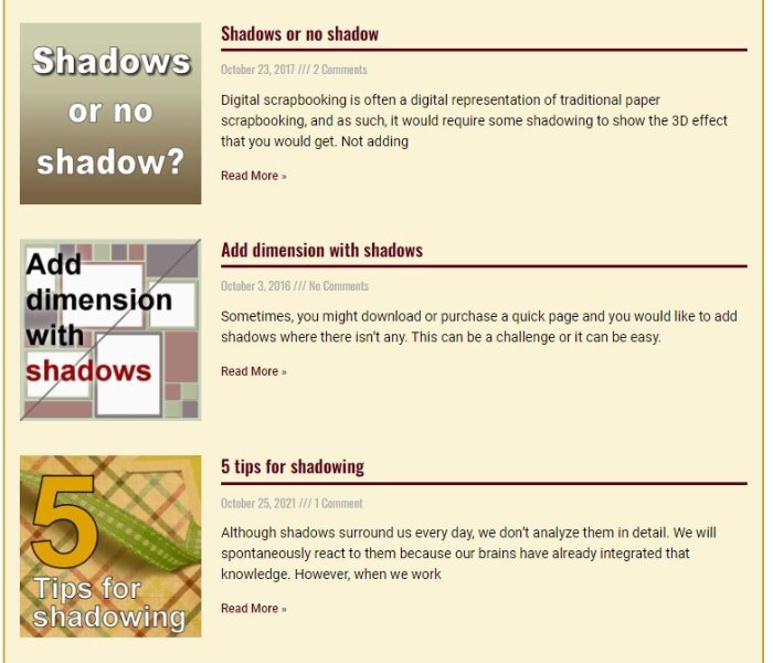
Anytime! I have added a screenshot of some useful tips on shadowing, which you can find in the blog. Please post your edited page, as I'm convinced adding shadows will make the every day heroes stand out, as they should.
-
A very nice layout Art. I Hope you don't mind me mentioning, that I think you may have forgotten to add shadows.
-
I have just noticed that you need to set the angle to zero.
-
To achieve the desired effect in the boxes, would depend on the colours and images used. Some may need a blend mode, along with lowering the opacity. To select the boxes, the selection tool, magic wand is more efficient, than creating a Mask. I will certainly be periodically checking in to check up on you all. I've decided not to take my small laptop this time.
-
What you need to do is using the pick tool drag the one layer either up or down, to reveal more or less of the effect you are looking for.
-
Thank you ever so much, I appreciate the feedback. I not only lowered the opacity, but also used a soft light blend mode. Also removed some of the frame, as it was my intention to have the main branch which the bird was perched on and the bird to stand out somewhat in the foreground.
-
I started this page 3 nights ago, all that was left to do was to add a post it note, date stamp, and an alpha bead. All element tutorials can be found in the creative scrap. I think I have the titles of those tuts correct) My very first sighting and photo of this secretive bird will be a memory I shall cherish. I used the same technique that I used on the Great horned Owl. Created a mask, by using hide all, this time I added a frame. If the frame doesn't look right to you let me know
- 201 replies
-
- 10
-
-
-
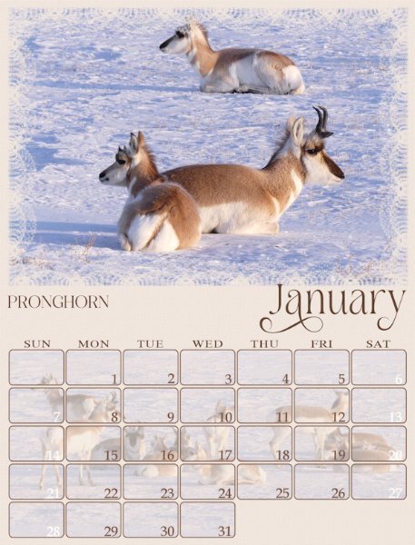
Month of January.
- 486 replies
-
- 13
-
-
-
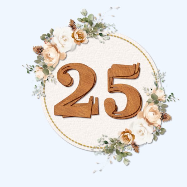
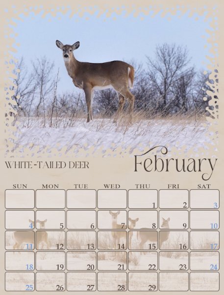
Ever such creative work submitted by talented ladies and gentlemen. Some will know that 3 weeks tomorrow I will be flying home, which had meant that throughout the summer I had been busy plodding away with calendars, cards and advent calendars. This year I made 3 different calendars, insects, landscapes and mammals. It just so happened that I used the very first set of templates for this calendar. So I thought I'd post Jan and Feb, as I am not actually participating this year. I created my own rounded date boxes.
- 486 replies
-
- 14
-
-
-
I also miss Annie Tobin. We had many private interactions of the years. Another person I miss greatly is Vickie Richards. She is still around, but not active. Aren't we all still learning, I hope we never stop either.
-
Unknown to us we must have telepathic links. Admittedly we do share many similarities in our creativity, right down to choosing a rectangle page over a square. Whilst maintaining our own unique styles, your style has evolved since you first joined the campus. Is there a possibility that unknowingly I may have had some influence in that. I know I was influenced by seasoned members when I first joined, and to a degree still am , when I see something that catches my attention. That is another asset of being a part of the campus family.
-
Long before we moved to Canada. I had a fascination for the world of fungal. I bought books, reading as much as I could about them. As the UK has a wet climate, fungal thrives there, particularly in ancients forests. I used to have a way with words, but over the years my literacy skills have diminished, mainly because if you don't use a skill, you loose it. Plus, my memory isn't as good as it once was. Mycology is the study of fungi and mushrooms, like botany is the study of plants. Here on the dry Prairies finding fungi, is a challenge, but they are here, hidden beneath the leaf litter, waiting for the right moment to explode into a myriad of colours.
-
I created the background paper using all of the photos in the layout. I use this technique frequently. Lowered the opacity, added a texture.
-
I proof read my writing twice, hopefully there aren't any typing, grammar or spelling errors.


.jpg.6261982a5cafc25358e1895746365d19.jpg)
.jpg.2e915fa8fc013f0b00fc5bac59b7030e.jpg)