-
Posts
5,739 -
Joined
-
Last visited
-
Days Won
17
Content Type
Profiles
Gallery
Forums
Everything posted by Cassel
-
Here is a link for a browser version: https://scrapbookcampus.activehosted.com/index.php?action=social&chash=af8d9c4e238c63fb074b44eb6aed80ae.3949&s=a16f9754af7f8507ca271ee628f9e02b
-
Have you attended a particular light show? You can check a better video on YouTube. Where was it? Do you have pictures? Let's chat.
-
Oh... silly me. I had not made the connection. It just seemed like you had issues with masks and I thought you were trying to add a mask where you didn't need to (since the template already had one for you). Sorry for the misunderstanding.
-
@Marie-Claire Maybe Poncho deserves a whole book, not just a magazine! ? @Corrie Kinkel I think I would be more "confused" by the mirror ceiling than glass walls (although the glass floor might be on top of the list). @Susan Ewart Another advantage of the digital world: you can try as many colors as you want or change your mind. If your background is "neutral" in the photos, maybe the background could be a bright color. Maybe one from the photo itself or one that makes sense based on the logo, or other meaningful element. And you don't have to have the same color all over. You can alternate also to have consistency instead of all different colors. Or choose one color palette that makes sense with the mood, and use that. Also, you COULD consider using a gradient or a textured solid. All possible options. @Shirley From your description, I can't figure out what might have caused that issue with the Text tool. Maybe it was just a fluke? Hopefully, it won't repeat itself. Those designs you share might convert a few of us to that kind of "doodling"! @Donna SilliaDid you mention where you got those waves? They come back, page after page, and it really ties everything together very well. @Anja PelzerNice and clear page. Very legible text (for who can read that language!) @Royanne Hewko That is definitely a perfect theme for a photo magazine! @Dorothy Donn Very informative page. I would suggest leaving a bit of padding around the text on the right column, just to give it some breathing space. @Michele It is fun how the blue matched your photo! @Sue Thomas Who could have guessed that your page is based on the same starting template!? @bina greene The line work is addressed later in the workshop, so as long as you save your projects in layers, you can always come back. On my page, I kept only one frame instead of both. @Anne Lamp Great pose with that lady. I love your background! @Louyse Toupin Did you happen to stretch the photo so it would fit the height? The people at the bottom seem a bit distorted. @Rene Marker Perfect. By rotating the templates, you know what you need to showcase your photos the best. Keep doing that! @Ann Seeber Yes, the absence of shadows is something that will go well in a magazine format. Of course, if one wants to include shadows anyway, I won't reprimand them, but this time around, no shadows also means faster pages! Tomorrow will be the last lesson, but the tutorials will still be available until October 1st, so you still have time to catch up if you had to take a break or start late.
-
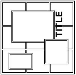
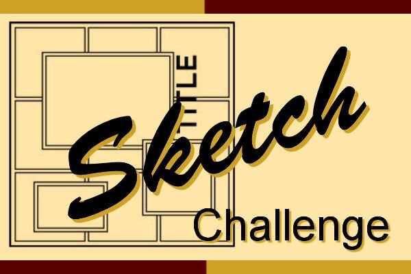
Learning scrapbooking is often done with practice, looking around for inspiration, and trying to recreate projects we admire. Sometimes, we can be inspired by finished projects, but sometimes, we also have to use our imagination to interpret something. This challenge will give you an opportunity to envision something from a “boring” base, and you will have to imagine the end result differently. The sketch is only a written idea, and you can fly with it, modify it, and customize it to fit your vision, your photos, and your supplies. And if you want more information on using sketches, check out this article. Post your project in the gallery.
-
Oh ok. I just thought it was a bit unusual to have a mention of the app store on that page. I thought you wanted it to be a link ?
-
@Anita Wyatt Since the white of the text might overlap a light area of the photo, you can move the whole title toward a darker area too, so it reads easier. For the issue about the text, maybe you had not reactivated the rasterized version of the text to turn it white? @Dorothy Donn What do you mean by using "A009"? Are you adding a new mask? The template included has a mask layer "ready to use". Or maybe you had not downloaded the template? @Susan Ewart When you have the Fill tool active, do you get that Dropper tool when you press the Ctrl key? Maybe, like for Suzy, the Dropper tool setting does not have a checkmark for the "Use all layers"? @Ann Seeber I guess my brain just does not accept the fact that the image is straight!!! ? Maybe I'll need to make an open magazine script with less thickness! (yes @Susan Ewartsaw, I sasw the hint!) @Anja PelzerI think you might have kept the black text on the Day 3 photo. In fact, you might have inverted the black and the white as the white would look good on that background. @James Durrant If you had not mentioned they were kites, I really thought they were some sort of creatures!!! Looking forward to more photos! @Corrie Kinkel Your pages might be a great example of where you could integrate a QR code to link to the app or to additional information. Check the blog for a tutorial on creating a real QRCode. @Gerry Landreth Such a simple and "ordinary" topic, that can make a wonderful project. We often tend to forget about those "ordinary" things that surround ourselves. @Anne Burgess Great photo of those sunflowers! @Rene Marker That is a good idea to use darker instead of white. The technique is the same and why not? On the Day 5 page, how much time is there between the two photos? Other than the flames, they look like only seconds apart, but the visitors certainly didn't appear that fast. @Anne Lamp It looks like you might have left the black vector layer under the rasterized one. At times, it makes for an interesting effect. It looks like your rasterized layer was shifted by one pixel down. If you move it two pixels up, it might actually look like a shadow! Glad you are getting the hang of it! @Donna Sillia Learning something every day in these workshops! @Royanne Hewko Oh cool. Visiting another part of Canada!!! That small out of bound effect is great!!! @Sue Thomas No apologies needed. Looking at your pages with more text and such, it FEELS like you are working so much more than I intended, but if you are able to reuse other elements from other projects, that is PERFECT. Reusing is one of the benefits of digital work! @Shirley What happens when you try to add text to the other page? If you describe the problem, I might be able to help. @MoniqueN. You can leave the background white for now, and once all the pages are completed, it might become obvious what to choose. Since all the pages are saved in layers, it is easy (and expected) that you will go back to tweak them. @Michele That is definitely a magazine topic!!! @Marie-Claire with gray hair, you are in the best place here! I never colored mine, and it is now salt and pepper. Tonight, I will be going to a special light show. I hope to get great pics to share after (maybe I would make another magazine?). It is called Lumina. Here is their site. I only have an old smartphone. I hope it will be smart enough to take reasonable photos in that context. This also means that I will be WITHOUT my computer for a while as I am NOT bringing it!
-
Check the Dropper tool and see if you have the "Active layer only/Use all layers" checked or not (depending on your version).
-
Glad to still see you post those pages, @Mary Solaas. You can also post it in the Travel Tale thread, so "late" viewers could still see all your pages! And of course, you can add them to the Gallery too.
-
@Anja Pelzer Those tiles are so nice and they obviously match your photos. @Ann Seeber I don't know if it is just me, but I would like to see the image on your Day 2 project to be "straight". That is a personal preference though. @Brian Smith Maybe you'll be able to share this magazine with the Newfoundland and Labrador tourism department! @Rene Marker Although you didn't use white to display the half-title, you used another approach to achieve something similar. Very creative! @Sue ThomasEven though these pages should be super simple and quick, I am sure you are putting in more time than I was expecting! @Corrie Kinkel I guess using a different color than white works fine! @Gerry Landreth I guess you didn't need to change the color of the text as it is easy to read. @Marie-Claire It is interesting that those intelligent dogs are not typically used as guide dogs. I would assume they would be great at that. @Dorothy Donn The pages are meant to be made very quickly so you can use the minimum and still get pages done. Go for it! @Anne Burgess I can't help but smile while looking at your projects!!! @Shirley Once you are done, it will be worth getting a printed version. You will be a featured artist in a magazine! And leave it on the coffee table as a conversation starter. Well worth it! Keep them coming. It is so nice to look at all those diverse magazines!
-
It is never done, is it? ?
-
@Louyse Toupin Oh, we are going to Mexico!!!! @Susan Ewart You will see that you will likely want to keep tweaking the pages as the lessons come through. @Corrie Kinkel Tweaking is something that you might do over and over again! Keep it up. @Shirley The borders are likely to change to a different color as you create your next pages. @Ann Seeber That gradient is really powerful in that page. @Anne Burgess That will be a fun magazine! Remember that you can change things later if you want. @Brian SmithDid you visit Newfoundland and Labrador? @Cristina That is a fun use of the text for that front page! @Rene Marker That will be such a colorful magazine! @Anja Pelzer That is an interesting texture you added! For the frames, you might want to tweak them later, maybe separate the two from each other, etc. You will see. @Marie-ClaireDid you edit that photo or did you take it that way? The perspective is spectacular! @Anne Lamp Will we have all colorful flowers like that? It will be a delight! @Donna Sillia Spectacular photo! Looking forward to more photos and stories. @Sue Thomas Once done, I am sure your magazine would be worth printing! @Gerry Landreth It is nice to visit the town! @Anita Wyatt That is a cool photo with the "silent cat"! As for the tutorials, you can do the minimum as the days go and then want to go back to the previous ones. It is expected! Don't worry yet about "finalizing" your pages. As you go through different lessons, new tricks will be shown and you might want to apply them to previous pages.
-
Have you ever done some renovations that ended up taking "a bit" longer than expected? Did you have to change course in some renovation/construction/major project? Let's chat.
-
It is absolutely ok to post yours. Even if you have the exact same song in mind, your projects will be different anyways, and that is what we love to see.
-
@Brian Smith Glad to see you were not intimidated by the square format. Those templates are easy to resize for rectangular pages. @MoniqueN.With the simplistic format, it should be easier to work on three magazines at once! @Corrie KinkelOh, looking forward to all those photos! @Rene Marker Yes, you will have a chance to add and change things over the 7 days. @Anne Lamp Adjusting the mask is one of the upcoming lessons, so you are already ahead! ? @Suzy Sometimes, a broken word title works. Sometimes, not so much. But as Sue mentioned, try rotating the whole page and see. @Sue Thomas I think even the ordinary smartphone can take large enough pictures for a full page! I hope your cover page will inspire others and show how varied our pages can be. @Gerry Landreth We will visit your town!! @Shirley You did that pen art???? That will certainly deserve a whole magazine! Looking forward to seeing more of those. @Anita Wyatt That is definitely a fun font and very appropriate! Keep posting.
-
I certainly hope that this workshop will make it easy for people to use all those pictures to create a page!
-
Yes, the wrong email was sent. I will send the correct links in a minute. Stay tuned.
-
The templates will be easily customizable. In fact, what Ann used was a customized version of most of the pages!
-
I love to include many options for scripts so that you can run them over and over again and get different results.
- 1 reply
-
- 2
-

-
Once a week, there is a radio show that has been on for many years. It is called Vinyl Tap. It is 2 hours of songs that are picked around a particular theme. Sometimes, it has to do with a word, sometimes, a topic, sometimes it is another particularity (like "unlikely duets"). With the fall months coming, use a title or lyrics of a song that has a COLOR in the title. "Lady in red", "Yellow submarine", "Pink Cadillac", "Brown eyed girl", etc. Are you up to the challenge?
-
Oh, I would LOVE to see those photos in this project!!!!
-
Yes, when it comes to dingbats, or fancy fonts, the designers might not always create something for all the keys. Sometimes, it will miss digits, or punctuation marks, etc. Even when I create fonts, I don't always have something for every possible keystroke. Good observation!
-
The discussion about "thieving" can be interesting and as Susan says, we all imitate in some way, and learning is about copying what we see (until we learn by messing up). There is a big difference between copying an idea to "play with" versus copying an idea and taking the credit. Many years ago, someone saw a new product in a store and she bought it, however, it was limited to 4 particular words, and she had no use for those words. She asked me if I could code a script to allow her to use other words and other fonts. I did. However, at the time, I didn't know who had designed the product I was recreating, and it caused a HUGE uproar when designers started calling me a thief because I "stole an idea" that one designer had created and it was very unique. They said I was just going to cause her to lose all sales because "everyone" would buy the script instead of her PNG product. That turned out to be a horrible week of name-calling in a very popular forum. That is, until one designer recognized the technique from an online tutorial. It turned out that the designer who claimed to have "created that unique effect" was, in fact, just copying it. She was using the same text, the same font, the same settings, and claiming it HERS and "never done before". In the process, *I* was called a thief. All that to say we all get inspired by something else, whether it is another digital project, a TV ad, a craft tutorial, or even nature! Being inspired is one thing. Taking credit is just something else.
-
It is in the DIAMOND section, in the "A new idea" thread.
-
So, have you seen Markus anywhere? Has he visited you? Did you participate in our Campus Dozen event last week? What did you think of it? Let's chat.


