Leaderboard


Popular Content
Showing content with the highest reputation on 06/15/2024 in all areas
-
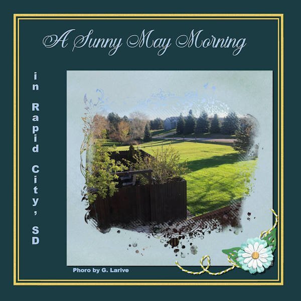
Jessica Dunn has a challenge for June on Pixel Scrapper using one of her masks. I am using that mask on this layout. The flower is from Rachel Martin (Pixel Scrapper); the string is a Cassel string in Picture Tubes; the leaves are mine from one of the labs; the Title font is Arshinta Kirania Script; the place name script is Arial Black.
 5 points
 -
Love the touch with the punches in the bottom corners. It adds a nice touch.4 points
-
I going to Jonah's first birthday party tomorrow, so I attached his card that I made in our workshop to his gift bag.
4 points
-
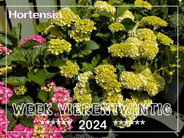
I used a photo of my patio in this week's chitchat and it had my hortensias in it. I had made a couple of photos and for Week 24 I used one that is a more close up one in which the hortensias are better to see. Thanks to the constant rainy weather and low temperatures they are very lush this year. Oké that's the only plus 😢 of this weather ☔
3 points
-
GOOD CATCH!! my eyes aren't as good as they used to be (nothing really is for this body). Yes, I so enjoy Cassel and this forum. Everyone is so helpful and so inspirational. I've gotten so many good ideas from different things you post as well as each one who posts in the forums. In fact, one of the background papers someone had in a layout led me to make several papers (and ribbons) like the one we are supposed to make for Lab 12 Mod 8 (my next Lab endeavor).
3 points
-
You maybe find your cards simple but those are in your own unique and subtle style! When I see them I know immediately it is by you even before I notice it.3 points
-
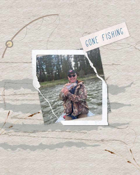
Here's the fisherman.
3 points
-
I have used that mask as well for this week's chit chat and I often use masks made by her. Nice elegant layout!2 points
-
Really nice, Mary! Gosh, how you have evolved from a year ago! It must be all that work you do on the Labs. I think I see a small typo on the line that identifies the photographer. Does it say Photo or Phoro by G. Larive? I'm not sure because of the reduced size...2 points
-
So true Corrie, I love Julie's style and find it hard to do myself.2 points
-
Oh, a first birthday. He might not remember, but the rest of you will. Adorable card.2 points
-
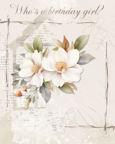
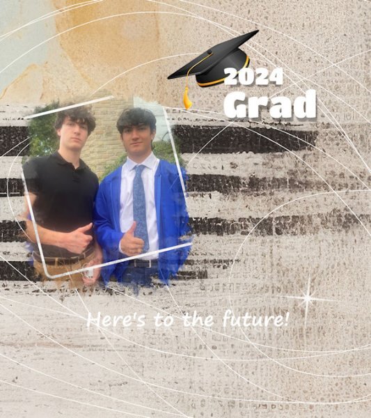
OK, it's kinda hard to post anything after Susan's masterpiece. She aced it! I too have been making "cards" for some folks since they send me photos and I get all excited and want to use them in layouts. But mine are quick and simple and yet the recipients seem to appreciate them (or they're just very polite!) One is a friend fishing in Montana; one is my great-nephew's high school grad; and the other is for a cousin's birthday coming up. I will add her name later below the flower. Oops, I'll have to upload the fishing pic separately. I exceeded the limit.....I have been using 2400 x 3000 as canvas size and resizing down, so they become 600x750.
2 points
-
Very pretty Corrie. Are the pink flowers hortensias too? They look a bit different (the flower and leaves).1 point
-
I'm eating my fill right now of cherries, the luscious dark ones from the US.1 point
-
Hi, Carole, this time am here without any problems😍. Fine to meet PSP-friends:)1 point
-
I'm not much PSP-ing these days, but will try to come along too 🙂1 point
-
R = Raisin (This might be a stretch since raisins are dried grapes.)1 point
-
Q = Queen Anne Cherry1 point
-
I LOVE the birthday girl one. Your style is so awesome, the ethereal quality I love, but cant seem to replicate.1 point
-
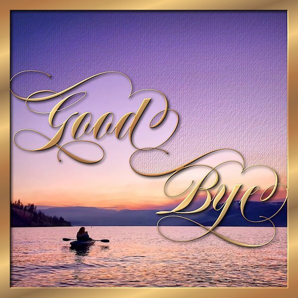
My physiotherapist is moving to the the interior of British Columbia (Kelowna, also part of the what we call the Okanagan area - home of the Ogopogo). I have lived in that area twice in my life enjoying mountains, lakes and lots of fruit (cherries, peaches, apples, grapes) and lots of wineries...even though I don't drink wine. This seems to be my go to e-card style of the moment. they are quick and easy to do...well, I say "quick", deciding on the font is the hardest part and takes forever playing around with it. You will notice the kerning on the word "Bye" is weird. I wanted the swash of B to blend in to part of the swash on the "e". I made masks for each, the upper and lower portions thinking I'd be using two different pictures (Lake shown is Lake Okanagan). I like the original photo, that I found on the internet so I put a copy into each mask but I wanted it to seem like it was two different elements. For the top portion I added two textures and some noise and used brightness/contrast to darken it a bit. That is also the area I added my sentiment on the copy I sent to her.
1 point
-
Decided to make this daily pic look like an old-fashioned scrapbook page. It's an updated version of the one I did in 2017 (in green). I like them both, but the display size that FB uses now is different than it was back then which is why I had to change it. The font is Nymph's Handwriting free from Nymphont.1 point
-
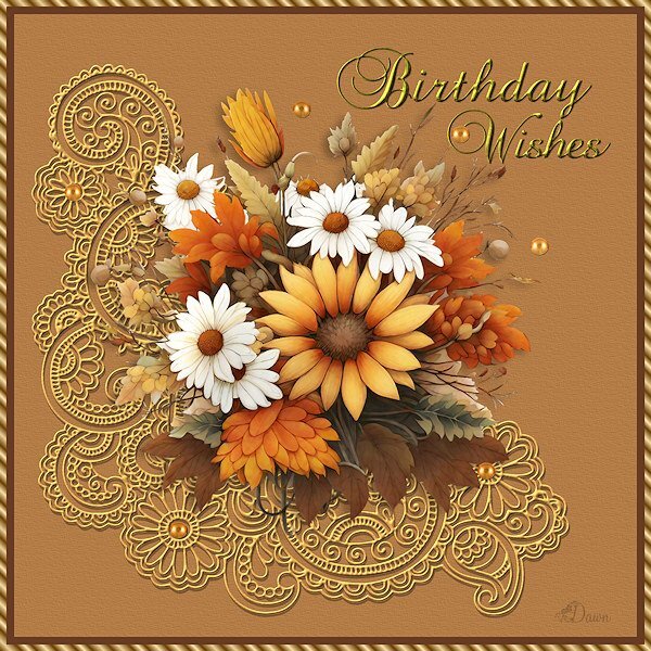
Thank you Michele always appreciate your kind words. i am going to try to make a card every day to get my brain active again. Corrie your Candle is beautiful. well done.. love it and will look great in a card. the card i am posting is a birthday email card. Flower is free from chantalia design...paisley lace sort of thing is created with a Ps brush that i use in PSP i downloaded it some time ago and the beads are done with cass. chain beads tube and the font is Brock Script. Best wishes to everyone.... Dawn. i could not remember where i got the free brush from so i went looking and found it...i found it on a site called antarasdiary.com it is set 28 when you click on download it takes you to brusheezy.com.
1 point
-
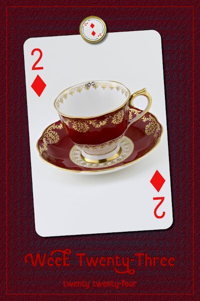
Week 23 Are we already this far into the new year. Where did the time go? I used lots of techniques that I now forget, on the background. There was a number of Effects piled on top of one another and noise was added. In the end the background looks a bit like fabric. The font and outline were treated to Effects or a blend mode (I'm sorry, I cant find my notes, I think I recycled them) so it looks somewhat painted on, although might not show up with this resolution. Yup, it's pretty blurry looking. If I get my act together I'll start posting on FB starting from the January classes. Time seems to be slipping through my hands these days.
1 point