Leaderboard
Popular Content
Showing content with the highest reputation on 06/16/2023 in all areas
-
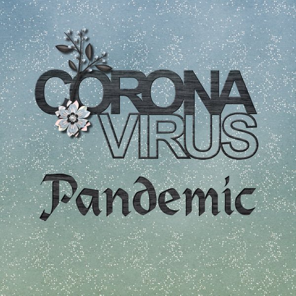
I haven't been scrapping much lately since I've been working on a history project for my church with my cousin. But I did finish an album about the pandemic and had it printed at Shutterfly. It is not especially interesting since it is mostly facts about Ohio, my county and my town. Lots of journaling. I started it with January 2020 and finally stopped with May of 2023 when both the WHO and the CDC declared the emergency of Covid as over. For my front and back covers I used some cut-outs from Scrapping With Liz. For the front cover I used Heidelstein font for the word Pandemic and Cass-punched out script after applying a paper to the raster layer. All papers and elements for both pages (except the cutouts) are from a kit that That Was A Year from Sweet Shoppe Designs. The back cover of all the cutouts was originally saved as 12x12 since I was going to use it as a page. I changed my mind so I had to make some adjustments so things were not cut out on the book cover. I just put every layer into a group and used the pick tool to scale down the size and recenter everything on the page. This is the 12x12 version of it. Worked great!6 points
-
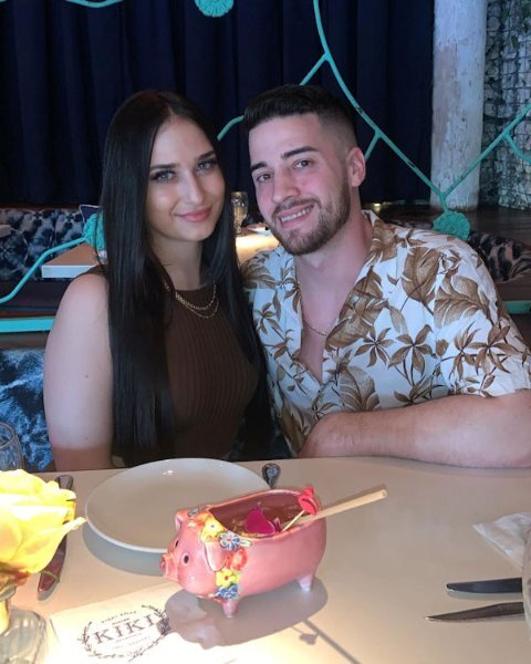
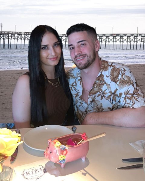
I posted this under its own topic but in case you missed it, here it is, also. I was reviewing the Back Off Master Class when I realized with the newer versions of PSP we have Artificial Intelligence built in that promises to change backgrounds easily. I tried it with a photo of my grandson, Brad, and his girlfriend, Livia. The original background was quite dark and I replaced it with a beach scene offered by my PSP 2023 Ultimate. Here is the original and the digitally changed version.5 points
-
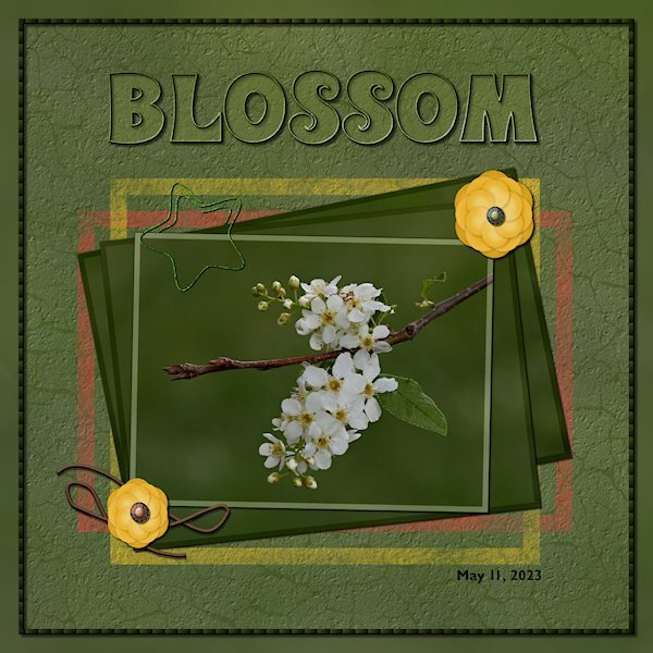
Back in the Lab again! This time Lab 6-9 Wire Clip Flower 2 Overlapped String The wire clip was fun to make, making sure I read the WHOLE instructions on how to use the clip properly in my layout is another story. At first I thought my flower was going to be ho-hum boring but after getting to the end and adding the shadows and the color on the edges it really took shape. They are quite pretty when they are done. The string, well, let's just say I did get two parts overlapped. I wont be known for making fantastic string. I used the see-through technique on the title. And I used the painted frame freebies from the store blog. I put the same asphalt texture (or is it called cement?) on the layer so it looked like it was painted on the asphalt/cement. I also used the eraser tool to make it look scuffed up. The cracks are from my garage door that I photographed and extracted the cracks and made an overlay. Fonts are: Wonderbar 2.0 (title) from Creative Fabrica and Gill Sans MT for the date (windows). Photo is mine. two little brads on the flowers are from Gina Jones Delish Brad 09 (Digital Scrapbook)4 points
-
And one more for my book. This one is of the village and the surroundings where my daughter lives with the places we visited there like Stanford University! I kept this page in line with the others qua style and font to get a somewhat cohesive look for my book. Mary Solaas, thank you for the shield which I adapted for the road where I was. It made this page come together a bit quicker. I have one more to do and then I can assemble the book with all the individual photos and send it to the printer.3 points
-
3 points
-
2 points
-
This is really cool. I would have thought that's how it was, the only 'tell' was a piece of blue above the yellow flower. I wouldnt even know how to go about using this tool. Hopefully when I grow up I'll be as brave as you. (I'm not sure I'll ever grow up though ?)2 points
-
I was reviewing the Back Off Master Class when I realized with the newer versions of PSP we have Artificial Intelligence built in that promises to change backgrounds easily. I tried it with a photo of my grandson, Brad, and his girlfriend, Livia. The original background was quite dark and I replaced it with a beach scene offered by my PSP 2023 Ultimate. Here is the original and the digitally changed version.2 points
-
The background paper I used is from CF's Tangerine Dreams set. I found the illustration years ago, probably on a Google search (the game is repeating the daily themes from 2016, but I'm trying to create new pics every day). I clipped the girl and added her on top of the background layer several times at very low opacity; I'm not sure if that made the BG look too busy. Cass's Mitered Corner Frame script is one of my favorites and saved me a lot of time creating this frame. You can't see it at this size, but the ribbon frame has a Multiply blend mode, letting the background show through a bit. The font is Anton.2 points
-
I just ADORE the Hilda pin-ups by Duane Bryers so I thought I would have a little fun with this theme. The font is Morning Sun.2 points
-
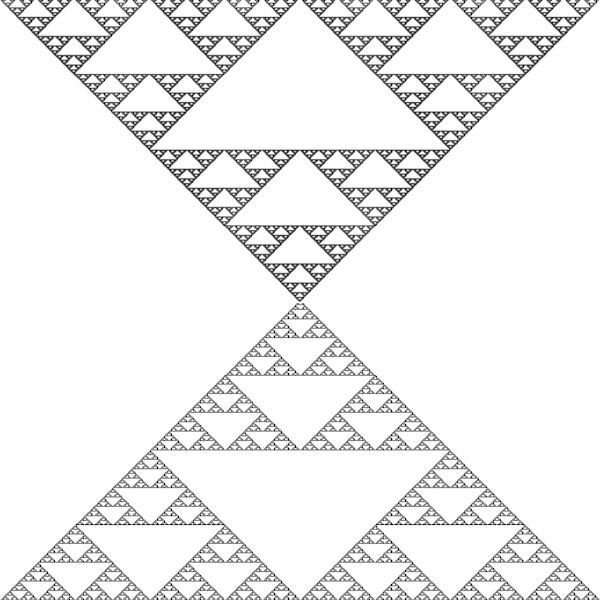
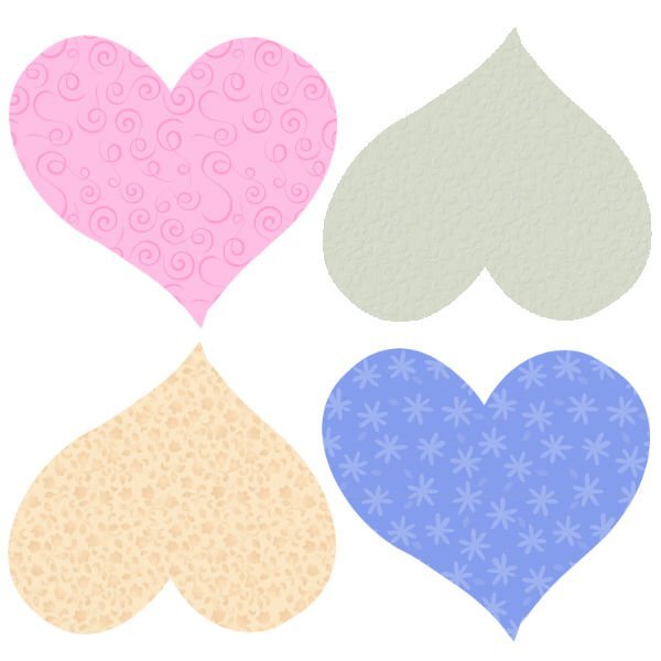
There are so many tools in PSP. But I did download that fractal explorer that Kasany was talking about. Played around with it in my OCD phase about papers and patterns. Well I made 2 patterns out of that and then thought about psp's preset shapes and the heart shape and so I'll show you what I have been doing instead of what I should be doing!!LOL!!!1 point
-
I cant wait. I have an itchy old green corrugated fence in the yard this is often my "background". Be nice to change it. I'll have to find some time to try out those tutorials. I really liked what you did.1 point
-
Thanks so much, Susan. First I used a black outline on the font. Then I added 1) a small black drop shadow at a low opacity and 2) a larger orange drop shadow at a higher opacity and moved it below the first one. Does that make sense? I'm glad you liked the low-opacity lady on the background; I thought it might have been too much.1 point
-
Thank you. The flower is something you could really use in kits. I think they are really quite pretty. next time I do one I will make it bigger to start, so I can downsize or keep it larger without it getting fuzzy. There is tons of possibilities in the wire clips with different shapes. Enjoy the lab. they (the Labs) are a good challenge. And a good way to get some vector experience in a number of them.1 point
-
Susan, this is wonderful. You have made me excited to do this lab!1 point
-
1 point
-
I love this style of layout. The font has a darker glow around it, is that a layer style or drop shadow? i really like how you used the lady with the lower opacity on the orange background.1 point
-
Thank you Fiona, I have all the patience in the world for all the interests I have. Not so much for people in general. So many wonderful pages being posted. Michele, you never cease to amaze me with your pages. No two are ever even remotely similar. Corrie, it's great to have you back.1 point
-
Thanks, Fiona. Duane Bryers created his "calendar girl" in the 1950's.1 point
-
I really love what you did with the background paper. And, looks like I'll have to order the mitered frame script.1 point
-
This illustration is fantastic. What an imagination. I can almost see the frogs leaping off the page. Thank you for introducing us to the artist. It would make a lovely card for girlfriends.1 point
-
I absolutely fell in love with this sweet little face. The fonts are Bubble Bath and Jellyka - Love and Passion. I created the background paper using the Balls and Bubbles effect (Artistic Effects).1 point
-
1 point
-
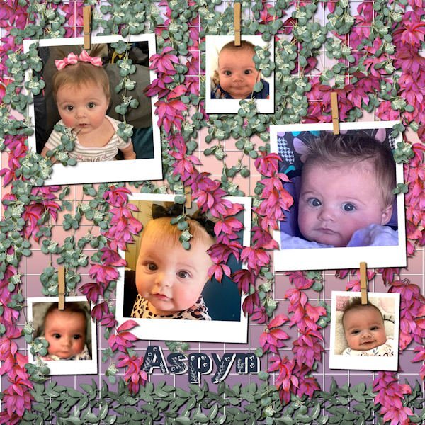
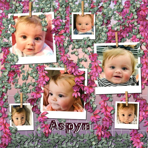
Still playing with Carole's hanging photos, this time with the grid background. I ended up with multiple layers of hanging picture tube vines. This is still Aspyn Dionne, from my last layouts. I finally used all the photos that her mother, Kristan, posted. This turned into a double page, or actually, two coordinated pages. This layout only used 6 photos each and I had 12 photos.1 point


