Leaderboard
Popular Content
Showing content with the highest reputation on 06/06/2023 in all areas
-
4 points
-
3 points
-
3 points
-
I'm adding this layout here because it's June and I'm late for the May Scraplift Challenge. The background paper is made with effects>texture effects>texture>bricks. I scuffed it up with an overlay I made from the image in the middle. The middle dandelion fluff, is one of my photo's, which i did negative image and some other unspeakable things to. Only unspeakable because I cant remember, guessing I desaturated and lowered opacity and other stuff. I used barbed wire instead of stitching, it seemed to fit better. Photo's are mine. I spray water on the seed heads and brought them in the studio to photograph. The concept needs more experimentation (perhaps with gycerine instead). Fonts: Black Range (pluviophile) & Alisabela Brushley (quote) both from Creative Fabrica. I tried putting water spots on the layout but couldnt make it look random enough so just left it off for now. Carole: should this go in the miscellanous area of the gallery or in the Scraplift part, even though I'm late with it.3 points
-
3 points
-
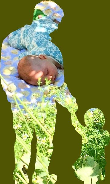
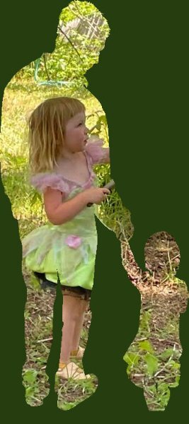
@Ann Seeber One little trick you might want to use is to hold the Shift key when you draw a preset so it keeps the original proportions. In the last images, it looks like it is a little stretched vertically, compared to the original.2 points
-
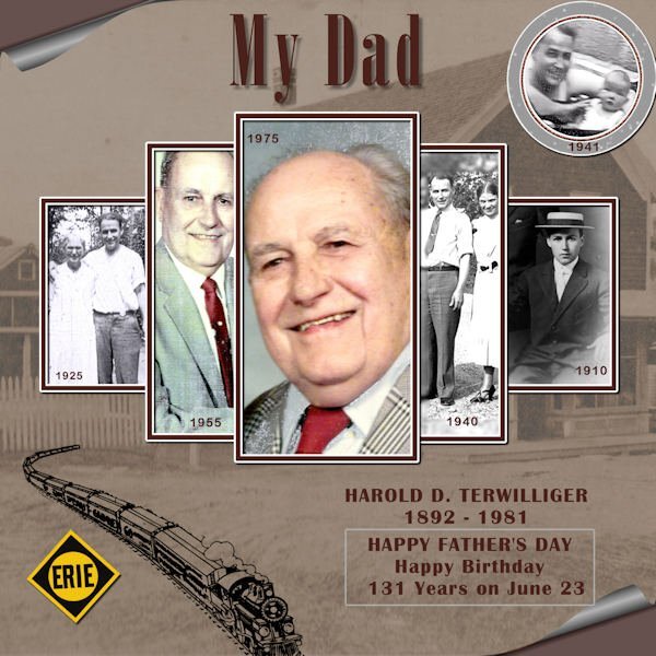
Is that you up in the 1941 box? Beautiful layout and tribute to your father. i like the photos done that way and the background with the curled paper edge.2 points
-
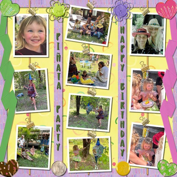
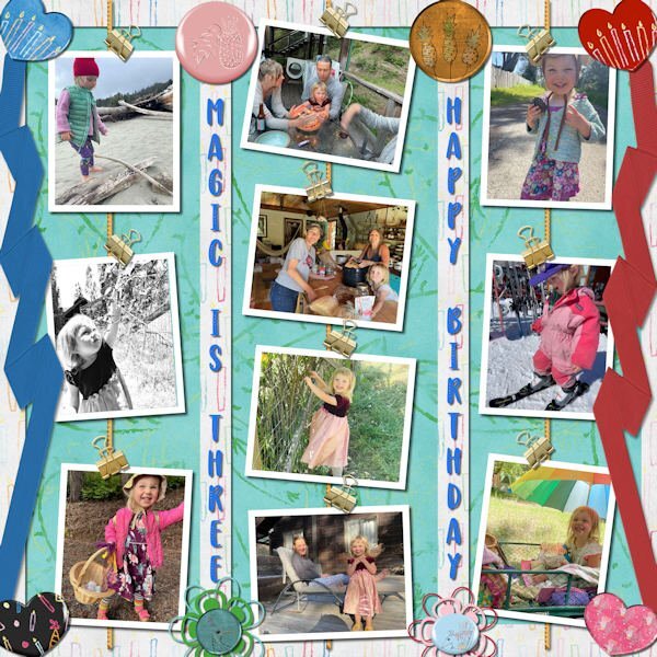
Ann, both those are beautiful, and such a great, great use of that script! The whole thing just shouts, “fun in the summer”, and “it’s my birthday!” And I absolutely love how you put the closeup photo of her with her pink cheeks and big smile in the upper left. She looks so excited!2 points
-
During the last weeks I discovered that my PSP (2021 Ultimate) every time remembers the same word I wrote in a last layout. For example yesterday I exercised Carole's "Punched detailed" handout. As soon as I wanted to write the text, the last written appeared again, even if I didn't save it before. Later on I made another try, (closed PSP completeley before), PSP showed first the last word and afterwards the cutout effect! just by a simple click out of the word. Don't know how to get rid of this ?!1 point
-
Thanks, Susan, yes that is me top right (bald baby ?) the year I was born.1 point
-
In the text toolbar, after the vector shape icon, you'll see a small box with a T in it, if you have selected it, it will remember the text last used. You'll need to unclick it. to resolve your issue.1 point
-
I am the lucky one who won the wool2 tubes from Cassel and I tried something with it. The background paper is by Marisa Lerin Own pictures. Our daughter's dog regularly comes on holiday for a week while she is on the move for work.1 point
-
1 point
-
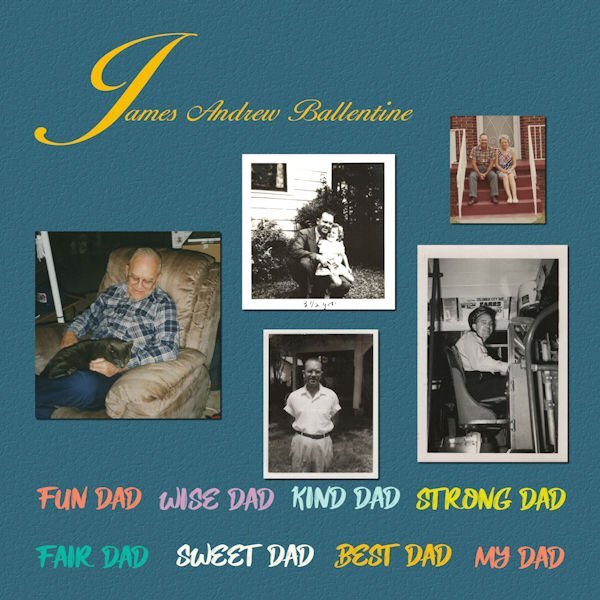
Happy Fathers day to All the Good Dads and to all the People Blessed to have One. A Good Father And Thank you Cassel for the cutouts and free bees have always loved them like a Present for real.1 point
-
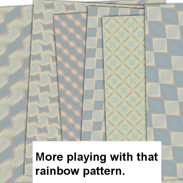
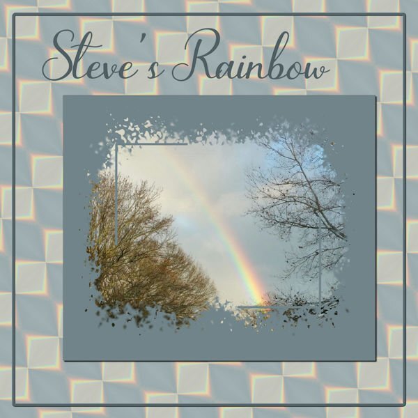
So, I'm playing with Steve's Rainbow again. I took a section of the rainbow and played with Effects>Reflection>Feedback and came up with one I liked; put it on a larger canvas size and duplicated, flipped and rotated it until I had a pattern I liked and then made a background paper of it. Used Cass' Mask from Mask Workshop Extra 3. The font is Bluebell. Canvas frame is of course from a selection and inner bevelled.1 point
-
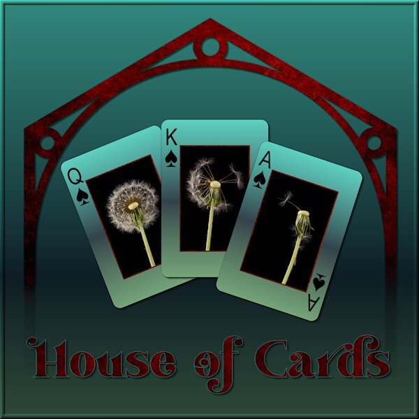
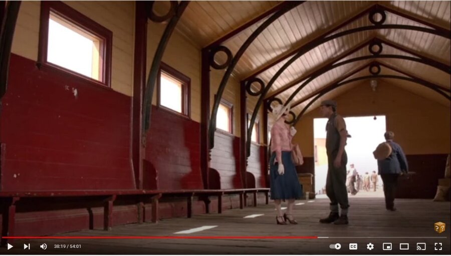
I am watching this Australian Mystery series on utube and there was a scene with a cool design in the building (picture below). I wanted to try and receate the graphic version. I cant wait till we do the Vector workshop. I used vectors to create it and did some problem solving along the way. I'm happy with what I did this time. I didnt quite get the proportions right. When I know better I'll do better. I was playing with what to do with the background when I tried the gradient called "Underworld" so my theme was gambling in the underworld (too much watching the TV show Supernatural). I used the eraser tool to fade out the bottom as if it was descending to the underworld. It was the first time using the Custom Playing Card script from Carole. I LOVE IT. I learned to click "cancel" when choosing a photo and "cancel" again to continue the script and ended up with the layers of, white background and card number/suit. I put the same gradient on the card, lightened, and put my photo's on. I can see a lot of ways to use this script. My original layout was quite dark (my monitor is very light so it's hard to know what it looks like) so I lightened it up for the forum/gallery. My photo's of a recent studio shoot, fun with expiring dandelions. Font is Vanilla Right.1 point
-
I was surprised to learn I won the Phrase Strips script! I had to play with it which took a bit of time as I made the adjustments to the script itself (as per instructions included) and needed some help from Carole. My deadlines for two projects are now behind me (other stuff) and I can get back to PSP time. I like the "idea" of this layout, but I'm not entirely pleased with the harsh white background. I had to leave it like that b/c I'm not much good at extracting an image and getting a transparent background (the sketch of Mrs. Roosevelt). If I changed or softened the background, then the borders of the sketch were too visible. It's a skill I have to acquire.... Otherwise, I'm happy with the phrase strips and how to use them. Thanks Carole!1 point


Resized.thumb.jpg.d25811db03a63358cedab1e79f527635.jpg)

