Leaderboard


Popular Content
Showing content with the highest reputation on 02/25/2023 in all areas
-
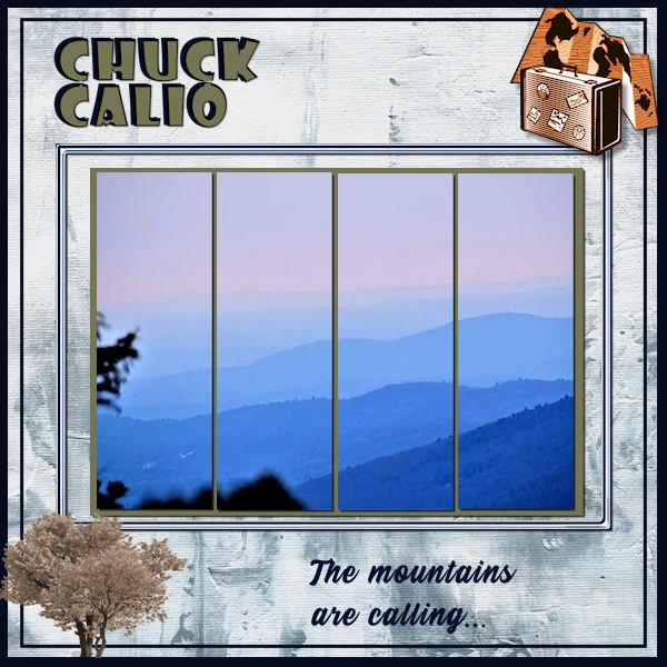
Here is my completed entry for the Scraplift Challenge. Title font is Showcard Gothic; journaling is Stay Outside. The background paper is ps_melo-vrijhof_winter-day. The embellishments are all Picture Tubes. I added a mat behind the photos and filled it with a woodgrain pattern and colorized to match the title.
 3 points
 -
Lesson 6 Font imprint MT shadow and arial ( I think Arial narrow) I now used the brush variance pallet??
2 points
-
Day 7 the small photos are made with a Free script from Cassel in the store : cass-polaroid Sticker: Master class Title Work 3. I enjoyed participating in this Workshop for the third time, and to see the various beautiful pages you have made. Thank you Carole for reviewing our work.2 points
-
On my desktop, I don't have a mouse plugged in so I do EVERYTHING with the tablet. On my laptop, I still have the mouse (I hate the touch pad), but occasionally, if I am away for a long period, I will bring my tablet. And working with PSP, it is so much more precise than a mouse!!!1 point
-
I do use a tablet but it is not a wacom. I bought a cheaper type called XP. I have only used it with PSP. And not on the laptop. It is connected to my desktop which is mostly where I work. I have to remind myself, though to use it. Mostly it is when I invoke the pen tool. I'm beginning to be more comfortable with it and with the pen tool. I really hated the pen tool until I started using the tablet.1 point
-
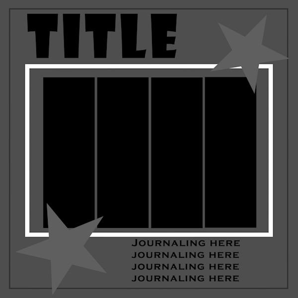
Scraplifting is one of my favorite challenges. I always start with copying the example and enlarging it to 3600. Then I reduce the colors to grayscale. From there I build a template, keeping the original as my base layer, and filling in shades from black to white for each component, be it full sized paper or embellishment. I make all photo areas black. At the end, I increased the colors to 8bit so there will be a full palette available. Here is my finished template in a reduced version for posting here. I will put the full sized version on our Facebook and the .pspimage in the Files area there for those who want a head start. Feel free to download it and start creating! I will be back with my own new creation in a while. Edit: I did discover that the black areas for photos didn't work in the Raster-to-Mask script until I used Negative Image on them again and they turned white. Then the script was ok.
1 point
-
I found it here Simple Pen Solid Font | zeenesia studio | FontSpace1 point
-
Yes the font is clled Simple Pen Solid, it was a free font but I don't remember where from1 point
-
Marie - I sure enjoy your pictures of your dog - Poncho - isn't that his name? I also enjoy your layouts.1 point
-
Oops, I never noticed that. Further proof that my English is not very good.1 point
-
I finished the Masks Workshop Final Quiz with 10/10 as result. Yes ! ?1 point
-
Actually, notices would be correct in that sentence.1 point
-
Day 6 Flower: Marisa Lerin, digitalscrapbook Text : digitalscrapbook1 point
-
The font is Femme, free from DaFont; I thought it had a nice relaxing feel. The background is mine, but I need some help. I wanted to add a little interest to the background to blend into the watercolor clip art I got from CF. I didn't like the results from any of the watercolor brushes I have. I ended up adding a texture which, unfortunately, changed the color. So I promoted the "spots" from the texture, then flood filled them to adjust the color. There has to be an easier way to do this as it took me forever to get this result. One of these days I have to master the brush variance as that would probably have solved my problem. Any suggestions?1 point