MoniqueN.
-
Posts
902 -
Joined
-
Last visited
-
Days Won
15
Everything posted by MoniqueN.
-
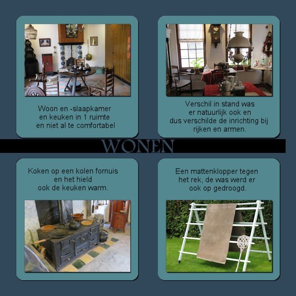
Day 5 We were at an show garden this weekend, the pictures I took there and will be used for this bootcamp. The text says: A lovely spot to get some rest, but the funny thing is, we never sit there but at a spot earlier on. I used parts from kits I had in my stash from pixelscrapper and the text "rust" (rest) I used "enamel" (effects--artistic effects--enamel

- 172 replies
-
- 10
-

-

-
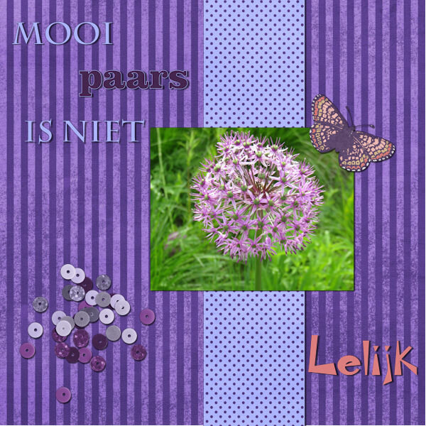
Yes! Funny, I just edited my original post and now I see your question ? Ugly is lelijk in Dutch, so that's why I chose that font in the right corner.
-
I'm late as usual, sometimes life is demanding ? The textis translated: Beautiful purple isn't ugly, that's why the text in the right corner has an odd font ? My first project:
-
-
U- Universal love for our mothers (well most of us do)
-
But we ARE a helpful bunch of people here.?
-
In future when searching for a font, you can use whatthefont . ?? The site helps you find the font you're looking for. ?
-
Day 6 Later, during the making of this project I thought the photo's should of been a bit larger, but it's ok for now. Not all the photo's were suitable for this lay out when I had chosen them. All the papers, elements I had in my stash, most come from pixelscrapper.
-
I don't know how thick scatters are because I don't know exactly what it is/what they are. (Paper, metal?) Something in thickness between sequins and confetti??
-
Much better!?
-
I'm working on day 6 of the double page workshop and added some scatter on my project. Does scatter need a shadow? I'm asking, because when I add shadow the whole scatter gets very dark. (Tried different settings) The scatter itself I reduced the opacity to 36, so I thought maybe the shadow has to be 36 too. But that doesn't look ok either. Maybe I should use an even more lower opacity??
-
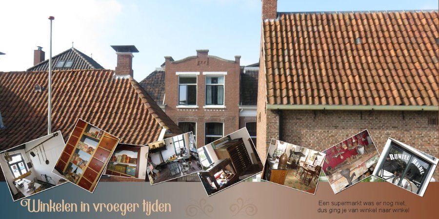
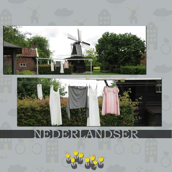
I used the script from Carole again (scattered photo's) Font is latishine and the swirl is from Maria Lerin if I remember correctly. The text says: shopping in the past and on the right side "a supermerket didn't excist so you had to go from shop to shop.
- 203 replies
-
- 11
-
-
-
Ann, have you tried to lower the opacity of the background page, so that you can see the title more or change the colour of the edge of the title? The layout is wonderful!?
-
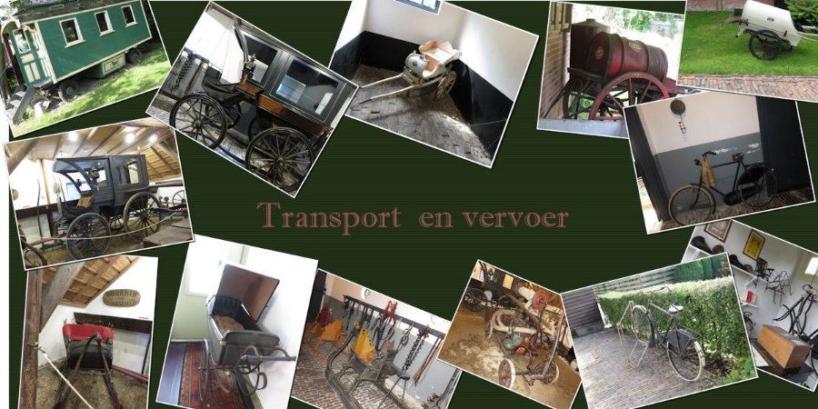
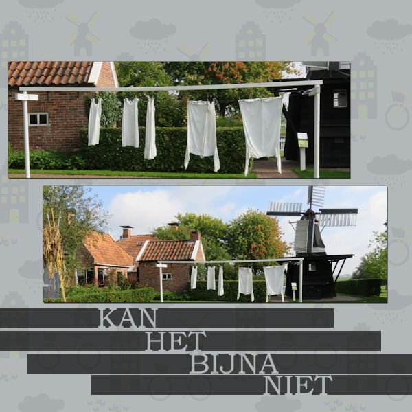
Carole's script Scattered photo's helped much ? Font Imprint shadow The pictures were taken in the same Dutch museum.
- 203 replies
-
- 10
-
-
-
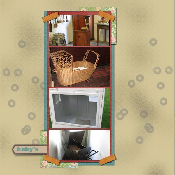
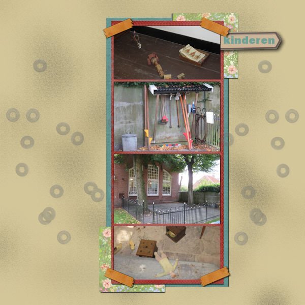
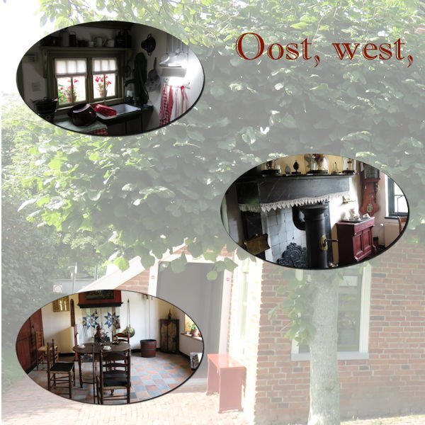
Day 3 East west, home's best is the translation. Pictures taken at a Dutch museum. Masks made by myself, the font MT imprint shadow.
- 203 replies
-
- 13
-
-
-
Nice and bright!
-
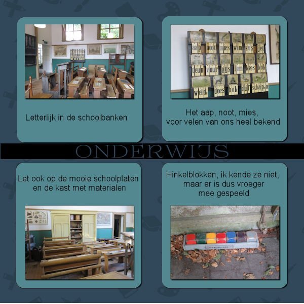
Day 2 Carole's phrase cut out script and the paper and tulips are from pixelscarpper.
- 203 replies
-
- 13
-
-
-
I'm almost glad Mary is also late with her projects. Had a busy week last week and when I finally sat down ,nothing was to my liking. But here's day 1? My project will be about a museum in the North of the Netherlands. I used Carole's Cut out phrase script for the text, Arial is the font and also Book antiqua, one other font I don't know. I think the template came from pixelscrapper
- 203 replies
-
- 11
-
-
-
I have Nexusfont installed, so will try that also.?
-
I found the script but it doesn't say which font it was ?
-
Found the edit history, will have a look if I can find the font ? Thanks for your help??
-
Can I see that even when it was saved a few days ago?
-
Is it possible to find the font you used in a project? And in this case after using Carole's Phrase cut out script? I forgot to write down which one I used and for the consistent look I would like to know which one is it was?
-
Happy birthday!?
-
Ik doe het ook nooit hoor en geef de kinderen groot gelijk dat ze geen foto van hun dochter op internet willen. Ben zelf ook zo anoniem mogelijk op internet. Die rare cirkel op haar anders zo snoezige koppie is ook geen gezicht, maar vond de lay out van dit project best lollig geworden. The double page challenge that's coming up I wanted to do with photo's of my granddaughter, but decided to do another subject.