-
Posts
893 -
Joined
-
Last visited
-
Days Won
15
Content Type
Profiles
Gallery
Forums
Everything posted by MoniqueN.
-
Tomorrow the last one with lesson? ? I have the day 10 one I saw,but no lesson ?
-
Oh! It must be in my spam folder then, will have a look ? Odd ?
-
Was day 10 the last of this series? In 2020 we had one lesson to go? (Looked in my Cassel folders and there was one more project in 2020 ? )
-
If you would like to print your lay-outs, you can go to a printservice/photobook service. They are a bit expensive. But my printer is a good one, so I could print with book quality. But then , how to make it into a book without a photobook service? Laminate the pictures so they won't damage? Or use thick photopaper and a device to put spirals in it? Or use cardboard for a cover and then spirals? How do you do that with your projects??
-
The flower is now on top, just like it has been thrown there. ?
-
It looks like your looking out of a window in a cabin. Love it!
-
I saw your project before reading the text and thought: wow! This is a book cover! ?
-
I'm usually not a real fan f plaids, but this one is so right for this project! I love it! ?
-
I forget a lot too, espcially when you don't use it a lot at paintshopping. But I have Carole's tips and tricks book nearby and try to find what I want there. ?
-
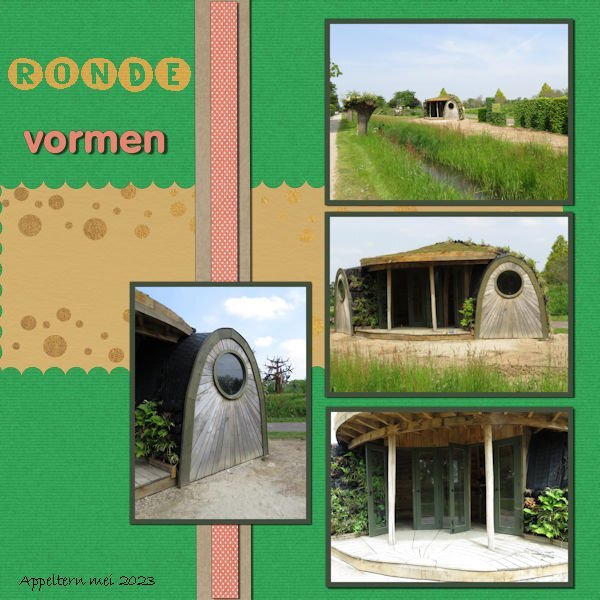
Day 7 Because of the round shape of the "shed" I used a mat with circles on it. And instead of squares to cut out, also circles this time to fit the round shapes of the "shed". The font is unround (The yellow ones) I didn't look nice to have them in different colours, will maybe do that in another project. Vormen (Shapes In English) is the VAGrounded font (Like it!) The shed looks a bit like a Teletubbie house ? I should of added a reverse shadow to the left of the big mat, I thought the map was completly (sp?) to the left of the project ? It's nice to repeat things from earlier bootcamps, I forgot for example to use the magic wand to create borders around the photo's, I always add a mat:). I saw beautiful projects in the gallery, I'm now taking the time to look at all of them in this thread in the forum and add my "likes".
-
Does "snap to guide" also work vertical instead of horizontal??
-
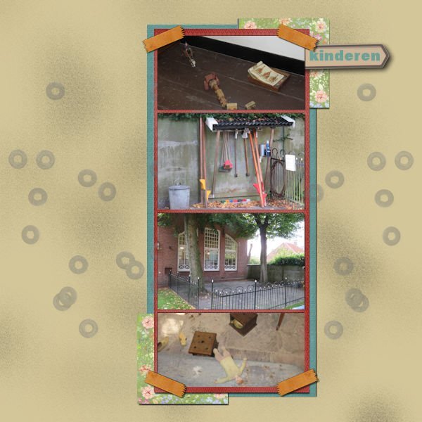
Day 6: I haven't got much to tell about this project. Papers are again from my stash , mostly from pixelscrapper, the glitters from the d/l of the lesson and I forgot which font I used for the title?
-
-
Funny you say that, I've been moving around with it, but couldn't decide which way. Thanks for the input!
-
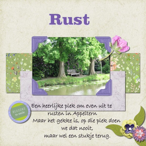
Day 5 We were at an show garden this weekend, the pictures I took there and will be used for this bootcamp. The text says: A lovely spot to get some rest, but the funny thing is, we never sit there but at a spot earlier on. I used parts from kits I had in my stash from pixelscrapper and the text "rust" (rest) I used "enamel" (effects--artistic effects--enamel
- 172 replies
-
- 10
-

-

-
Yes! Funny, I just edited my original post and now I see your question ? Ugly is lelijk in Dutch, so that's why I chose that font in the right corner.
-
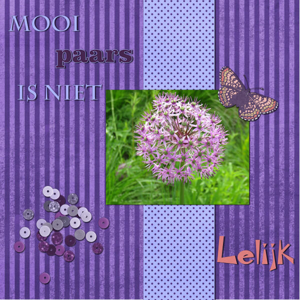
I'm late as usual, sometimes life is demanding ? The textis translated: Beautiful purple isn't ugly, that's why the text in the right corner has an odd font ? My first project:
-
U- Universal love for our mothers (well most of us do)
-
But we ARE a helpful bunch of people here.?
-
In future when searching for a font, you can use whatthefont . ?? The site helps you find the font you're looking for. ?
-
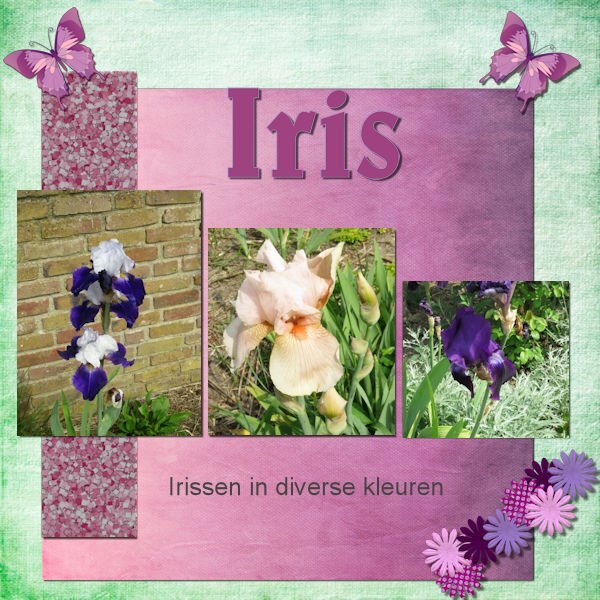
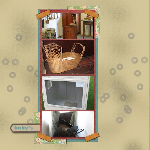
Day 6 Later, during the making of this project I thought the photo's should of been a bit larger, but it's ok for now. Not all the photo's were suitable for this lay out when I had chosen them. All the papers, elements I had in my stash, most come from pixelscrapper.


