MoniqueN.
-
Posts
893 -
Joined
-
Last visited
-
Days Won
15
Content Type
Profiles
Gallery
Forums
Everything posted by MoniqueN.
-
I often rename my layers to keep track, otherwise I get lost too ?
-
Had to Google that, I never heard it!??
-
Watched the first video just now and I often think when I see what can be made with PSP it's almost magic! ? Now hopefully remember all the new things we will learn!?
-
N- naughty
-
osteoporosis.........me too........found out after I broke my upperarm and Tibia Plateau (scheenbeen plateau) within 4 months. ?
-
Is there a difference between craft and hobby's/hobbies? When I translated it, it came out more as an "oldfashioned" occupation like furniture making or goldsmith ? Hobbies? Too many! Since my childhood years I always made things with paper, fabric (dressing my barbie doll) , made dolls with cast and dress them in oldfashioned costumes etc etc. Embroidery, card making, jigsaw puzzles and later, when the computer came in our lives, I made video's about our holidays, building websites etc etc. And since a year I have a Cricut cutting machine, very addictive!! And of course PSP ? Sometimes I wish there were more hours in a day! ?
-
K- knowledge (about ST Patrick)
-
F- Feast of Saint Patrick
-
Y- yearning for another colour than green?
-
Sorry, I meant, the Corrs aren't very traditional,but are a nice band. The chieftains are very traditional?
-
U- Unique???
-
Not very traditional, but the Corrs are wonderful too ?
-
Oops!!?
-
Because my Outlander project was a bit of a story, I added all projects in Canva and made a video of it. (It has white edges, but don't know how to change that) An Outlander story by Monique Edit: I found a template with squares ?, but now it's a slideshow ?
-
U- Unique
-
 It's so strange that one week they come into my inbox and other week in the spam folder? I mark it as no spam too every time it happens?
 -
I had to look for a certain email via webmail and saw in the spam folder a Creation Cassel email I never recieved .(with the Buid a kit workshop announced) I really don't get it, most of the emails from Creation come directly to Outlook, others end up in the spam folder on the server of my provider. This is not something Carole can do anything about it, but it's so odd!
-
"Behind the clouds the sun shines" they always say, hope this will be the case for you too ?
-
It's a very addictive machine ? The possibilities are endless. I was very happy when my granddaughter was born, but now even more happy now I can make things for her clothes, for her bedroom, window etc. ? Maybe I won't make a notebook for EVERY workshop, but there will be more for sure!???
-
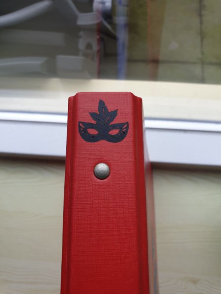
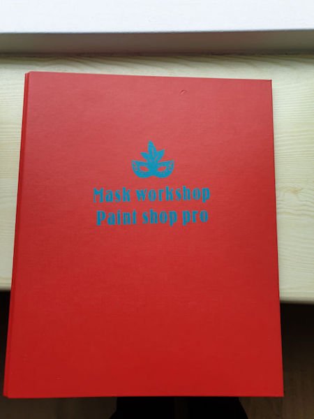
I made a multimap for the mask workshops. So if I want to read how to......(fill in.......) I can easily find it. I've made the title and the mask on the side with my Cricut maker 3 and vinyl. The text is not very straight on the cover, but ok ? Now I'm working with the Cricut for over a year now, I can see what you meant (See archive Forum topic) about the waste you get (especially with) making vinyl projects. With paper you can always use the left overs, but with vinyl you can't.

-
I- intresting story about St. Patrick
-
Resizing was the first thing I did, will tweak with a brush tomorrow. Thanks again!
-
Another extra.? I've got a question? On the left photo at the top you can see a bit of the "end" of the photo. (Vertical) How do I fix that so that you don't see that anymore? I thought Carole said something about that in the video's, but can't find it now? I will be at at a wedding tomorrow, so I think I won't be online tomorrow?
-
Another extra.? Font is Charlemagne and Augusta